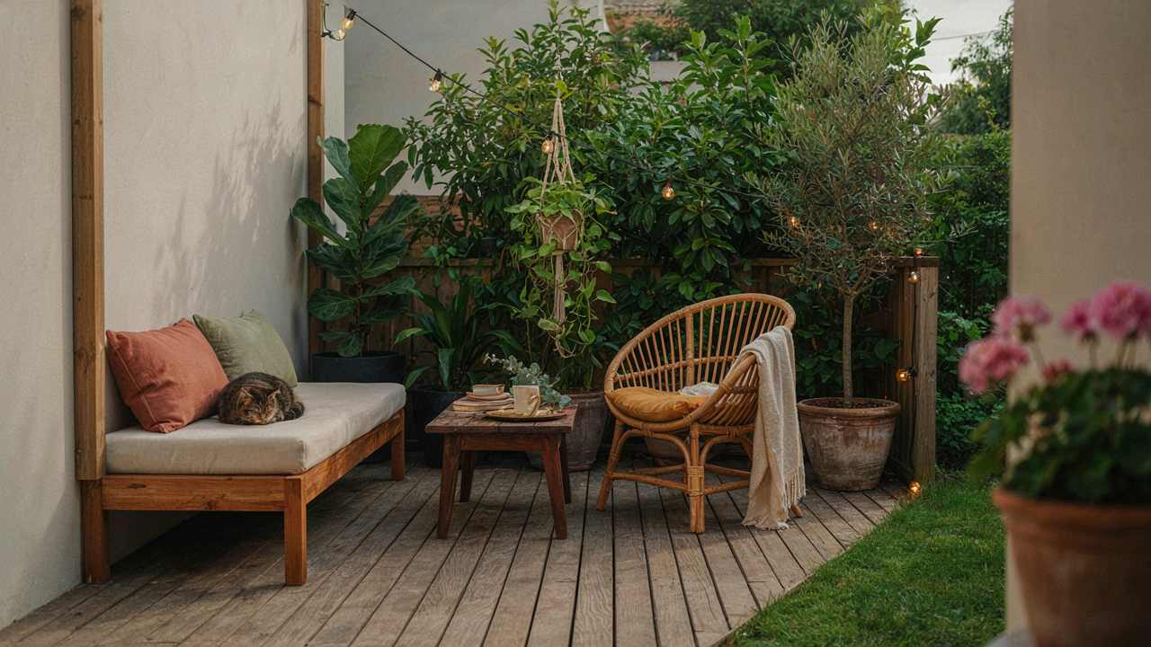
The Inverse Proximity Principle: Maximizing Your Corner Patio
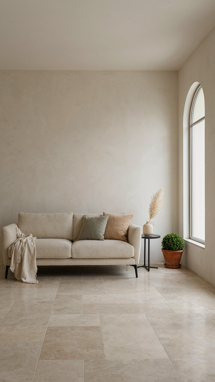
Empty Space Works Harder Than Furniture
You want your corner patio to feel bigger because a cramped yard signals you can’t afford better, and that stings. Here’s the mechanism: in spatial design, negative space functions like white space in typography. It creates visual breathing room. Most people fight this instinct and pack their corners with chairs, tables, and planters. They’re wrong. Strategic emptiness makes boundaries recede.
A corner patio with 40% empty ground performs optically larger than one stuffed to capacity. This isn’t psychology or subjective preference. The eye processes open floor as expansive. Place your seating cluster on one side, leave the opposite quadrant bare. Paint that bare section a lighter tone than your seating zone. The contrast amplifies perceived depth without adding square footage.
Constraint Creates Clarity
The common advice here is surface-level: just remove stuff you don’t use. That misses the actual principle. Clutter compounds because each object competes for visual weight in a small space. Remove one item, and the remaining items still fight for attention. You need systematic reduction based on function, not feeling.
Audit every object: does it serve sitting, eating, or entertaining? If it serves none of these, it goes. This includes decorative planters, side tables with no purpose, and outdoor rugs that define nothing. One planter in the corner outperforms five scattered around. The constraint forces your eye to rest on intentional pieces, making the space feel controlled and deliberate rather than cramped and chaotic.
Beyond The Bush: Vertical Garden Wall As A Space Multiplier
Go Vertical, Not Wide

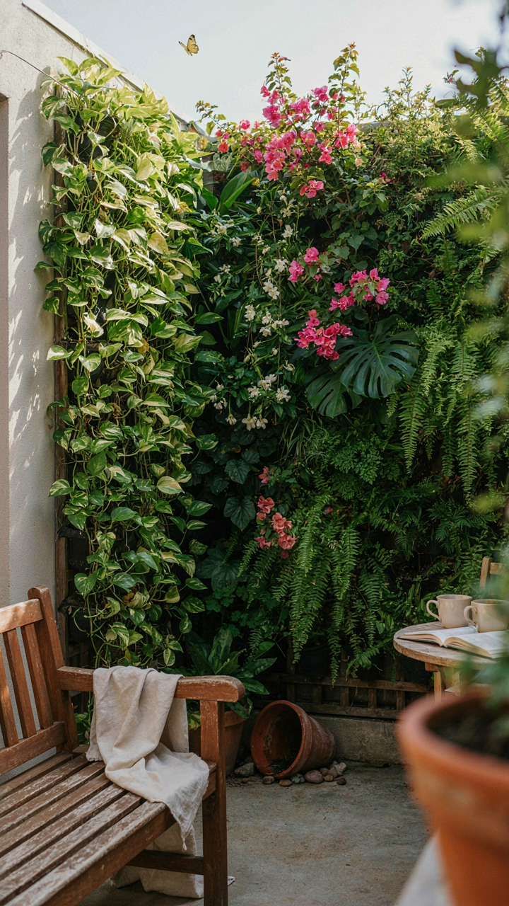
You want your corner to feel less cramped without spending money on an expansion you can’t afford. Here’s the mechanism: vertical surfaces create the illusion of depth because your eye tracks upward instead of stopping at the fence line. This is basic visual hierarchy from graphic design applied to physical space. A wall of climbing plants or tiered planters pulls attention away from the corner’s natural constraint and reframes it as intentional architecture.
Ground-level planting sprawls horizontally and eats square footage. Vertical growing systems—trellises, wall-mounted planters, living walls—compress the same botanical density into zero additional footprint. The corner stops reading as a dead zone and starts reading as a focal point with layers. This shift happens in the viewer’s spatial perception the moment they register vertical movement instead of flat ground coverage.
Choose Plants That Anchor, Not Choke
Most corner garden advice defaults to ivy or clematis because they climb fast. That’s incomplete. Vigorous vines overwhelm small spaces and create a suffocating tunnel effect that makes a corner feel smaller, not bigger. You need plants with distinct structural form that reward vertical training without aggressive sprawl.
Jasmine, honeysuckle, and climbing roses have woody stems that hold shape and create visible framework rather than dense green walls. Ornamental grasses planted at ground level add texture without blocking sightlines. For instant structure, use annual vines like scarlet runner beans on a permanent trellis—they give you control over density and pull-back seasons. The trellis itself becomes the visual anchor; plants are the secondary layer. This separation of structure from foliage is what prevents the corner from collapsing into a single undifferentiated mass.
The “Corner Patio Ideas” Illusion: Why Symmetry Shrinks
Asymmetry Disrupts The Expected Pattern

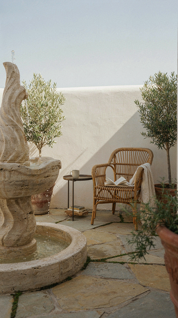
You want your corner patio to feel intentional, not like you ran out of budget or vision. Here’s what actually matters: symmetry signals completion, which signals smallness. Your brain registers a balanced, mirrored layout as finished and contained. Break that pattern and suddenly the space feels like it extends beyond what you can measure.
Asymmetrical placement works because it creates cognitive friction. A furniture grouping offset from the corner’s natural center point forces the eye to search for balance rather than accept what’s immediately visible. Place a seating area slightly left of center. Position a planter or accent table on the opposite side but not in a mirror image. This forces the viewer’s gaze to move and reprocess the space, which registers as depth and complexity where none exists spatially.
Breaking Visual Lines Of Sight
You don’t need sightlines to feel trapped, but they’re the mechanism that makes a corner feel like a dead end. Borrow from military tactical doctrine: blocked sightlines create perceived expansion. When you can see the entire corner in one unobstructed glance, your brain files it as a single, finite volume. Block that line and it becomes undefined.
Install vertical elements that interrupt the sight path but don’t fully obstruct it. A tall planter with ornamental grasses, a trellis with climbing vines, or a fence panel angled slightly inward breaks the straight line from entry to far corner. The viewer can’t see the full depth at once, so the brain assumes more space exists beyond the blockage. Positioning these elements off-center rather than centered along the corner’s angle amplifies the effect. Don’t make this symmetrical or you defeat the entire mechanism.
Outdoor Corner Ideas: The Rule Of One Primary Element
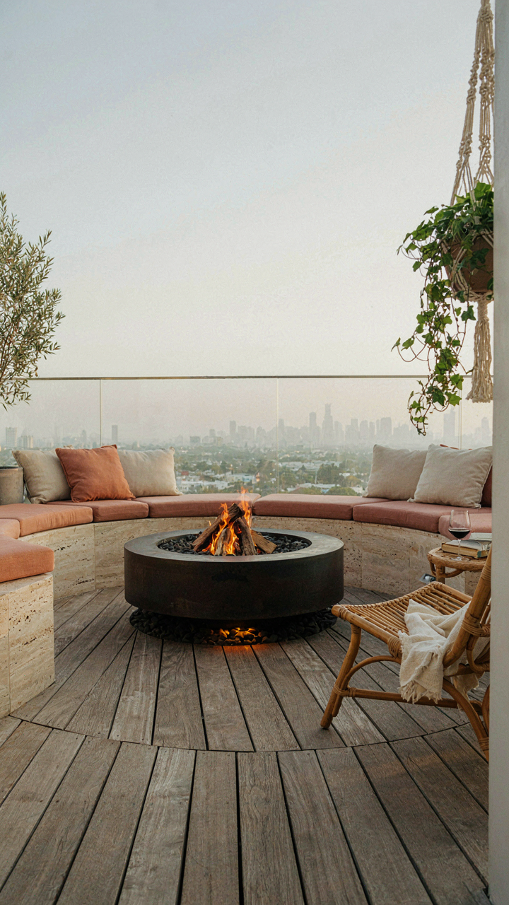
Pick One Thing That Stops The Eye

You want people to notice your corner patio feels intentional, not like you crammed in whatever was on sale. This is about visual hierarchy, a principle from graphic design where the eye needs a clear landing spot or it bounces around and the space feels chaotic. A small yard corner with seven competing elements reads as cluttered. A corner with one dominant feature reads as designed.
The mechanism is simple: your eye can only focus on one thing at a time. Pick a water feature, a seating arrangement, a plant installation, or a structure. Everything else becomes supporting cast. This isn’t minimalism for its own sake. It’s the fastest way to make limited square footage feel controlled and intentional.
Furniture Placement That Anchors The Space
Most people treat corner patio furniture like a puzzle where pieces just slot in. Wrong approach. Furniture placement is about creating a reason for someone to use that corner, not just exist in it. Position your primary seating to face into the yard, not toward a fence or wall. This instantly expands the perceived space because your sightline extends outward.
Anchor a bench or chair group three to four feet from the corner vertex, not directly in it. The corner becomes negative space that breathes, while your furniture group becomes the focal point. This distance also prevents the cramped feeling that kills small patios. Measure before you buy and commit to the placement. Moving it later is harder than getting it right once.
The “Patio Layout” Deception: Openings, Not Walls
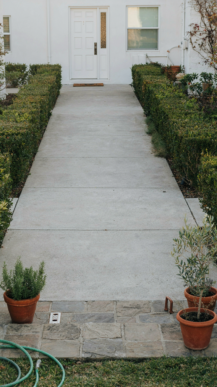
Sightlines Beat Square Footage

You want people to think your patio is bigger than it actually is. That’s the real reason you’re reading this. Here’s the mechanism: sightlines control perception of space more than the actual dimensions do. In physics, this is called the principle of sight lines and perspective. Your corner patio isn’t competing on size. It’s competing on how far the eye travels before hitting a barrier.
Most patios fail because they block the view. A corner setup means you already own two walls. Don’t wall yourself in further. Instead, position seating and structures so they frame open sight lines toward the yard’s center or garden. The moment you interrupt a view with a planter, screen, or furniture, that boundary becomes a psychological wall. Your patio shrinks instantly.
Barriers Steal Perceived Space
Heavy structures—privacy screens, solid fences, dense hedges—tell the brain the space ends sooner than it does. You’re doing the opposite of what you think you’re doing. The advice to “add screening for privacy” works against you when space is limited. Privacy and perceived openness compete directly.
Instead, use transparent or semi-transparent elements. Glass panels, mesh screens, or open lattice maintain sightlines while blocking wind or creating definition. A low boundary (36 inches or under) disappears visually when you’re seated. Keep sight lines above seating height clear. The strategic move is trading absolute privacy for perceived expansiveness. Position your seating to face open territory rather than walls.
Corner Lighting: The “Depth Perception” Protocol
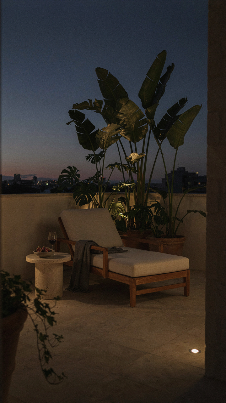
How Light Bends Space Perception

You want your corner to feel twice as large without spending money on construction. Light is the mechanism. Physics treats light like a tool that controls what your eye measures as distance. When you place light strategically, you force the eye to perceive boundaries differently, which directly changes how large a space feels. Dark corners compress space. Lit corners expand it. The difference is measurable in how people move through and use the area.
Most people light their patios evenly, which is the worst approach. Flat light kills depth. You need contrast. Light the far corner brightly while keeping the near corner moderate. This pushes the perceived boundary backward. The eye reads the lit area as farther away than it actually is. A 10-by-10 corner suddenly reads as 12-by-14 because your brain fills in distance based on illumination falloff, not actual square footage.
Uplighting Creates Perceived Height
Uplighting forces the eye upward, which tricks the brain into registering volume instead of just footprint. When light comes from ground level pointing upward at trees, fences, or walls, it creates shadow patterns and highlights that expand vertical space. A corner patio with uplighting feels less cramped because your attention travels up, away from the ceiling or sky edge. Height feels less claustrophobic than floor area alone.
Install uplights at the base of the corner where two walls or fence lines meet. Aim them at vegetation, structural elements, or the wall face itself. This creates a gradient of light that your eye interprets as depth extending beyond the physical corner. The uplighting protocol works best at dusk and evening when contrast is highest. Start with two uplights positioned 4 to 6 feet apart at ground level, angled between 30 and 45 degrees upward.
Small Patio Spaces: The “Deck Flooring” Continuum
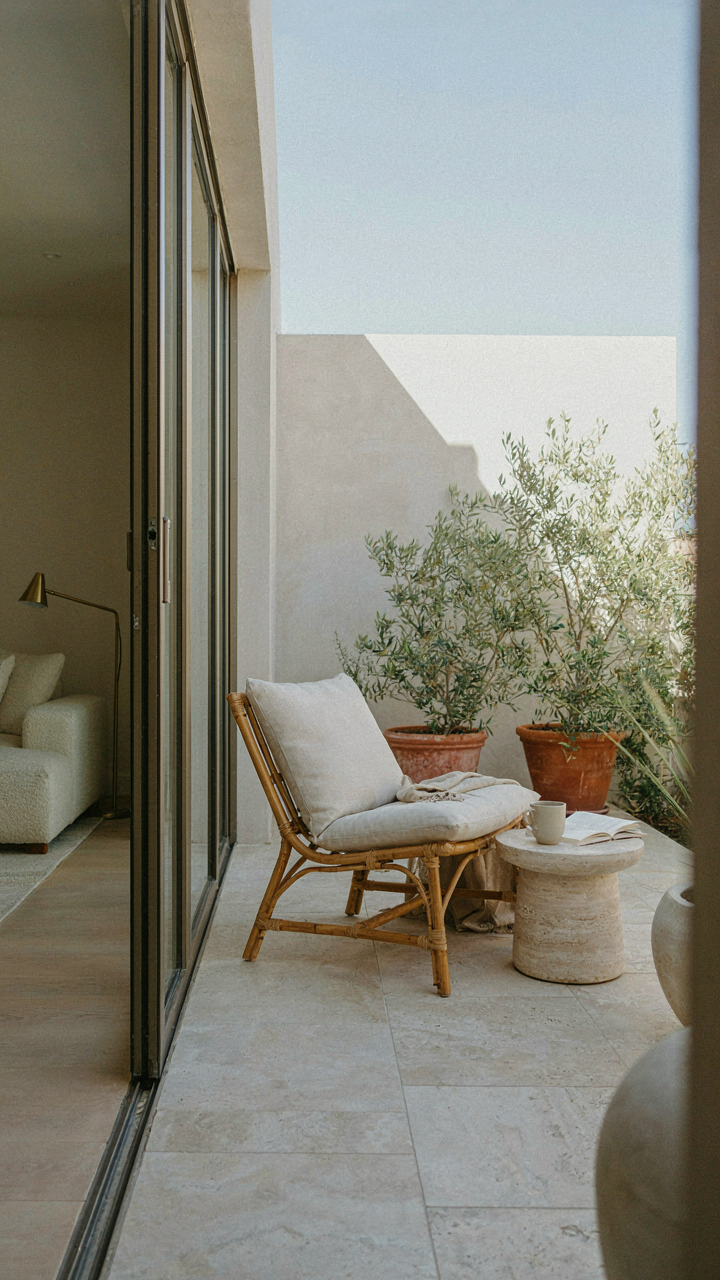
When Your Indoor Floor Meets Outdoor Space

You want people to walk from your living room onto the patio without noticing the transition, because that invisibility signals you have a larger property than you actually do. The mechanism here is borrowed from architecture’s principle of visual continuity: eliminate the threshold, and your eye travels further before stopping. Most people treat indoor and outdoor as separate zones. Wrong. They’re one visual plane that either breaks or extends.
The material you choose indoors matters as much as what you pour outside. If your living room ends in tile and your patio begins in pavers, you’ve created a visual stop sign. The eye hits the material change and registers: here is where inside ends. Matching material families, even if exact matches aren’t available, keeps the perception moving. Concrete, large-format tile, or similar neutral bases work because they don’t demand attention and they read as a continuous surface from inside looking out.
Flooring That Moves You Through Space
Flow is a physics concept: energy moves through the path of least resistance. Apply it to patio flooring by removing visual breaks that force the eye to pause. When your deck or patio floor aligns with interior flooring height or sits only slightly lower, spatial continuity happens naturally. Standard interior tile or polished concrete that extends to an exterior patio creates the illusion that your space is one cohesive footprint.
Uninterrupted flooring makes a corner patio feel like an extension rather than an addition. The practical step: measure your interior floor height, then design your patio to sit within two inches of that level. This prevents the visual “drop” that makes small spaces feel fragmented. If you can’t match exactly, use a beveled edge that softens the transition rather than creating a sharp line. The goal is making someone’s body move through the space without their brain registering a boundary.
The “Patio Corner Ideas” Leverage: The OODA Loop For Furniture

Observe, Orient, Decide, Act On Placement

You want permission to stop overthinking and actually move things around. The real mechanism here comes from military strategy: the OODA Loop, which Boyd’s fighter pilots used to outmaneuver enemies. Apply it directly to corner patio setup. Observe means you measure sight lines and sun patterns for three days before buying anything. Orient means you map where people naturally walk and where they stop. Decide means you pick one anchor piece. Act means you place it and live with it for a week.
Most people reverse this. They buy furniture first, then shuffle it like a puzzle. That wastes money and time. The corner becomes a dumping ground for whatever fits, not a strategic zone. You need data before commitment. Spend one afternoon tracking how light moves across your corner. Note where wind hits. Mark the high-traffic path. Only then does furniture placement become obvious instead of guesswork.
Adaptable Furniture Makes The Loop Work
Lightweight, modular pieces close the feedback loop faster than heavy, fixed furniture. A corner patio setup demands the ability to test and adjust without calling movers. Benches with removable cushions, nesting tables, and stackable chairs let you shift configurations in minutes. This isn’t about trendy minimalism. It’s about speed of experimentation. You observe, orient, decide, act, then observe again based on how people actually use the space.
The mechanism is friction reduction. Low friction between idea and reality means you’ll iterate more. You’ll catch problems in week two instead of year two when you’re committed to a $3,000 sectional that doesn’t work. Modular pieces cost less upfront and force you to think about the actual problem: How do people move through this corner? What stays fixed? What shifts with the season? Answer these with furniture that moves, not furniture that pins you down.
The “Perceptual Engineering” Framework For Corners
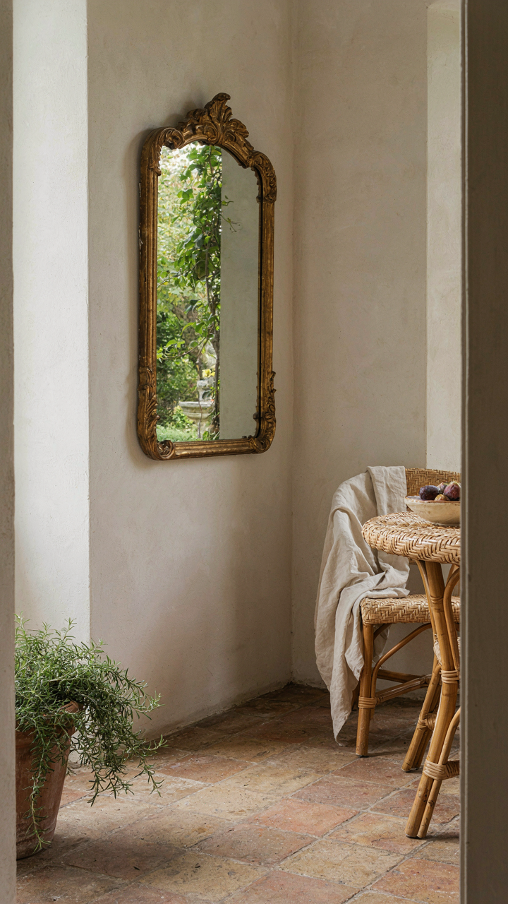
Mirror Placement For Expanded Vistas

You want your corner patio to feel deeper than it actually is because a cramped corner signals you couldn’t afford better. Here’s the mechanism: mirrors function as spatial multipliers in landscape design, the same way architects use reflection to double perceived depth in narrow spaces. A strategically placed mirror doesn’t just show plants or sky—it creates a false adjacency to space that doesn’t exist, forcing your brain to calculate the corner as larger than its actual square footage.
Positioning matters more than size. A mirror angled at 45 degrees toward the corner’s back wall, not facing inward toward seating, reflects the deeper yard beyond the patio edge rather than reflecting the patio itself back at you. This prevents the feedback loop effect where mirrors amplify the sense of confinement. Mount it on a fence post or lean it against structure at eye level when seated, roughly 6 to 8 feet from where people actually sit.
- Angle Toward Depth, Not Inward: Position mirrors to capture sightlines beyond the corner, not the patio zone itself. This extends perceived distance rather than bouncing the limited space back at the viewer.
- Weather Resistant Acrylic Over Glass: Use acrylic mirrors rated for outdoor use. They survive temperature swings and UV exposure better than glass, and they won’t shatter if a branch or furniture shifts into them.
- Mount Above Sight Lines When Possible: Install mirrors higher than typical standing eye level to capture canopy, sky, or distant landscape. Low mirrors mostly reflect ground clutter and nearby structures.
- Use Matte Finish Acrylic To Reduce Glare: High-gloss mirrors create harsh reflections that make the corner feel artificial and smaller. Matte finishes diffuse light and read as less jarring to the eye.
- Place Second Mirror On Adjacent Wall: A second mirror on the perpendicular fence wall, also angled outward, compounds the depth effect without creating an obvious hall-of-mirrors appearance.
Most people put mirrors facing into the corner thinking they’ll “open it up.” That closes it. The reflection becomes another surface trapping you inside the same limited boundary. Mirrors work when they extract sightlines from beyond the patio and pull them into your field of view while seated or standing in the corner zone.
Transparent Materials For Visual Continuity
You don’t need solid barriers between your corner and the rest of the yard. The common advice to use plants and screening actually shrinks perceived space because it fragments the view into zones. Physics calls this visual continuity—the uninterrupted sightline across a surface or material. Apply this principle here: transparent or semi-transparent materials allow the eye to travel past the corner boundary without mental stops, collapsing the perception of separation between patio and surrounding yard.
Glass panels, clear acrylic screens, and open fence designs (horizontal slats with gaps rather than solid boards) preserve sightlines while defining the corner space functionally. A 4-by-8-foot clear acrylic panel leaned against the back corner or affixed to existing fencing lets the yard extend visually into the patio edge rather than cutting it off. The boundary exists—you still have containment—but your brain doesn’t register the corner as a dead end. Use this tactic when the view beyond the corner is worth preserving, like facing toward landscaping, water features, or open lawn.
The positioning rule: transparent barriers work best when they divide space vertically (fence height or lower), not horizontally across sightlines. Horizontal barriers like dense hedges or solid shade cloth cut the view and trigger the cramped response. Place transparent panels at the corner’s deepest point, angled slightly to reflect or frame the best external view, then leave the patio side open. This trades barrier function for visual expansion, which trades small for perceivable.
The Real Obstacle Isn’t Your Patio’s Size, But Your Conventional Thinking About Space
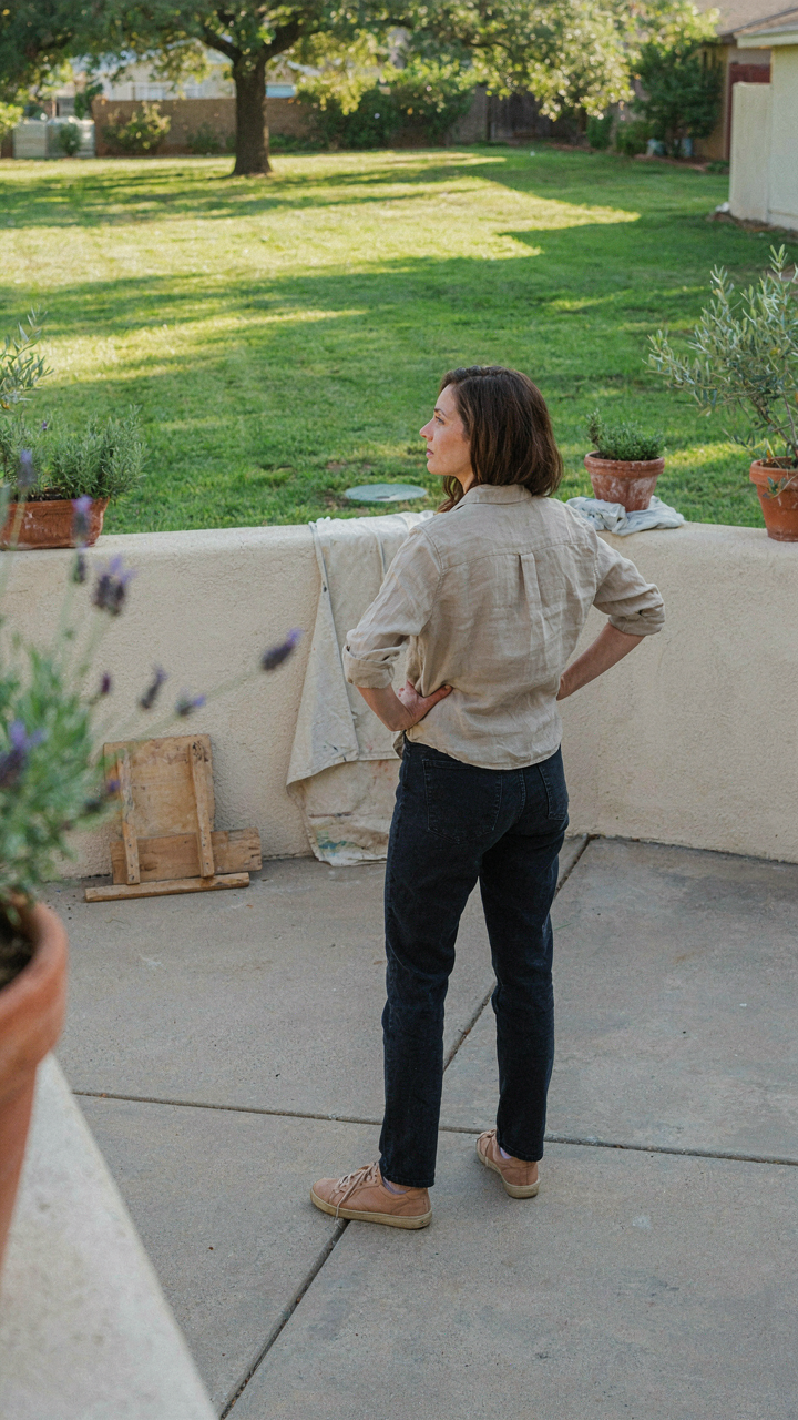
Most people design their corner patio like they’re filling a box. They buy furniture first, arrange it predictably, then wonder why it feels cramped. Stop. Walk your corner today and identify the single sightline you want to dominate, not the entire space. Build your corner patio setup around that one anchor point instead of trying to make every inch productive. Your yard didn’t get smaller. Your attention just got sharper.