The Illusion Of Home Away From Home: Why Your Campsite Looks Like A Hoarder’s Den
What You’re Actually Afraid Of Losing
You think a cluttered campsite bothers you for aesthetic reasons. It doesn’t. You’re afraid that a sparse setup signals you don’t belong in nature, that you’re not prepared, that you’re the person who gets left behind. The mechanism is simple: you’re confusing stuff with readiness. Every lantern, pillow, and decorative element you add is a vote of no confidence in the environment itself. You’re filling the void that nature creates, and that void terrifies you more than any storm.
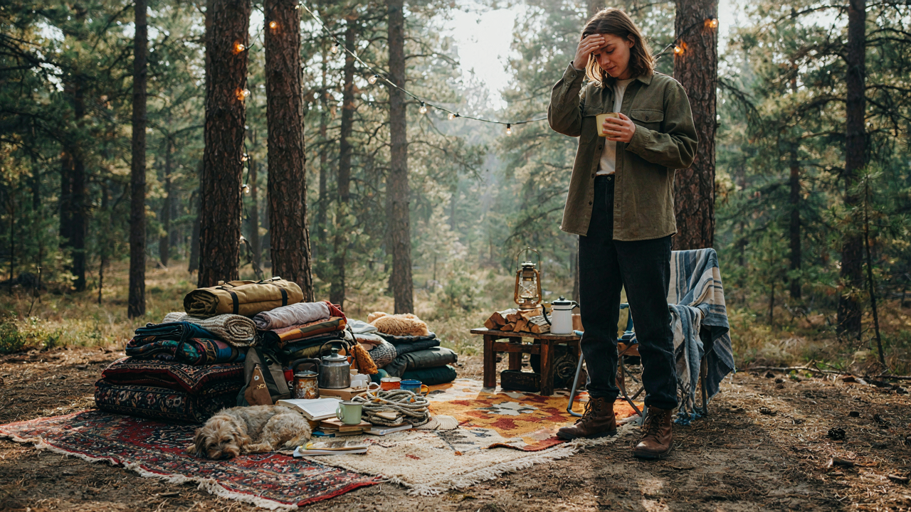
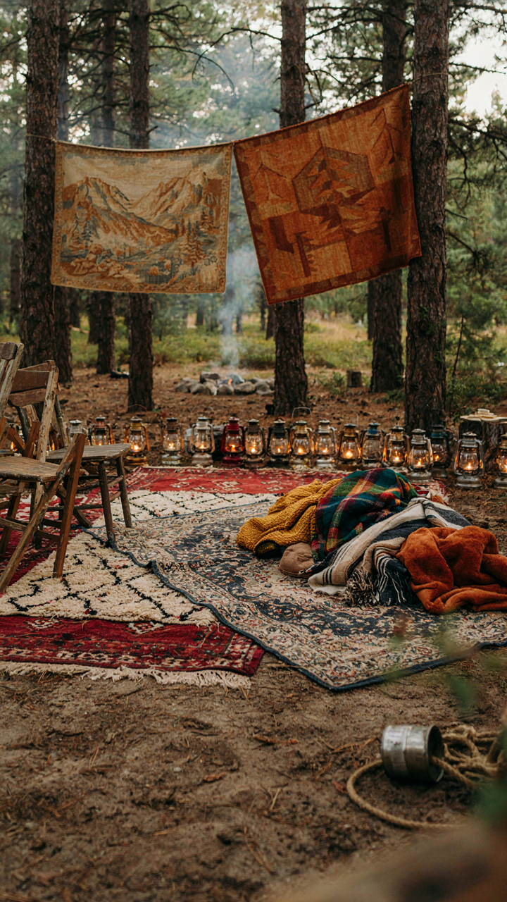
Clutter at a campsite works like cognitive load in attention economics. The more objects in your visual field, the more your brain taxes itself to process the scene. A string of lights, three different rugs, stacked camp chairs, hanging tapestries, and a collection of “cozy” throw blankets don’t make the space feel welcoming. They make it feel contested. Your eye never settles because there’s nowhere to settle. The human nervous system evolved in open environments, not crowded ones. Your campsite becomes a visual argument instead of a refuge.
The Volume Problem In An Infinite Space
The common advice says “bring what makes you happy.” That’s incomplete. What actually happens is you bring what makes you feel in control, and then you arrange it all because empty space feels like failure. In a bounded environment like a home, clutter reads as lived-in. In an open campsite surrounded by thousands of acres, the same items read as desperate. Scale matters. A throw blanket in your bedroom is texture. The same blanket draped over a camp chair in the woods is a flag of cognitive dissonance.
Nature operates on subtraction, not addition. A forest doesn’t decorate itself. It establishes dominance through space and silence. When you layer human decor onto that, you’re not enhancing the environment. You’re competing with it and losing. The mechanism here is visual weight: each item you add doesn’t add charm proportionally. The fourth lantern adds almost nothing. It just increases the total mass of human artifact in the space. Strip down to function first. Your campsite should look like you arrived with intention, not like you’re running from something.
Beyond “Cute”: Practical Aesthetics For Seasonal Campsite Setup Ideas

Decor That Earns Its Space

You want your campsite to look intentional, not like you grabbed whatever was on sale. That’s the real fear underneath. The mechanism is simple: every object at your site either solves a problem or creates visual noise. Borrowed from industrial design, we call this constraint-based aesthetics. Your camping lantern isn’t decor because it’s pretty. It’s decor because it lights your space and happens to have form. The same logic applies to everything else. A throw blanket draped over your camp chair serves temperature regulation and visual weight. A decorative stone arrangement serves nothing and collects dirt.
The distinction matters because messy campsites aren’t caused by too much stuff. They’re caused by stuff that doesn’t justify its existence. Start by auditing what’s already there. Identify each object’s primary function. If it has none, remove it. This filters out the impulse buys and the Instagram props before you even think about seasonal transitions. Your baseline becomes lean and functional. Everything visible has work to do.
What The Season Actually Controls
Seasonal changes don’t require you to swap out your entire aesthetic. They require you to swap out what fails under different conditions. Winter camping demands different material performance than summer camping. A thin canvas tarp works fine in July. In November, it collects moisture and sags under its own weight. Your decor choices should follow material behavior, not a calendar date. A wool blanket stays functional year-round. A cotton one gets clammy in high humidity and useless when wet.
The practical trigger for seasonal swaps is environmental stress, not the equinox. Document what degraded last season. Canvas fades and tears faster than wool. Rope frays when exposed to UV. Metal rusts without proper treatment. These aren’t aesthetic problems. They’re performance problems that show up visually. Plan your decor swaps around what actually breaks, not what looks different. Keep your summer setup stored dry. Inspect it before deploying again. Replace what failed. Keep what held.
The “Welcome Campers” Paradox: When Hospitality Becomes Hindrance
Every Item Must Earn Its Space

You want people to think you’re the kind of person who has it together at a campsite. That’s the real driver here. But the mechanism is simple: every decoration you add increases visual noise and creates maintenance burden. You’re not running a resort. You’re managing a temporary structure in the elements.
The common advice says decorate to make guests feel welcome. That’s incomplete. What actually works is subtractive design. Ask one question per item: does this serve function or pure aesthetics? Lanterns with actual light serve function. Decorative bunting serves only aesthetics. Most people pile both. You need to eliminate the pure aesthetics layer entirely. A clean setup with functional lighting beats a cluttered setup with themed decorations every single time.
Consolidate Welcome Functions Into One Station
Hospitality in camping operates under the constraint of limited resources, borrowing a term from operations management: bottlenecking. Every welcome element should feed through one physical location. Instead of scattered signs, bins, seating areas, and decorative touches, build one entrance station that handles check-in, supplies, and orientation.
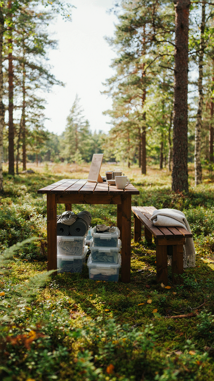
Position a small table or weatherproof stand at the campsite entrance. Mount a single informational sign here. Store guest supplies in containers below it. Add one bench or sitting area adjacent to it. This consolidation eliminates the visual scatter that makes campsites look chaotic. The human eye processes grouped objects as intentional; dispersed objects read as disorganized. One station achieves hospitality without multiplying clutter.
The Biomimicry Principle: Designing Your Tent Camping Aesthetic
How Nature Organizes Space More Efficiently Than You Do

You want your campsite to look intentional rather than like you threw gear at the ground and hoped it stuck. The mechanism is simple: nature solves organization problems through constraint and repetition, not decoration. Biomimicry borrows directly from biology, and the principle that matters here is clustering. Organisms don’t scatter identical functions across space randomly. Trees don’t spread roots evenly in all directions. They cluster them where water flows. Your campsite should mirror this. Group gear by function and frequency of use, not by what looks balanced to the eye.
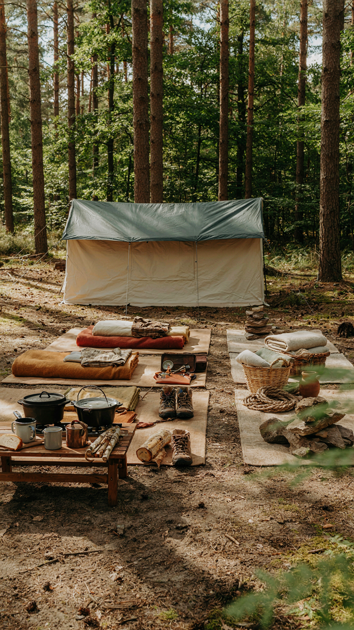
Most campers treat their site like a living room, spacing items for visual symmetry. That’s backward. Efficiency creates visual coherence automatically. When you cluster your cooking zone, your sleeping zone, and your storage zone into three distinct areas instead of scattering cookware, sleeping bags, and supplies across the campsite, the site reads as organized instantly. This isn’t about aesthetics winning over practicality. It’s about recognizing that practicality and visual clarity are the same outcome.
Patterns That Reduce Clutter Without Removing Anything
The real problem with messy campsites isn’t too much gear. It’s gear arranged without repetition or rhythm. When items sit at random angles and distances, your brain treats each one as novel visual noise. Repeating patterns reduce cognitive load. Place tarps, guy lines, and poles on the same horizontal or vertical axes. Stack containers in aligned rows. Orient similar items the same direction. You’re not decorating. You’re creating visual predictability through deliberate arrangement.
This works because your eye stops scanning once it detects a pattern. A tarp thrown haphazardly takes up visual space equivalent to three tarps arranged in a grid. Deploy this protocol: arrange all rectangular items parallel to your tent’s main axis, group all rope and cordage in one designated area, and store all bags vertically in a line rather than scattered. The campsite becomes readable instantly. Messy campsites violate pattern consistency, not item count.
The Minimalist’s Manifesto For Camp Site Decor Ideas
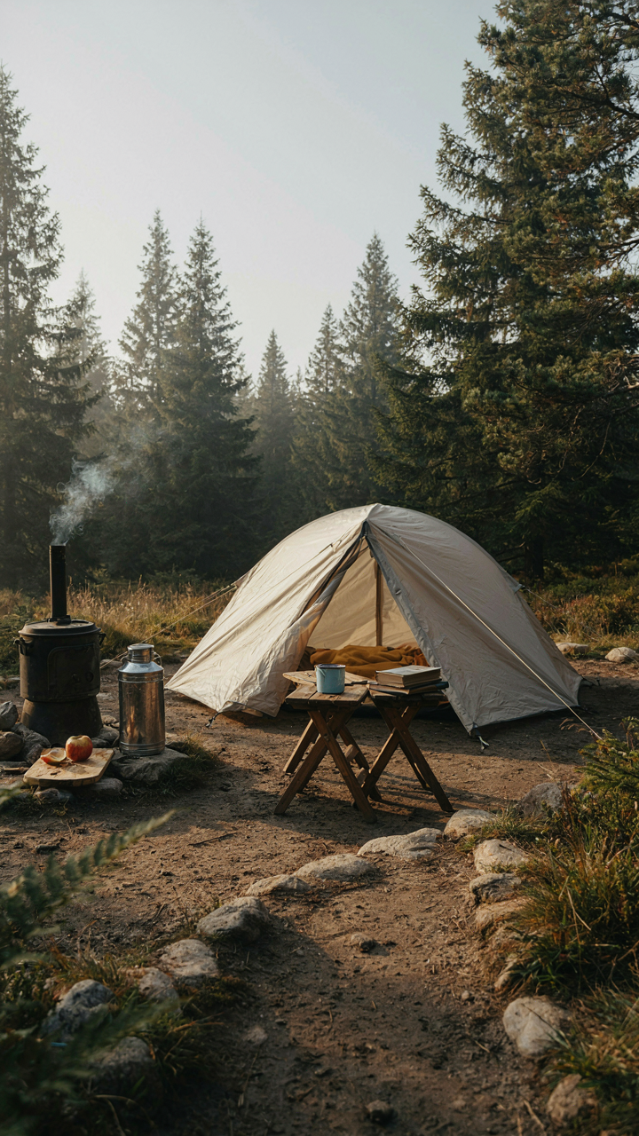
Separate Gear From Decoration
You want your campsite to look intentional because chaos signals incompetence to anyone watching. Here’s the mechanism: your brain treats visual clutter as cognitive load, and cognitive load triggers stress. Most people solve this wrong by buying matching gear sets or “decorative” camping accessories. That’s just adding more objects to the problem. Essential gear is anything that serves survival or comfort: tent, stove, water container, seating. Decoration is everything else. The line is sharper than you think.
Stop treating your tent arrangement like an Instagram setup. Gear should cluster by function, not aesthetics. Cook zone separate from sleep zone separate from social zone. When each item has a specific location tied to its purpose, not its color or style, the site stops looking scattered. Your eye stops hunting for visual balance because the spatial logic is obvious. This is why military camps look clean even when packed tight. Function creates order without requiring decoration to hide dysfunction.
Blank Space Works Harder Than Stuff
Graphic designers call this negative space, borrowed from the principle that what you exclude matters as much as what you include. At a campsite, negative space is the gaps between objects, the ground without a tarp, the sight line without obstruction. Every unused square foot of your site is doing the work of organization for you. Most people fill these gaps out of anxiety, thinking emptiness looks incomplete. It doesn’t. It looks controlled.
The tighter you camp, the more critical spacing becomes. Leave walking paths clear. Keep the perimeter of your tent zone open. Position seating to face outward, not inward at a central pile of gear. A single cooler placed deliberately reads cleaner than two coolers and four bags clustered together. Space is free material that costs nothing but restraint. Use it as your primary design tool, not as a gap to fill.
DIY Camp Themed Decorations: Crafting Clutter Or Creating Character?

The Utility Test Before You Build

You want people to think you’re resourceful, not that you showed up with arts and crafts supplies. Here’s the mechanism: DIY decorations only work when they solve a problem first and look intentional second. A hand-carved wooden sign directing people to your site serves navigation. A macramé wall hanging serves nothing but your ego. The difference is function. Without it, decoration becomes visual noise that signals poor judgment about what matters at a campsite.
Most DIY advice tells you to make things. That’s wrong. Start by asking what your setup actually needs. A rope organizer for firewood? Build it. A decorative dreamcatcher? Leave it home. The camp aesthetic people respect isn’t about craft projects. It’s about things that earn their place by working. Test every DIY item against one question: does this solve a real problem at camp, or does it just take up space?
Decoration That Doesn’t Tax Your Setup
The real cost of camp decor isn’t in materials. It’s in weight, time, and mental load. Build something that requires assembly or adds five pounds to your pack, and you’ve already made a mistake. The economics of campsite design work like supply chain logistics: every item costs you in transport, setup time, and storage space. Most people ignore this calculation and end up resenting their own projects.
Skip decorations that demand extra stakes, ropes, or hanging hardware. Skip anything that takes more than thirty seconds to deploy. A weathered canvas tarp strung between trees looks intentional and serves wind protection. A homemade bunting banner requires fifteen minutes of rigging for zero function. The rule is simple: if setup time exceeds five minutes or weight exceeds two pounds, the decoration doesn’t belong. Only build what travels light and deploys fast.
The “Camp Signs” Fallacy: Are You Communicating Or Contradicting?
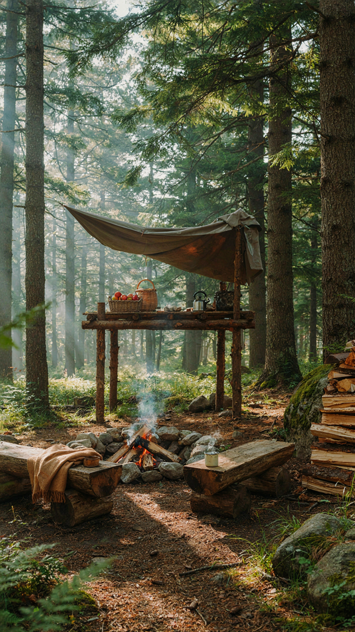
What Your Signs Actually Say About You

You want people to think your campsite is intentional and organized. The truth is simpler: most camp signs communicate the opposite. You’re installing them because you don’t trust that your layout speaks for itself. A hand-painted “Welcome to Camp Whatever” sign doesn’t add personality. It signals you need external decoration to fill the gaps your actual setup left empty.
Here’s the mechanism: signs work as redundant communication. If your fire pit zone is obvious because the seating faces it, you don’t need a sign marking it. If your food storage is elevated and separated, you don’t need a label. Every sign you add is an admission that your physical design failed to communicate function on its own. The best campsites rarely have directional or welcome signage because the space itself is the instruction manual.
Replace Signage With Spatial Design
Forget the advice that says more signs equal more charm. That’s backwards. You need to design your campsite so people understand the zones without reading anything. Use material contrast instead: place cooking equipment on a darker tarp than your seating area. Position your tent on slightly elevated ground separate from the gathering zone. These visual differences work like traffic patterns. Economics calls this “revealed preference”—people understand purpose through structure, not labels.
The swap is direct: remove one sign and add one physical boundary. Mark pathways with stepping stones or a slight raked line in the dirt. Define the food prep area with a dedicated table at a different height than surrounding furniture. Stack firewood vertically in a specific corner so the pile itself becomes the marker. When you finish, no visitor should need to ask where anything is. Your layout does the work your signs were supposed to do.
Campsite Decorating: The Utility First Protocol

What Actually Needs To Be There

You want your campsite to look intentional instead of like you grabbed whatever was in the garage. That’s the real anxiety here. The mechanism is simple: objects without function create visual clutter because your brain registers them as decision debris. Everything at a campsite earns its space by solving a problem first, then looking decent as a side effect.
Functional items aren’t decoration pretending to be useful. They’re the inverse. A well-organized camp kitchen isn’t decorated—it’s arranged so you can find a spatula at dusk without fumbling through four bags. A weatherproof gear storage system doesn’t need aesthetic treatment because its design already communicates order. The mistake most people make is buying decorative items and hoping they’ll somehow organize the space. They won’t.
- Rope and carabiners: Secure food from bears, organize tarps, hang wet gear. Quality rope degrades in UV light over years, so rotate annually. Visible rope work signals a camp that functions.
- Lantern stands or hooks: Mount lighting at eye level to eliminate shadows and create usable space after dark. A lantern sitting on the ground wastes its beam and looks abandoned.
- Storage bins or crates: Contain your items so nothing sits loose on dirt. Clear or labeled containers let you navigate without unpacking everything. Stacking creates visual hierarchy automatically.
- Fire ring surround or grate: Contains coals, protects ground, defines the gathering zone. A proper fire structure prevents ash spread and makes cleanup systematic instead of scattered.
- Weatherproof groundsheet or tarp under sleeping area: Protects tent floor, prevents moisture wicking, defines personal space boundaries. The structure alone communicates order before aesthetics enter.
When utility is the starting point, aesthetics follow without extra effort. A clean gear layout looks composed because it functions. Organized rope management looks intentional because it serves a purpose. The visual cleanliness comes from constraints, not decoration.
How Organization Becomes Visual Cohesion
Utility doesn’t conflict with aesthetics, it creates them. Think in terms of visual hierarchy from architecture and design. In buildings, load-bearing walls organize space before decoration fills it. At a campsite, functional zones do the same work. Your sleeping area, cooking zone, and fire pit already divide the space visually before you add anything else.
When you anchor items to their purpose, they stop looking random. A cooking station with a prep table, utensil holder, and fuel storage in one zone reads as intentional. A gear corral with bins stacked by category reads as controlled. The space communicates competence because nothing exists without reason. A messy campsite has decor scattered everywhere trying to hide dysfunction. A clean one has function organized so tightly that it looks refined. Organize your utility items by zone first, then align them on sight lines. This single protocol eliminates most visual chaos before it starts.

The Leave No Trace Aesthetic: Integrating With Nature, Not Imposing On It
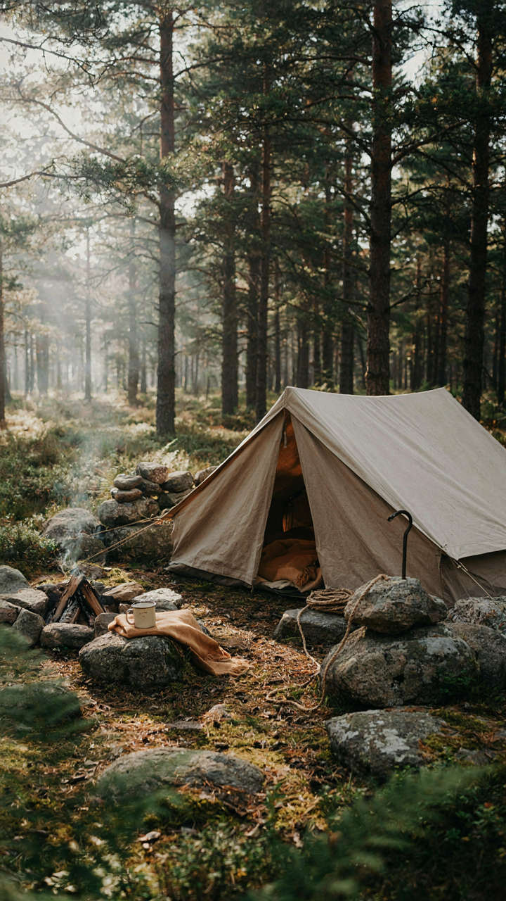
Your Decor Choices Shape What Survives
You want permission to decorate without guilt. That’s the real ask here. But decor choices aren’t neutral—they’re ecological decisions that either accelerate or prevent site degradation. The mechanism is simple: contrast attracts damage. Bright synthetic materials, rigid structures, and color anomalies draw foot traffic, weather stress, and animal interaction. Vegetation dies under repeated pressure. Soil compacts. The site recovers slower or not at all. Sites that look “decorated” get treated like destinations. Sites that look integrated get treated like passing-through zones. Muted tones and organic forms distribute impact instead of concentrating it.
Every item you place either blends into the existing environment or creates a visual exception that rewires how people move through space. Ecology calls this “edge effect”—when two different environments meet, you get concentrated activity at the boundary. A bright blue tarp at a campsite creates an edge. Visitors gravitate toward it. They walk the same paths. Grass dies in predictable lines. The untreated site disperses use across a wider area naturally. This isn’t philosophy. It’s hydrology and soil science applied to human behavior. The campsite that looks least decorated actually requires the most strategic placement.
Natural Materials That Don’t Announce Themselves
Synthetic fabrics fail here because they demand maintenance and announce their foreignness. Canvas, untreated wood, natural fiber rope, and undyed burlap disappear into any landscape within days—not because they’re magic, but because they share the same visual weight as their surroundings. Cotton duck canvas has been used for field camps since the 1800s for this exact reason: it absorbs light instead of reflecting it. Stone, gravel, and dead wood serve the same function. They don’t trigger the pattern-recognition system that makes people notice things.
The real mechanism: materials that match the local color palette don’t require your eye to process them as objects. Gray canvas doesn’t fight the charcoal of old fire rings. Natural rope blends with branches. Undyed canvas absorbs into soil tone. When decor stops being visually parsed as “decor,” it stops controlling foot traffic and becomes environment. Source materials from the region you’re camping in—stones from the area, wood that’s already down, fibers that echo what’s already present. Stop trying to create visual interest. Reduce visual load instead.
Beyond Instagram: Cultivating An Authentic Campsite Experience
Decor That Works Versus Decor That Performs
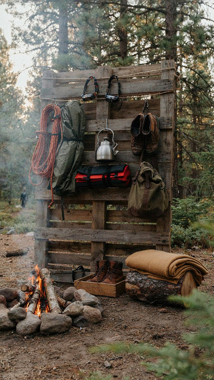
You want people to think your campsite is thoughtfully put together, not thrown together. That’s the real reason you’re reading this. The mechanism is simple: performative decor prioritizes visibility over function, while practical decor solves actual problems first and happens to look intentional as a side effect. Lanterns that don’t emit enough light to cook by are performative. A well-organized gear wall that doubles as windbreak is practical. One creates visual noise. The other creates capability.
The mistake most people make is treating campsite setup like interior design, where aesthetics lead and utility follows. Reverse this. Start with what you need: shade management, food storage access, seating proximity to fire, water source distance. Then add finishing elements that reinforce these systems rather than compete with them. A decorative tablecloth that slides off when you set down a hot pan is worse than no tablecloth. Rope arranged to guide foot traffic while securing guy lines is decor that earns its place.
Comfort Shapes Memory, Not Camera Angles
This section asks you to measure success by experience rather than documentation. Economics calls this opportunity cost: every dollar spent on a decorative element that doesn’t improve your actual time at camp is a dollar not spent on something that does. You don’t remember campsites from photos. You remember them from whether your back hurt, whether you slept well, whether you stayed warm, whether you felt organized enough to relax.
Most campsite decor advice comes from people optimizing for social media feeds, not for the person sitting around the fire at 11 PM. They recommend string lights without asking if you need task lighting. They suggest color-coordinated storage without addressing whether those containers actually fit your gear. Practical decor solves the small frustrations first: easy-access boot storage so you’re not digging through bags, a designated spot for headlamps so nobody’s searching in the dark, cooking surfaces at the right height to reduce strain. Build these systems. Then everything else follows naturally.
Your Cluttered Campsite Reveals A Fear Of Genuine Wilderness Immersion
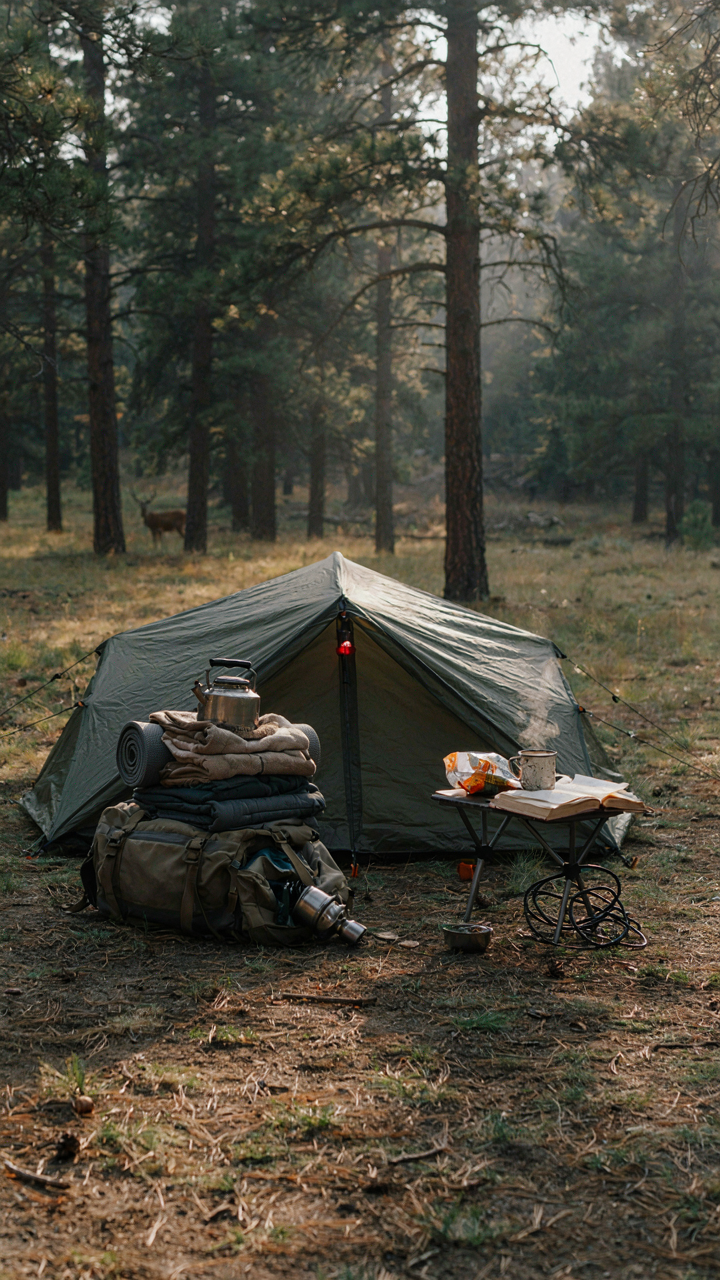
Most people pack their campsite like they’re afraid of silence. Every surface cluttered. Every moment filled. But genuine wilderness demands subtraction, not addition. The discomfort you feel around a minimal campsite isn’t about aesthetics. It’s about confronting yourself without distraction. Strip your setup today. Remove one non-essential item. Notice what surfaces when the noise stops. Your campsite should make you feel more present, not less. Clutter is just anxiety wearing a disguise.