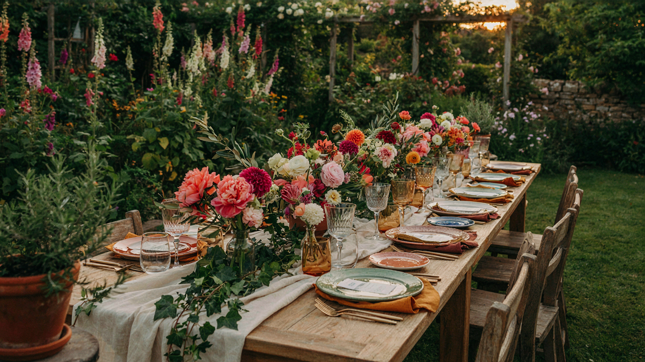
Beyond Beige: Why “Safe” Palettes Are Killing Your Garden Party Vibe
The Timeless Trap
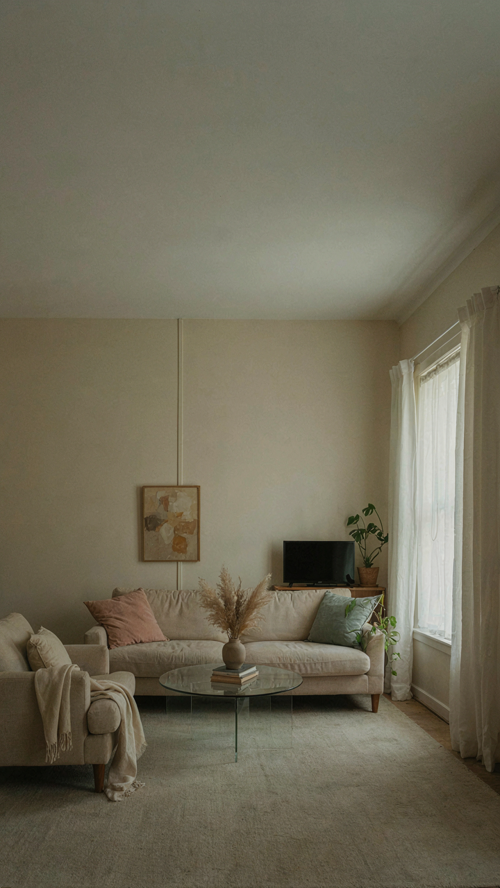
You want to look like you have taste without risking that you don’t. The real mechanism at work here: consensus color schemes exist because they’ve already failed to offend anyone, which means they’ve failed to register at all. The word “timeless” is marketing speak for “forgettable enough to survive a decade.” Soft grays, cream, and muted sage have dominated garden party design for years precisely because they demand nothing from the viewer and commit to nothing themselves.
Timelessness is the opposite of memorability. A palette becomes iconic because it made a choice at a specific moment in design history. The Bauhaus used primary colors deliberately. Art Deco used jewel tones and metallics deliberately. Mid-century modern used warm woods with pops of saturated color deliberately. None of these movements succeeded by playing it safe. Your garden party operates under the same principle: people remember the events that took a visual position, not the ones that whispered in beige.
When Boredom Becomes Social Friction
Psychology research shows that environmental monotony triggers mental disengagement. Apply that to garden parties: dull color creates dull energy, and dull energy makes guests feel obligated to leave early. The mechanism isn’t subtle. Your nervous system registers visual novelty as social permission to be present. Strip that away and you get the thermodynamic equivalent of a color palette: zero stimulus means zero activation.
Guests don’t think “this color is boring.” Instead they think “I’m bored,” and they blame themselves or the company. The actual culprit is spatial monotony. A cohesive garden party palette doesn’t mean one tone repeated endlessly. It means visual contrast that feels intentional, not chaotic. Pick three to four colors with actual separation between them, deploy them with strategy, and watch people naturally stay longer and move more freely through the space.
The “Emotional Resonance” Protocol: Designing For Feeling, Not Just Looking

Color Psychology Creates Measurable Behavioral Shifts
You want your guests to feel relaxed and impressed simultaneously, and you think the right colors just happen. They don’t. Color psychology operates like neurology: specific wavelengths trigger predictable neurochemical responses in the brain before conscious thought enters the picture. Soft greens and blues activate the parasympathetic nervous system, lowering cortisol. Warm yellows and corals spike dopamine. This isn’t opinion. The mechanism works whether you acknowledge it or name it deliberately.
A garden party color palette built on intention uses this knowledge as scaffolding. Choose muted sage and soft cream if you want guests to linger and talk longer. Select coral, peach, and warm gold if your goal is energy and movement. The difference between these outcomes lives in the wavelength you’ve selected, not in luck. Measure success by how long people stay, what they discuss, and whether they return to specific zones.
Colors That Change The Conversation Itself
The generic advice says colors should “complement each other.” False. Colors should create friction and resolution simultaneously. Think of it like tension in storytelling: the eye needs something to resolve, not perfect harmony that bores the viewer into passive observation. A garden party palette that includes one unexpected color, properly placed, becomes the thing people actually notice and discuss.
Blush pink paired with deep forest green creates cognitive dissonance that makes people stop and look. That pause is where conversation originates. Introduce a single jewel tone, like dusty plum or teal, into your neutral-dominant palette. Place it as accent elements: table linens, floral arrangements, or a statement wall. The color becomes a focal point that naturally draws clusters of guests and generates questions. This is how color architecture functions as social infrastructure.
The “Unexpected Bloom” Strategy: Curating Contrasting Focal Points
When Visual Tension Becomes The Design
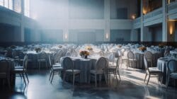
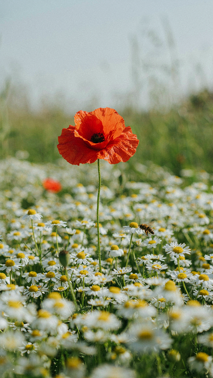
You want permission to break the rules without looking amateurish. Here’s the mechanism: contrast works because your eye needs somewhere to land. Monotony kills attention. In design physics, this is signal versus noise. A garden party palette needs signal, and signal requires deliberate dissonance. One saturated jewel tone against soft pastels creates hierarchy. Without it, everything competes equally and nothing registers. The brain dismisses uniform softness as background.
Most garden party advice preaches “cohesion” and “harmony.” That’s incomplete. Cohesion without tension reads as flat. You need 80 percent restraint and 20 percent disruption. Pick your dominant palette first, then identify where a contrasting focal point lands. This might be a single deep burgundy table among blush linens, or charcoal chairs against cream and sage. The contrast works because it interrupts expectation without breaking the palette’s logic.
One Statement Beats Safe Repetition
Bold color choices fail when scattered. Safe choices fail because nobody remembers them. The difference is concentration. Deploy your contrast in one location, one statement piece, one visual anchor. A bright coral accent wall at the garden entrance works. Coral napkins, coral centerpieces, and coral lights do not. Repetition dilutes impact and reads as indecision.
Identify your focal point before selecting any colors. This might be the cocktail area, the food table, or the seating arrangement. Then commit the contrast there completely. Everything else retreats into supporting role. Deep forest green works as a single statement; scattered green accents work only if coordinated as a secondary palette. The mechanism is simple: concentration creates authority. Dispersion creates confusion. Place your bold choice where it controls the eye first.
The Permaculture Palette: Understanding Color As Ecosystem
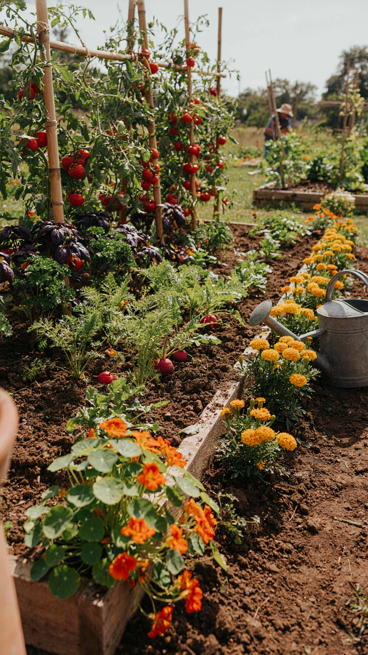
Color Flow Without Fighting Nature

You want your garden party to look intentional, not accidental. That requires seeing color the way permaculture sees land: as a system where elements either support or undermine each other. In permaculture, stacking functions means each element does multiple jobs. Color works the same way. One shade shouldn’t exist alone to look pretty. It should amplify what sits next to it and serve the larger visual structure.
Most advice treats colors as isolated choices. Pick your three colors, apply them, done. This fails because it ignores relationship. A blush pink next to sage green reads entirely different than blush pink next to cream. The surrounding colors either create contrast that pops or harmony that blends. Permaculture calls this edge effect. In garden party palettes, edge effect is where your real control lives. Place complementary tones at visual boundaries, muted tones in the middle, and you’ve built a system instead of a scatter.
How Elements Support Each Other
Colors don’t work in isolation at a garden party. Each one carries load for the others. A single saturated accent color, for example, makes three muted background tones read more cohesive instead of chaotic. That accent functions as the anchor. Without it, the palette looks indecisive. Add it, and suddenly restraint reads as intention.
Texture amplifies this guild effect. Matte finishes on tablecloths absorb light and let pastel tones breathe. Shiny surfaces on glassware bounce light and make those same pastels feel more active. The physical material you choose determines how your colors land. Pick your three core colors first. Then assign each one a job: one leads, one supports, one transitions. This is how you move from palette to actual, functioning space.
Garden Party Colors: When “Natural” Isn’t Enough
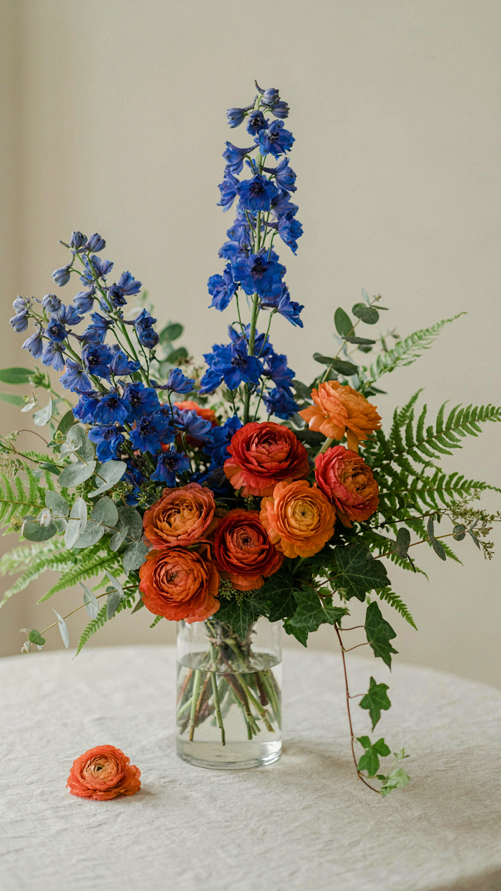
Beyond Green And Brown
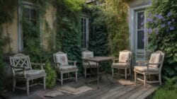
You want permission to use color without looking like you’re trying too hard. That’s the real tension here. The mechanism is this: most garden party palettes fail because they treat nature as a constraint instead of a starting point. Green and brown alone read as default, not intentional. You need one non-botanical accent color that anchors the scheme and makes every other choice feel deliberate.
Introduce a single color with no plant equivalent in your garden. Dusty blue, terracotta, soft cream, or muted mauve work because they don’t compete with living plants. They frame them instead. This accent appears in linens, glassware, or furniture. The plants then feel like they belong to your design, not the other way around. Everything else stays rooted in the garden’s actual palette.
Saturation As A Design Tool
Saturation is the physics concept most people ignore in garden design. Think of it as contrast: the degree to which a color differs from gray at the same brightness level. High saturation colors in small doses amplify the muted tones of existing foliage. You’re not adding more color. You’re activating the color already there through strategic contrast.
If your garden runs muted greens and dusty grays, one highly saturated element shifts perception of the whole space. A single runner in deep coral, a stack of chartreuse plates, or bold linens in wine red makes adjacent soft tones read richer. The saturation difference does the work. Apply this rule: no more than one high saturation textile or accent per ten linear feet of table space.
The “Rule Of Three” For Floral Colors: Impactful Groupings
Constraint Creates Clarity, Not Limitation

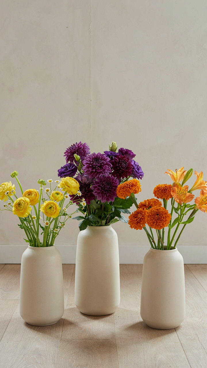
You want people to remember your garden party for the right reasons, not spend the evening visually confused. The mechanism is simple: your brain processes color contrast faster than saturation. When you limit your primary palette, each color works harder and lands cleaner. This is how constraint functions in design the same way it does in economics—scarcity increases perceived value. Three colors maximum means no color dilutes another.
The common advice here is wrong. People think adding more colors gives you options. It doesn’t. It gives you visual noise disguised as abundance. Your guests’ eyes have nowhere to rest, which means nowhere to focus. A tight palette forces intentional placement. Every bloom, every tablecloth detail, every accent becomes a deliberate choice instead of a default.
Three Colors Maximum For Visual Punch
Limit your selections to avoid competition between similar shades vying for attention. The garden party color palette works best when each hue occupies a distinct position in the color wheel, preventing visual fatigue. Start by choosing one dominant color, one secondary, one accent. This framework keeps the eye moving purposefully rather than searching.
- Dominant Color: occupies roughly 60 percent of the visible space, sets the overall mood and tone for the entire garden setting.
- Secondary Color: fills about 30 percent of the space, supports the dominant without competing, typically a complementary or analogous choice.
- Accent Color: uses only 10 percent of space, provides contrast and visual interest, draws the eye to key focal points like a statement floral arrangement.
- Foliage Neutrals: greens and grays act as visual separators between colors, preventing adjacent blooms from clashing or overwhelming the palette.
- Lighting Factor: daylight shifts how colors read outdoors, so test your three colors in the actual venue at the actual event time before committing.
This distribution prevents any single color from dominating so completely that the space feels flat. Your accent color works only because the other two give it room to breathe. Remove this hierarchy and you’re back to visual confusion. Test your three-color combination in the actual garden light at the time of day your party runs. Colors shift under morning sun versus afternoon shadow. Commit only after you’ve verified the combination holds.
Bright Wedding & Summer Wedding Colors: Escaping The Pastel Trap
Why Pastels Often Dilute Rather Than Define

You want pastels because they feel safe and look expensive in photos. Here’s the mechanism: pastels work through absence. They remove saturation to create perceived refinement, but low saturation also removes contrast. Contrast is what your eye actually processes. Without it, every element flattens into the same visual weight. Your guests don’t remember flat. They remember defined moments. Pastels promise elegance but deliver visual noise dressed up as sophistication.
The real cost of pastel garden parties emerges in spatial depth. When every flower, ribbon, and cushion sits in the same tonal family at low intensity, your brain treats the space as one blurred surface instead of distinct zones. Designers use pastels to hide budget constraints, not to create memorable atmospheres. If you want a cohesive garden party, you need saturation differences that create visual hierarchy, not uniformity that erases it.
Vibrant Hues For Memorable Summer Celebrations
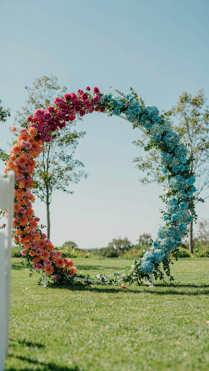
Vibrant colors work because they create separation without complication. Take a saturated emerald green against a saturated coral: your eye lands somewhere concrete instead of wandering. Contrast doesn’t require complexity. It requires intentional difference. Summer celebrations thrive on this principle because outdoor light amplifies saturation naturally. Direct sunlight burns out soft colors but intensifies bold ones. Your vibrant palette becomes more vivid in the exact conditions where pastels fade into invisibility. You’re working with the light, not against it.
The protocol is simple: choose one dominant saturated hue, anchor one accent hue with equal or higher saturation, then use white or cream as a breaker. This gives your eye clear landing zones. A deep jewel tone table setting with bright yellow flowers and cream linens creates instant visual logic. Guests process the space in seconds instead of searching for focal points. Set your dominant color first, then build saturation around it, never down from it.
The “Contrast Calculus” Method: Highlighting Key Elements
Dark Against Light Creates Visual Hierarchy
You want people to notice what matters at your garden party without you having to point it out. That’s the real game here. Contrast works like value in graphic design: light bounces off dark, dark recedes against light, and your eye travels exactly where you positioned it.
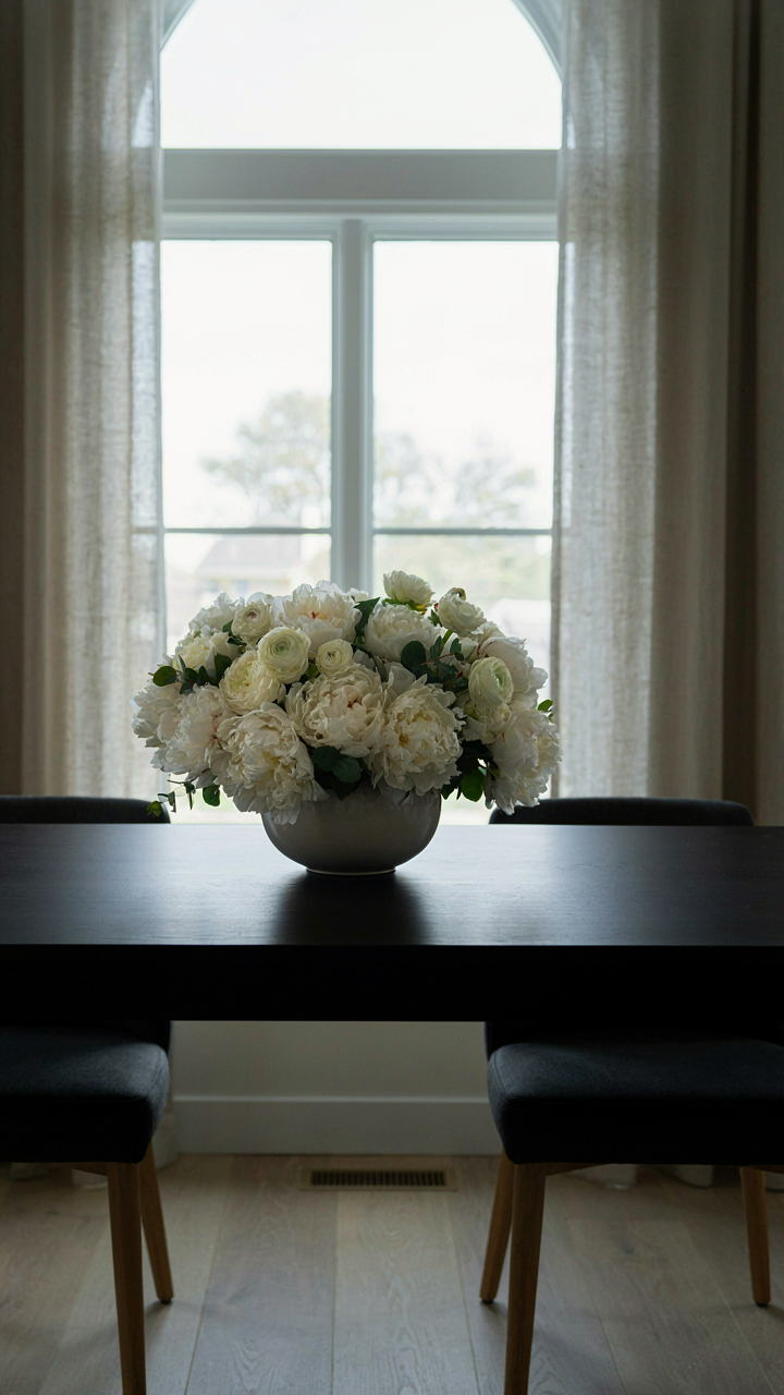
The mechanism is simple physics. A pale linen tablecloth against deep charcoal or forest green napkins forces the eye to land on the table first. Reverse it: dark fabric with pale accents recede into the background while lighter elements advance. This isn’t decoration. It’s directional control. Place your darkest tones at anchor points—hedges, tent fabric, potted topiaries—and lighter tones fill the gaps. The contrast does the work.
Making Features Pop Intentionally
Most people scatter accent colors randomly and call it design. Wrong. You accent one focal point per zone, not five. A single vibrant dahlia arrangement against muted sage walls pops because nothing else competes for attention.
Identify your visual anchor in each space: the beverage station, the seating cluster, the dessert display. Introduce your saturated color there only. Surrounding colors should shift toward lower saturation—soft greens, warm taupes, pale florals. This creates subordination, not chaos. The saturated element becomes unavoidable. Everything else supports it. Build your palette by deciding what deserves attention, then engineer the contrast around that decision.
Garden Chic Color Palette: The Art Of Deliberate Understatement
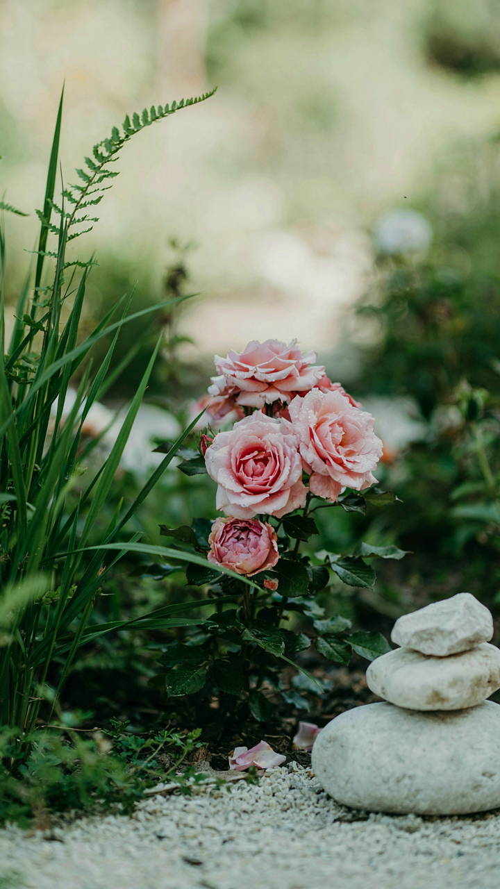
Subtlety Wins When Restraint Becomes Visible

You want people to notice you have taste without trying. That’s the real math here. The mechanism is constraint: every color you don’t use makes the ones you did use work harder. Garden design borrowed from signal theory in physics. A signal stands out not by being loud but by having clear contrast against noise. A muted palette with one sharp element cuts through clutter. Most people load their gardens with competing hues and wonder why nothing lands.
Restraint is a choice that signals control. When you limit your palette to three or four colors maximum, each one carries weight. Guests see intentionality, not accident. The garden chic aesthetic dominates high-end events precisely because it refuses to shout. Pale greens, soft grays, and cream tones create breathing room. This isn’t about blandness. It’s about letting the structure, texture, and flowers do the work instead of color doing all of it.
One Anchor, Everything Else Fades Back
Most advice says “add variety with multiple accent colors.” Wrong. That’s how you end up with visual chaos disguised as richness. The real move is identifying one accent color that justifies its existence, then making everything else support it. A single deep burgundy or slate blue accent transforms a pale garden palette from flat to deliberate. All other elements recede. The eye lands exactly where you designed it to land.
Pick your anchor based on what the event needs to communicate. If elegance is the goal, a muted terracotta or dusty rose among ivory and soft sage works. If you want drama, charcoal or deep forest green punches through pastels without screaming. Everything else becomes a supporting player. Linens, flowers, furnishings all follow the rule: they either echo the palette or they disappear into neutrality. This is how you create cohesion without looking rigid.
The Only Truly Cohesive Garden Party Is One That Defies Expectation, Not Fulfills It
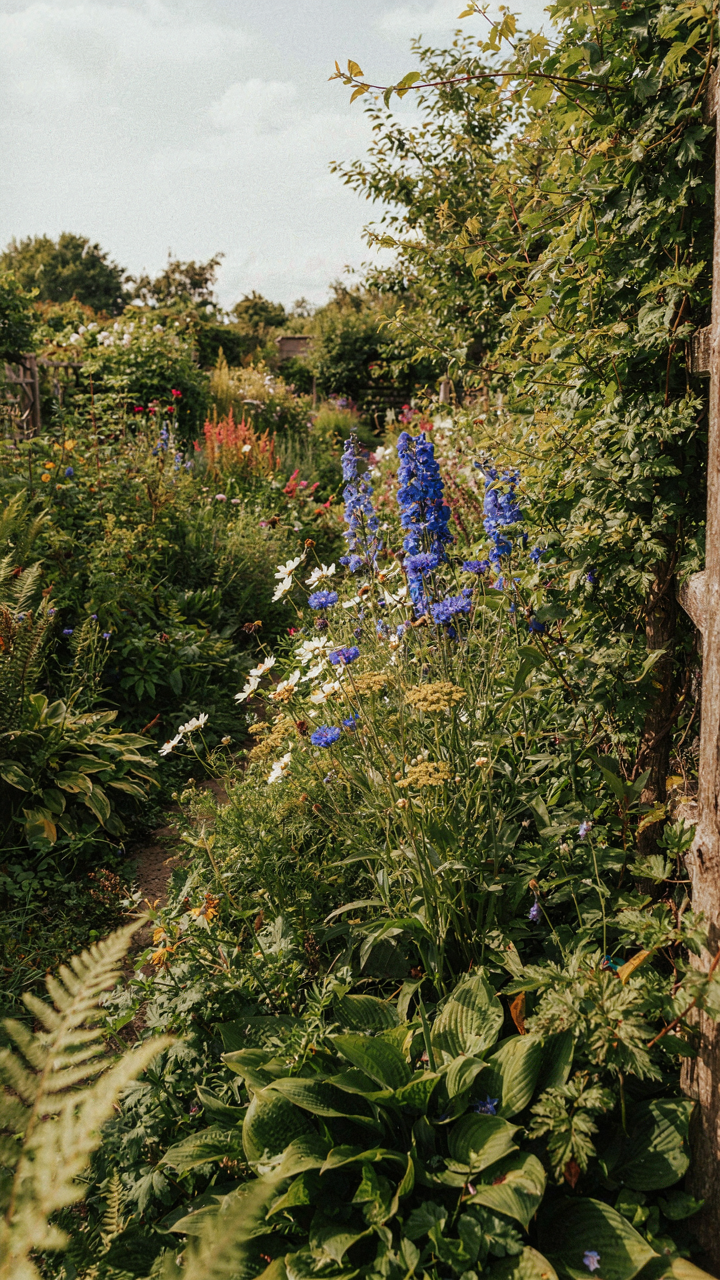
Stop treating your garden party color palette like a rulebook. The gardens that feel alive break every principle you’ve read. Pick one color that scares you slightly, then build everything else around defending that choice. Don’t match. Contrast. Your guests came to feel something, not to admire your obedience to design trends. The most memorable garden parties aren’t the ones that match Pinterest. They’re the ones that make people wonder why they never thought of that combination before.