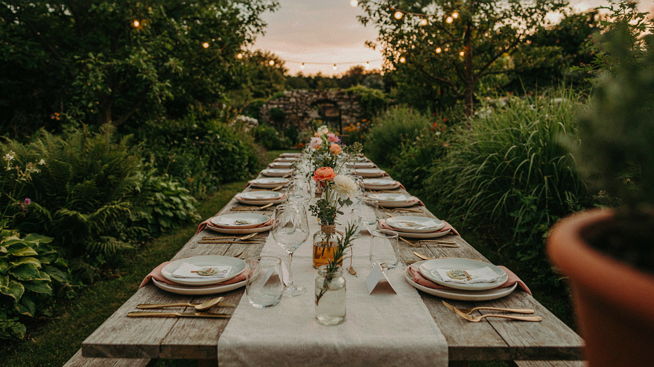
The “Accidental” Seating Strategy
Flow Beats The Symmetry Trap
You want the place card to signal status through perfect balance. That’s backwards. The real mechanism is traffic flow: people move through outdoor space differently than indoor rooms. A place card’s position either creates natural pathways or forces guests to navigate around tables like obstacles. Position cards to guide people toward the bar, bathroom, or exit without making the routing visible. Your outdoor dinner place card becomes a wayfinding tool disguised as decoration.
The common advice is to center everything and call it elegant. That kills energy. Instead, stagger table positions and use place cards to mark the intended flow between them. Slight asymmetry in card placement makes guests move naturally, which generates conversation clusters instead of isolated clusters. The place card isn’t just naming a seat. It’s a physical anchor that tells bodies where to walk.
The Conversation Type Signal
Place cards function like social framing in behavioral economics: they presignal which conversation mode the seated guests will adopt. A formal card stock with calligraphy signals formal discussion. A cardboard tent with marker signals casual banter. Most hosts miss this because they treat the card as pure identification. The card is actually a contract that tells guests what kind of interaction to expect before they sit down.
Put high-energy guests next to quiet ones, but signal it through the card itself. A casual card next to a formal one creates cognitive dissonance that breaks people out of their default mode. Use material contrast deliberately: place a natural wood card beside a metallic one, or kraft paper next to vellum. This friction forces guests to recalibrate their social mode instead of defaulting to autopilot. The place card works only if it nudges behavior before the conversation starts.
Beyond Paper: The Material Dictates The Mood
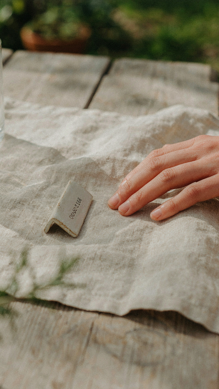
Unconventional Materials For Relaxed Authenticity

You want people to think you didn’t try too hard. That’s the real reason material matters for place cards at casual outdoor dinners. The mechanism is signal matching: your guests decode effort level through tactile and visual cues before they even sit down. Paper signals formality and planning. Everything else signals you picked something because it fit the moment, not because you followed a rule.
Wood, clay, and stone work because they’re materials people expect to find outside already. A place card carved into a slice of birch log or pressed into air-dry clay feels like discovery rather than decoration. The durability bonus is secondary. What matters is the guest’s subconscious read: this person values authenticity over polish. That read happens in under two seconds and shapes the entire dinner’s tone.
Durability For Unpredictable Outdoor Elements
Weather doesn’t care about your aesthetic choices. The real constraint is material performance under moisture, temperature swings, and wind. Borrowing from materials science, think of your place card as a substrate exposed to environmental stress cycles. Paper fails immediately. Thin cardstock buckles within an hour of humid air or dew. Laminated stock resists moisture but looks corporate and kills the casual vibe you built with unconventional materials.
Wood sealed with matte finish handles moisture without looking plastic. Slate or stone never deteriorates outdoors. Kraft paper with a thin coat of food-grade mineral oil survives a single dinner without degradation if you place it strategically away from direct water exposure. Cement or concrete place card holders anchor cards vertically, protecting them from wind and morning moisture. The protocol is simple: match material durability to your setup’s actual exposure time and water sources.
The “Less Is More” Place Card Protocol
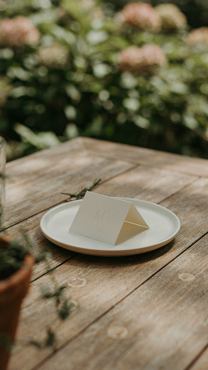
Minimalist Design Wins The Attention Battle

You want your place cards to signal taste without screaming for validation. The real mechanism is scarcity of visual information: your brain treats blank space as a signal of intentionality. When a place card has one typeface, one color, and breathing room, guests register it as deliberate. Clutter reads as nervous. A single name in clean type on white cardstock beats a decorated card fighting for attention every time.
The constraint forces precision in execution. Your material choice, card size, and typography become non-negotiable decisions instead of decoration problems you solve by adding more. A 2×4 inch card in 11-point type with one-inch margins isn’t sparse because you’re poor on ideas. It’s sparse because you understand that outdoor lighting, wind, and distance make legibility the actual job. The place card’s job is not to impress. Its job is to tell people where to sit and make them feel expected.
Information Hierarchy Over Everything Else
The common advice says to include a guest’s name, table number, and maybe a fun fact. Wrong framework. Think like a waiter’s system: every element on the card must answer one of two questions: “Where do I go?” or “Who am I sitting with?” Anything else is noise that fights the outdoor environment for processing power.
The guest’s name takes the visual lead. It’s the largest element and positioned at the top third of the card where the eye lands first. Table number goes small, lower on the card, in a different weight or size. You can kill the decorative text entirely. The card functions at a glance in moving light. Make the hierarchy so clear that a guest reads the name, notes the table, and sits down without thinking about it. That’s the protocol that works.
Tactical Placement: Guiding The Guest Experience
Where Eyes Land First

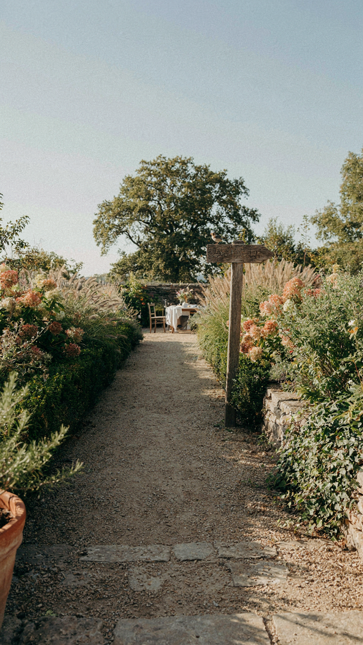
You want people to feel welcomed the moment they arrive at the table, not confused about where to sit. This section maps onto sightline theory from architecture and design: the place card functions as a visual anchor point that immediately orients the guest and eliminates friction. Most hosts scatter cards without thinking about angle, distance, or line of sight. That’s the mistake.
Place cards work best when positioned at eye level or slightly above the seated guest’s natural gaze. Set them two to three inches behind the plate’s top edge, centered on the placemat or table surface. This positioning ensures the name becomes visible before the guest commits to sitting. Avoid placing cards flat on napkins or tucked into glasses where a guest must hunt for them. The card should announce itself without shouting.
Spacing That Moves People Through Space
Guest flow determines whether your outdoor dinner feels like controlled movement or accidental crowding. Physical spacing between place settings matters more than most hosts realize. Use the place card’s position to telegraph where the next seat begins, essentially creating invisible lanes people naturally follow.
Position each card so it sits directly above or just behind the individual’s water glass. This creates a column of visual markers running down the table. When guests approach from the side, they read the cards in sequence and find their spot without stopping other arrivals. Space cards consistently: if one sits four inches from the plate edge, all do. Inconsistent spacing breaks the rhythm and forces people to second-guess their placement, killing momentum.
The “Social Physics” Of Name Tags For Wedding
Removing Friction From First Contact

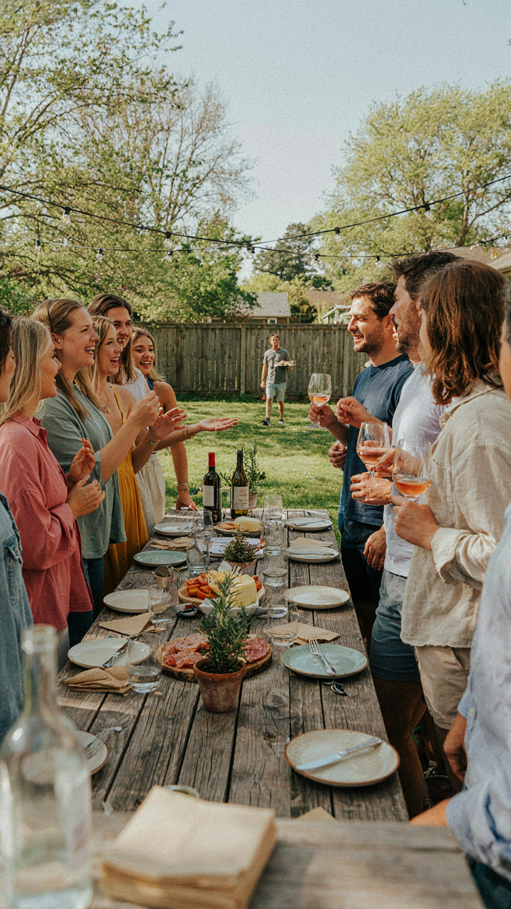
You want people to feel welcomed and remember each other’s names without the awkward pause. That’s the real motive here, and it matters because most hosts skip this step entirely, creating a void that small talk struggles to fill. In physics, friction is resistance to motion. On a dinner table, a place card functions as friction reduction: it eliminates the decision overhead of “how do I address this person” and pre-loads their identity before conversation starts. Without it, guests default to surface-level pleasantries. With it positioned correctly, you’ve already handed them a conversation starter.
Place cards work because they compress social setup time. A name plus one strategic detail (occupation, connection to host, single fact) transforms a stranger into a known quantity. Position them at eye level when guests approach their seat, not flat on the plate where they discover it after sitting. The card bridges the gap between arrival and belonging in under three seconds. This small design choice determines whether your dinner becomes a cluster of isolated conversations or an actual gathering.
Spatial Choreography Before Guests Arrive
Map where you actually want energy to flow, not where tradition says to seat people. Most advice tells you to alternate men and women or scatter friends, but that ignores the real mechanism: conversation follows proximity and removes friction when people with aligned interests sit within voice range. Before guests arrive, sketch your table layout and mark which clusters will form naturally based on who knows whom and who has reason to talk. Position place cards so emerging sub-groups face each other across or around the table rather than in parallel lines where side conversations dominate and center energy dissipates.
The outdoor dinner place card becomes a tool for controlling attention architecture. If you want the whole table engaged in one conversation, seat strong personalities opposite each other with quieter guests between them. If you’re hosting mixed-familiarity groups, seed connectors throughout to bridge clusters. Place the card where a guest’s eye lands first as they approach their seat, aligned with their body’s natural sightline. Test this by walking the table’s perimeter yourself before anyone arrives. Adjust cards now so each person knows their destination and their neighbor’s name before they sit.
Personalization That Isn’t Pretentious
The Real Reason You Care About Details

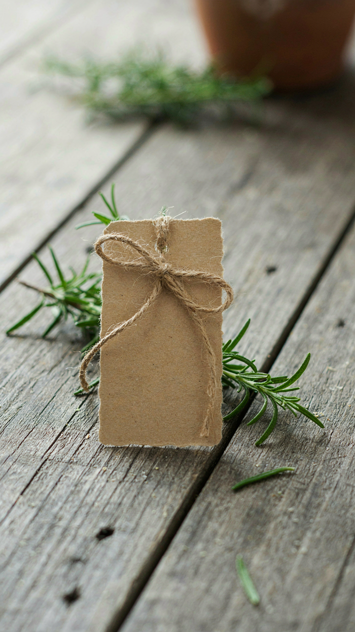
You’re worried that a plain place card makes you look lazy. That’s the actual mechanism at work. The truth is simpler: people notice effort, not expense. A handwritten name on kraft paper signals you thought about who was sitting where. A mass-printed card signals you didn’t. The gap between those two reads instantly, regardless of budget.
Authentic personalization works because it’s friction. You can’t fake it at scale. When you add one specific detail about a guest directly onto their card—a small drawing, an inside reference, their preferred drink nickname—you prove attention happened before they arrived. This isn’t about impressing; it’s about removing doubt that you considered them as individuals.
Handwritten Versus Printed Tension
The conventional advice says handwritten is always more personal. That’s incomplete. Handwriting actually works as a status signal in reverse: it can read as rushed or unpolished if the penmanship is poor. Printed calligraphy or hand-lettering by someone skilled reads differently than your shaky cursive at the last minute. The mechanism matters more than the format.
The real trade is consistency versus authenticity. Printed place cards look intentional and controlled. Handwritten ones prove you did the work yourself, even if imperfectly. For casual outdoor dinners, slight imperfection in handwriting actually works better than flawless printing, because the flaws prove a human made it. Write names clearly in black or dark blue ink on white or cream cardstock. Legibility beats aesthetics every time.
Leaf Place Cards Wedding: Nature’s Utility
Natural Elements As Functional Design

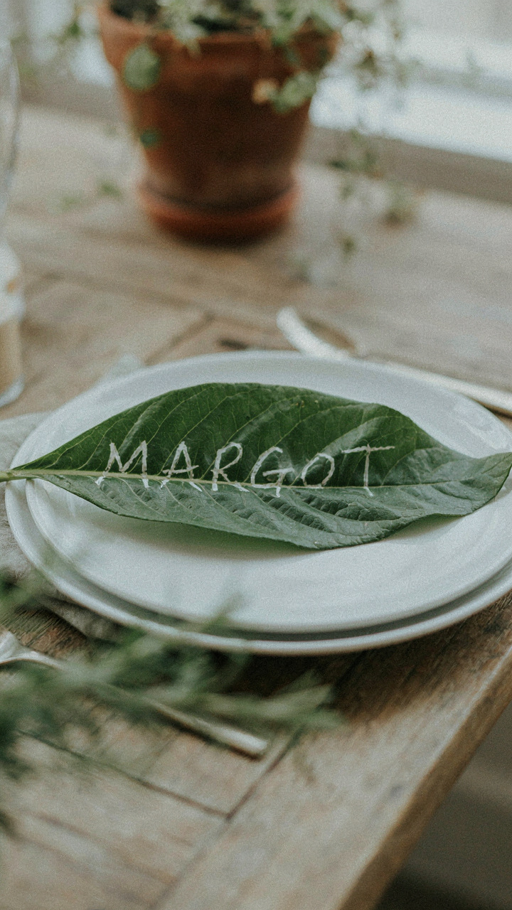
You want leaf place cards because they signal you didn’t buy everything from a party supply catalog. But the real mechanism is simpler: natural materials solve a structural problem that paper alone cannot handle in outdoor conditions. Borrow from industrial design’s concept of “load bearing”—your place card must physically support itself against wind, moisture, and temperature shifts while remaining readable. Leaves provide rigidity. Paper does not.
- Magnolia leaves: Large, waxy surface resists moisture and holds shape in humidity. The spine provides natural rigidity for propping or pinning without damage.
- Eucalyptus leaves: Dried varieties maintain structural integrity in direct sun. Aromatic qualities add sensory layer without visual clutter on the card.
- Preserved oak or beech leaves: Tannin content prevents rapid decomposition outdoors. Handle well when pressed flat or slightly curved as card backing.
- Leather leaf fern: Not a leaf, but functions identically. Naturally glossy finish repels light rain and holds ink without smudging from moisture exposure.
- Tropical foliage: Bird of paradise or monstera leaves offer size advantage. Their thickness stabilizes handwritten guest names against wind displacement.
The mechanics matter here: a guest’s name written on raw paper gets illegible when condensation hits. A name written on a treated leaf with wax coating stays visible through a three-hour dinner. Source leaves from local florists, dried flower suppliers, or your own yard if you have mature trees. The acquisition cost approaches zero. The functional performance outpaces cardstock by a measurable margin in outdoor conditions.
Elegance Through Salvaged Materials
Most advice says “forage sustainably and call it eco-conscious.” That’s marketing language masking a transaction. The real payoff is visual contrast at zero friction. Gathered leaves against a simple white ink treatment create perceived sophistication because the asymmetry reads as intentional, not cheap.
The setup requires two inputs: a source of uniform leaves and a reliable pen. Collect leaves of the same species and approximate size to avoid visual chaos. Use a paint pen or white ink on darker leaves, black or deep green ink on lighter ones. Lay them flat for 24 hours under weight to standardize their position on the table. The guest sees craft, not labor. The cost per place card runs 15 to 40 cents depending on whether you source leaves yourself or buy dried stock. You spend the money on quality ink, not on the base material. That inversion is where the elegance lives.
Beyond The Name: Subliminal Messaging
The Details That Signal Intentionality

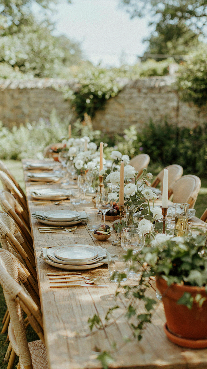
You want people to think you planned this. The real mechanism here is cognitive fluency—borrowed from psychology—where guests unconsciously trust environments that feel considered. A place card functions as a signal of intentionality the same way a polished shoe signals competence. When details align, the brain registers “this person cares,” and that judgment happens before conscious thought.
Small, relevant details on a place card do this work: a pressed leaf matching your table’s plant life, a handwritten flourish that echoes your invitation’s font, or a material that complements your table runner. These aren’t decoration. They’re proof of deliberation. The card stops being a name holder and becomes evidence that every element connects to something larger.
The Vibe Lives In Restraint
Most advice tells you to load place cards with personality. That’s incomplete. Restraint communicates vibe better than abundance does. A minimalist card with one detail says “we’re elevated and efficient.” A maximalist card with patterns, colors, and fonts says “this is playful and loose.” The vibe isn’t in what you add—it’s in what you exclude. Choose which version matches your gathering and remove everything else.
The mechanism is contrast and scarcity. When a casual dinner place card has only two colors instead of five, those two colors hit harder. When a formal place card uses one typeface instead of three, that typeface becomes the statement. Design your restraint deliberately. Don’t remove details because you ran out of ideas. Remove them because the vibe you want demands emptiness.
Magnolia Leaf Place Cards: The Unconventional Choice
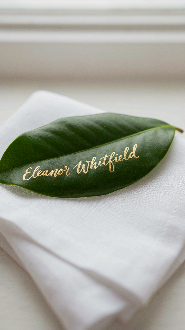
Why Magnolia Leaves Work Better Than Paper

You want people to notice you spent thought on details without looking like you tried too hard. That’s the real draw here. Magnolia leaves solve a mechanics problem nobody names: paper place cards telegraph “I bought these,” while organic material signals intention. The leaf’s waxy coating naturally resists moisture and wind—two variables that destroy standard cardstock outdoors. The surface holds ink and handwriting without smudging, and the leaf itself doesn’t curl or warp in humidity the way paper does.
Magnolia leaves carry visual weight that card stock simply doesn’t. A guest picks up a leaf with calligraphy on it and registers craft and specificity. The material forces you to commit to names beforehand, which eliminates the amateur move of handwriting place cards an hour before guests arrive. You’re not decorating with leaves as some design flourish. You’re using a material that functions better than the alternative under actual outdoor conditions.
Processing Leaves For Practical Use
The common advice is to pick them fresh and use them immediately. That’s incomplete. Magnolia leaves need preservation to maintain flatness and prevent browning. Harvest leaves from the lower branches where they’re mature and thicker—these hold their structure longer than tender upper leaves. Press them between newspaper weighted with books for five to seven days before your event. This process removes excess moisture and creates a stable writing surface that won’t ripple when exposed to evening air.
After pressing, store the leaves in a flat box with parchment between each layer. Keep them in a cool, dry space until setup day. When you’re ready to write on them, use a fine-tipped calligraphy pen or paint marker—ballpoint pens skip across the waxy surface. Mount the leaf to a small card base or fold a subtle stand from cardstock beneath it so the leaf tilts slightly upward at the place setting. The stand should disappear visually. Your setup is complete once each name is legible and each leaf sits stable enough to survive a gentle breeze without moving.
Stop Asking For Permission; Start Designing For Inevitable Influence
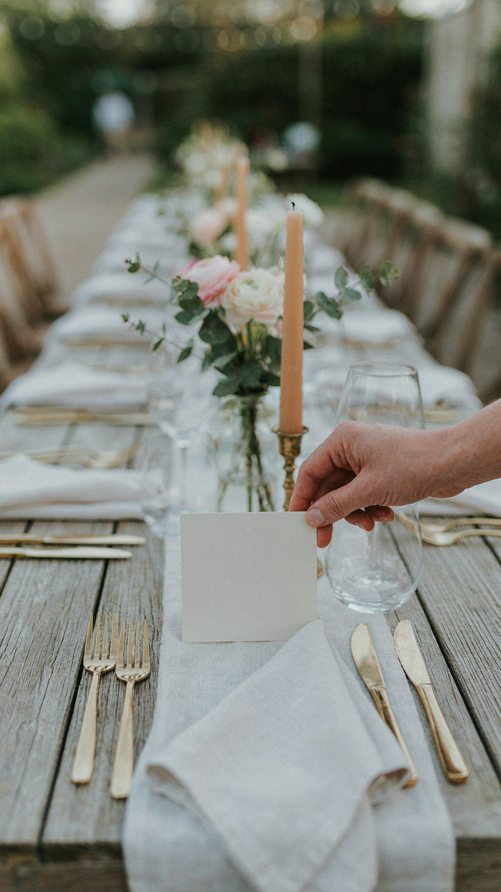
Your outdoor dinner place card isn’t decoration. It’s a signal that you control the experience. People notice who orchestrates the details. Design one today using cardstock and a single font that matches your table’s energy. Watch how guests react when they see their name placed with intention instead of scribbled on napkins. You’re not styling a party. You’re teaching people what to expect from you.