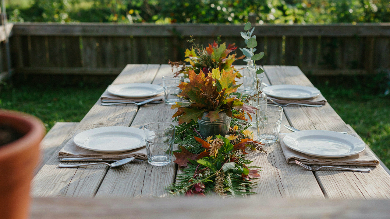
The Frugal Aesthetics Protocol: More Than Just Tables Decorations

What Dollar Stores Actually Stock That Matters
You’re reading this because you don’t want to look cheap. Here’s the mechanism: dollar stores don’t sell cheap things. They sell full-price items at fractional markups because their supply chains eliminate middlemen. The real gold isn’t the obvious stuff. Clear glass vases, bulk votives, and metallic spray paint show up everywhere because they’re inventory staples. What matters is recognizing which items were originally designed for different contexts entirely, then repurposing them without apology.
Dollar stores carry industrial-grade items most people overlook. Galvanized metal buckets, wire baskets, and plain linen napkins were engineered for durability, not aesthetics. These pieces exist in the storage aisle, not the party section. The cost stays low because demand stays low among the typical customer. Your advantage is seeing them as tablescape infrastructure rather than as their original category.
Constraint Breeds Unconventional Combinations
Most advice says to match themes. That’s incomplete. The real mechanism comes from constraint-based design, a principle borrowed from systems engineering where limited resources force novel solutions. When you can only afford five dollar store items, you stop trying to build a cohesive color palette and start building contrast instead. A metallic napkin holder next to a terra cotta saucer next to a clear glass creates visual tension that costs nothing but reads as intentional.
Unconventional pairings work because they signal curation, not budget. A galvanized metal bucket filled with dollar store greenery (real or artificial) next to formal glassware confuses the eye in a way that’s actually sophisticated. The mixture of materials disrupts the expectation of matching sets. You’re trading theme-based design for material-based rhythm, which is a harder skill and costs exactly the same.
Affordable Table Settings: The Illusion Of Opulence
Layering With Texture, Not Cost

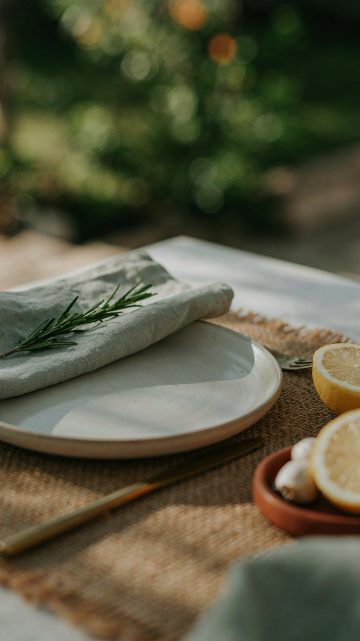
You want people to think you spent money you didn’t spend. That’s the real motive here, and texture is how you pull it off. The human eye registers complexity as expense. Texture creates visual weight without requiring premium materials. Borrow from architecture: the principle of “visual mass” applies directly to tablescapes. A dollar store tablecloth layered under a printed napkin creates perceived depth that a single expensive piece cannot match.
Dollar store finds excel at texture because cheap manufacturers layer production techniques. A basic white napkin gains presence when you fold it into a triangle and place it under a contrasting table runner. Add a woven placemat beneath both. The eye processes this as intentional design, not budget constraint. This layering strategy works because it mimics how high-end tables actually function: multiple planes of material stacked to create sophistication.
Strategic Color Palette For Perceived Value
Most people believe color coordination requires matching sets. Wrong. Curated color restriction reads as expensive restraint. Pick three colors maximum for your entire table. This means tablecloth, napkins, plates, and any florals or candles align within that palette. The dollar store sells items across color spectrums, but constraint creates the illusion of curation. Monochrmatic palettes (varying shades of one color) perform best because they suggest intentional design rather than random assembly.
Neutrals anchor the visual field. Use cream, white, or gray as your base from the dollar store. Then add one accent color through napkins or a runner. A third color appears only as a subtle detail: a single candle or small floral element. This restraint signals that you chose deliberately, not cheaply. When guests scan the table, they see cohesion first and cost last.
Budget Wedding Table Decor: The Constraint Driven Creation
Scarcity Forces Better Decisions

You’re reading this because you need permission to spend less money without looking cheap. That permission doesn’t exist. What exists instead is a mechanism: scarcity removes noise. Military logistics operates under hard constraints—fuel, tonnage, time—and this discipline forces precision that unlimited budgets destroy. Your dollar store budget works the same way. You can’t buy seventeen centerpiece styles and hope one works. You choose one and execute it perfectly across every table. The constraint becomes your competitive advantage, not your limitation.
The real work isn’t shopping. It’s deciding what single visual element repeats across your entire outdoor dinner. Will you use votives? Greenery? Fabric runners? One choice, repeated faithfully, reads as intentional design. Multiple ideas crammed onto one table read as confusion. Military planners call this unified logistics. You’re doing the same thing when you commit to one Dollar Store product as your anchor and build everything else around it. That discipline is what separates a coherent tablescape from visual static.
Tactical Advantage Through Rapid Iteration
Most advice tells you to “be creative with what you have.” Useless. Here’s what actually works: resourcefulness is speed of decision-making under pressure. You move fast because you have fewer options, not more. A dollar store has roughly two hundred items. A HomeGoods has two thousand. The smaller inventory forces you to see connections faster. You spot that white plastic chargers stack perfectly under that metallic tablecloth. You notice the battery operated string lights fit inside those glass vases. You build from constraint, not indulgence.
The tactical advantage compounds when you visit the store with a single mission: find items that solve one specific problem. Don’t browse. Identify your gap—bare table surface? No height variation? Missing light?—then hunt for the dollar store item that fills it. Test the combination at home before the event. A five dollar experiment beats a fifty dollar miscalculation. Execute your solution across all tables identically, and your tablescape reads as designed rather than assembled.
Simple Table Decorations: The Power Of Monotony
Repetition Beats Visual Noise

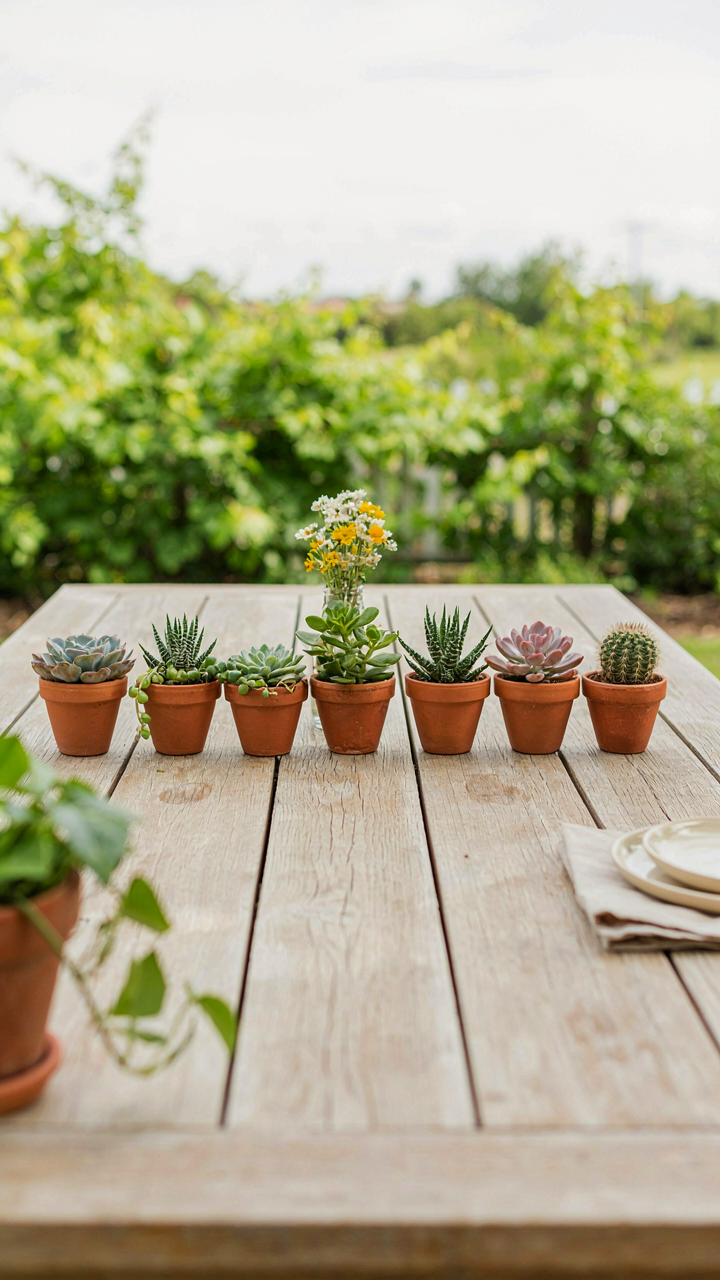
You want permission to do less work and still look intentional. Here’s the mechanism: your brain processes repetition as design. In gestalt psychology, the principle of repetition creates unity and reduces cognitive load. Apply that to tablescape design, and you get this: one element repeated across the table reads as “curated.” Five different elements scattered around reads as “leftover.”
Dollar Store candles exemplify this. Buy twelve identical votives instead of mixing heights, colors, and styles. Line them down the table center or cluster them in threes across place settings. The uniformity makes cheap materials read as deliberate. Consistency signals control, and control signals competence.
One Strong Element Over Everything
Most tablescape advice says “layer textures and colors for depth.” That’s wrong. Layering works when you have designer materials and actual budget. On a dollar budget, layering exposes cheapness. You need the opposite strategy: find one element worth featuring, then remove everything competing for attention.
The mechanism is contrast through subtraction. Choose one focal point—napkins, runners, or centerpieces—and execute it well. Everything else becomes supporting infrastructure: plain white plates, basic glassware, neutral tablecloths. Dollar Store white paper runners with a single bold element outperform a table crowded with mixed accessories. Constraint forces clarity, and clarity makes even cheap materials feel intentional.
Table Scape: Deconstructing The Visual Hierarchy
Low Cost Centerpiece Alternatives

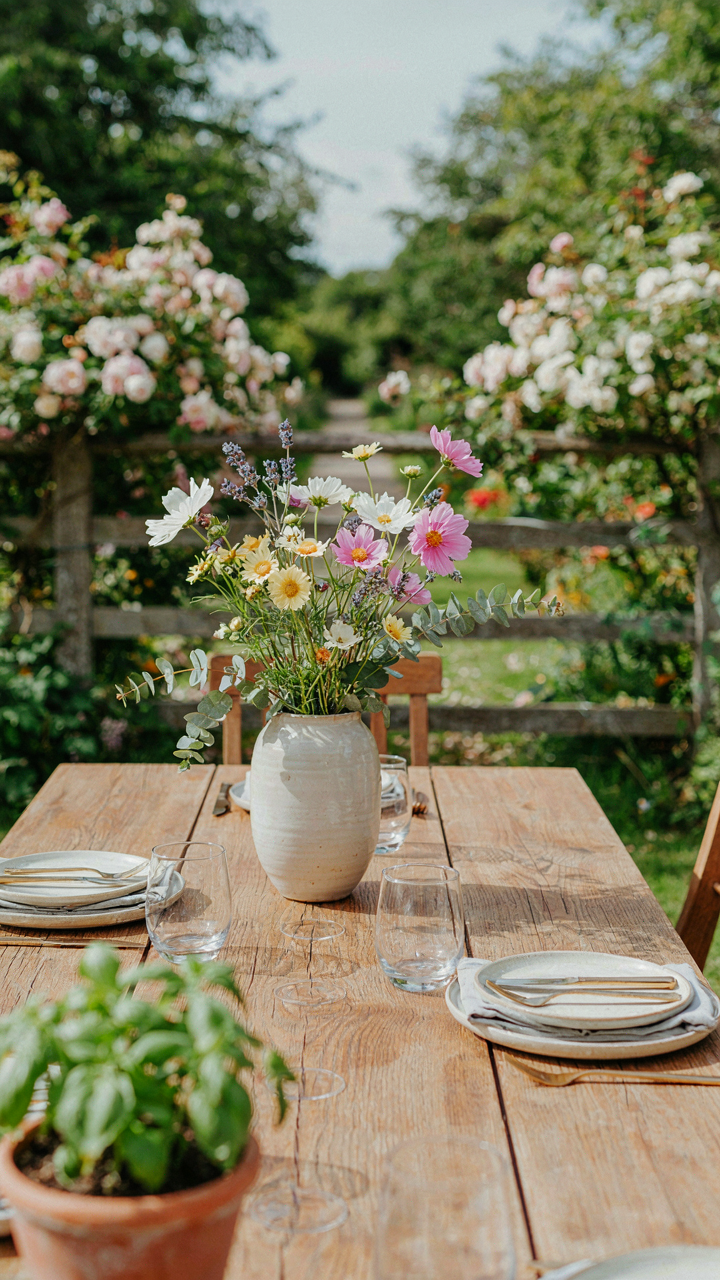
You want people to think you planned this. That’s the real reason you care about centerpieces. The mechanism is simple: a focal point makes any table feel intentional instead of empty. Most advice tells you to buy flowers. That’s lazy. Flowers die in three days and cost money every event. Instead, use objects that hold visual weight without disappearing.
Dollar stores stock items designed to catch light and draw the eye. Glass votives, metallic containers, and ceramic pieces work because they reflect light and create contrast against a plain table. Stack three different heights of the same item, or group five identical objects in odd numbers. The pattern registers faster than random placement. This isn’t decoration. It’s visual anchoring.
Height And Scale Using Common Objects
Design uses the term “visual tension” to describe when objects at different elevations force the eye to move. Apply that principle: never lay everything flat. A cheap wooden box from a dollar store becomes a platform. A stack of books becomes a riser. A mason jar inverted under a plate lifts that plate six inches higher than its neighbors. The height difference alone signals that someone made a choice here.
The scale rule is mechanical. Objects that are too uniform in size create boredom. Objects with no relationship to each other create chaos. Mix one large item, two medium items, and three small items in your centerpiece. That ratio works because it’s not symmetrical but not random either. Your eye knows something is controlling the arrangement even if it can’t name what. Measure the tallest piece at roughly one and a half times the width of your table section.
Easy Tablescapes Simple: The Asymmetry Advantage
Why Imbalance Works Better Than Matching

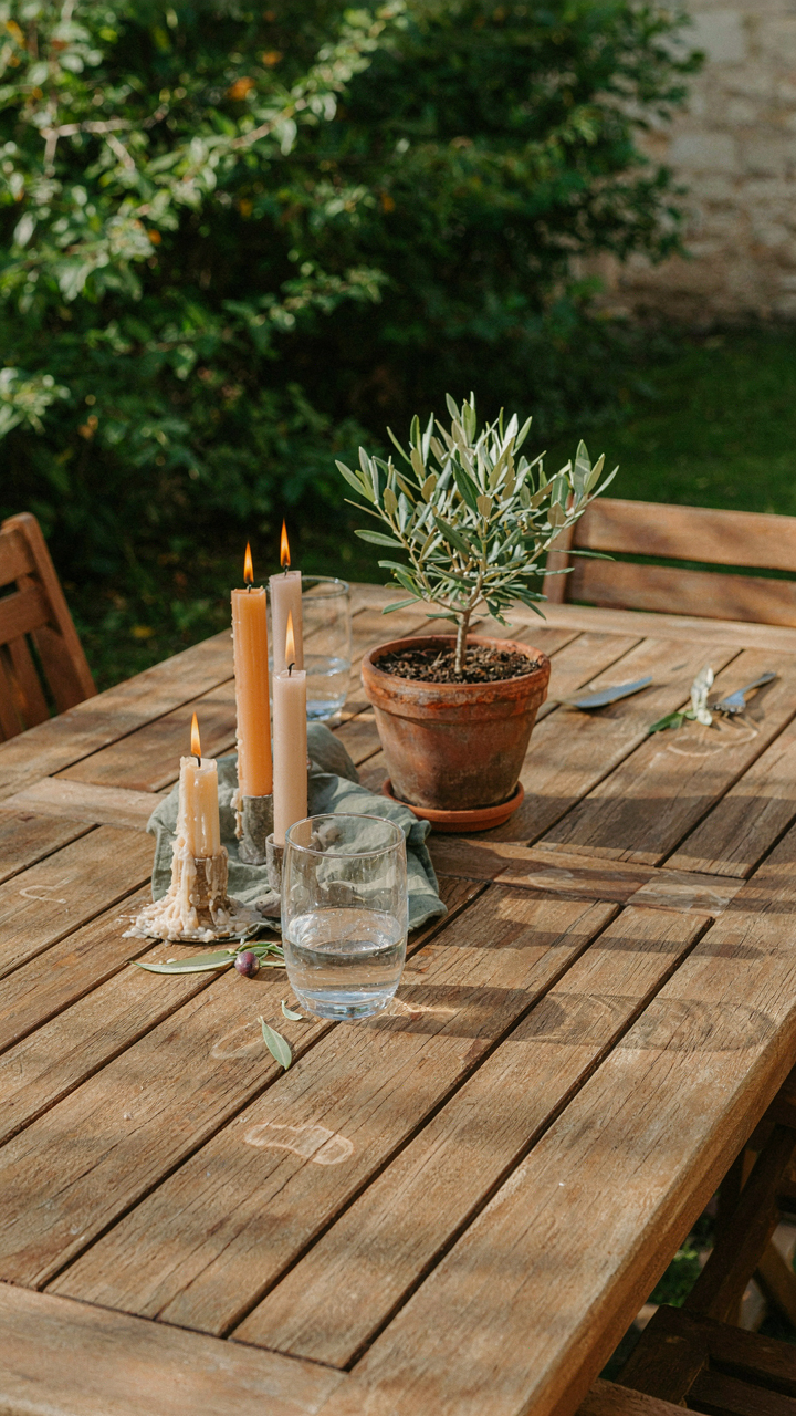
You want your table to look intentional, not like you ran out of budget mid-setup. That’s the real fear underneath the search for cheap tablescape ideas. Asymmetry solves this because it forces deliberate choice instead of default repetition. Design borrows from physics here: a balanced system requires equal force on both sides, but an asymmetrical one creates dynamic tension that holds attention longer. Dollar store finds arranged symmetrically scream budget. Arranged with purpose, they signal taste.
The mechanism is simple. Your eye expects matching pairs to signal either abundance or laziness depending on context. Intentional imbalance breaks that expectation. Place three candles on the left of the table, one on the right. Use two different vases instead of a matching set. Stack plates at one end instead of spacing them evenly. This isn’t disorder, it’s calculated restraint. The audience reads restraint as confidence, which reads as quality regardless of actual spend.
Asymmetry Kills The Budget Look
Everyone defaults to symmetry because it feels safe and requires no decisions. That’s exactly why it fails on a budget. When you have cheap pieces, matching them amplifies cheapness because the repetition draws attention to the individual item’s cost rather than the overall composition. Breaking symmetry with intention redirects that attention to composition itself.
The practical move: choose one anchor element and build unbalanced around it. A single tall vase with greenery from the dollar store becomes a focal point. Place it off-center. Then scatter lower elements around it with no mirror arrangement. You’re not decorating a table. You’re staging a scene that happened to use dollar store materials. The viewer never calculates cost per item when they’re processing spatial relationship and hierarchy instead.
Decorate Table For Party: Ambient Light Manipulation
Candles And Fairy Lights For Atmosphere

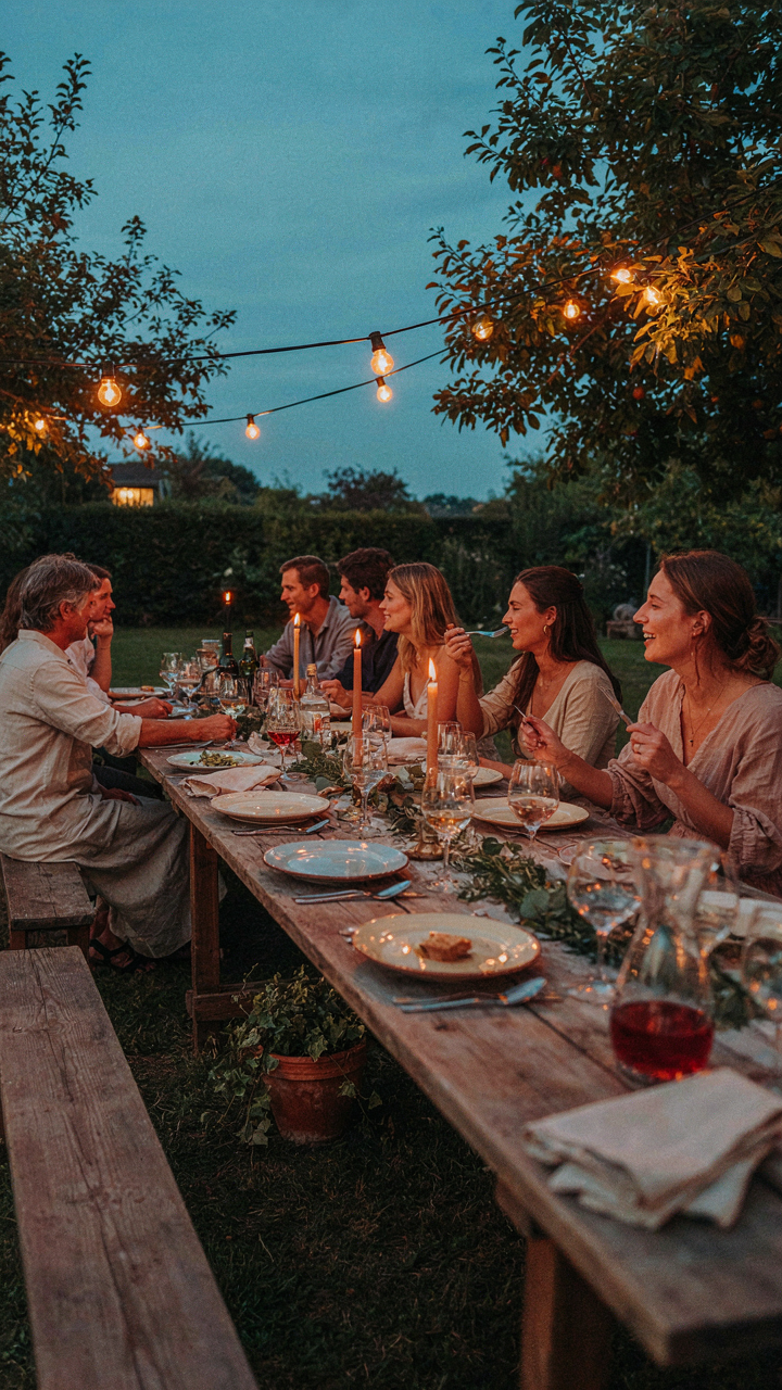
You want people to feel like your dinner matters more than it cost you. Here’s the mechanism: light controls perception of time and social status faster than anything else at a table. In physics, luminance is the intensity of light reflected from a surface. In tablescape design, luminance is your ability to create depth without spending money. Dollar store candles and fairy lights do this because they fracture light across multiple points instead of flooding one area.
Unscented dollar store candles work better than scented ones for outdoor dinners because wind moves the flame, creating flicker that reads as intentional rather than cheap. Fairy lights from dollar stores operate on the same principle but with less risk of wax pooling on fabric. The key is placement: scatter them low across the table surface and around the perimeter, not overhead where they flatten everything. Lights positioned at eye level or below trigger a psychological response that the space was designed, not decorated.
Reflective Surfaces To Amplify Glow
Most people think reflective surfaces mean mirrors, which breaks the budget and looks out of place. The real play is cheaper: dollar store aluminum trays, white ceramic plates layered under main plates, and clear glass positioned to catch and bounce candlelight back across the table. Reflection doesn’t add light, it multiplies its visual impact by forcing it through the same space twice.
Position aluminum serving trays flat behind the candles so flames bounce off the metal surface back toward diners. This creates the illusion of more light without additional candles. White or cream-colored napkins placed strategically beside candles serve the same function. The mechanism is simple: every reflective surface you add makes existing light work twice, cutting your candle needs in half while increasing perceived effort.
Cool Table Settings: The Foraged Element Integration

Natural Elements As Decor, Not Garnish

You want foraged elements because they signal effort without the price tag, and that matters more to you than you’ll admit. The mechanism is scarcity signaling. In retail economics, scarcity drives perceived value. What guests see is a table that required hunting, not shopping. The difference converts instantly into status in their minds.
Foraged materials work because they break the symmetry dollar store items create on their own. A Dollar Tree tablecloth becomes intentional when surrounded by actual branches, stones, or moss you gathered. You’re not decorating with found objects. You’re using constraint as design principle. The table reads as curated, not budget.
- Branches and Twigs: Collect straight or slightly curved pieces during walks. Strip bark partially for contrast. Bundle three to five per place setting, tied with dollar store twine. They frame plates without taking up table space.
- Moss and Lichen: Gather from shaded areas where bark meets soil. Press between paper for drying. Layer under dollar store glass votives or scatter along table runners. Adds organic texture immediately.
- Smooth Stones and Pebbles: Riverbeds and lakeshores yield consistent pieces. Paint dollar store acrylic paint on them for color, or leave natural. Use as place card weights or table scatter.
- Fallen Leaves and Seed Pods: Preserve flat leaves under heavy books for three days. Arrange around centerpieces or use as charger underlays. Seed pods work as small sculptural elements between plates.
- Bark Pieces: Strip from deadfall only, never living trees. Bark fragments create height variation when stacked. Use as card holders or arrange vertically in dollar store vases.
The second layer is timing. Gather materials the day before setup, not an hour prior. Wet foraged items dry unpredictably and lose visual definition. Prepped materials let you work systematically, placing each piece once and moving on. No scrambling, no visible stress.
Seasonal Finds, Maximum Impact
Winter teaches you what summer won’t: scarcity creates hierarchy. When your region offers limited fresh plant material, what you do gather reads as deliberate choice, not decoration filler. This is true in design philosophy too. Constraint breeds clarity. A bare winter table with three carefully placed elements outperforms a summer chaos of greenery.
Spring and early summer offer abundance, which is when most people fail. They overload tables with every available plant material and dilute the entire effect. The real move is editing ruthlessly. Pick one material type per season and build around it. If it’s spring branches, that’s your anchor. Everything else supports that choice. If it’s summer wildflowers, limit yourself to one color family gathered that morning. The Dollar Tree items you add now have a frame to live in instead of competing for attention.

Fall presents the easiest window because natural color variation does your work. Fallen leaves in October need minimal arrangement. Dried corn husks cost nothing and age well. Pumpkin stems, gourds, and seed heads create volume quickly. The constraint here is different. You’re not fighting scarcity. You’re fighting visual noise. Choose three texture types maximum. Stick to them across all place settings.
Late fall into winter flips the dynamic entirely. Evergreen clippings, bare branches, and frost-struck foliage become your only options in most climates. This limitation forces precision. A table with five bare branches and one dollar store candle reads intentional. The same table with fifteen assorted “seasonal” items reads confused. Gather one week before the event, store materials in a cool location, and arrange them the morning of service.
Simple Table Setting Ideas: The Unconventional Base
Fabric Scraps And Paper As Table Foundations
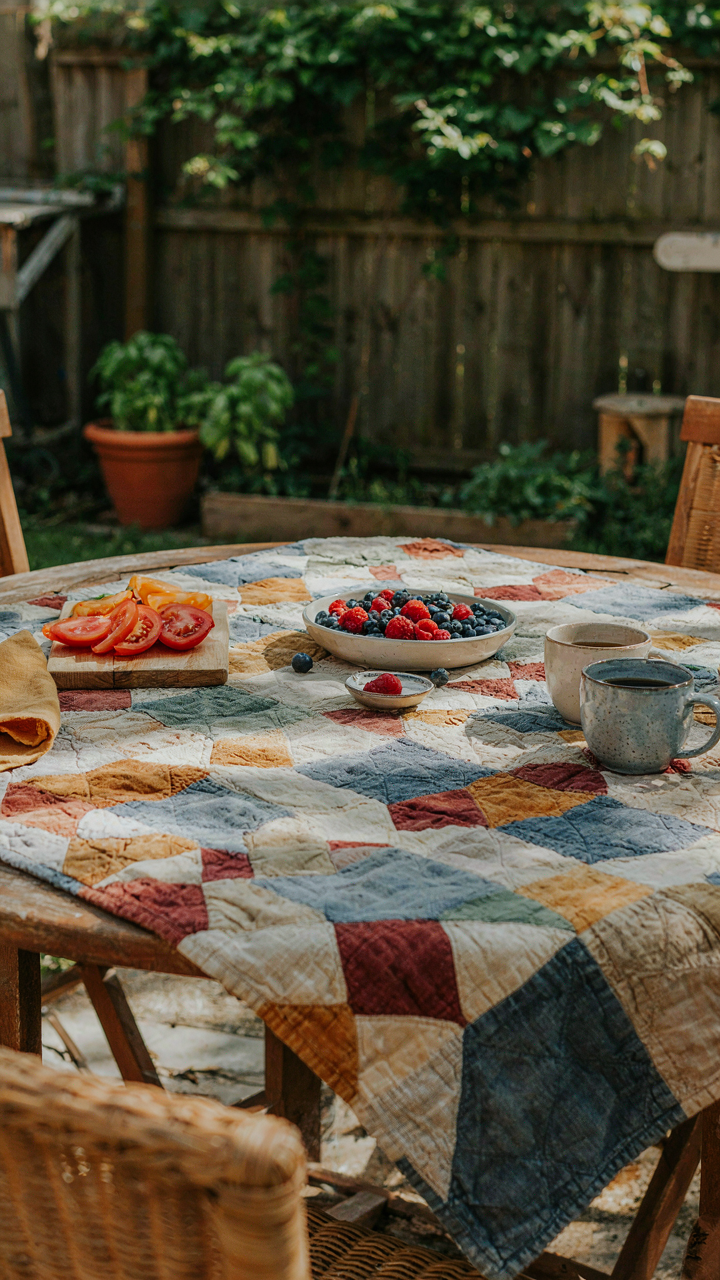
You want people to think you planned this. That’s the real reason you’re reading this section. The mechanism is contrast: a deliberate base layer signals intentionality, even when it costs nothing. Fabric scraps, old sheets, or newsprint function as what designers call “visual anchoring”—they create a bounded frame that makes everything else on the table feel curated rather than thrown together. The dollar store sells kraft paper rolls cheaply. Torn fabric from old linens works identically to expensive linen rentals when layered correctly.
The common advice says to hide cheap materials. Wrong. Expose them as choice. Layer newsprint under kraft paper, then add place settings on top. The texture reads as industrial design, which currently sits higher in status perception than homogeneous table cover. Newsprint yellows over time and tears deliberately—use that. A table that looks constructed beats one that looks concealed. Tear the edges rather than cutting straight lines. This takes thirty seconds and destroys the “budget” appearance entirely.
Found Objects Replacing Charger Plates
Charger plates serve one function: they occupy space and signal formality through scale. Economics teaches us about substitution goods—items that deliver identical utility at different price points. Slate tiles from a hardware store, flat stone from a garden, or even stacked coasters achieve the same visual weight. The dollar store sells ceramic tiles in muted colors. Flip them over, place a dinner plate on top, and the mechanism activates: a visible base layer that justifies the plate’s presence above it.
Skip the matching set trap entirely. Mismatched chargers actually reinforce the intentional-choice signal more than uniformity does because uniformity screams “bought as a bundle.” Alternate between tile, stone, and wood rounds across seats. This requires you to source four to six different objects, which takes longer than buying six matching chargers but costs less and reads as more sophisticated. Scout thrift stores or construction sites for free stone. Lay them out before guests arrive so the table looks settled, not assembled.
The Real Obstacle Isn’t Your Budget, It’s Your Imagination’s Scarcity Mindset
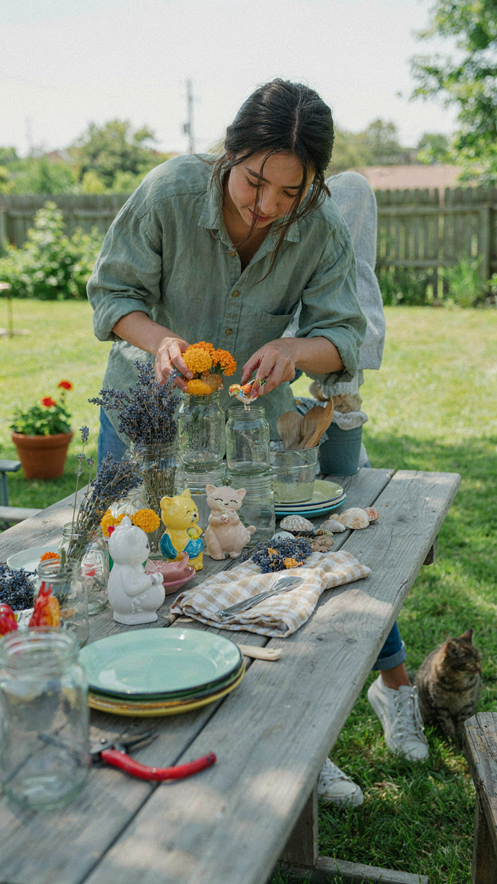
You don’t need money to create a stunning tablescape. You need permission to see dollar store items as raw materials instead of cheap knockoffs. Every person you’ve seen execute a beautiful outdoor dinner faced the same blank table you’re staring at now. They just decided their vision mattered more than their budget. Stop waiting for the “right” supplies to show up. Walk into a dollar store today and buy three things that make zero sense together. That discomfort is where creativity lives.