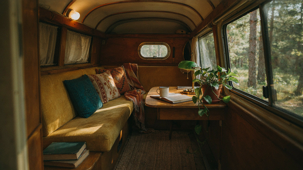
The Faux Vintage Fallacy: Why Your Retro RV Looks Off Brand

When Nostalgia Becomes A Costume
You want people to see your camper and feel something real, not assume you bought a bundle from a home goods chain. The mechanism at work here is signal authenticity, and mass produced retro decor sends the opposite signal. Most people dress their vintage campers with reproductions designed to look old rather than things that actually are old, which creates cognitive dissonance the moment someone steps inside. Your brain detects the contradiction between the aesthetic promise and the material reality.
Real vintage pieces carry the weight of actual use and time. A 1970s Airstream aluminum fixture shows patina and wear patterns that are nearly impossible to fake at scale. Reproduction brass lamps made to mimic midcentury camping accessories lack the slight irregularities in casting, the specific yellowing in the metal, the way authentic materials age. You can’t manufacture history, only imitate its surface. That gap between imitation and authenticity is what makes a space feel staged rather than lived in.
The Material Tells The Story
In materials science, authenticity is determined by the specific composition and degradation pattern of an object over time. Vintage camper decor works the same way: the material composition signals era and legitimacy instantly. Laminate used in 1960s campers has a particular thickness, texture, and way it separates at edges that modern laminate cannot replicate. Real wood paneling from that period has growth ring spacing and finishes that reflect the technology available then, not today’s manufacturing precision.
When you mix genuine pieces with reproductions, the real ones expose the fakes by comparison. A legitimate 1970s camping heater has specific solder joints, weight distribution, and enamel finish that modern manufacturers don’t match because they prioritize cost and speed. The shortcut is to source one or two anchor pieces that are factually vintage, then build around them. This forces you to commit to a specific era rather than sampling from multiple decades, which is the core reason most vintage camper interiors feel chaotic and inauthentic.
The Material Truth: Why Authentic Vintage Camper Interior Starts With Texture

Real Materials Beat Imitation Every Time

You want people to feel the difference between your space and a copy. That’s the real reason texture matters. Synthetic materials broadcast “someone tried to fake this,” and your eye catches it before your brain names it. Vintage campers from the 1950s through 1970s used wood, aluminum, steel, and cotton because those were the available options, not because designers made a trend decision. The authenticity isn’t a choice you make—it’s a material fact built into what lasts and what degrades.
The mechanism here is economic: manufacturers in that era used durable materials because replacement costs were higher and labor was cheaper than materials. A Shasta or Airstream didn’t have laminate because laminate hadn’t scaled yet. They used birch plywood, aluminum frames, and wool upholstery because those materials held resale value and survived years of road vibration. When you swap synthetic for natural materials in a vintage camper, you’re not decorating—you’re returning the object to its original material logic. That coherence is what makes a space feel settled instead of staged.
Wood, Metal, And Fiber Tell The Story Time Wrote
Borrowing from material science: patina is the visual record of oxidation and wear. In vintage campers, you see this most directly in aluminum oxidation on exterior siding, but it works the same way inside. Bare wood darkens from UV exposure and hand oils. Metal hardware develops verdigris. Natural fibers like linen and wool pill and fade according to their chemical structure, not randomly. These materials age predictably because their molecular bonds respond to light, moisture, and friction in documented ways. A reproduction vintage camper made from modern synthetics won’t pass this test because plastic doesn’t patina—it just yellows or cracks.
The practical play: don’t refinish or restore wood surfaces to “like new” condition. Sanding out wear marks erases the evidence that makes the object readable as old. Leave the wood with its original finish or topcoat where safe. Replace hardware, upholstery, and soft goods with period-appropriate natural materials, but keep hard surfaces in their aged state. If you’re sourcing replacement pieces, source them from salvage yards or vintage dealers who pull from actual 1950s-1970s stock. That way, your wood grain, metal patina, and fabric wear patterns all carry the same temporal signature. Everything in the space tells the same story, and nothing contradicts it.
The “Scarcity Principle” Decor Method For Cozy Campers

Limited Space Forces Intentional Choices

You’re drawn to this because you sense that constraints actually create better design than unlimited options. Economics teaches scarcity pricing: when supply is finite, value per unit rises. A vintage camper operates on the same law. You have maybe 200 square feet. Every item must earn its place through function or visual weight, not through decoration filler.
The math is brutal. A 1970s Airstream bedroom has one wall for nightstands, one corner for storage, one narrow shelf for decor. You cannot add a mirror, a plant, a lamp, and wall art without the space collapsing into noise. Vintage camper owners solved this by selecting pieces that served dual roles: a wooden shelf that held both books and a radio, a small rug that defined the sleeping area while adding warmth, a single framed photograph instead of five. This constraint forced clarity.
Beauty And Function Collapse Into One
Most design advice splits these into separate concerns. Wrong. In a confined camper, beauty and function are the same choice or they compete for space you don’t have. A 1960s Formica dinette isn’t beautiful because it looks retro. It’s beautiful because its compact footprint, integrated storage, and durable surface execute function flawlessly. That execution is what reads as beauty.
The decor method is simple: before adding anything, identify what it does. A vintage metal side table holds a lamp and a drink. A hand-stitched throw blanket insulates and covers worn upholstery. A small wooden shelf stores both camp dishes and displays a single decorative item. If an object only decorates, it stays out. Examine each candidate piece for its primary job first, then ask if its visual presence strengthens the space while performing that job.
Beyond Beige: The Strategic Color Palette For Retro Travel Trailers
How Vintage Trailers Actually Used Color

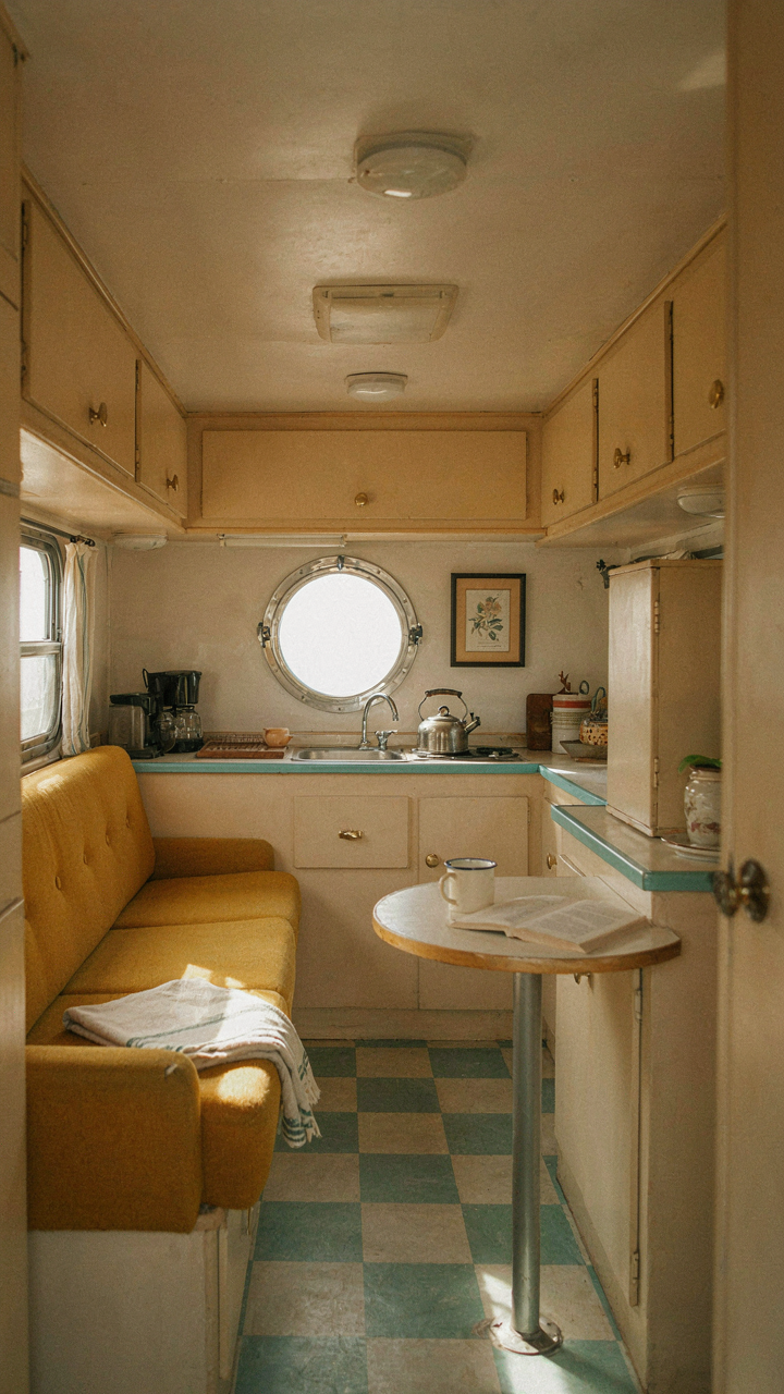
You want vintage camper decor to feel authentic because you’re worried beige-on-beige will read as lazy instead of period-correct. Here’s what actually happened: trailer manufacturers in the 1950s and 1960s deployed color as a psychological anchor for buyers. They weren’t selling transportation. They were selling escape. Avocado, harvest gold, and dusty rose weren’t random. They matched the interior design language of suburban homes, making travel trailers feel like portable status symbols. The mechanism was simple: familiar colors reduced purchase anxiety.
The color palettes of specific eras came from strict constraints. Manufacturers needed paints that adhered to aluminum without primer, resisted UV damage, and stayed affordable. Certain hues dominated because they worked within those material limits, not because designers loved them universally. Coppertone, seafoam, and cream dominated 1950s trailers for this reason. By the 1970s, manufacturers had more chemistry options, so burnt orange and chocolate brown appeared. The takeaway: your color choices should reference what was actually possible to produce, not just what looks good on Instagram.
Restraint Works Better Than Nostalgia Maximalism
Most people get this wrong by loading every wall with period colors and calling it vintage. That creates visual chaos, not coziness. The real mechanism here is contrast scarcity: when everything competes for attention, nothing lands. Vintage trailers used muted tones as the baseline because of economics and psychology combined. A soft cream or pale gray wall costs less to produce and doesn’t trigger visual fatigue during long drives. You layer interest through texture and accent pieces, not by painting everything a different color from 1962.
Start with one dominant neutral that matches your trailer’s original palette. Off-white, soft gray, or pale cream work universally. Then choose a single accent color: deep teal, rust, or forest green. Apply the accent strategically to one wall, cabinet face, or textile. This creates hierarchy without chaos. The accent color should appear in your curtains, a throw pillow, or vintage signage. Repeat it exactly twice more in the space, then stop. This frequency creates recognition without overwhelming the small square footage you’re working with.
The Patina Protocol: Curating Wear, Not Covering It

Embracing Natural Aging As Design

You want patina because it signals you own something real instead of something you bought last month. The mechanism is simple: wear tells a story that finish cannot. A 1970s Airstream with original oxidized aluminum panels carries legitimacy a polished replica never will. Natural aging on vintage campers works like archaeology. Each scratch, discoloration, and material degradation documents actual use. This is not about negligence. It is about recognizing that damage from function beats damage from fakery.
Most people get this backwards and sand everything clean. That erases the primary asset: proof of survival. Original fabric fading, wood grain exposure from wear, and metal patina are not problems to solve. They are evidence to preserve. The key distinction separates campers that lived from campers that merely existed. A faded awning stripe tells you the camper spent seasons outside. A cracked vinyl dashboard shows authentic mileage. Stop treating these as defects. Document them photographically, stabilize deterioration if necessary, and leave the surface alone.
Real Patina Versus Artificial Distress
The vintage design industry sells fake aging because it moves inventory faster than waiting for actual time. Here is what people miss: artificial distressing looks like someone attacked the object with sandpaper and resentment. Real patina has logic. Sun fade follows window lines. Wear concentrates on high-touch zones like cabinet handles and step edges. Genuine rust develops along seams and fasteners where moisture collects naturally. Reproduction distressing scatters randomly because the person applying it has no reason to make it coherent.
Identify authentic patina by tracing cause to effect. UV damage on the south-facing side only. Scratches aligned with storage access patterns. Discoloration marking where liquids actually spilled. Artificial distress breaks this chain. It appears on protected surfaces. It follows no functional map. When evaluating a vintage camper, run your hand across surfaces and ask: does this wear pattern make mechanical sense? If the answer is no, someone manufactured it. Keep original imperfections and remove added ones. This preserves authenticity while stopping active deterioration.
Lighting As Emotion: Crafting Ambiance In Your Vintage Camper Remodel
Stack Light Sources For Depth And Control

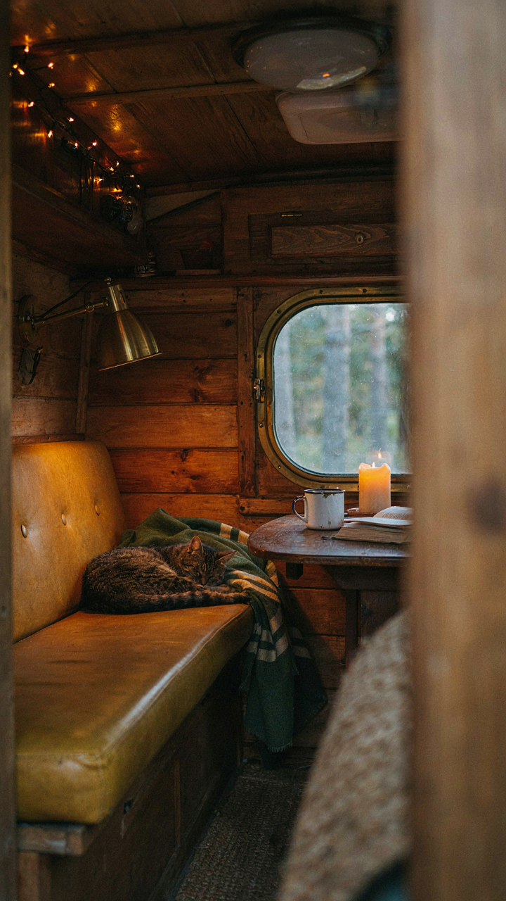
You want the space to feel intentional instead of like you’re camping in a parking lot. The mechanism is simple: physics treats light like a problem of layering. In a small space, one ceiling fixture creates flat, harsh zones. Multiple sources at different heights and intensities let you control what gets attention and what recedes into shadow.
Start with ambient light as your base. A ceiling fixture handles the minimum functional need. Then add task lighting near the galley or dinette where you actually do things. Finish with accent lighting, usually a wall sconce or shelf-mounted piece, that lets you dial the mood down when you’re not moving around. This three-tier approach works because your eye reads variation as intentionality.
Period Fixtures Match The Camper’s Actual Era
Don’t mix signal. A 1972 Airstream demands fixtures from that design language, not something salvaged from a 1950s motel. Midcentury campers used brass, thin geometric forms, and exposed filament bulbs. 1970s models moved toward wood-grain trim, warmer metals, and frosted glass. Matching the fixture to the camper’s year creates coherence. Mismatching it reads as confused, even if you can’t name why.
Hunt for original-period sconces and pendant shades at salvage yards rather than reproduction sites. Original pieces cost less than you think because most people assume they’re worthless. A brass wall sconce from 1968 runs thirty to sixty dollars. Install it where the previous owner likely mounted one, using the existing bracket holes if they’re still there. This keeps the visual logic intact and anchors the whole space in reality instead of nostalgia theater.
The “Function First” Blueprint For Vintage Camper Decorating Ideas

Hidden Storage Beats Surface Clutter

You want your camper to look vintage without feeling cramped, which means you’re afraid empty space makes it look cheap. The mechanism is simple: vintage campers solved storage through built-in architecture, not decoration. Every inch had a job. Modern camper owners add throw pillows and call it done. That’s backwards.
- Underseat compartments: RVs from the 1960s-1980s used bench seating with lift-top access. Restore these or replicate the design with plywood boxes that accept vintage hinges and latches for authentic operation and hidden linens.
- Wall-mounted shelving with rails: Aluminum or wood shelving mounted with era-correct brackets prevents items from sliding during travel. Vintage campers used rail systems; modern ones ignore this entirely for aesthetic reasons.
- Overhead cabinets with magnetic catches: Original campers used magnetic latches instead of handles to maintain clean lines. These still work and cost under ten dollars to source from restoration suppliers.
- Fold-down tables and desks: Hinged surfaces that stow flat were standard in 1970s Airstreams and Travel Trailers. Install one above a bench to create dining or workspace without permanent footprint loss.
- Cabinet dividers and vertical slots: Partitioning inside existing cabinets with wood or cardboard keeps dishes, cookware, and decor organized vertically. This prevents shifting and maximizes usable volume by forty percent.
The reason vintage camper interiors feel intentional is because nothing sat on a surface by accident. Every object either stored something or served dual purpose. Replicate this constraint and your space stops looking like a dorm room.
Design That Works Before It Looks Good
You don’t have room to waste on things that only look nice. In small spaces, the hierarchy reverses. A 1970s Scotty camper lived eight feet long and five feet high. The decorator’s first job wasn’t aesthetics. It was making sure two people could cook, sleep, and store belongings without touching each other. That’s industrial design thinking applied to camping.
Color and texture come second. The vintage feel comes from proportions and restraint, not from finding the right shade of burnt orange. Use cream or soft gray as your base. Add wood tones through original cabinetry or replacement panels that match the era of your rig. Keep textiles minimal: one throw blanket, one or two pillows, simple curtains. Every addition fights against livability. A 35-square-foot bedroom doesn’t accommodate both romance and reality. Prioritize reality, and romance follows naturally from the authenticity itself.
Painted Campers: The Exterior As An Extension Of Interior Narrative
Color Harmony Between Shell And Interior

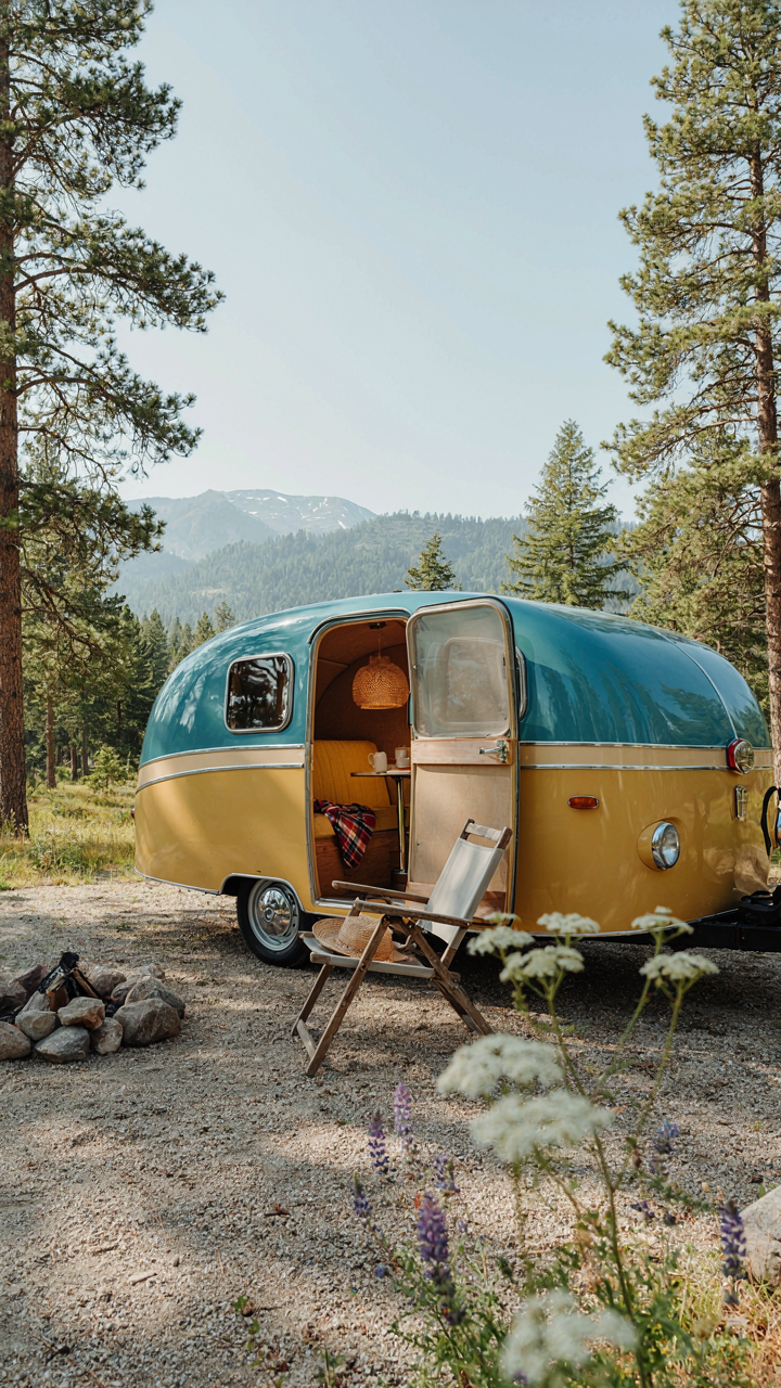
You want the outside to signal what’s inside because people judge the whole unit before stepping in. The real mechanism: exterior color either amplifies or contradicts your interior narrative, and that contradiction creates cognitive friction that kills the aesthetic. A soft sage green exterior makes sense with a mid-century modern pine interior. A hot pink shell with farmhouse white walls inside creates jarring dissonance. Match your exterior palette to your dominant interior wood tone and textile choices, not the other way around.
Think of color as a signal in information theory—your exterior broadcasts what’s contained. A 1970s Airstream painted in period-correct avocado or harvest gold tells visitors the interior will reflect that era before they see it. A travel trailer with a dusty blue-gray exterior sets expectations for cool-toned wood and muted textiles inside. The cohesion isn’t about trendy matching. It’s about eliminating the mental disconnect that makes a space feel scattered.
Modern Protection Without Stripping Character
Everyone says “just repaint.” That’s incomplete advice because wrong products destroy vintage exteriors. Modern UV-stable polyurethane finishes and marine-grade acrylic latex paints preserve original aluminum, fiberglass, and metal siding without peeling the way older enamel formulas did. The difference: modern finishes adhere through chemistry rather than sitting on top. They expand and contract with temperature swings that vintage campers experience daily.
Use a primer rated for aluminum or fiberglass depending on your shell material. Two-part epoxy primers work better than single-part on metal. Apply topcoat in thin, overlapping passes—not thick coats. Sand between coats with 220-grit minimum. This creates mechanical adhesion that prevents adhesion failure. Finish with exterior-grade poly or acrylic latex. The payoff: a 10-to-15-year finish that won’t crack, bubble, or peel like original paint would have after five.
The Caravan Makeover Manifesto: Intentional Imperfection
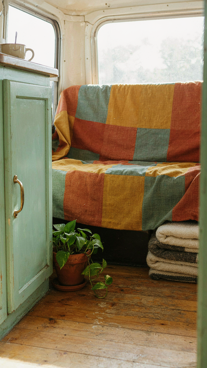
Embrace The Worn, Reject The Showroom

You want your camper to look authentic because you’re afraid a perfect renovation screams “I’m trying too hard” or worse, “I bought this from a catalog.” Here’s the mechanism: authenticity lives in the gap between intention and entropy. Vintage campers earned their character through years of use, temperature swings, and the small failures that come with living in a metal box. You can’t manufacture that by sanding everything to museum quality. The worn patina on aluminum siding, the slightly faded fabric on original upholstery, the hairline cracks in Formica countertops—these aren’t defects to hide. They’re evidence.
Perfection kills the story. A camper that looks like it rolled off the factory line yesterday contradicts the entire category. The 1960s and 1970s rigs that command respect now are the ones where you can read the wear patterns. Original hardware with a bit of verdigris. Water stains on cabinetry that tell you where condensation pooled. These details anchor credibility in a way new parts never will. The move is to restore function and cleanliness while leaving the visual record intact.
Stop Sterilizing The Space
The standard advice is wrong: don’t refinish everything. This impulse comes from watching renovation shows where spotlessness equals success. It doesn’t apply to vintage campers. Think like a conservator, not a contractor. Conservators preserve artifacts by intervening minimally, keeping original materials whenever possible. A camper interior isn’t a house that needs to last another fifty years of family life. It’s a vessel with a specific design language from a specific era. Overrestoration destroys that language.
Strip the function, not the character. Address water damage, replace failing plumbing, rewire electrical systems if they’re unsafe. Leave the original cabinets if they’re structurally sound. Keep the original linoleum or flooring if it’s intact. Replace the engine or furnace, not the interior walls. The goal is a camper that operates reliably and feels like its authentic self simultaneously. When you finish, someone should be able to date the rig by looking at it, not wonder if you bought it last month.
The “Less But Better” Principle: Your Ultimate Camper Interior Guide

Every Object Earns Its Space
You want your camper to feel curated, not cramped, because clutter signals you’ve lost control. The mechanism is simple: each item you own either serves function or carries meaning. Nothing else stays. Vintage camper interiors from the 1960s and 1970s operated under physical constraint. You couldn’t afford dead weight. Modern campers have more storage, but that’s a trap. Intention reverses entropy.
Start by naming the job each object performs. A ceramic mug doesn’t just hold coffee. It occupies three inches of shelf space and requires washing. If it doesn’t solve a problem or anchor a memory, it goes. This isn’t minimalism as aesthetic. It’s logistics. Every item you carry burns fuel and mental bandwidth. Camper living exposes this truth faster than any other environment. Remove one item per week for two months and watch the space breathe differently.
Visual Quiet Rewires Your Nervous System
Psychology calls this “cognitive load.” Your brain processes visual information constantly, and clutter demands processing power you can’t spare in a small space. Order doesn’t feel good by accident. It works. Vintage camper design nailed this by necessity. Wood paneling, simple built-ins, and intentional negative space created visual rest. A cramped camper with every surface covered produces the opposite effect.
The protocol: scan your camper from the entrance. Count how many colors you see. Count how many competing textures. Vintage design typically used two or three colors maximum plus natural wood tones. More than five creates visual noise. Start consolidating. Group similar items together. Use containers that match your existing palette. Hide functional clutter inside closed storage. Leave horizontal surfaces mostly clear except for one or two meaningful objects. This shift moves your nervous system from alert to settled within days.
The Only Thing Dated Is Your Inability To Build On Constraint, Not Just Decorate Around It
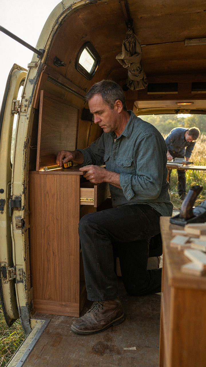
Most people see a cramped camper and decorate it smaller. You should see constraint as your design superpower. Work within 200 square feet forces you to choose. Every piece matters. Every color choice echoes. This isn’t decoration. This is editing your life down to what actually moves you. Pick one vintage camper aesthetic today that matches how you actually want to live, then commit to it ruthlessly. Your space won’t feel cluttered because you refused to keep anything that didn’t earn its place.