The Illusion Of “Bakery Made”: Debunking The Myth
Stop Chasing The Wrong Standard
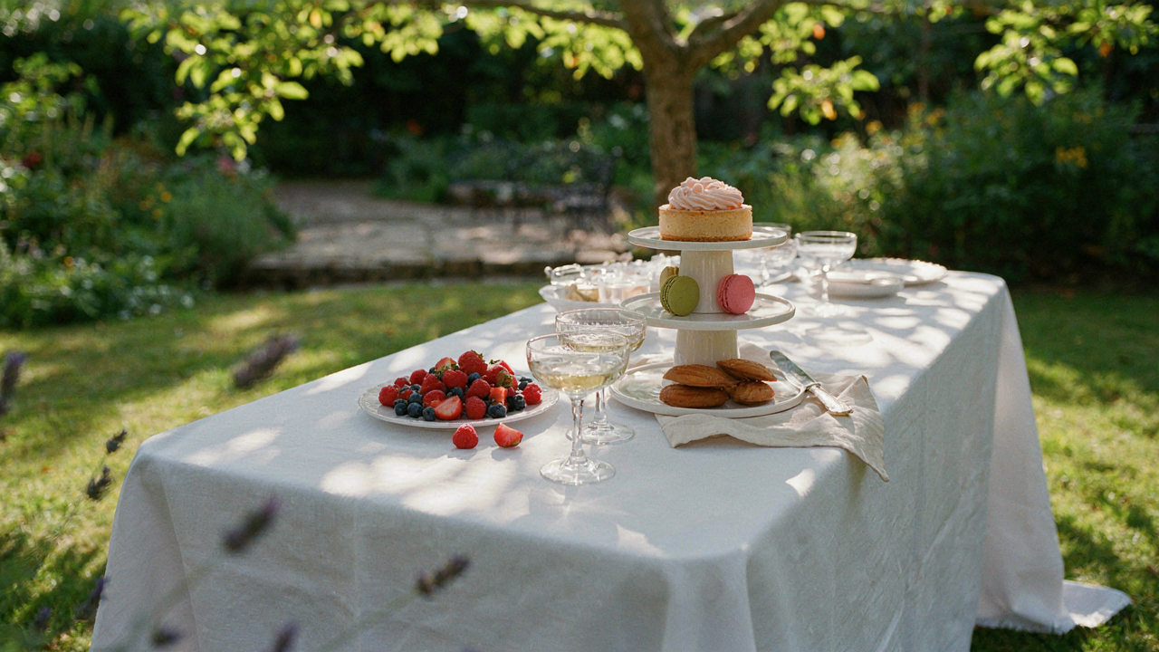
You want people to think you didn’t make this yourself because homemade feels inferior, and bakery made feels like proof of taste. Here’s the mechanism: bakeries don’t actually look perfect. They use constraint as design. A bakery display case is cramped, lit from above, and sits behind glass. Your garden party table has open air, natural light, and proximity. What reads as “polished” in a bakery reads as sterile outside. You’re aiming at the wrong target entirely.
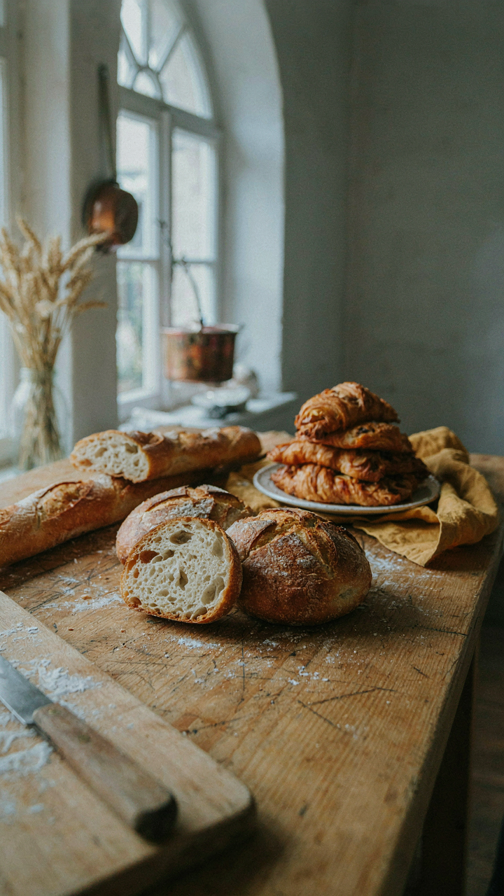
The real gap isn’t skill. It’s that bakeries repeat one formula five hundred times while you make desserts twice a year. Repetition creates consistency, not magic. They also benefit from commercial equipment, bulk ingredient quality, and controlled humidity. You have none of that. Accepting these constraints is the only path to looking intentional instead of trying to look like something you’re not equipped to be.
Perceived Perfection Is Structural Theater
What looks flawless in images is often asymmetrical in person. Photography flattens depth, hides scale, and frames around mistakes. A three-tier cake that photographs as “bakery perfect” might have a hand print on the back nobody sees. Composition in real space requires different thinking than composition in a two-dimensional frame.
The actual execution gap is simpler than you think. Bakeries spend time on speed and repetition. You should spend time on strategic visibility and honest presentation. A hand-frosted cake with visible texture beats a smooth one that cracks under outdoor heat. Arrangement matters more than uniformity. When you stop fighting your medium and start using it, the table stops looking like an amateur’s attempt at professional and starts looking like a host who knows what works outside.
Strategic Simplicity: Your Secret Weapon For Elegant Garden Party Desserts
Fewer Choices, Stronger Impact

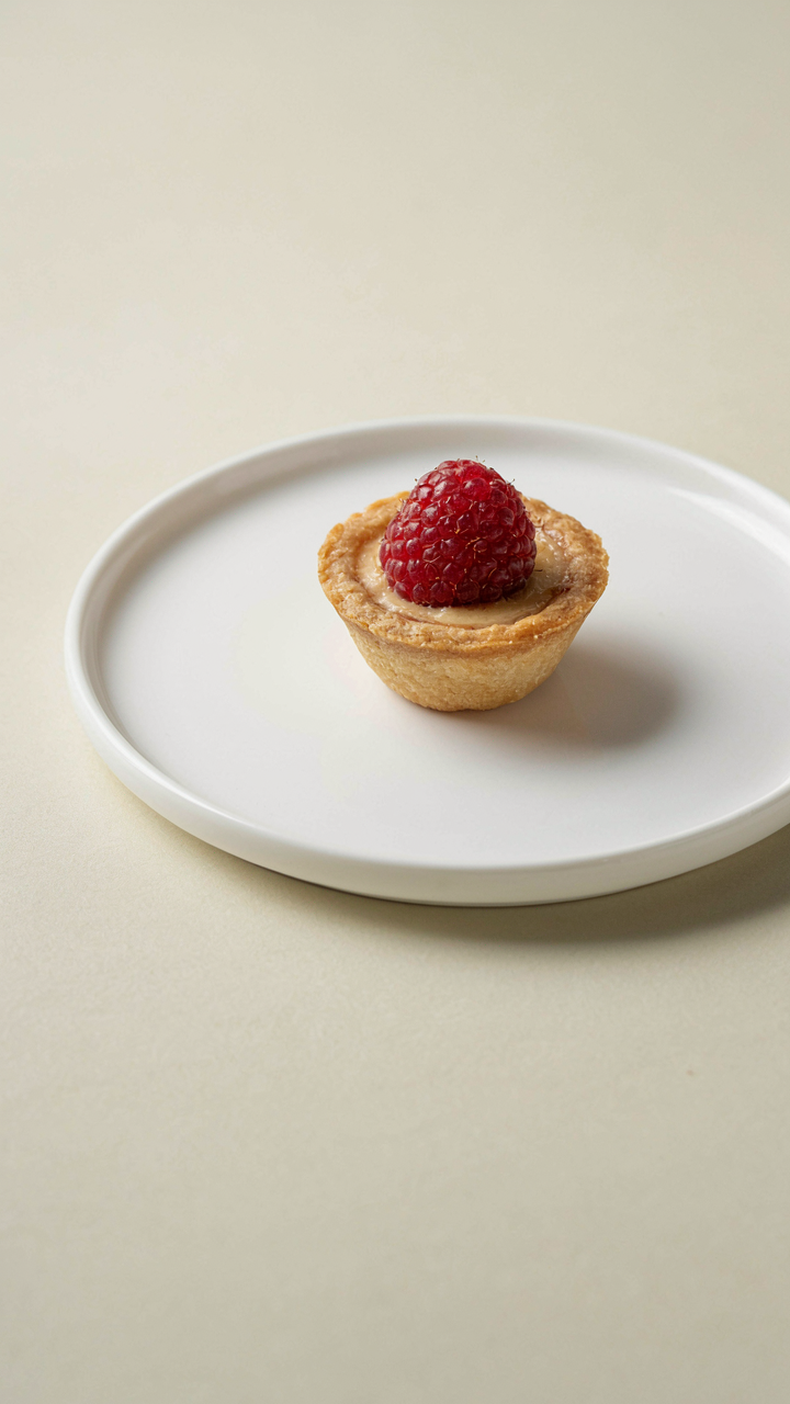
You want people to think you hired a pastry chef. That’s the real fear underneath this decision. Here’s the mechanism: constraint forces intentionality. In visual design, negative space operates exactly like inventory control in restaurants. A five-item menu reads expensive. A fifteen-item menu reads desperate. Your dessert table works the same way. Three to five desserts arranged with breathing room between them signals control and craft. Overcrowding signals panic.
The bakery aesthetic doesn’t come from variety. It comes from curation. When you limit yourself to chocolate cake, lemon bars, and macarons, each item occupies mental real estate. Guests notice the quality of each piece because there’s nothing else competing for attention. They see intention. They assume you spent time thinking about what goes on that table instead of throwing everything you own at it.
Investment In Actual Ingredients
Everyone says “use good butter.” That’s not advice. That’s noise. The real move is understanding that ingredient quality directly replaces decoration labor. A dessert made with European butter, real vanilla, and quality chocolate doesn’t need elaborate plating. It sells itself through taste. A mediocre cake drowning in fondant and edible glitter is masking the problem. A good cake needs almost nothing.
Source your core ingredients first. Buy from suppliers who specialize in baking, not grocery stores stacking inventory. Kerrygold butter, Nielsen Massey vanilla, Ghirardelli chocolate. Real lemon juice, not concentrate. When your base ingredients are strong, your presentation can stay minimal. The dessert will look and taste like it came from a professional kitchen because the inputs were professional grade. Simple plating on a good dessert beats elaborate plating on a weak one.
The “Buffet Sucré” Blueprint: Engineering Desire
Sight Lines And Stopping Power

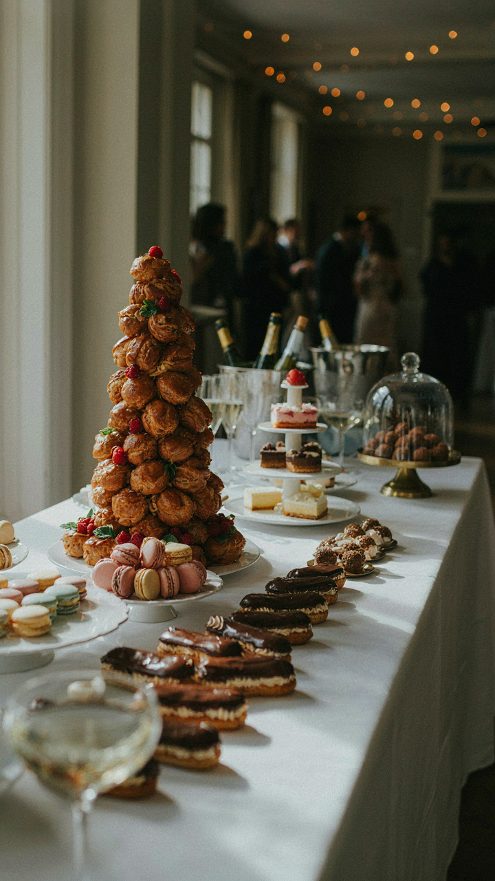
You want people to notice your dessert table and assume you hired a pastry chef. That’s the real reason you’re reading this section. Here’s the mechanism: visual hierarchy controls attention before taste ever enters the equation. Borrow from retail merchandising, which treats high-margin items like focal points. On a dessert table, the anchor is vertical contrast. A three-tier stand holding your best item—say, a layered cake or tiered macarons—stops the eye before horizontal spread does. Guests process vertical first. Height creates perceived value.
The common advice says “arrange by color” or “create balance.” Wrong frame. Arrangement serves one job: make the best item unavoidable. Position your statement dessert at eye level when guests approach from twelve feet away. Flatter spreads blur together. A single elevated piece reads as intentional, expensive, professional. Use a cake stand, wooden box, or tiered structure. The surface below matters less than the vertical pop. Guests will assume the entire table matches that top piece’s quality because you’ve anchored their expectation there first.
Entry Point And Hand Motion
Flow determines how many desserts guests actually eat, and how long they linger. Think of it like foot traffic design in a retail space—guests need a clear entry point and a logical path that doesn’t loop back on itself. The table shape and placement control this entirely. A rectangular table positioned parallel to guest approach works better than corner placement because people don’t have to circle or lean across bodies. Start the dessert sequence at the left end (where most people naturally begin reading visual information) with lighter, smaller items: macarons, petit fours, tarts. Build toward denser, larger pieces at the right end: cakes, brownies, pastries requiring both hands.
Serving utensils matter more than most hosts admit. Small tongs or dessert forks let guests move quickly without thinking. If you force plate-and-fork navigation, you kill momentum and create congestion. The mechanism is friction reduction. Guests will eat more variety and stay longer when they move through without hesitation. Place napkins at the entry point, not scattered across the table. This creates a natural grab-pause-browse rhythm that feels curated rather than chaotic. End the table run with something that closes the experience: water glasses, coffee cups, or a small chocolate to finish.
Bridal Shower Desserts: Scaling Down Without Sacrificing Impact
The Constraint Becomes Your Advantage

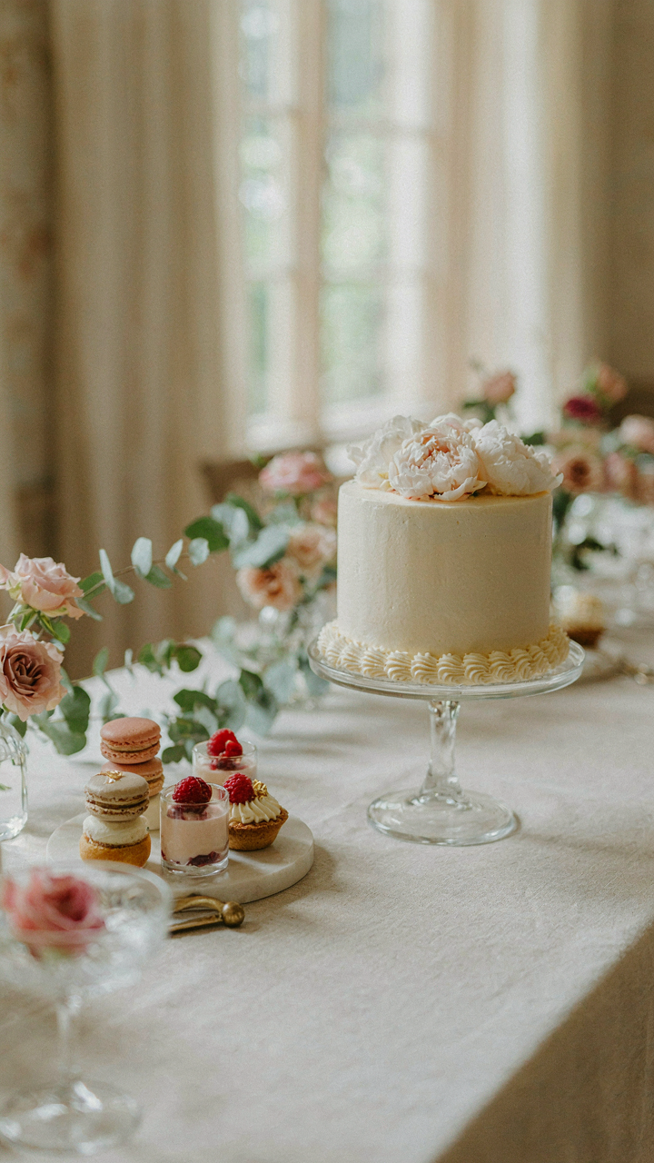
You’re worried a smaller guest count means the dessert table looks sparse and cheap. Here’s the mechanism: constraint forces specificity, and specificity reads as intentional. A bridal shower with thirty guests lets you build a dessert display around quality over quantity. Three perfectly executed items beat twelve mediocre ones. The economics work backward from what you expect. You spend less total money but allocate it where it lands visually.
Intimate gatherings demand density, not volume. Calculate your pieces per guest as the first move. For thirty people, fifteen to twenty total pieces across all items keeps the table full without waste. Focus on height variation and negative space. Two tall cake stands, one low ceramic platter, and one mid-range tiered server create visual rhythm. The eye moves, finds something new, perceives abundance.
The Personalization Trap
Everyone says add personal touches. That’s vague enough to paralyze you. The real move is functional personalization, not decorative. Build each dessert type around something the bride actually consumes or remembers. One signature flavor replaces ten generic options. If she loves lemon, make lemon bars. If she mentions raspberry, source that for one featured item. This isn’t sentiment masquerading as design. It’s strategic editing that eliminates decision fatigue for guests and reduces your prep burden.
The display mechanics matter more than the story you attach. Stack macarons in clear acrylic boxes with printed labels showing only the flavor and one ingredient highlight. Arrange mini tarts in rows by color gradient, not narrative. Use plain white or cream-colored platters and stands. This removes visual noise and lets each dessert read as deliberate choice, not filler. The guest experiences curation, not clutter, because you eliminated everything except what deserves to be there.
The Terroir Of Treats: Local Sourcing For Authentic Flavor
When Fruit Ripeness Actually Matters

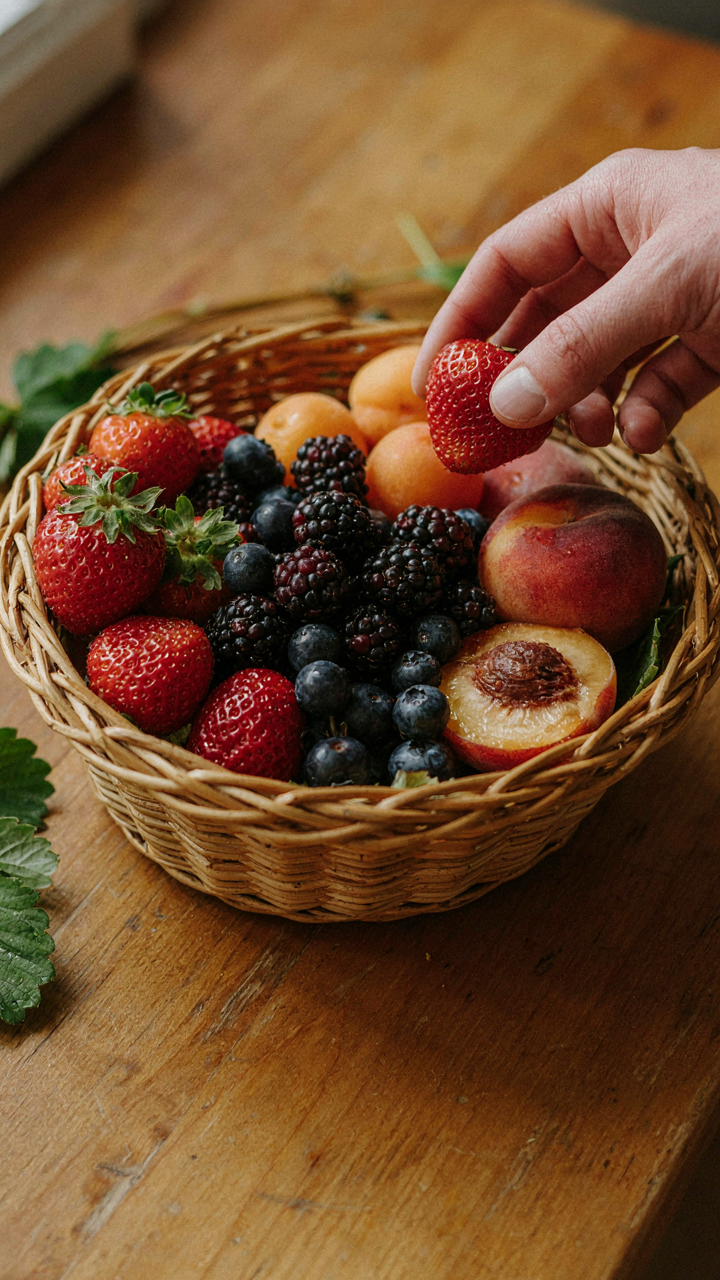
You want your dessert table to look like a bakery made it because you know people judge competence by presentation, and local fruit signals you didn’t just buy commodity garbage. Here’s the mechanism: fruit ripeness isn’t a vague quality. It’s sugar content. A strawberry picked ripe has roughly double the sugar density of one picked green and ripened in transit. That sugar caramelizes differently in a tart. It hydrates differently in a compote. The difference shows as visual depth, not brightness.
Seasonal availability forces constraint. Constraint forces creativity. A June table built around early stone fruit hits different than a July table scrambling for berries. Local farms harvest at actual ripeness instead of two weeks before. You get fruit that holds structure in filling, that doesn’t weep into crust, that photographs with genuine color variation instead of waxy uniformity. This is why a local sourced dessert looks intentional and a supermarket one looks like backup plan.
Garden As Design Anchor
Borrowing from landscape design, a garden party dessert table should use color harmony, not novelty. Your surroundings aren’t wallpaper. They’re the constraint that determines what works. If your setting has established plantings, roses, hydrangeas, mature trees, your desserts should echo that palette through actual ingredient color, not decorative paint.
Local sourcing creates this naturally because regional produce has adapted to regional light. Berries from nearby farms ripen under the same sun hitting your garden. Colors sync. A blackberry from fifty miles away has the same anthocyanin profile as the ones growing in your region’s soil. Pull ingredients from your actual geography and the table stops feeling imported. It looks grown, not bought.
Uncommon Containers: Elevating Small Dessert Table Set Up
Height Creates Hierarchy Without Space

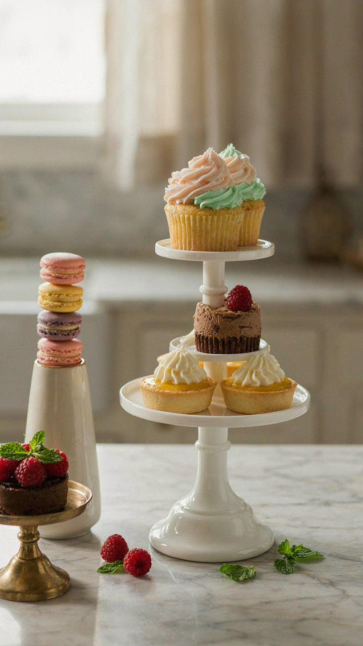
You want guests to think you hired a professional. That’s the real concern here. The mechanism is physics: leverage. Height multiplies perceived value while consuming zero horizontal real estate. A dessert table uses elevation the same way military logistics uses terrain—to control sight lines and direct traffic flow without adding square footage.
Stack containers vertically instead of spreading horizontally. Use cake stands, wooden boxes, or tiered risers to create three distinct levels across your table. The eye processes a layered display as more abundant and intentional. Most people pile everything flat and wonder why their spread looks sparse. You won’t. Varied heights force guests to scan the entire table rather than grabbing from the front row.
Access Flow Determines Guest Experience
Military logistics teaches one principle: minimize friction at chokepoints. Your dessert table operates under the same constraint. A crowded table with poor positioning creates a bottleneck where guests block each other, conversations stall, and desserts topple. The real problem isn’t the size of your table—it’s the path guests must take to reach it.
Position your containers so guests approach from one side and exit from another. Place small-bite items at entry points, larger plated desserts in the middle zone, and serving utensils at the exit where hands are free. This creates directional flow instead of a scrum. Stack napkins and plates at the approach point, not scattered throughout. Guests move through a sequence, not a maze. The mechanism is positioning: arrange containers to create a one-way traffic pattern that prevents collisions and keeps momentum high.
Flower Garden Party: Integrating Flora Without Overkill
Strategic Placement Beats Visual Chaos

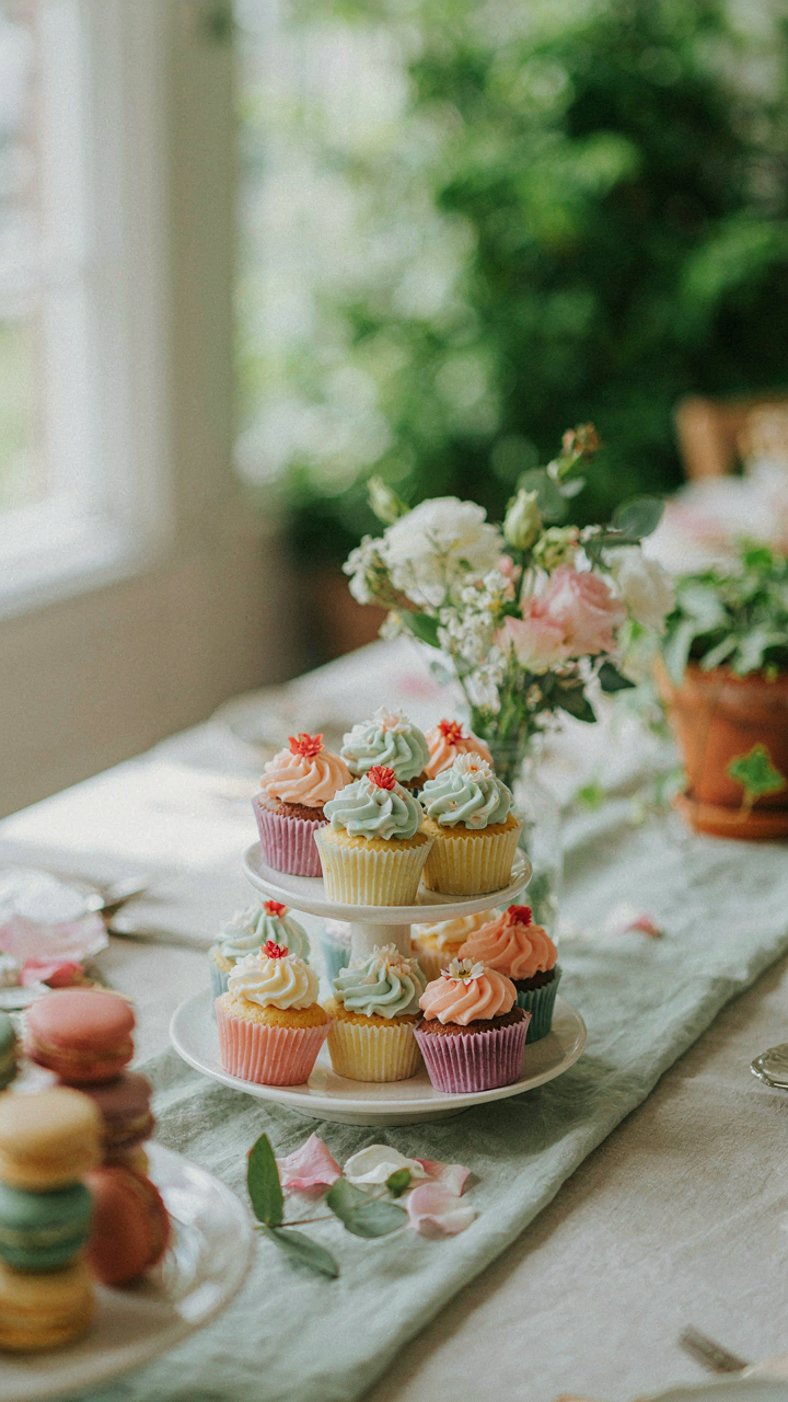
You want flowers on the dessert table because they signal care and expense without actually requiring skill. Here’s what nobody says: flowers compete with desserts for attention, and desserts should win. Use constraint like a designer uses negative space in layout. One focal arrangement behind the table, positioned high enough that guests see it before scanning downward to the food. Skip the scattered blooms around platters. They look intentional that way instead of like decoration someone forgot to remove.
Scale matters more than abundance. A single large arrangement (18 to 24 inches tall) at the table’s center-back creates depth and frames the desserts without crowding them. Choose blooms that don’t shed petals into food: roses, dahlias, or ranunculus hold structure. Avoid heavily scented varieties like gardenias or lilies, which overpower the smell of baked goods and confuse the sensory experience. Position the arrangement so it doesn’t block sightlines to your best-looking desserts from any angle where guests approach.
Color Harmony Over Floral Maximalism
Matching your blooms to your dessert palette is the mechanism that makes the table read as intentional rather than hodgepodge. Think of color temperature as a design system. If your desserts lean warm (caramel, chocolate, gold leaf), use warm-toned flowers: peach ranunculus, coral roses, or cream dahlias. If you’re working with pastels and berries, cool tones work: pale pink, lavender, or white blooms. Never mix both warm and cool unless you’re explicitly working with a neutral palette that anchors everything.
The practical move: choose your dessert colors first, then select flowers that sit one shade lighter or darker than your dominant sweet. This creates visual rhythm without collision. Greenery (eucalyptus, dusty miller, or Italian ruscus) adds volume without adding noise. Skip variegated foliage and anything too architectural. Your dessert table should feel refined, not like a wedding ceremony centerpiece. The flowers exist to make the food look more expensive and intentional, period.
Wedding Dessert Table: From Compromise To Cohesion
The Real Cost Of Saying Yes To Everything

You want to please everyone because you’re afraid someone will remember what you didn’t serve. The mechanism is simple: unlimited choice kills cohesion. When you treat a dessert table like a democratic voting booth where every guest gets representation, you create visual noise instead of a designed space. The table collapses under its own contradictions. You need constraints, not variety.
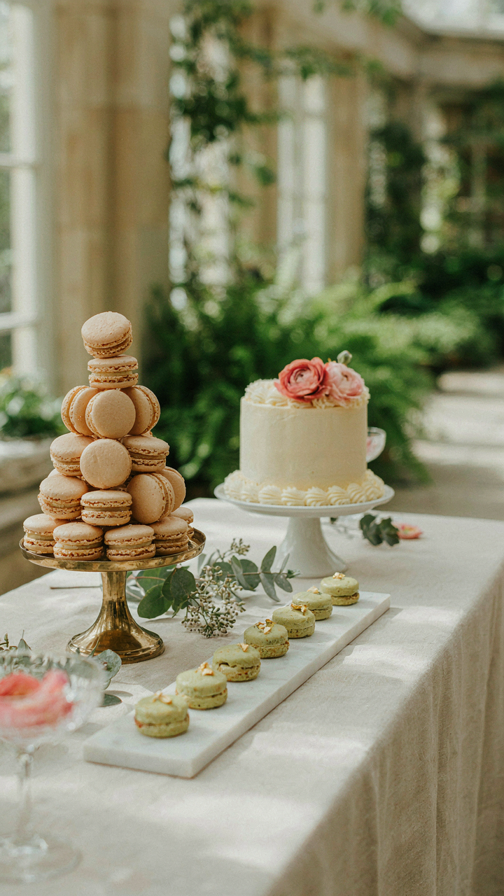
Economics calls this the paradox of choice. Apply it here: limit your dessert types to three, maximum four. This isn’t restriction. It’s the difference between a curated collection and a clearance rack. A wedding dessert table with six different cakes, three types of cookies, macarons, brownies, and fruit tarts reads as indecision. Four pieces, strategically selected for flavor contrast and visual consistency, reads as intention. Guests remember the table that knew what it was serving, not the one that tried to be everything.
Shape Your Selection Around Real Constraints
Stop pretending you can accommodate every dietary preference on the same table without it looking fragmented. You can’t, and trying wastes real estate and creates logical problems. Instead, stack your constraints intentionally. Decide first: is this table for guests with no restrictions, or are you building it around specific dietary needs? Pick one anchor point. Then build everything else from there.
If you choose the no-restriction path, your three core desserts should vary in texture alone: one soft (cake), one firm (cookie or tart), one smooth (mousse or panna cotta). Add one wildcard if the table size justifies it. This works because texture diversity keeps the eye moving and the palate engaged without forcing you to chase every preference. Your job is to serve good desserts well, not to serve all desserts adequately. Execute the latter, and you fail at the former.
The Asymmetry Advantage: Breaking Free From Rigid Symmetry
How Visual Weight Beats Mirror Images

You want people to think your dessert table was curated by someone with taste, not assembled by someone following instructions. The mechanism is borrowed from graphic design: visual weight. In design, weight refers to the perceived heaviness of an element based on size, color, and density. On a dessert table, a tall cake on the left needs counterbalance on the right, but not a matching cake. That’s the trap everyone falls into.
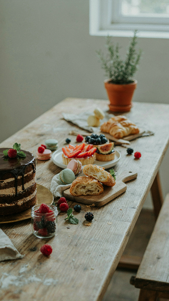
Symmetrical layouts feel safe because they’re easy to execute and hard to fail at obviously. They also feel corporate, templated, and forgettable. The moment you see two identical tiered stands flanking a centerpiece, you’ve seen every garden party dessert table from the last decade. Break symmetry by placing your tallest element slightly off-center, then balance it with a lower, denser cluster of smaller items on the opposite side. The eye still finds rest, but the arrangement signals intention.
Irregular Spacing Creates Movement
The common mistake is treating negative space as wasted real estate. It’s not. Strategic gaps between desserts create sight lines that move the viewer’s eye around the table rather than letting it settle and stop. When everything is evenly distributed, the eye lands, catalogs, and leaves. Irregular spacing makes people lean in, scan, and spend time.
Place your focal point dessert where it breaks the expected grid. If your table is eight feet long, put a statement cake at the two-foot mark instead of the four-foot center. Let macarons cluster tightly in one corner while individual plated items sit isolated elsewhere. This variation in density makes the arrangement feel discovered rather than designed, which is the entire aesthetic you’re after.
Baking The Best: Wedding Desserts That Don’t Compromise
Flavor And Texture Over Everything
You’re worried people will judge you for a mediocre dessert table. That fear drives most hosts to overstuff the spread with quantity instead of asking what actually tastes good. The mechanism is simple: your palate registers three things at a garden party—temperature contrast, structural integrity, and whether the thing melts or breaks cleanly. Everything else is decoration.
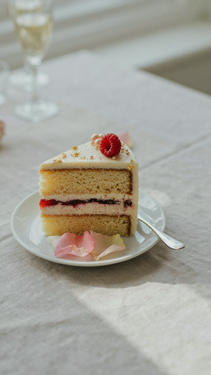
Forget the consensus that more options mean success. A chocolate cake that stays moist for four hours under sun beats five dry sheet cakes that crumble. Temperature contrast sells the experience. Pair warm items with cold components. Cold cream against warm cake. Cold fruit against room-temperature mousse. Your guests taste the difference before they think about it.
- Moisture retention in heat: Glazes, syrups, and crumb structures that resist drying. Test desserts 30 minutes in direct sun before the event to catch failures early.
- Structural integrity at serving: Cakes that slice clean. Pastries that don’t shed layers. Avoid overly fragile constructions that fall apart under a fork in front of guests.
- Temperature contrast pairing: Warm pound cake with cold berry compote. Chilled mousse with room-temperature chocolate sauce. The shift matters more than individual components.
- Texture layering: Combine soft, crispy, and chewy in single bites. Brittle shortbread with silky ganache. Meringue with fresh fruit and cream.
- Flavor clarity: Remove confusion. Each dessert should taste like itself. Chocolate tastes like chocolate. Lemon tastes sharp. Vanilla tastes rich. No competing signals.
Most desserts fail not from technique but from poor planning. You bake the night before, store it wrong, then watch it fall apart at 2 PM. Bake what holds. Choose recipes designed for sitting, not recipes that demand immediate serving. The bakery look comes from confidence, not precision.
The Power Of One Signature Dessert Done Right
Depth beats breadth. This principle comes from manufacturing: you produce one part perfectly rather than five parts poorly. Apply it here. One killer chocolate torte outperforms a table with six forgettable options. Guests remember what moved them, not what crowded the table.
Choose one dessert you’ve made ten times. Your hands know the temperature, timing, and texture. You spot problems before they become disasters. The second dessert should be something you’ve also mastered—not a new experiment. A fruit tart. A lemon bar. Something that complements the star without competing. That’s it. Two items, each flawless.
The instinct to add more comes from insecurity, not strategy. One stunning dessert signals control and intention. A table buried in options signals you lacked confidence in any single thing. Your guests will eat one or two items anyway. Make those two items unforgettable. Bake only what you’ve rehearsed until repetition kills the anxiety.
Your Fear Of Imperfection, Not A Lack Of Recipes, Is Sabotaging Your Dessert Table
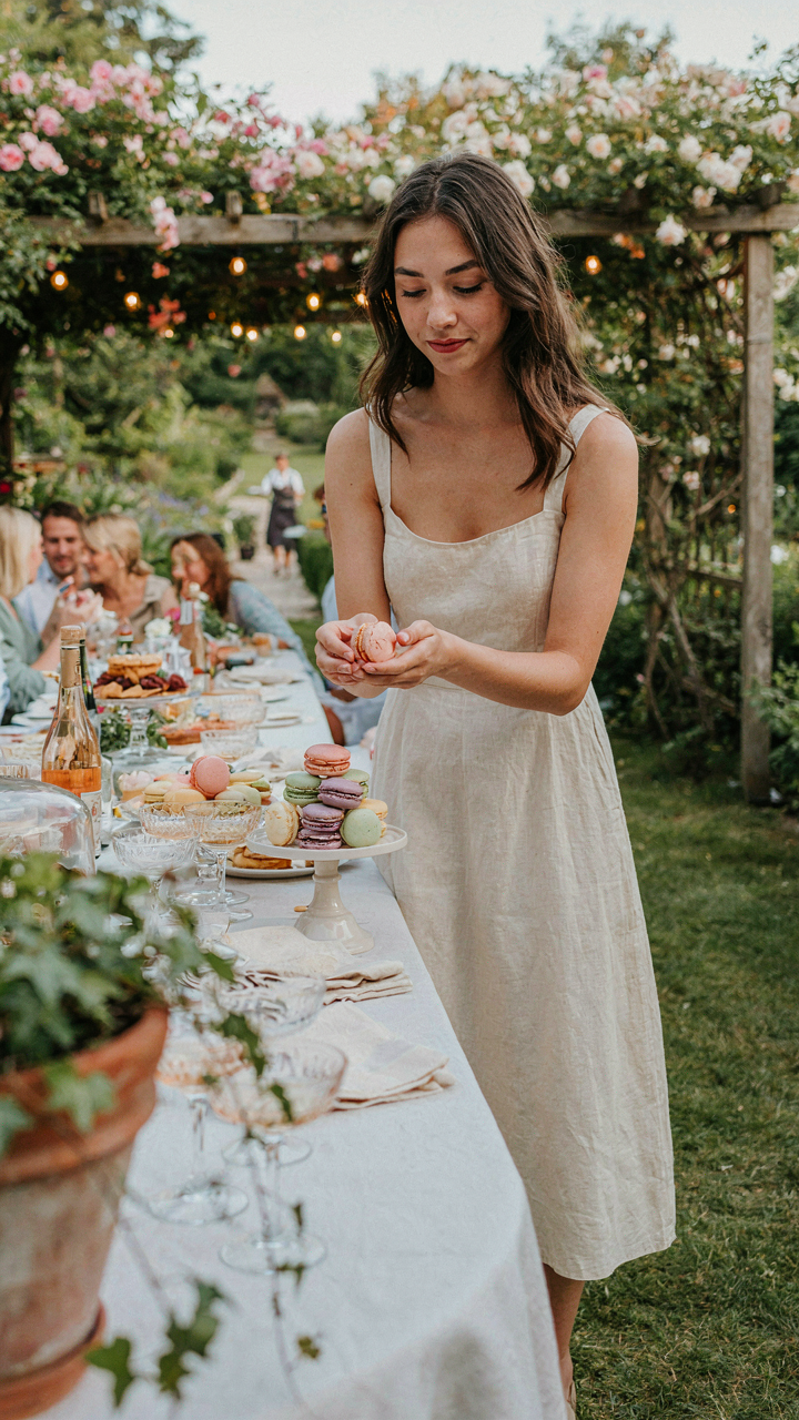
You already know how to make a garden party dessert table look expensive. You’re scrolling past the knowledge every day. What stops you is the voice in your head saying your macarons won’t stack right or your fruit won’t arrange like the photo. That voice is a liar. Set out what you make today. Imperfect beats imaginary every single time.