
The Illusion Of Choice: Why Generic Labels Fail

What Guests Assume About Empty Space
You want people to think your spread is effortless and abundant, so you skip labels on half the dishes. That’s the real move here, and it backfires every time. When a guest encounters an unlabeled dish, they don’t assume quality or mystery. They assume you forgot, or worse, that you don’t know what’s in it. That uncertainty triggers hesitation, and hesitation means they eat nothing or grab the labeled item instead.
The mechanism borrows from information theory. In data, missing information isn’t neutral—it’s interpreted as noise. A guest standing at your table experiences the same gap: they fill the void with doubt, not imagination. They’ll ask other guests what something is, creating a bottleneck of questions at your table. Some skip the dish entirely. Others take a tiny portion out of caution. A simple label moves them past that friction point in under a second.
The Real Cost Of Ambiguity
The advice to “keep it casual” or “let guests discover” misses the point entirely. Ambiguity doesn’t create engagement. It creates work for your guests and liability for you. Someone with a shellfish allergy stands at your table and can’t eat anything because three dishes lack allergen information. They leave hungry or annoyed. Someone else grabs the spicy appetizer without warning and spends ten minutes looking for water. These aren’t edge cases—they happen at every self-serve table.
The hidden cost is decision fatigue multiplied across your entire guest list. Each unlabeled dish forces a micro-negotiation in someone’s head: Do I want this? Can I eat this? Is this worth the risk? Multiply that by twenty guests and five unlabeled items, and you’ve created unnecessary cognitive load at an event meant to be low-friction. Labels solve this in seconds. The protocol is simple: identify every dish, flag major allergens, note temperature or texture if relevant, then step back and watch guests move through your table with actual confidence.
The Dan Koe Method: Strategic Information Deployment

What Your Guests Actually Need To Know

You want labels to look effortless because you’re terrified of appearing neurotic about food details. The mechanism is friction reduction. Every unlabeled dish forces a guest to make a choice under social pressure: ask you directly, guess based on appearance, or skip it entirely. Labels eliminate that friction before it creates anxiety. The real work isn’t making labels look nice. It’s predicting which questions your guests will have before they ask them out loud.
Most hosts treat labels as decoration. They’re not. A label is a compression of information that would otherwise require a conversation. Allergens top the list because guests need this before touching anything. Secondary details like “contains nuts” or “dairy-free” answer the second wave of questions. Temperature indicators matter too. A “serve cold” label prevents someone from eating potato salad that’s been sitting out for two hours. Deploy labels strategically: place them directly above or in front of the dish, large enough to read from standing distance, specific enough to eliminate ambiguity.
Labels As Behavioral Anchors
This borrows from behavioral economics, where anchoring describes how the first piece of information a person receives shapes all their subsequent decisions. A label functions as an anchor. “Homemade” anchors guests toward perceived quality. “Gluten-free” anchors dietary compliance before someone reaches for it. “Spicy” anchors pain tolerance expectations. You’re not providing context for politeness. You’re controlling the frame before guests form an opinion or make a mistake.
The second anchor is ownership and source. Labels that say “brought by Sarah” or “store-bought” create psychological distance. Guests eat differently when they know something was made by someone present versus purchased. This isn’t snobbery. It’s how humans evaluate risk and intention. A label reading “contains shellfish” becomes a compliance checkpoint. A label reading “shrimp dip from Mark” becomes a social data point that influences consumption. Deploy ownership labels for items where guest perception matters to your social positioning, and allergen labels everywhere else without exception.
Diy Food Labels For Party: Beyond Pinterest Aesthetics

Make Labels Work Before They Look Good

You want your labels to look intentional because you’re afraid they’ll scream “I tried too hard” or worse, “I didn’t try at all.” The real mechanism is readability under poor lighting at arm’s length. A label that looks great in your design app but vanishes when someone stands three feet away at a buffet table is decoration, not function. Start by answering one question: can a guest identify the food and its allergens in under two seconds from a standing position? Everything else is secondary. High contrast between text and background solves this. Black text on white or cream background beats every trendy color combination. Font size matters more than font choice. Ten-point type looks sophisticated in a design mockup. It disappears under string lights. Go 16 points minimum for the main food name. Allergens and dietary notes can run smaller, but not below 12 points.
Position trumps aesthetics in every dimension. Labels should sit where eyes naturally land when someone approaches the table. This means placing them directly in front of or slightly below each dish, not off to the side or behind serving utensils. Guests shouldn’t have to lean in or move items to see what they’re eating. This is a logistics problem, not a design problem. Solve it first, then layer in your visual preferences.
Paper, Plastic, And The Materials That Hold Up
These materials matter because they either disappear into the background or become the disaster everyone remembers.
- Card stock (80-110 lb): Holds its shape through humidity and movement. Resists wilting when placed near ice or steam. Use white, cream, or light gray to maintain contrast and readability.
- Laminated cardstock: Adds water resistance without bulk. Protects against condensation from beverage stations. Slightly more expensive but survives a full evening without deteriorating at the edges.
- Kraft paper: Aesthetic choice that works only if you prioritize appearance over durability. Absorbs moisture quickly, causing text to blur. Avoid if your table is near a drink station or outdoors.
- Plastic tent cards: Rigid structure keeps labels upright without external support. Reusable across multiple events, reducing per-use cost. Standard 3×5 or 4×6 sizes fit most table setups without looking oversized.
- Handwritten on cardboard: Conveys authenticity but requires legible handwriting and protection from smudging. Use permanent marker, not pen or pencil. Only viable if you have clear, consistent handwriting that reads from distance.
Avoid materials that warp, absorb moisture, or require constant repositioning. Tent cards beat flat labels because they don’t slide around or flip over when someone brushes past. Lamination adds five to ten minutes to your prep but eliminates the high-stress moment of watching a label dissolve halfway through your party. Buy materials that let you set the label and forget it.
The Signaling Theory Of Buffet Labels DIY

When Labels Signal Scarcity Instead Of Abundance

You want labels because you’re afraid guests won’t eat what you’ve made. That’s the real fear underneath this. Here’s the mechanism: economics calls this “perceived scarcity,” and it works on buffet tables the same way it works in retail. A label doesn’t just inform—it constrains mental availability. When a guest sees “Chef’s Special Herb Dip” instead of an unlabeled bowl, their brain registers intentional curation, not leftovers. The label creates the perception that this item is limited, chosen, worth trying before it runs out. Your guests subconsciously believe labeled food is more valuable than unlabeled food, even if the contents are identical.
This isn’t psychology theater. Retailers proved this decades ago. The label does the work of making your effort visible. Without it, a dish sits invisible in plain sight. With it, the same dish becomes a selection worth investigating. The mechanism is pure information asymmetry: the label bridges what you know about your food and what guests can infer about it. Write the label, reset expectations, and watch consumption change. Guests stop grazing and start deciding.
Host Effort Becomes Visible Only When Named
Most advice says labels “add polish” or “look nice.” That’s incomplete. Labels are the only mechanism that proves you planned this. A bare table reads as convenience. A labeled table reads as intent. When you take thirty seconds to write “Roasted Garlic and Rosemary Olives,” you’ve done something the unlabeled bowl next to it hasn’t: you’ve made your work legible. Guests don’t see the shopping, prep, or arranging unless you force them to. The label forces them to see it.
Intentionality is a status signal disguised as information. It tells guests you didn’t just dump food on a table and hope. You considered which items needed explanation, which needed emphasis. You separated the store-bought from the homemade. You valued their time enough to eliminate guessing. This costs you two minutes per label. The return is guests who understand your effort existed, and therefore eat more deliberately, not out of obligation or uncertainty. Label every homemade item and every item requiring dietary context. Leave store-bought basics unlabeled. The contrast teaches guests what you actually cared about.
How To Make Food Labels For Party: The Efficiency Imperative

Batch Your Templates And Reuse Them

You want to look organized without actually spending three hours on design—that’s the real reason you’re reading this. The mechanism is simple: batching removes decision fatigue by collapsing identical choices into a single action. Create one label template, fill it with different food names and allergen info, print it once. Done. Don’t design each label individually. That’s the tax you pay for perfectionism nobody will notice.
Most people waste time because they treat each label as a separate project. Wrong approach. Design a standard 3×2 inch card with your font, color, and spacing locked down. Use the same template for crackers, dips, desserts, and proteins. Change only the text. Print on cardstock, cut once, stack them. Your actual workload drops by 80 percent the moment you stop treating variation as freedom.
Design Choices That Stop You Dead
This is where people get stuck: they think the design matters more than the information. It doesn’t. The label serves one function—communicate what’s in the dish and what it might hurt someone. Pick a sans serif font. Pick black or dark gray text on white or light cardstock. Done. Your guests don’t care if you used Helvetica or Arial. They care if they can read it from three feet away and if it tells them whether the dip has nuts.
Common advice says make it “fun” or “match your theme.” Ignore that. A readable, consistent label works across every party setting forever. Print once, reuse the template. Keep allergen categories consistent: nuts, dairy, gluten, soy. Use the same order on every label. Your brain stops hunting for information. You actually save money by not reprinting custom designs for each event. Consistency is the real efficiency play.
Free Printable Food Labels: When “Free” Costs You More
The Markers Of Rushed Execution

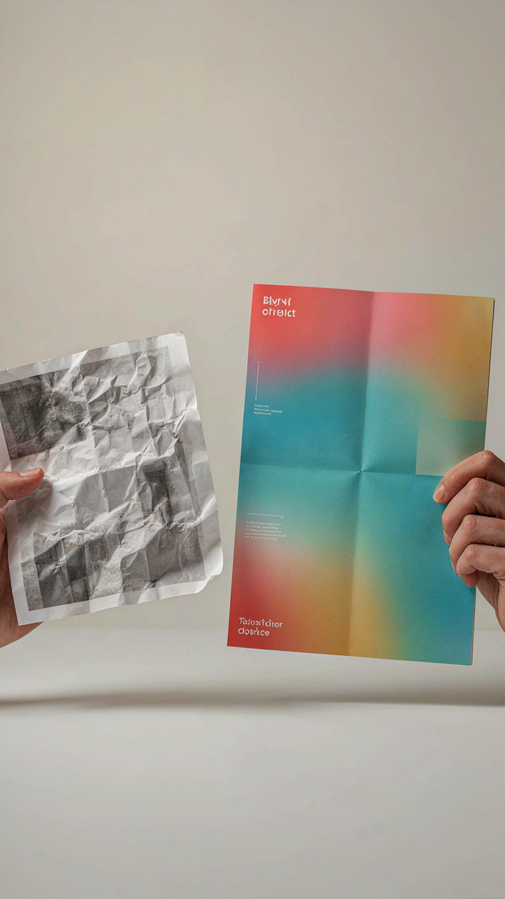
You want free because you think it saves money. It doesn’t. The mechanism at work here is signal degradation—borrowed from information theory, where noise corrupts the message. A blurry, generic template label is noise. It tells guests you didn’t care enough to solve the problem, which means they won’t care enough to trust what’s on the table.
Generic printables use thin fonts, clip art from 2003, and placeholder text that screams template. They sit loose on toothpicks or tape that peels. Guests register this immediately. The label isn’t communicating allergen information or dish names—it’s communicating negligence. You paid zero dollars and zero attention, and everyone knows it.
Custom Design As Intentionality Made Visible
Customization isn’t about looking fancy. It’s about proving you made a choice. A label with your party’s actual date, a font that matches your table’s aesthetic, or text that reflects how you actually describe the food signals that you thought about the experience. Guests believe the food is better when the labels suggest someone cared.
The real advantage isn’t visual—it’s psychological trust. A custom label with clear allergen warnings and legible ingredient lists creates liability protection and guest confidence simultaneously. You’re not paying for aesthetics. You’re paying for specificity. Print custom labels on card stock at least 110 lb weight, laminate them if the table will have moisture, and attach them with museum wax or clips that hold firm. Specificity compounds: the more precise your label matches your actual spread, the more professional the entire setup appears.
Buffet Name Tags: The No Nonsense Placement Protocol
Eye Level Positioning Cuts Through Distraction

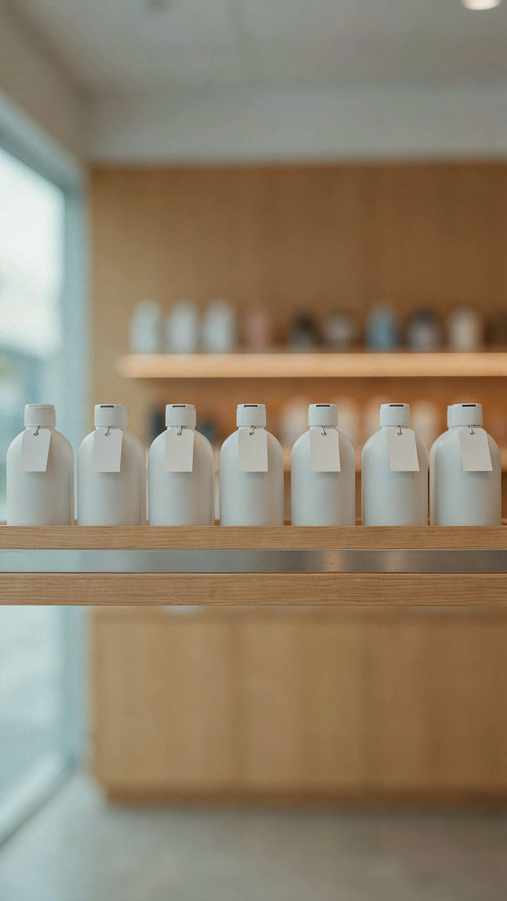
You want people to know what they’re eating without having to hunt for it, and that matters because confusion kills appetite and creates liability. Apply the principle of sightline dominance from visual merchandising: place labels at the exact height where a standing person’s eyes naturally land when approaching the table, roughly 48 to 60 inches from the floor depending on average guest height. Position each label directly behind or immediately adjacent to its corresponding dish, never to the side or floating above.
The label must occupy the same visual plane as the food itself. When a guest scans the table, their eyes move horizontally across the spread. If the label sits three feet away or angles awkwardly, their brain has to work to connect it. Mount labels on thin stakes or adhesive stands that keep them at or slightly above the rim of the serving dish. This eliminates the cognitive load of matching food to text and removes the reason someone asks “what is this” instead of just eating.
Signal To Noise Ratio Demands Restraint
The mistake most people make is treating name tags like decorative elements instead of functional information systems. One label per dish. One font. Minimal contrast reduction through overstuffed design. When you crowd the table with multiple signs, directional arrows, cute chalkboard stands, and motivational text, you’ve created visual noise that actually makes identification harder, not easier.
Use a single readable typeface at 18 point minimum for legibility from two feet away. Black text on white background or white text on dark background works. Skip the script fonts, the multiple colors, and the supplementary design elements. The label’s job is to transfer one piece of information fast. Everything else on that label competes with its core function and loses. Place all labels in a consistent left-to-right reading order that mirrors how guests move through the buffet line.
Food Labels For Party: The Unspoken Rules Of Dietary Disclosure

Allergen Information: Non Negotiable Clarity

You care about this section because you’re terrified of liability and social blame, not because you want guests comfortable. The mechanism is simple: allergens operate like military rules of engagement. Once you identify a threat, you must disclose it. There’s no gray area. A peanut trace isn’t a marketing detail you hide until someone asks. It’s a factual statement that goes on the label, period. Most hosts skip this because they assume people will ask. That’s delegation masquerading as politeness.
Write allergen labels in the same font size as the food name itself. Use contrast. Black text on white background reads faster than any design choice you’ll make. Include the eight major allergens if present: peanuts, tree nuts, milk, eggs, fish, shellfish, soy, wheat. If your hummus contains sesame, label it. If the veggie dip contains dairy, state it. The label doesn’t need to say “may contain” for trace amounts your supplier can’t eliminate. It needs to say what’s actually in the food. Place the allergen label where someone’s eyes land before they touch the plate.
Ingredient Lists: Transparency Builds Trust
The common advice here is garbage: most guides tell you ingredient lists are optional at casual parties. They’re not optional if you want people to eat your food without suspicion. Transparency isn’t about seeming virtuous. It’s about removing friction between someone’s dietary requirement and their ability to load their plate without interrogating you. An ingredient list answers the unasked question before it becomes an awkward conversation at the table.
Write ingredient lists in order of weight, descending, exactly as FDA labeling requires for packaged food. For homemade items, list the components in the same order. “Spinach dip: spinach, cream cheese, garlic, salt, pepper” takes thirty seconds and eliminates doubt. Don’t abbreviate ingredients. Don’t say “spices” without naming them. Someone avoiding MSG needs to see whether you used soy sauce or fish sauce. The list goes on a small card next to or in front of the food. Simple clarity prevents every dietary disaster before it starts.
Your Biggest Failure Isn’t Bad Labels, It’s Misunderstanding Human Psychology


People don’t read labels at parties. They graze. They avoid. They ask someone else instead of looking. Your job isn’t to write better descriptions. Your job is to remove friction so guests stop thinking and start eating. Today, audit your next party setup. Remove every label that requires more than three seconds to understand. The clarity that matters most is the one that requires zero effort to grasp.