The Illusion Of Abundance: Why More Dessert Charcuterie Ideas Fail
When Less Wins The Room
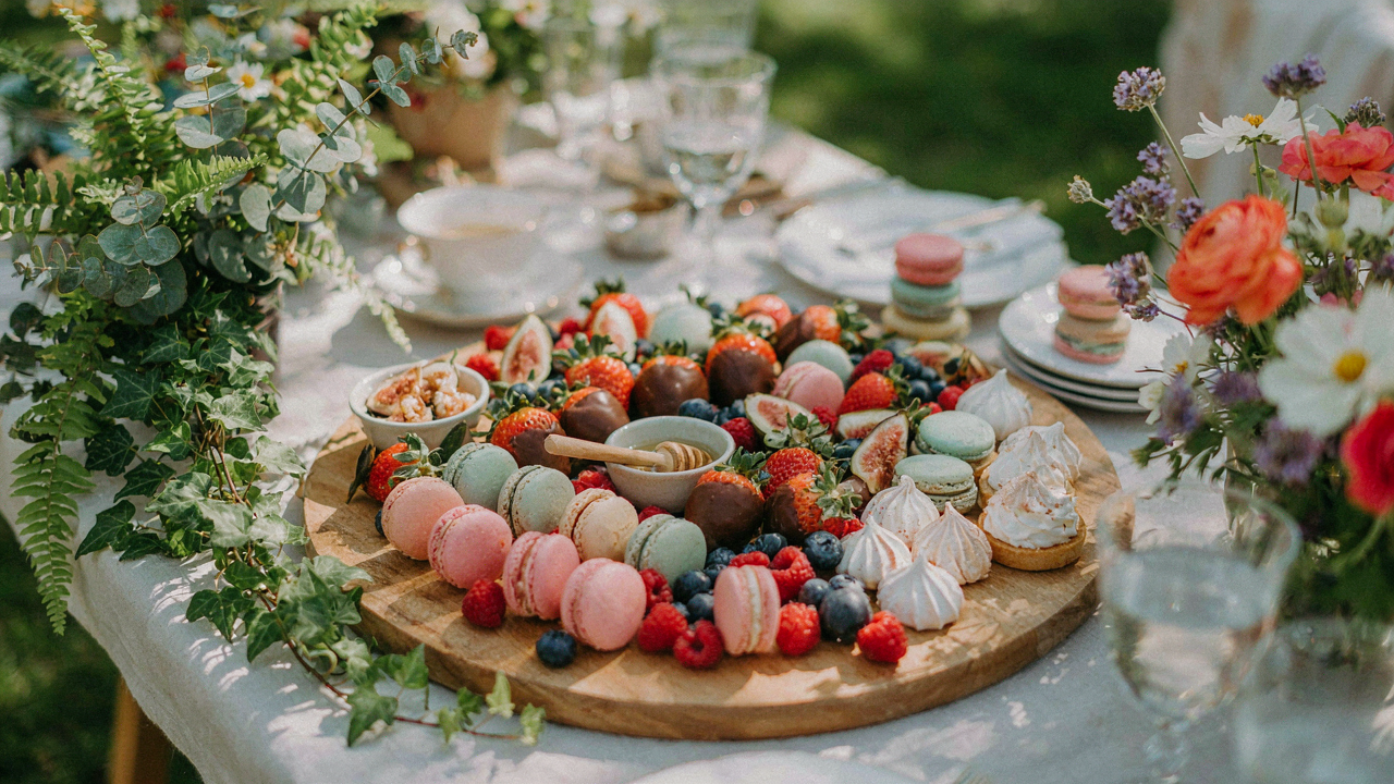
You want to prove you put effort into this. That’s the real reason you’re reading about dessert charcuterie boards instead of just throwing chocolate on a board. The mechanism is simple: your brain treats abundance as a signal of thoughtfulness, but your guests’ brains treat it as noise. Paradox of choice applies here the same way it does in economics. You’re creating decision paralysis on a platter. The person standing in front of your board should know what to grab in under three seconds, not stand there cataloging twelve different options while their hand hovers in the air.
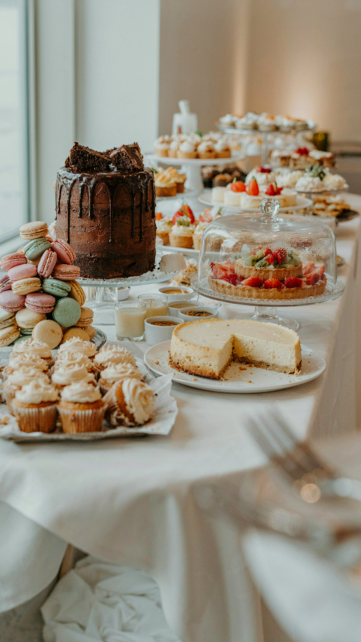
Most people load boards like they’re stocking a bakery. They add another chocolate, another cheese, another cracker variation. Each addition feels like progress. It’s not. The board that wins isn’t the fullest one, it’s the one where every item earns its place by doing something the others don’t. Three types of chocolate beat eight. Five cookies beat fifteen. Restraint compounds. When you remove an option that doesn’t serve the spread, the remaining items become more visible, more approachable, more eaten.
Stop Building For Instagram
The styling advice floating around treats boards like art installations that need to fill every millimeter. Forget it. That’s wrong thinking dressed up as design guidance. A dessert charcuterie board is a consumption tool, not a wall hanging. Empty space on your board doesn’t represent failure, it represents clarity. Your garden party guests don’t care about composition theory. They care about reaching for something, eating it, and feeling satisfied they made the right call.
The boards that photograph well and sit uneaten aren’t failures of execution, they’re failures of priority. You optimized for the wrong metric. Strategic gaps between items actually make everything pop more visually, force the eye to land on individual components instead of scanning a dense mass, and crucially, make the board easier to eat from without dismantling it. Design the board like you’re designing a webpage: ruthless white space, clear hierarchy, obvious next action. Place items with intention, not to fill space.
Deconstructing The Brown Food Board Ideas Trap
Why Your Dessert Board Looks Flat

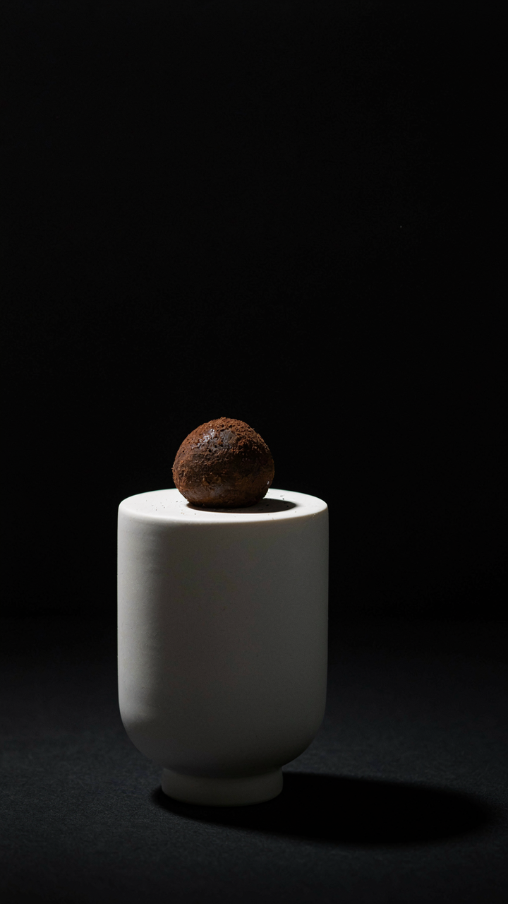
You want permission to believe that restraint equals sophistication. The real mechanism is contrast. In design, contrast operates like tension in composition: without it, the eye stops working and moves away. Brown dominates desserts naturally—chocolate, caramel, nuts, pastry. Add more brown and you’ve created visual noise, not elegance. The board becomes wallpaper. Guests scan it once and forget what they saw because nothing demanded their attention. A monochromatic dessert charcuterie board isn’t timeless. It’s invisible.
The reason people build brown-on-brown boards isn’t aesthetics. It’s safety. Brown pairs with everything, so there’s no risk of clashing. That’s precisely why it fails. You’re optimizing for the wrong outcome. A board that won’t fail is also a board that won’t register. The fix requires one deliberate color decision that contradicts your instinct about what “goes together” on a dessert board.
Contrast Creates The Frame
Color theory treats the visible spectrum like a territory to occupy strategically. On a dessert board, saturation is your leverage point. Saturation means how vivid or muted a color appears. Your browns and tans sit low on the saturation scale. Introduce one saturated element and it becomes the focal point automatically. This isn’t opinion. It’s how human eyes prioritize information.
Place a high-saturation item—fresh raspberries, a jewel-toned preserve, candied violet flowers—off-center on the board. Everything else supports it now instead of competing. The browns become a base layer. You’re not fighting them. You’re using them as a canvas. The board reads in seconds instead of requiring interpretation. This is the mechanism: saturation difference does the work your arrangement couldn’t.
The “Scarcity Principle” Protocol For Charcuterie Board Ideas Sweets
Premium Selection Over Volume
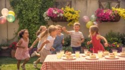
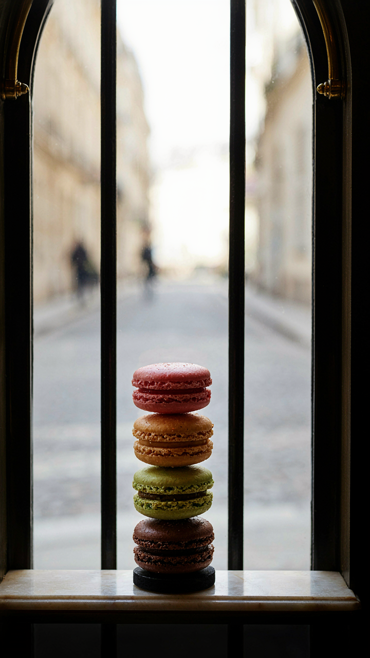
You want people to think you have refined taste without admitting you’re afraid of looking like you just threw money at a problem. The mechanism is scarcity economics: restrict the total number of items on your board, then make each one matter. Fewer pieces force guests to evaluate quality rather than quantity. This works because human attention defaults to abundance as a proxy for effort. Reverse it. A board with twelve carefully chosen sweets beats one with thirty forgettable options every time.
The practical move is this: aim for four to six distinct sweet categories maximum. That means one chocolate item, one fruit-based item, one nut or brittle item, one cookie or biscuit, and perhaps one fresh or whipped element. Constraint forces intentionality. When you’re limited, you stop defaulting to “what looks good” and start asking “what tastes different from everything else on this board.” This prevents the visual disaster of repetition that screams amateurism.
Scarcity Through Rotation
Limited editions create perceived value because they exploit the loss aversion principle from behavioral economics: people value things more when they know supply ends. Bring a different dessert board composition to each garden party rather than defaulting to the same lineup. Rotate seasonal items, source regional sweets for specific events, or feature one rotating “spotlight” item that changes monthly.
This doesn’t mean reinventing the wheel each time. Keep your core anchor items consistent. Swap out one or two elements based on season or sourcing. Guests remember what they can’t get again. A blood orange curd mousse in spring becomes a conversation point precisely because it won’t appear on your summer board. The mechanism is simple: unpredictability increases memorability. Document which sweets you used for which events, then never repeat the exact same combination within a calendar year.
The “Effortless Elegance” Method For Your Charcuterie Sweet Board
Asymmetrical Tension Wins Attention

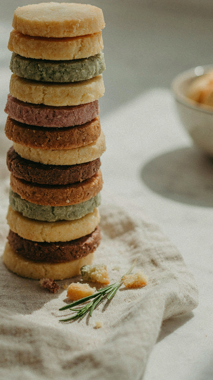
You want guests to think you didn’t try, which means you’re desperate to prove you have taste. Here’s the mechanism: symmetry reads as forced and artificial. Asymmetry mimics how humans naturally arrange objects, triggering the perception of confidence instead of effort. Think of it like visual tension in graphic design. Place your tallest element (a chocolate tower, a tiered cake component) off-center. Position your densest cluster of items on one side, then balance it with negative space on the other. This creates a focal point that pulls the eye without announcing the design.
The math is simple: divide your board into thirds, not halves. Put your anchor piece in one third. Build secondary clusters around it, staggered by height and color. Never mirror anything. Guests will feel the composition’s ease because their brain registers the calculated imbalance as natural rather than staged. This is exactly how high-end restaurant plating works, and it transfers directly to boards.
Breathing Room Beats Abundance
Everyone stuffs their board. The consensus is more equals better. Wrong. Empty space is a design tool, not a failure. In interior design, negative space creates hierarchy and forces focus. Apply this directly: leave 15 to 20 percent of your board untouched. This isn’t waste. It’s the mechanism that makes what you’ve placed matter.
Strategic gaps between item clusters create visual rhythm. They signal intentionality. When every inch is packed, the eye has nowhere to rest, so nothing registers as special. Place chocolates in one zone, cookies in another, fresh fruit in a third. Let the board show between them. Your guests will perceive abundance not from quantity but from the confidence displayed in restraint. This is how you move from cluttered to considered.
Beyond “Easy Dessert Charcuterie Board Ideas”: The Factionalized Food System
Treating Dessert Categories As Competing Power Structures

You want your board to look intentional instead of scattered because people judge competence by visual hierarchy. Borrow military strategy here: dessert categories operate as factions with territorial claims on the board’s real estate. Each faction—chocolate, fruit, nuts, caramel, cream—fights for dominance based on visual weight and flavor territory. The mechanism is simple: dominant factions control perception. If chocolate occupies the center and consumes 40 percent of your space, guests orient around it first. Everything else becomes secondary support. This isn’t accident. It’s architecture.
The common advice says “balance your board.” Wrong. Balance creates visual noise. Instead, establish one clear faction as your power center, then let secondary factions orbit it with defined roles. Chocolate demands the prime real estate because it reads as luxury and anchors flavor memory. Position your secondary factions—say, candied nuts and dark fruit—at 45-degree angles to create asymmetrical tension. This tension keeps the eye moving instead of settling. Guests remember boards with clear dominance. They forget balanced ones.
The Dominant Sweet Element Sets The Entire Premise
Most people stack their boards with equal representation across chocolate, caramel, fruit, and cream. This dilutes impact. One dominant element must carry the visual and flavor load. If you choose dark chocolate as your power center, every other element amplifies or contrasts it rather than competes. Dark chocolate paired with bright raspberries, salted almonds, and mascarpone creates a clear narrative. The chocolate leads. The other elements confirm its authority.
This mechanism works because human perception processes hierarchy before detail. Your guests unconsciously scan for what matters most, build their flavor expectation around it, and then explore supporting elements. If nothing dominates, they default to random sampling and form no coherent memory of the board. The concrete action: choose one element occupying 35 to 45 percent of your board’s visual area. Everything else fills supporting roles. Placement and proportion create meaning faster than variety ever will.
The “Dessert Charcuterie Board Ideas Simple” Blueprint For Fresh Fruit
Seasonal Produce: Natural Perfection

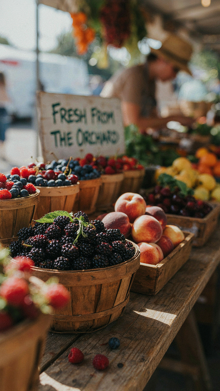
You want seasonal fruit because it signals you know what you’re doing, and guests notice the difference between what’s forced and what belongs. The mechanism here borrows from supply chain economics: scarcity and peak ripeness move together. When a fruit is in season, it ripens naturally to maximum sweetness and texture. Out of season, it’s picked early, shipped long distances, and tastes like obligation. Boards that fail do so because they chase variety over timing.
- Summer berries: Peak from June through August across most regions. Strawberries, raspberries, and blackberries hit maximum sugar and firmness simultaneously, requiring no flavor compensation.
- Stone fruits: Peaches, plums, and apricots dominate July and August. Their natural acid balances richness on the board without added tartness or citrus masking.
- Citrus and pomegranate: Winter through early spring varieties. These provide color contrast and extend the board’s visual interest without competing with summer sweetness.
- Figs and grapes: Late summer through fall seasons. Both store longer than berries and offer textural variety that justifies their presence beyond mere decoration.
- Melons: Peak June through September depending on type. Cantaloupe and honeydew provide bulk and visual weight without the cost of chocolate or nuts.
You build a board around what’s actually good right now, not what’s on sale at the supermarket. Check your local farmers market one week before your event. This tells you what’s at peak ripeness and what to avoid entirely. Gaps on the board beat bruised or mealy fruit masquerading as filler.
Unadorned Fruit: Intrinsic Beauty
The common move is to dust fruit with sugar, add edible flowers, or drizzle it with something to make it “feel fancier.” This is wrong. It signals you don’t trust the fruit itself, and it buries the actual draw of a dessert charcuterie board, which is textural and flavor contrast against chocolate, nuts, and cheese. Good fruit needs nothing added to it.
Cut fruit strategically. Halve berries only if they’re large enough to dwarf other items on the board. Slice stone fruits thick enough to hold their shape without collapsing into the arrangement. Leave grapes whole. Melon gets cut into wedges or cubes large enough to grab without a toothpick. The rule is simple: if it falls apart in someone’s hand, you cut it wrong or picked it too soft. Fruit must maintain structure from board to mouth.
The “Sweet Treats” Deception: Quality Over Quantity
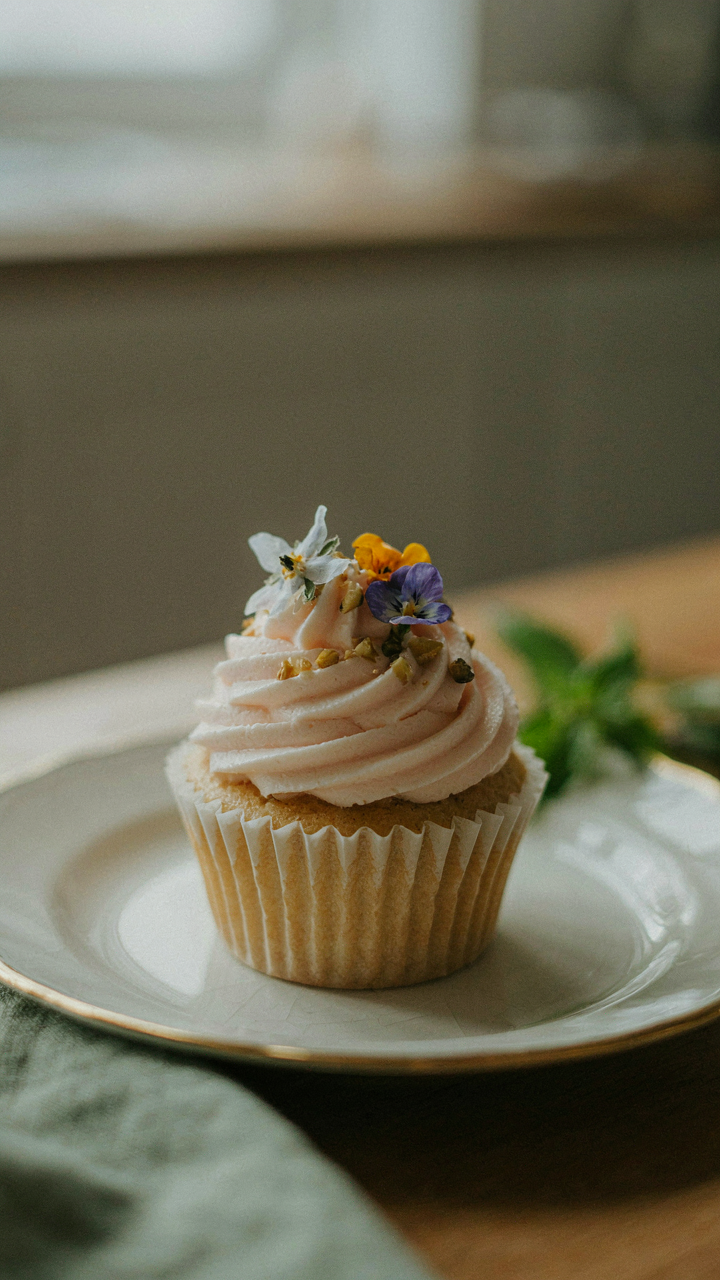
Artisan Over Mass Produced
You want people to think you have refined taste without doing the work to actually develop it. Here’s the mechanism: mass-produced treats signal convenience, which signals low effort, which signals low status at a garden party where presentation matters. Artisan confections reverse this equation because scarcity and craft require knowledge to source them. You’re not buying better sugar; you’re buying the credibility that comes with selecting something most people won’t find at a supermarket.
The difference between a factory macaroon and a hand-piped one isn’t just flavor. It’s structural integrity under outdoor conditions, visual distinction that photographs, and the story you can tell about where it came from. Local chocolatiers, small-batch candy makers, and family-run bakeries exist in most regions. Your job is to identify them before the party, taste-test their offerings, and commit to specific items that anchor your board’s narrative.
Ingredient Focus Elevates Humble Treats
Most people believe ingredient quality matters most for exotic items. Wrong. A chocolate truffle made with grocery-store cocoa powder tastes like cocoa powder. The same truffle made with single-origin chocolate from a known origin tastes like the place it came from. Ingredient focus is an economics concept where marginal improvements in inputs create disproportionate improvements in outputs. Upgrade the base materials, and even simple treats transform.
Start by identifying what actually matters in each category: cocoa percentage and origin for chocolate items, real fruit versus fruit flavoring for jams and pastes, butter quality for shortbread, and vanilla extraction for anything vanilla-adjacent. A single-origin dark chocolate paired with sea salt costs more but requires no additional labor to serve. The ingredient speaks for itself. Source from producers who list origins and methods, then arrange these items so their identity is visible on your board through clear labeling or strategic placement near complementary elements.
Leveraging Natural Elements: The Garden As Your Co Conspirator
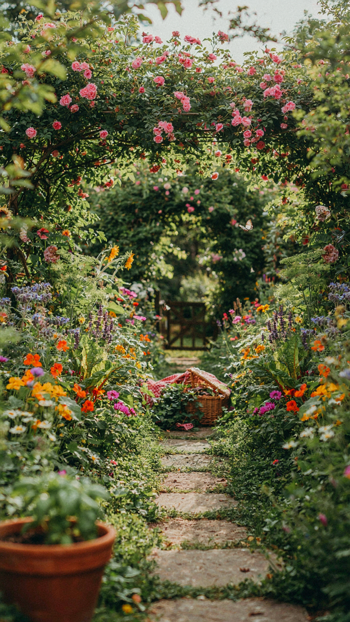
Edible Floral Accents Organic Beauty

You want guests to think you didn’t try too hard, which means you’re terrified they’ll see the effort underneath. The mechanism here is borrowed from botany: succession. Just as plants colonize bare ground in stages, edible flowers create visual layers that make the board feel unplanned. Pansies, violas, and nasturtiums aren’t decoration. They’re proof the board emerged from the garden itself, not a calculated assembly.
Edible flowers work because they solve a texture problem boards face. Chocolate, ganache, and caramel all compress into similar densities visually. A scatter of borage flowers or calendula petals breaks that sameness with actual form. Place them where negative space exists, never filling gaps that should breathe. The flower sits on top of nothing, not nestled between items. This creates depth that viewers register before they taste anything.
Found Objects Rustic Charm Unexpected Textures
Most advice tells you to buy decorative boards and props, which wastes money on things that blend into every other party. Ignore that. Walk your garden and grab what doesn’t belong on a plate. Moss covered stones, weathered wood pieces, lichen covered twigs, and seed pods become contrast tools. They interrupt the smooth surfaces of chocolate and candy with genuine texture that photographs register instantly.
The protocol is straightforward: source before you style. Collect items during the week, rinse them clean, and let them dry completely. Arrange them first as anchors on the board itself. Then build edibles around them, not over them. A piece of slate leans against the board edge. A branch crosses diagonally, creating sight lines. A stone sits where two clusters meet. These objects don’t decorate the board. They organize it.
The Art Of The Reveal: Strategic Placement For Maximum Impact
Flow And Progression Guiding The Eye
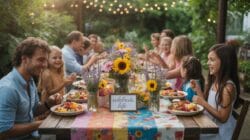
You want people to think you have taste. The real mechanism here comes from visual hierarchy, borrowed from graphic design: your eye moves through a composition based on contrast, density, and direction. On a dessert board, this means you’re not scattering items randomly. You’re creating a path. Start with the densest, most neutral elements (the base chocolates, nuts, dried fruit) anchoring one third of the board. This establishes visual weight and prevents chaos. Move your eye toward lighter, more delicate items as you progress across the surface. The path should feel inevitable, not accidental.
Guests follow this progression without thinking about it. They start eating in the dense zone and naturally move toward the refined edges. The mechanism works because humans process visual information by tracking contrast and change. Place your richest, darkest chocolates in the lower left or right quadrant, then cascade toward pale macarons, white chocolate shards, or fresh berries on the opposite side. This creates directional pull. You’re not decorating. You’re directing foot traffic and eating order through pure spatial logic.
Surprise Elements Unexpected Delights
Common advice says scatter unusual items for discovery. That misses the point. A surprise only works if people actually find it, which means placement matters more than the item itself. Hide one high-value element in an unexpected zone: a luxury chocolate wrapped in foil tucked near the edge, a single exotic fruit positioned where the eye doesn’t naturally land first. This forces a second pass. Guests circle back. The board feels deeper, more intentional.
The mechanism is psychological reactivation. Once someone finishes the obvious path, your hidden placement reengages their attention. Position your surprise element at roughly 60 to 70 percent through the visual journey, not at the start and not buried in pure density. Use contrast to make it slightly stand out without screaming. A bright candied flower near dark chocolate works. A matte element among glossy surfaces works. Your job is making the second discovery feel earned, not random.
Beyond The “Fruit” Bowl: The Unexpected Pairing
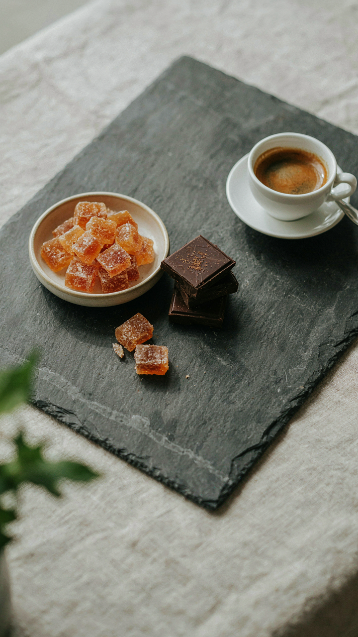
When Bitter Meets Sweet
You want people to think you understand flavor complexity without actually having to cook anything. Here’s what nobody says plainly: the mechanism is sensory contrast. Bitterness triggers salivary glands and resets palate fatigue—the same neuroscience principle that makes salt enhance sweetness. Add dark chocolate with sea salt, candied citrus peel alongside honeycomb, or marcona almonds near caramel. These aren’t decorative additions. They’re palate validators that make the surrounding sweetness register harder.
The garden party context matters here. Guests move between conversation and tasting. A board without savory counterpoints becomes one-dimensional by the third bite. They’ll taste nothing after five minutes. Include olives cured in herbal brine, prosciutto wrapped around figs, or aged gouda alongside the desserts. You’re not being eccentric. You’re solving the actual problem of sensory adaptation over a two-hour event.
Crunch Stops Monotony
Texture hierarchy borrowed from industrial design: dominance, subordinance, accent. Apply it here. One dominant texture creates boredom. A board needs the sequence of crunch first, then chew, then cream. Start with candied nuts and brittle. Follow with dried fruit and caramel chewy pieces. Finish with soft cheeses, chocolate ganache, and whipped components. This progression keeps the mouth engaged because each texture requires different jaw mechanics and tongue placement.
The mistake people make is filling a board with all soft items: brownies, cookies, mousse, ganache. Same compression pattern every bite. Add honeycomb, toasted meringue shards, or crispy wafer cookies. Position them near the softer items so guests naturally alternate. The crunch dissolves and triggers new flavor perception from the items it precedes. This isn’t theory. It’s how taste buds reset between components.
The Only Thing Holding Back Your Dessert Board Is Your Fear Of Genuine Simplicity
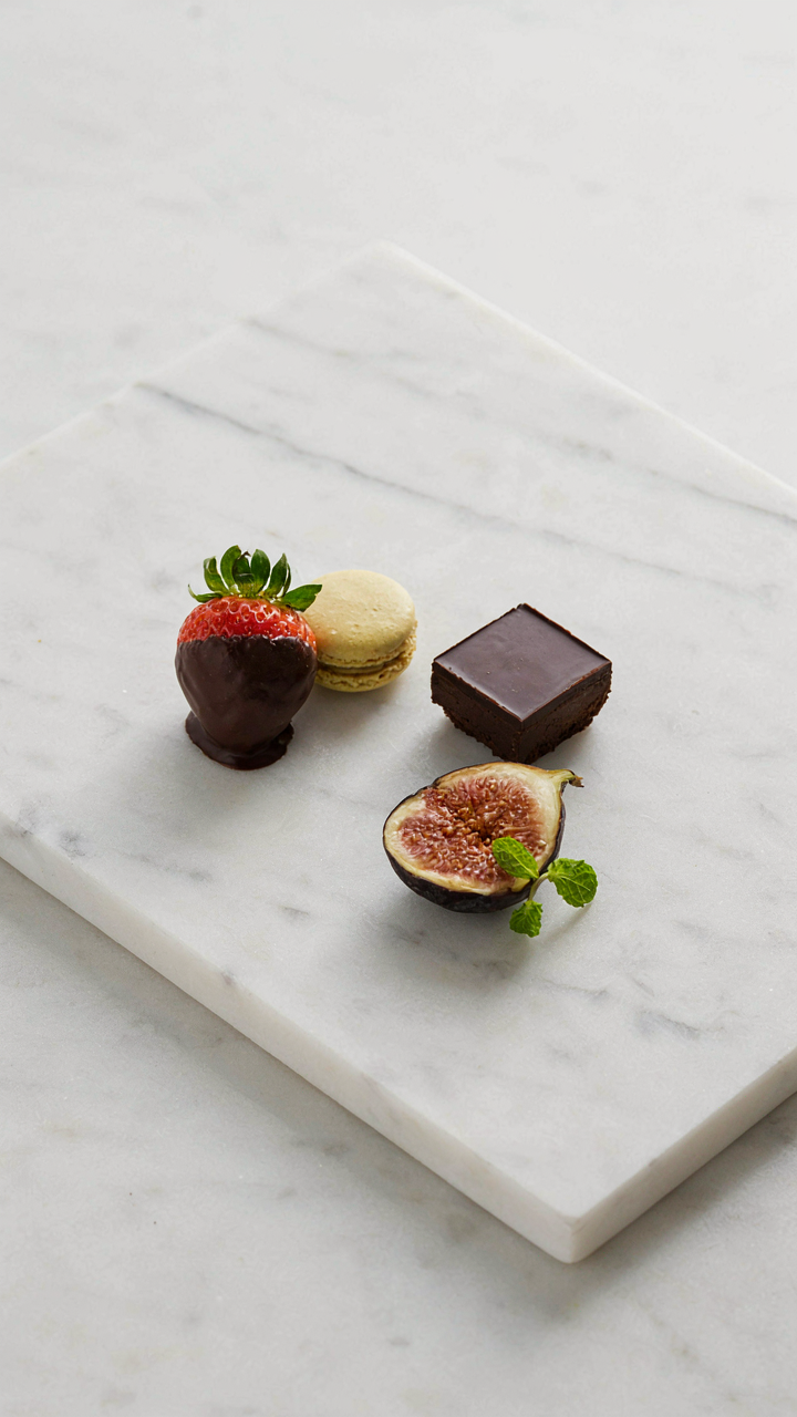
You’re overthinking this. Most people drown their dessert charcuterie board in clutter because they mistake abundance for skill. The real move is restraint. Pick five elements maximum, arrange them with intention, then stop. Today, buy one premium chocolate, one fresh fruit, one textural element like nuts or honeycomb, and one spread. Nothing else. Your garden guests won’t remember quantity. They’ll remember the one board that looked intentional instead of panicked. Simplicity is confidence made edible.