Introduction
Planning your wedding just got easier by choosing a pastel theme. This style emphasizes soft and delicate colors that create a calm and romantic atmosphere. Many couples prefer pastel weddings because pastels add elegance and freshness without overwhelming the senses. If you want your ceremony to feel intimate and sweet, soft pastel colors might be the perfect choice. They offer a gentle background that brings out the joy and love of your special day.
Soft pastel wedding ideas help transform your venue into a picture-perfect scene. Selecting the right shades and decorations can set the mood seamlessly. You might wonder how to combine colors, flowers, and styles to reflect your personality. This article guides you through different ways to use pastels in your ceremony. You will find ideas for invitations, dresses, decorations, and more. The goal is to make your big day truly memorable while keeping it simple and beautiful.
Choosing the Right Pastel Colors for Your Wedding
Select pastel colors that connect with the overall mood you want to set for your wedding. Think about your chosen theme, the time of year, and the venue when picking colors. For example, soft pink paired with mint green works well for a garden wedding, while lavender and pale blue create a calm feel suited to beach ceremonies. You can combine several pastels to add depth without overwhelming the setting.
Consider the emotions each color evokes. Peach and blush tones often feel warm and inviting. Light blues and greens bring freshness and calm. Pale yellows add brightness and cheer without being harsh. Try to choose colors that enhance the feelings you want your guests to experience on your special day.
How will your colors look in photos? Testing color swatches in different lights can help before you commit. Your choices should complement your venue’s natural elements and ensure your wedding time and place shine through without clashing.
Match Pastel Colors to Your Wedding Style
Different wedding styles match well with specific pastel tones. For rustic weddings, earthy pastels like dusty rose, sage green, and soft beige blend well with wood and natural décor. These tones add a cozy, grounded feel.
Classic weddings benefit from soft blush paired with ivory or light gray. These colors maintain a timeless, elegant look without overpowering traditional elements. Your invitations, table settings, and floral arrangements will feel cohesive and refined.
A modern wedding pairs pastels like light lavender with pale blue or mint green. Using cooler pastels framed by sleek décor makes the space feel fresh and clean. You can add contrast with metallic accents to highlight the softness of your chosen pastels.
What wedding style speaks to you? Make sure your pastel palette supports your vision, so every design choice feels intentional.
Consider Seasonal Colors and Venue
Season influences which pastels will look best. Spring weddings welcome soft pink and lilac, matching blooming flowers and new growth. Summer weddings often suit cool pastels like pale aqua and light lemon to keep things bright and fresh.
Autumn weddings can use creamy peach or muted mint that blend with the season’s warm tones without feeling heavy. Winter weddings look lovely with frosty blues, soft purple, or silver-tinged pastels that mimic the crisp, cool air.
Look closely at your venue’s lighting before finalizing colors. Bright natural light enhances pastel vibrancy, while low light can make these tones appear duller. Indoor venues with warm lighting might shift pastel shades, so bring samples and observe them at the time your wedding will take place.
Will your venue’s atmosphere highlight or weaken your pastel palette? Testing the colors in that space helps ensure your chosen tones remain soft, inviting, and fitting throughout your ceremony and reception.
Incorporating Pastel Colors in Wedding Attire
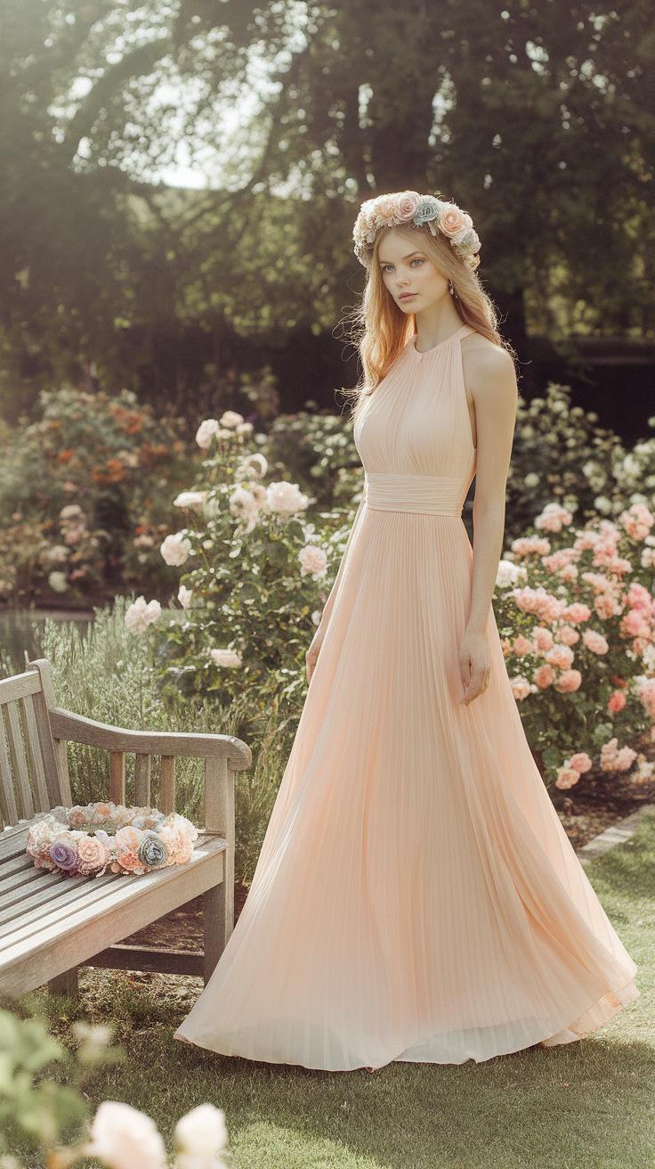
Soft pastel colors bring a gentle charm to wedding attire, perfect for creating a romantic and delicate look. You can add pastel shades to bridal gowns, bridesmaids’ dresses, and even the groom’s outfit for a cohesive style. When choosing gowns, consider light pinks, pale blues, or mint greens to add color without overwhelming traditional white. Pastels soften the bridal look and make photographs appear bright and timeless.
Pastel gowns pair well with subtle accessories, like pearl jewelry or silver shoes, to maintain elegance. For bridesmaids, mixing various pastel shades can add visual interest and keep the palette fresh. Grooms can complement the soft tones by wearing pastel ties, pocket squares, or shirts. Light gray or beige suits work well to balance pastel accessories.
Are you prepared to coordinate everyone’s look without clashing colors? Opting for a shared pastel palette helps the whole wedding party appear polished and harmonious. Current trends highlight pastel hues that blend fashion-forward choices with classic wedding style. This approach invites you to express your personality through color while preserving sophistication.
Pastel Bridal Gown Options
Choosing a pastel bridal gown involves balancing color with traditional wedding elegance. Shades like blush pink, lavender, or powder blue are popular because they offer a soft alternative to pure white. These colors work best when the fabric is high quality and the design is simple, keeping the gown graceful.
You can maintain a refined look by selecting gowns that use pastel shades subtly—such as lace overlays, embroidery, or tulle skirts tinted with color. Pairing a pastel gown with neutral or white accessories ensures the overall style doesn’t become too bold. Think about the setting too; for example, lighter pastels suit spring and outdoor weddings beautifully.
Would a pastel gown fit your vision for the day? Allow the shade to highlight your features and complement your skin tone. The key lies in soft, muted hues that add color without stealing the spotlight from you as the bride.
Dressing the Wedding Party in Pastels
Coordinating bridesmaids and groomsmen in pastel colors creates a unified look that enhances the romantic mood. Bridesmaids’ dresses work well in soft shades like lilac, peach, or mint. Varying the styles and fabrics while keeping to a pastel palette offers visual depth and keeps the group from looking too uniform.
For groomsmen, pastel ties and shirts can blend nicely with classic suits in navy, charcoal, or light gray. Pastel bow ties and suspenders also add playful touches. Matching the men’s pastel accessories to the bridesmaids’ dress colors ties everything together.
As you plan the looks, ask yourself how the colors you pick support the wedding’s theme and season. Will the sunlight bring out the best in these tones? Mixing different pastels within the party can highlight personalities while maintaining harmony. Pastel outfits make photos soft and dreamy, reinforcing the romantic atmosphere you want to create.
Pastel Wedding Invitations and Stationery
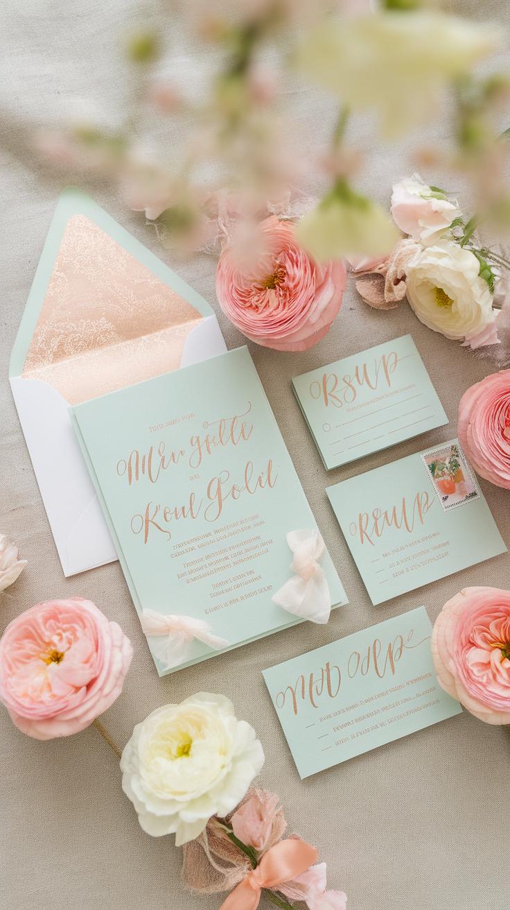
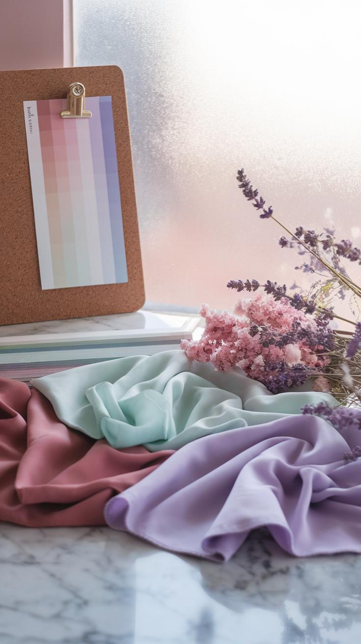
Designing your wedding invitations and save-the-date cards with pastel colors sets the tone for your romantic ceremony. Soft pastel shades like blush pink, mint green, soft lavender, and pale peach work well to create a gentle, inviting look.
Balance is key when using pastels. Too much color can distract, while too little can feel bland. Use pastel backgrounds paired with darker, clear text to keep your cards readable and visually pleasing. For example, a light lilac background with charcoal gray font offers a subtle but sharp contrast.
Think beyond invitations. Programs, menus, and thank-you cards should use the same pastel palette to tie your stationery together. Consistency creates a dreamy experience for your guests from the first card they receive to the last note after your big day.
Select Fonts and Layouts that Complement Pastels
Choose fonts that balance softness and clarity. Clean serif fonts like Garamond or Caslon add elegance without overpowering pastel colors. Sans-serif fonts such as Lato or Raleway keep the design modern and readable.
Don’t crowd your layout. Give text room to breathe with generous spacing and margin. This approach prevents the pastel tones from getting lost beneath heavy type or cluttered designs.
Ask yourself, does the font feel gentle and clear? Pair delicate script fonts sparingly for names or headings, combined with simple body text to maintain readability without dulling the pastel charm.
Use Pastel Motifs and Graphics
Incorporate floral motifs in soft pastel hues to add subtle charm. Consider watercolor flowers or hand-drawn illustrations in muted pinks, light blues, and soft greens. These visuals enhance romance without overwhelming the design.
Abstract shapes like gentle waves, circles, or brush strokes in pastel tones offer a modern twist. They provide texture and interest while staying true to the soft color scheme.
Think about small details too. Using pastel-colored borders or icons can connect your stationery pieces and create a balanced, thoughtful collection that fits your wedding’s romantic vibe perfectly.
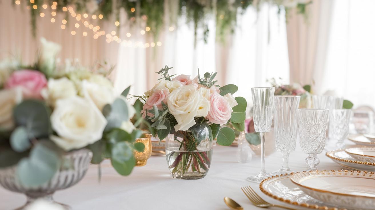
Floral Arrangements Using Soft Pastel Tones
Pick Flowers That Suit the Pastel Theme
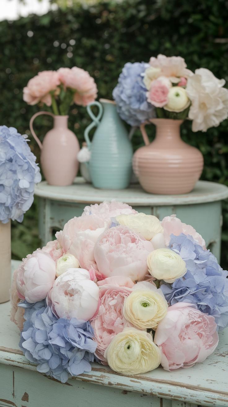
Choose flowers that naturally come in soft, muted colors to keep your wedding bouquets and centerpieces gentle and romantic. Popular pastel flowers include peonies, pale pink and white roses, dusty miller, hydrangeas, and lisianthus. These flowers offer soft shades like blush pink, creamy white, light lavender, and soft peach. Each of these blooms blends well together, creating a calm and cohesive look without clashing. You might also consider ranunculus for its delicate layers or dusty blue thistle for subtle texture. Think about how these colors will appear in different lights and whether they match your overall theme. What moods do you want the flowers to inspire for your ceremony and reception?
Create Balanced and Beautiful Arrangements
Balance your flower colors by mixing lighter shades with slightly deeper pastels to add dimension. Combine round blooms like peonies and roses with spikier shapes such as eucalyptus or lavender to create contrast in form. Avoid overloading with one color or shape, which can make the arrangement look flat. Instead, space out colors evenly and vary the heights of stems in your centerpiece or bouquet. You could place a white rose cluster next to a subtle pink lisianthus, with soft green leaves weaving through. This variety draws the eye while keeping the arrangement soft. How can you use texture alongside color to make the design inviting and fresh?
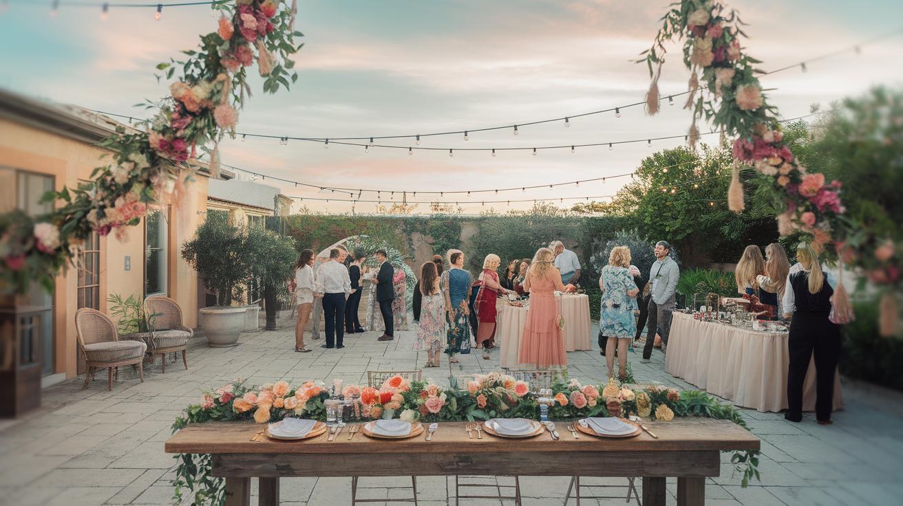
Decor Ideas for a Soft Pastel Wedding
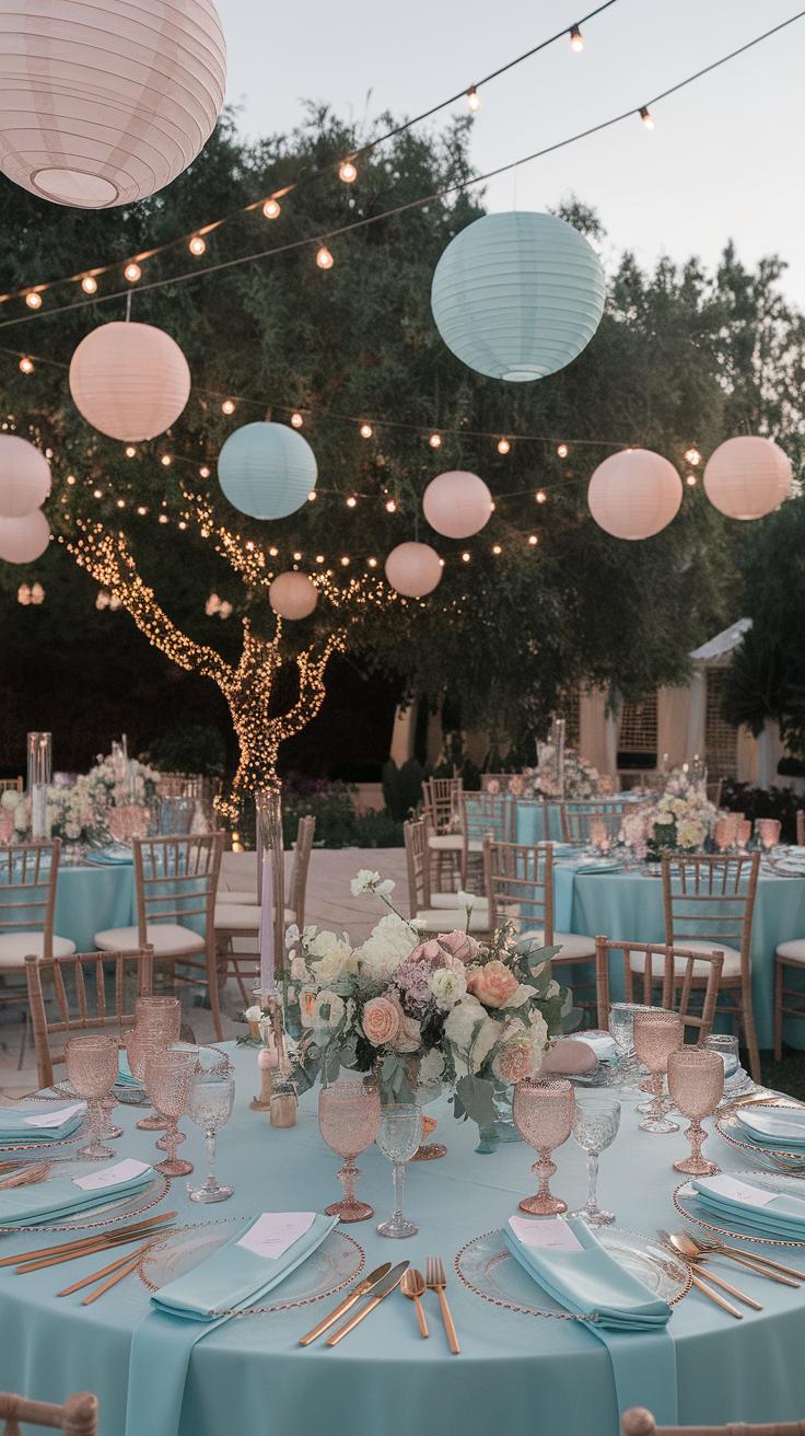
Soft pastel colors create a calm and inviting space for your wedding. Using these shades in your decor can set a gentle, romantic tone without much effort. Start with your table settings by choosing linens and centerpieces that reflect your chosen pastels. These colors should flow naturally across your décor, tying every element together.
Lighting plays a key role in softening the atmosphere. Use warm, dimmable lights to enhance pastel tones without washing them out. String lights or paper lanterns in pastel colors add a gentle glow and charm without breaking the budget. Think about adding delicate backdrops made of pastel fabric or paper flowers behind the ceremony area or sweetheart table.
For budget-friendly decorating, consider DIY options like painting plain candles in pastel hues or crafting simple garlands with tissue paper. Personal touches like these make your wedding unique and heartfelt. How might you transform everyday items into soft pastel decor that fits your style and budget?
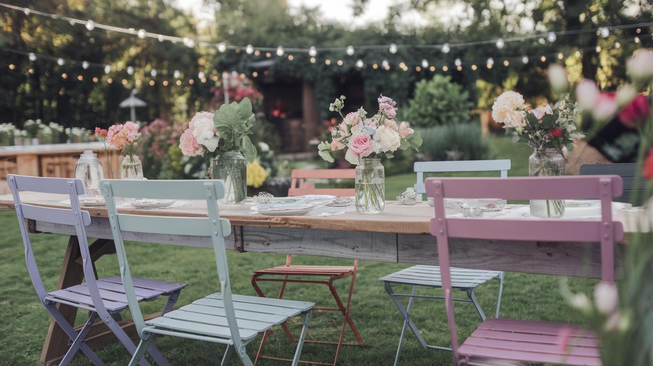
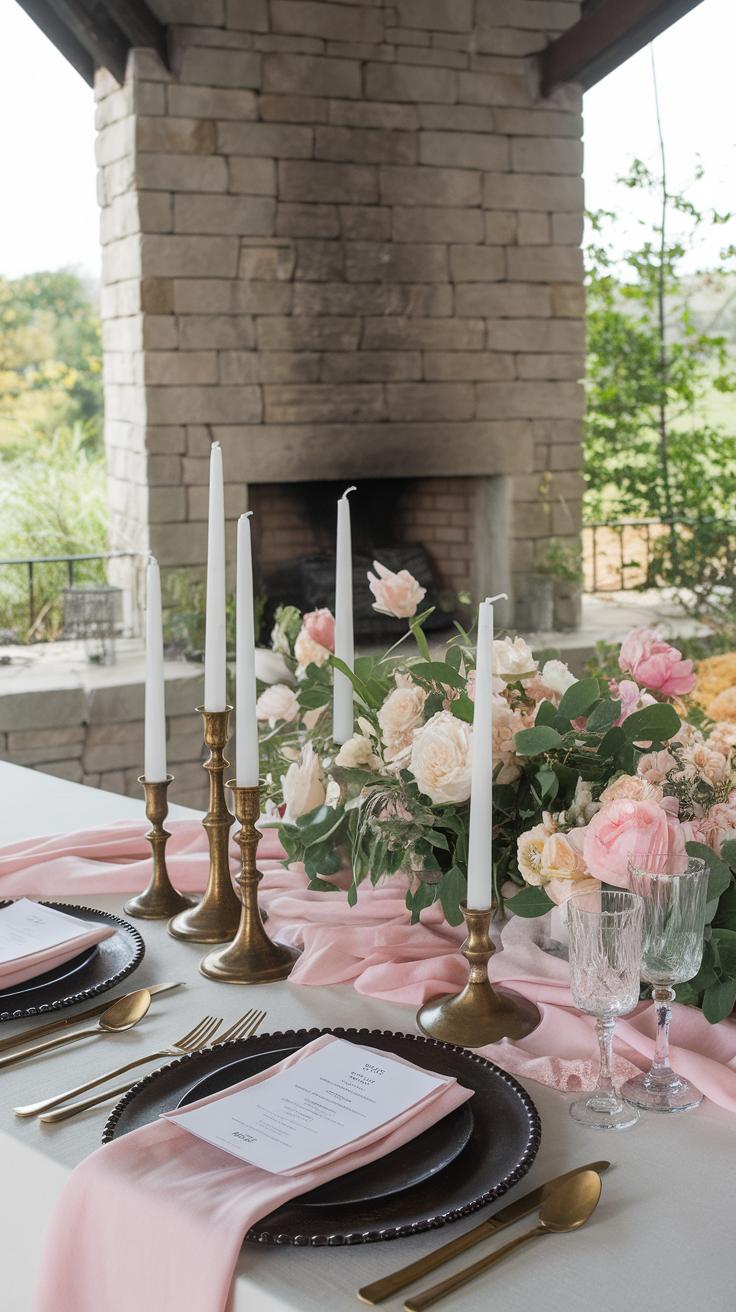
Pastel Table Settings and Linens
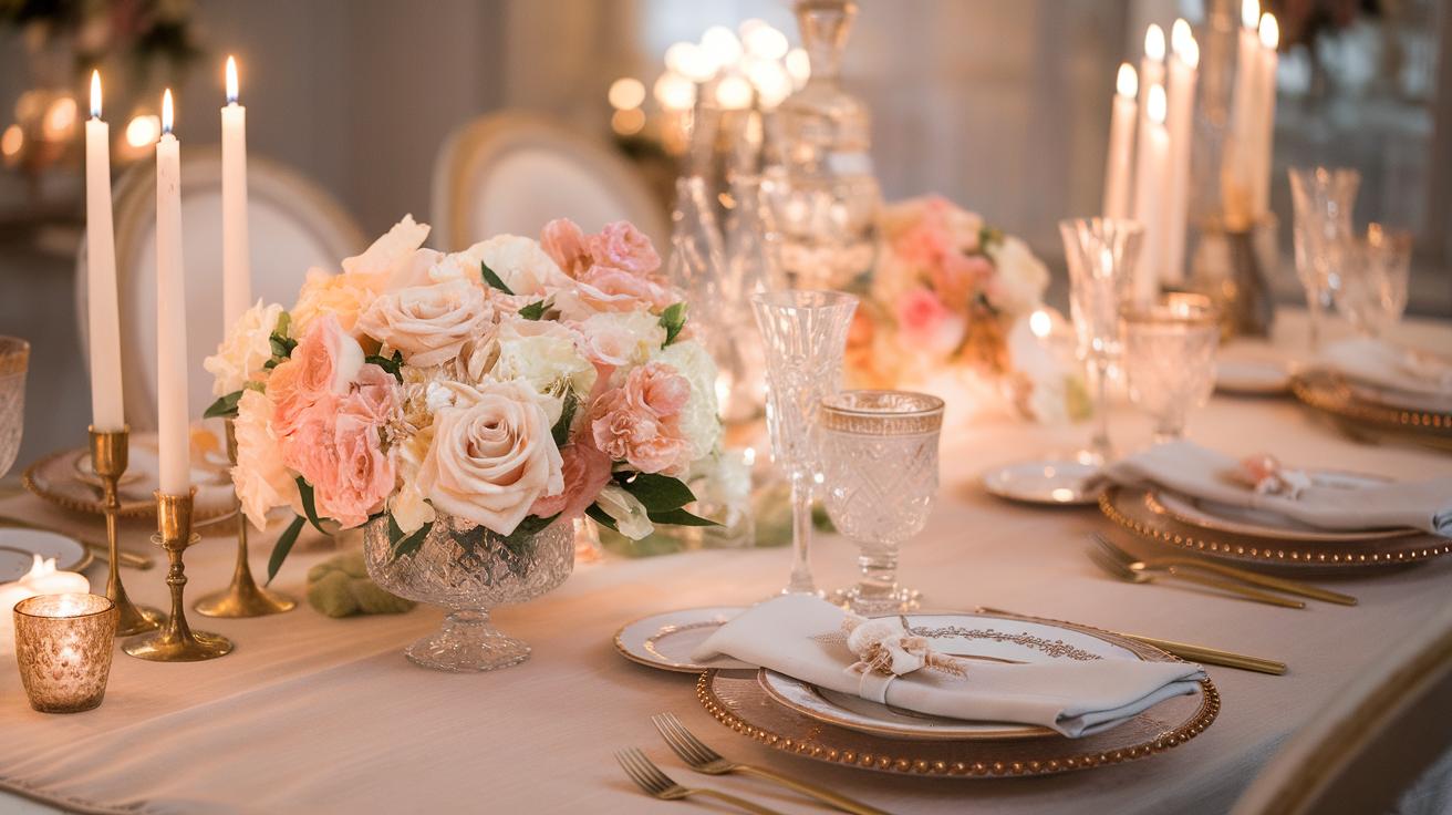
You can change the look of any table with pastel tablecloths and napkins. Choose soft pink, mint, lavender, or peach fabrics that complement your wedding palette. Cotton or linen blends offer a natural, elegant feel without high costs. Consider mixing pastel napkins with neutral tablecloths if you want a subtle touch.
Centerpieces bring tables to life. Pair small vases of pastel flowers with candles wrapped in pastel ribbons. Use glass jars, painted in light pastel shades, filled with seasonal blooms for a fresh yet affordable option. Adding pastel-colored plates or chargers can emphasize the color theme even more.
Think about napkin rings or table runners made from pastel-colored lace or ribbon. These small details can elevate your table design without adding expense. What creative ways can you use linens and centerpieces to make your tables feel soft and inviting?
Ambient Lighting and Decorative Details
Lighting helps you create a warm and cozy feeling. Soft, warm white lights work best to highlight pastel colors. Use fairy lights woven through greenery or draped along tables to add a glow that feels romantic and gentle on the eyes.
Candles are another easy way to boost ambiance. Place them in pastel-colored holders or wrap plain votives with pastel washi tape. Consider battery-operated candles for safety and ease, especially in outdoor settings.
Accessories like hanging paper lanterns or pastel bunting help define your space without much cost. These touches add movement and depth to your decor. Would soft lighting in combination with pastel decorations help your guests feel relaxed and connected at your celebration?
Soft Pastel Wedding Cakes and Desserts
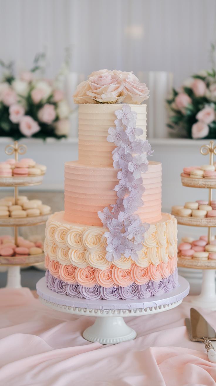
You can create a delicate and charming dessert table by focusing on soft pastel colors for your wedding cakes and sweets. A cake decorated with light shades of pink, mint green, lavender, or pale blue fits a romantic pastel theme well. Consider icing in smooth buttercream or fondant that blends these tones without overwhelming the eye.
Layered cakes with subtle ombre effects or simple floral designs can highlight the pastel palette beautifully. Flavors like vanilla bean, almond, or lemon work nicely with such cake colors and add a fresh, light taste. A cake that visually matches your pastel wedding scheme adds cohesion and elegance to the celebration.
Think about coordinating desserts that complement your main cake. Options like macarons, mini tarts, and mousse cups in pastel hues keep the color story consistent. Adding fresh berries or edible flowers can boost both flavor and appearance. How will your dessert table capture the softness and romance you want to convey?
Choose Pastel Colors for Cakes
Selecting the right pastel shades means considering colors that suit your overall wedding palette and create a calm, romantic mood. Light lavender, peach, pale yellow, and baby blue work well on cake icing. You can mix these tones gently for a soft gradient or keep each tier a single color for clean lines.
Pick edible decorations like sugar flowers, delicate piping, or pearl accents in matching pastels. These details make the cake look cohesive with your bouquet and table settings. Avoid very bright or dark colors as they clash with soft pastels and can disrupt the calming effect you want to achieve.
Ask your baker for color samples or photos of past pastel cakes. Testing a few icing colors can help you decide which pastel shades look best under your venue’s lighting. Are the pastels soft enough to feel romantic, but still vibrant enough to catch attention?
Offer Complementary Dessert Choices
Build a dessert table with treats that echo your pastel theme in both color and flavor. Macarons come in many pastel shades and pair well with fruit or cream fillings. Mini cupcakes with pastel frosting allow guests to try multiple flavors easily.
Panna cotta, fruit tarts, and pastel-colored jellies add variety while keeping the look gentle and sweet. If you want more texture, consider pastel meringues or light sponge fingers dusted with powdered sugar. All these choices create layers of flavor that keep dessert exciting.
Even small touches, like pastel-colored candy or delicate edible flowers on plates, help maintain the theme. Which desserts will delight your guests’ taste buds while fitting your romantic pastel vision? Make sure your sweets invite everyone to enjoy and admire your carefully crafted theme.
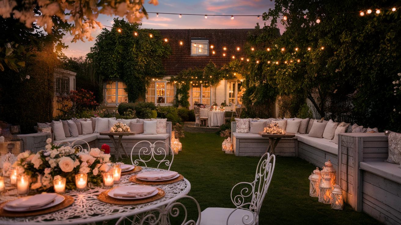
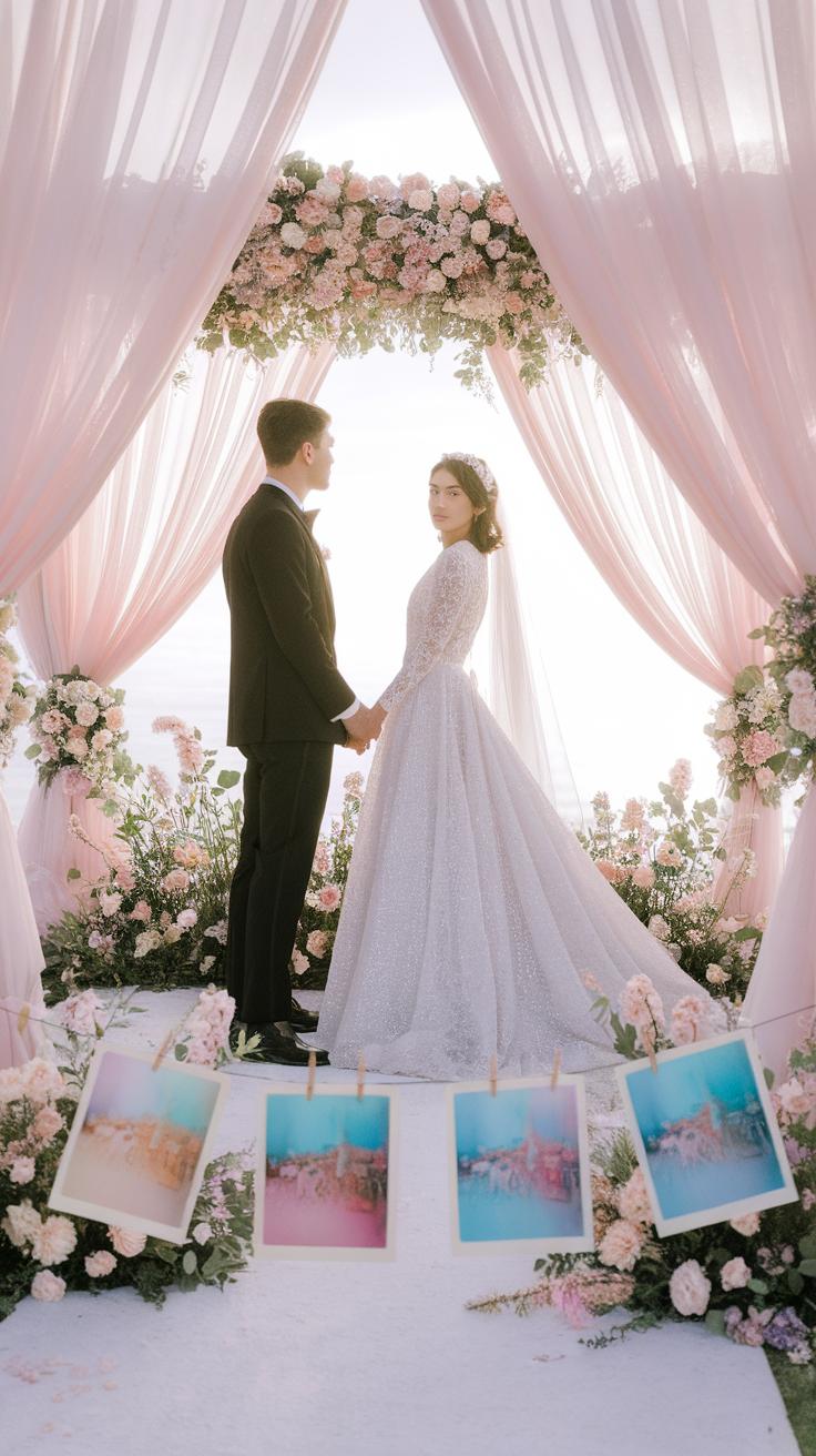
Making the Ceremony Space Romantic with Pastels
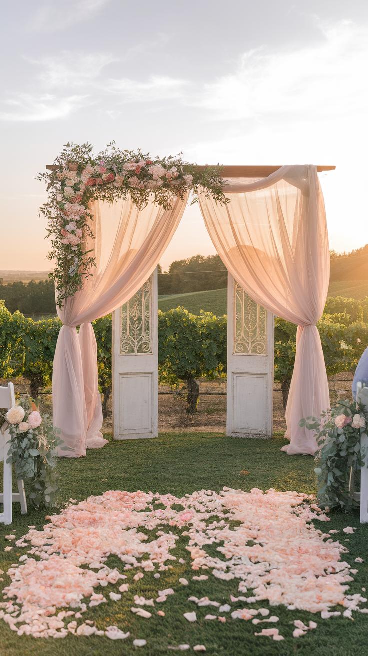
Pastel colors soften any ceremony space and bring a calm, intimate mood. Using fabrics, flowers, and lighting in gentle pastel shades creates a setting that feels both welcoming and romantic.
Think about the walls or ceilings where you can add pastel fabrics to frame the space naturally. Soft pinks, pale blues, light lavenders, or mint greens work well. These colors invite calm and can make your ceremony feel more personal and warm.
Pastel lighting, such as string lights with pastel bulbs or soft uplighting, enhances the colors without overwhelming the scene. They cast a soft glow that adds to the romance and draws attention to the important moments.
Use Pastel Draperies and Fabrics
Choosing the right fabrics helps highlight the ceremony area beautifully. Sheer voile or chiffon in pastel shades brings softness and movement.
Hang drapes behind the altar to create a gentle backdrop. Layering different pastel hues can add depth without making it busy.
Consider using fabric runners along aisles or wrapping chairs with pastel sashes. These touches tie the color scheme together and guide guests’ eyes towards the altar.
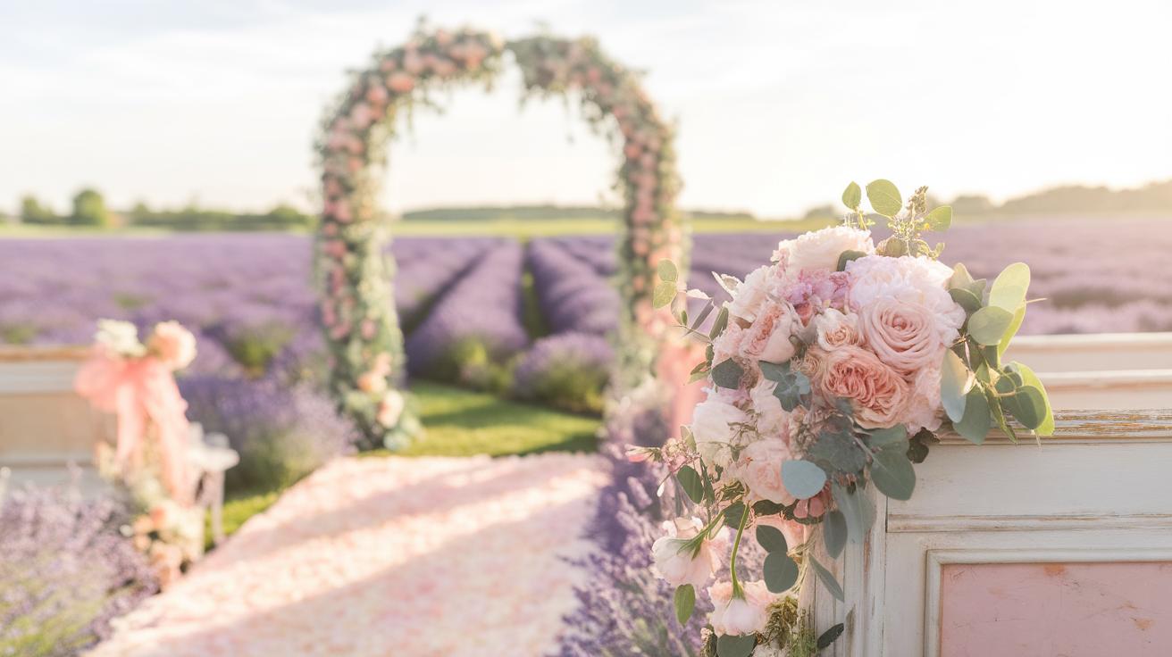
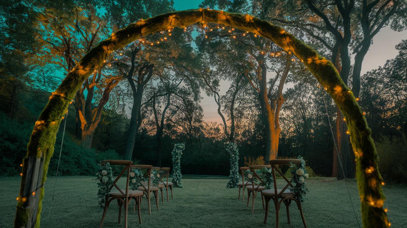
Create Floral Arches and Pathways
Floral arches in soft pastels mark the focal point of your ceremony clearly. Use flowers like pale roses, peonies, or hydrangeas combined with greenery for fresh, natural beauty.
Flower-lined pathways make it easy for guests to find their way and add charm to the processional. Small bouquets or petals in pastel shades on the aisle seats enhance this effect.
Flowers placed in matching colors help balance the overall look and keep it feeling light and romantic. What pastel flowers speak to your personal style for this special moment?
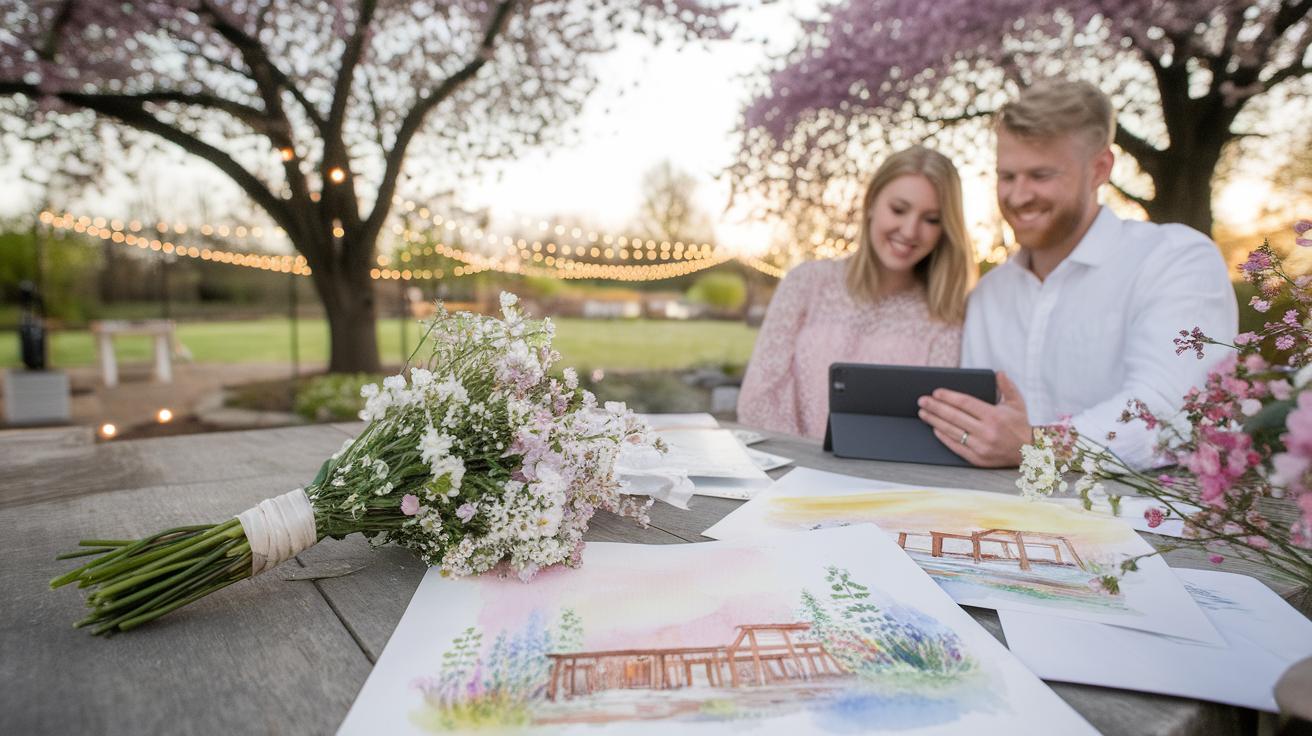
Incorporating Pastel Colors in Wedding Photography
Using soft pastel colors in your wedding photos can create a calm and romantic feel that fits perfectly with your pastel-themed ceremony. Choose locations where pastel shades naturally appear or can be added without overwhelming the scene. Look for gardens with light-colored flowers or gentle greenery to complement the pastel tones. A pastel-inspired setup can also be created indoors with carefully selected props and backgrounds.
Think about how the colors interact with the light in each scene. Pastels work best when lighting is soft and even, helping to reveal subtle hues and textures. Avoid harsh shadows that may distort the delicate colors. Include props like pale ribbons, vintage pastel furniture, or translucent fabrics. These details will add layers to your photos and keep the romantic mood consistent throughout your images.
How can you highlight the gentle tones while keeping the focus on the couple? Experiment with depth of field, using blurred pastel backgrounds to make your subjects stand out. Planning a photo session around these ideas will help you capture timeless photos that echo your dreamy wedding style.
Choose Pastel Backdrops and Props
Selecting backdrops in shades like dusty pink, mint green, or baby blue sets a gentle stage for your photos. Use fabric panels or painted boards to bring these pastel hues into your frames. For example, a light blush curtain behind the couple creates softness without distraction.
Include simple props that match your palette. Think of pastel balloons, paper fans, or delicate floral arrangements. Placing a few props close to the couple or around the venue helps keep the color story consistent. Vintage items like worn, pastel-painted frames or soft-colored cushions can add texture and interest.
Ask yourself what items reflect your personal style but still fit the soft pastel theme. Choose props that support your story but don’t steal attention away from your photos’ main focus – the emotions and connection of your wedding day.
Use Natural Light to Highlight Pastels
Soft natural light brings out the best in pastel shades. Shooting in the early morning or late afternoon, when sunlight is gentle, enhances the faded beauty of the colors. Avoid using direct midday sun, which can create harsh lines and dull pastel tones.
Use window light indoors or open shade outdoors to let the pastels shine. This type of light adds dimension to fabrics and flowers, making them appear more tactile and dreamy. Natural light also helps the camera capture subtle color shifts that artificial light might wash out.
Consider how shadows play with pastel colors in your photos. Shadows can add depth, but too much contrast reduces the softness you want. Position your subjects where light diffuses evenly for the best results. Have you noticed how some pastel hues almost glow under natural light? Using it well will bring that effect to your wedding photography.
Selecting Pastel Wedding Favors and Gifts
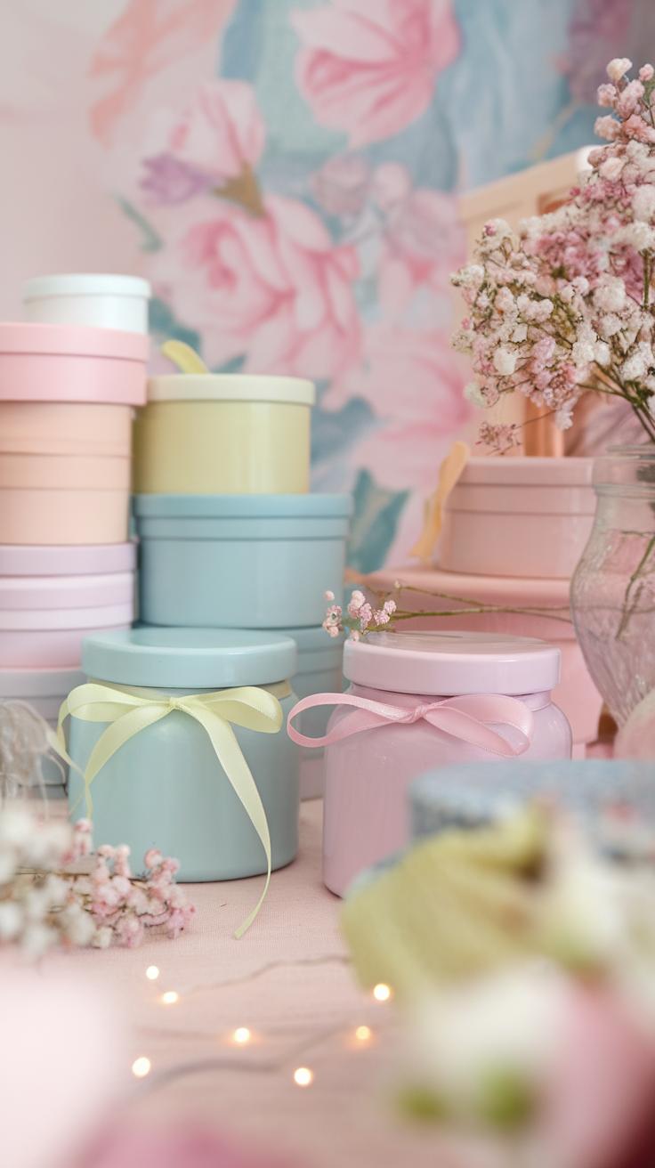
Choosing wedding favors in soft pastel tones helps keep your romantic theme consistent. Thoughtful gifts in gentle shades make guests feel appreciated while adding a personal touch to your ceremony. You can select from charming store-bought items or create your own DIY options that fit your wedding style and budget.
Consider favors that double as keepsakes. Items such as pastel-scented candles, mini succulent plants in pale pots, or silk lavender sachets become lasting reminders of your special day. Matching the color of your favors with your wedding palette strengthens the overall theme, making your celebration cohesive and memorable.
Think about what your guests will enjoy using or displaying. Personalized pastel bookmarks, hand-painted coasters, or small jars of honey tinted with a soft label stand out. These choices invite interaction and appreciation, ensuring guests leave with a gift they value and treasure.
DIY Pastel Favors That Impress
You can craft elegant pastel favors without much effort or expense. Filling small glass bottles with pastel bath salts or sugar scrubs is an easy way to add a personal touch. Tying them with soft pink or mint green ribbons creates a delicate look.
Another idea is baking cookies and decorating them with pastel icing, then wrapping them in light-colored paper or small boxes. Your guests will enjoy delicious treats that match your wedding colors.
Creating simple flower crowns using pastel blooms or assembling seed packets wrapped in pastel paper gives guests a gift that connects to nature. You might also customize pastel-colored bookmarks using cardstock, watercolor paints, or stickers, turning something simple into a memorable favor.
Buyable Favors with Pastel Appeal
Several stores offer wedding favors already styled in soft pastel tones. Pastel-colored mini candles, packaged in elegant boxes, provide a calming gift. Another popular option includes pastel macarons or chocolate boxes that fit beautifully with your romantic theme.
Consider purchasing small jars of pastel-colored honey or jam. These edible favors add a touch of sweetness and are easy to transport. You can also find pastel-themed keychains, decorative soaps, or ceramic trinket dishes, which guests can reuse long after the wedding.
If you want a practical item, pastel notebooks or pens with your wedding date printed make useful keepsakes. Retailers often offer personalized pastel favors, letting you include names or messages, which makes gifts more special for your loved ones.
Balancing Pastel Tones with Other Wedding Elements
Balancing pastel colors in your wedding avoids a flat or dull feel. Use accents that contrast softly against pastels to create focal points. Think beyond just flowers and invitations. Incorporate different elements that highlight your pastel palette without overpowering it.
Choose decor items like wooden furniture or natural greens to add depth. These can ground the lightness of pastel tones. Reflect on how bringing in neutral colors or metallic finishes might change the room’s energy. Could silver candle holders or a white lace table runner uplift your pastel linens?
Pairing pastels with richer textures and finishes breaks monotony. Look at how velvet cushions or satin ribbons interact with blush pink or powder blue. Does the mix catch your eye in a way smooth fabrics alone cannot?
Ask yourself: What small change can add dimension here? Sometimes one well-chosen accessory or surface does more than multiple pastel shades layered together.
Introduce Neutral and Metallic Accents
Neutral colors like ivory, beige, and gray highlight pastels without competing for attention. They provide breathing space in your color scheme. Imagine soft peach roses resting on a cream tablecloth. The neutral backdrop makes the pastel pop naturally.
Metallic accents bring subtle shine and sophistication. Silver or rose gold vases, candle holders, or cutlery add sparkle that lifts the gentle tones. These finishes reflect light and catch the eye without overwhelming your soft palette.
Think about adding a gold belt to your bridal gown or bronze lanterns in your aisle decorations. These touches blend warmth and elegance, sharpening the overall look. Could mixing brass and pastel accessories balance tradition with modern style?
Mix Textures for Visual Interest
Combining various textures gives your wedding design layers and flair. Soft chiffon drapes play beautifully against rustic wood tables or sleek glassware. Mixing velvet, lace, and satin creates contrasts that delight without clashing.
Try pairing a smooth pastel table runner with rough linen napkins, or a silk bouquet ribbon with wicker baskets. This variety adds tactile appeal and visual depth. How do these fabric choices influence the atmosphere you want to create?
Textures in floral arrangements also matter. Matt leaves with glossy petals, or soft greenery next to waxy blooms, produce subtle intrigue. By mixing in textured elements, your pastel wedding design feels richer and more inviting.
Conclusions
You now have a clear path to creating a pastel wedding that feels both romantic and personal. Soft pastel colors can set your day apart by adding subtle beauty and calmness. From choosing your color palette to selecting flowers, decorations, and attire, every detail contributes to a cohesive and lovely atmosphere. Remember that your choices should reflect what makes you feel happy and comfortable. Consider how each element complements the others to build a seamless experience for you and your guests.
Your soft pastel wedding ideas should not just look good but also feel right. Keep a balance between the pastel colors and other design elements to maintain interest and avoid monotony. Use natural light, textures, and accents to bring everything together. By focusing on harmony and simplicity, you can make a lasting impression without stress or fuss. Think about your preferences and how to best showcase your love story through these gentle hues.