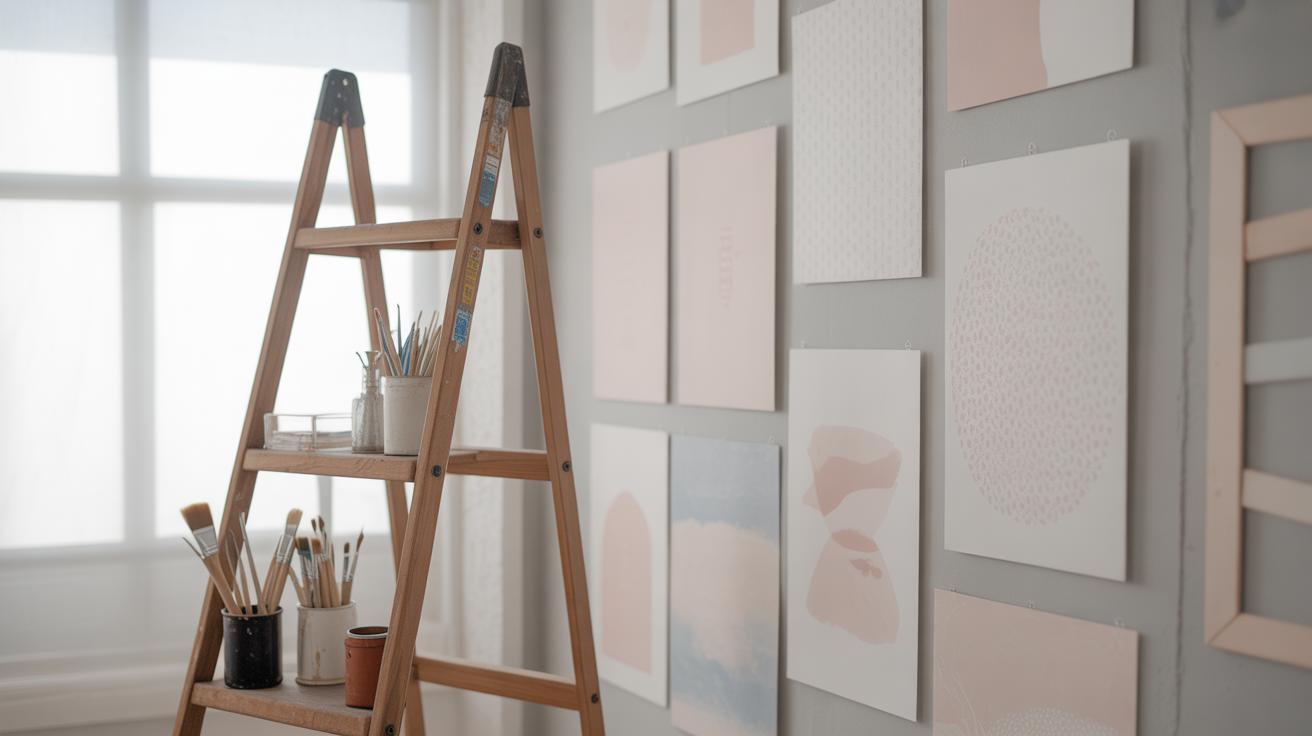
Introduction
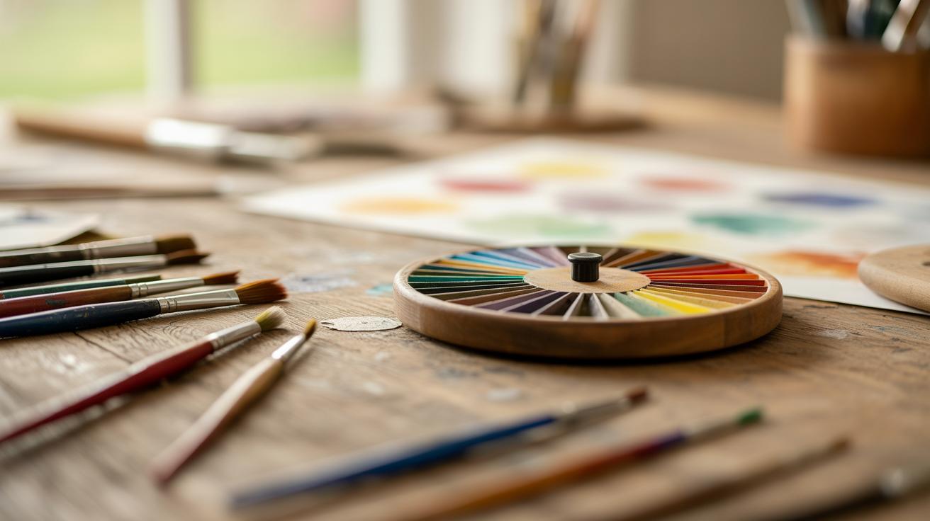
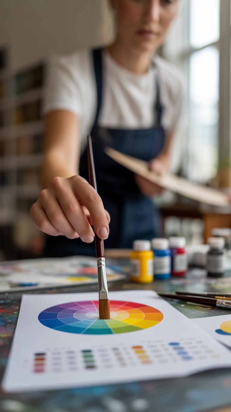
The colour wheel theory is a fundamental concept for anyone interested in art and design. It helps you understand how different colors relate to each other and how to combine them effectively. Whether you are mixing paints, choosing hues for your project, or exploring color in any creative way, the colour wheel is your guide.
This article explores the colour wheel theory in simple terms. We will explain the primary, secondary, and tertiary colors and how they form the wheel. You’ll learn practical tips to use this knowledge for your DIY art projects. By the end, you will feel confident in picking and blending colors to make your art stand out.
The History and Origin of the Colour Wheel
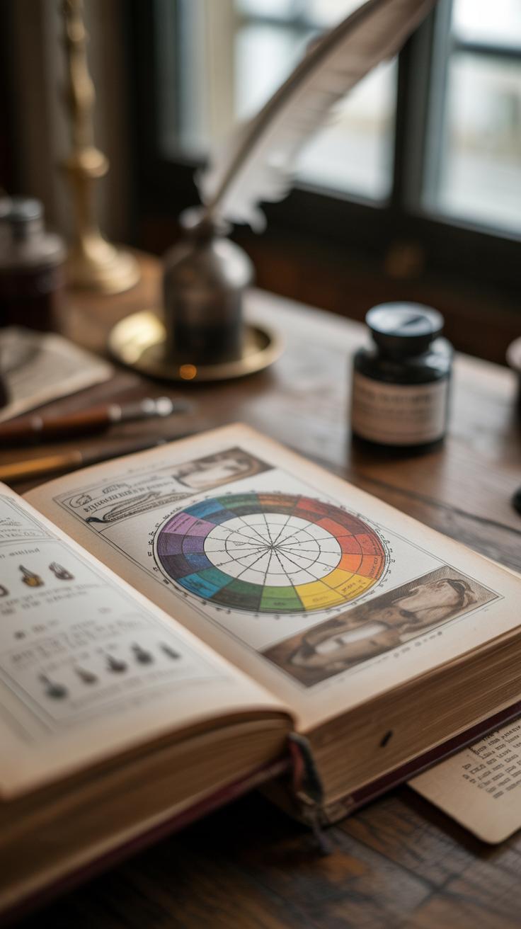
You might find it surprising that the colour wheel, something so common in art and design today, actually has roots stretching back several centuries. The story really begins with a handful of curious minds trying to make sense of light and colour — areas where science and art overlap in interesting ways.
Isaac Newton played a crucial role here. Around 1666, he used a prism to split white light into a spectrum of hues. This led him to create what he called a “colour circle.” His circle arranged spectral colours—red, orange, yellow, green, blue, indigo, and violet—in a continuous loop. Newton’s idea linked colour to light scientifically and visually, showing how colours relate in a way that wasn’t obvious before.
What made Newton’s colour circle so significant was how it started to shape thinking about colour beyond just pigments. It was an early tool for connecting the physical and perceptual aspects of colour, hinting at the harmony and contrast artists would later explore.
Over time, others built on Newton’s ideas. Goethe, with his more psychological approach, challenged some scientific notions by emphasizing how humans perceive colour emotionally. In the 18th and 19th centuries, artists and scientists began to blend theory and practice.
- Johann Wolfgang von Goethe introduced a colour wheel focusing on how colours affect emotions.
- Michel Eugène Chevreul explored how colours appear when placed side-by-side, influencing textile and art industries.
- Later, artists like Johannes Itten refined the wheel in art schools, integrating principles of harmony and contrast.
So, the colour wheel as we know it today isn’t just one thing. It’s the result of scientific experiments, artistic observations, and evolving ideas about how we see and use colour. When you look at your colour wheel, you’re seeing centuries of attempts to understand something as simple — yet complex — as colour itself. Makes you wonder — what will happen next in the story of colour theory?
Understanding Primary Colors
The idea of primary colors is central to the colour wheel—they’re the base from which all other colors are made. You can think of them as the starting point, the three hues that can’t be created by mixing others together. But there’s a twist here: there isn’t just one set of primary colors. It depends on the context—whether you’re working with paint, light, or digital displays.
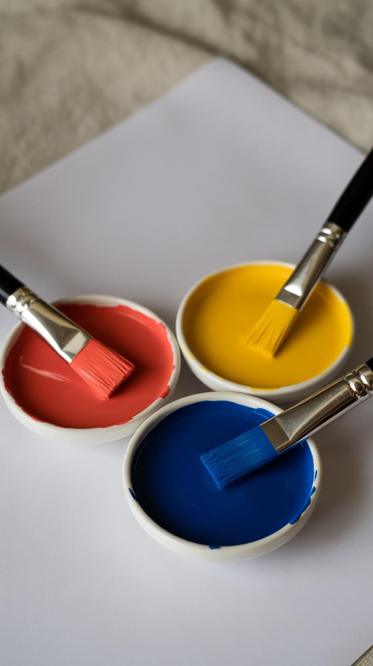
Traditional Primary Colors Red Yellow Blue
The classic trio—red, yellow, and blue—has been the go-to for artists for centuries. These pigments form the traditional colour wheel used in painting. When you mix these, you get all the secondary and tertiary colors on that familiar wheel with tones of orange, green, and purple sprouting from the blends. Red feels bold; yellow brings warmth, and blue offers coolness. Together, they make a broad range of colors, even though the mix isn’t perfect. Sometimes, red and blue might not produce a true purple, for example.
This set of primaries isn’t flawless scientifically, as some colours just can’t be perfectly mixed from RYB pigments, but for practical painting and pigment mixing, it’s simple and intuitive. Painters have trusted these for ages. I’ve often found it’s easier just to stick with them if you’re working with traditional media.
Modern Primary Colors Red Green Blue
Digital and light-based colours use a different model entirely: RGB—red, green, and blue. This system works on light itself, rather than pigments. When these colours combine, they create white light, not a muddy mess like paint can do. Screen pixels use this to produce the full spectrum you see on monitors and phones. It’s fascinating how mixing these three colors of light differs so much from mixing pigments.
This explains why colours on screens often look sharper or more intense than paint. The red here is a bit different, brighter in some ways, because it’s emitted light, not reflected. Green takes the place of yellow, reflecting the physics of light perception rather than pigment behavior. It may feel a bit odd if you’re used to RYB, but for any digital art or design work, understanding RGB is key.
Do you find yourself switching between these two systems often? It can throw you off, especially when trying to match digital colors to paint. Recognizing that these “primary” colours adapt to context might help you avoid frustration in your projects.
Secondary Colors and How They Are Made
Creating Orange, Green, and Purple
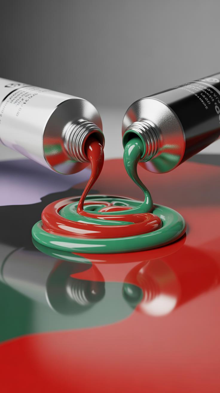
Secondary colors come from mixing two primary colors together. If you think about it, it’s a pretty straightforward idea, though the results can be quite surprising depending on your medium. For painters working with traditional pigments, mixing red and yellow makes orange. Blue and yellow combine to form green. Lastly, red and blue together produce purple.
These three—orange, green, and purple—sit right between the primary colors on the colour wheel. Their position helps you see how colours transition and relate to each other. For example, mixing red and yellow gives orange a warm feel that bridges those two primaries. But if you try mixing, say, purple by blending red and blue, you might get a slightly different shade depending on the exact tones or paints used.
It’s worth playing around with these mixes yourself to get a better feel. Mixing primaries isn’t always perfectly predictable. That’s part of the charm—sometimes you get a dull brownish purple or a vibrant one, depending on the pigments.
Secondary Colors in RGB and RYB Models
The secondary colours depend on the colour model you’re using—RYB for pigments and RGB for light. In the traditional subtractive model (RYB), the secondary colours are:
- Orange (red + yellow)
- Green (yellow + blue)
- Purple (red + blue)
Meanwhile, in the additive RGB model, which deals with light, the primaries shift to red, green, and blue. Mixing these produces different secondaries:
- Cyan (green + blue)
- Magenta (red + blue)
- Yellow (red + green)
You might find it a bit confusing that “yellow” shows up as a secondary colour in RGB but a primary in RYB. That happens because light and pigment behave differently. It highlights why understanding the context of what you’re mixing is key.
Differences in Various Color Models
Mixing colours in paint versus light isn’t the same world. With pigments, colours subtract wavelengths, so mixing two primaries tends to absorb more light, often resulting in darker or muddier tones. You get secondary colours by combining pigments that block out parts of the spectrum. That’s why mixing blue and yellow pigment gives green, since blue absorbs red and yellow absorbs blue wavelengths, leaving green visible.
On the other hand, light uses addition. Red, green, and blue light mix to create all sorts of colours—adding more light creates brighter—and eventually white—colours. So in light, combining red and green makes yellow light. This is very different from mixing red and green paint, which probably ends up looking more brownish-gray. Doesn’t it feel a bit strange how the same colour names don’t quite correspond between models?
Understanding these models helps you decide what to expect when mixing colours on your canvas or screen. If you’re working with physical paints, trust subtractive mixing rules. For digital projects or lighting, the additive model is your friend. Both systems serve their purpose, but they don’t always see eye to eye.
Tertiary Colors and Their Placement
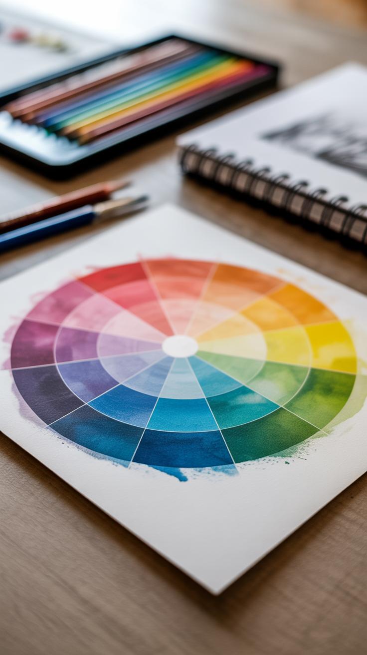
Tertiary colors are created by mixing a primary color with a neighboring secondary color on the colour wheel. This gives you hues that feel a bit more subtle or complex than pure primaries or secondaries alone. They sit right between the primary and secondary segments, filling in gaps and expanding your palette in interesting ways.
Think of it like this: if you imagine red as a base, and orange as a mix of red and yellow, a tertiary color would be red-orange—a blend leaning more towards red but softened by some orange warmth. These hues add variety without straying too far from familiar tones.
Examples of Tertiary Colors
Here are some common examples of tertiary colors and how to create them:
- Red-Orange: Mix red with orange (which is red plus yellow). You get a rich, warm color often used in autumn palettes.
- Yellow-Green: Combine yellow and green (green being blue plus yellow). This yellow-green can feel fresh or earthy depending on the mix.
- Blue-Violet: Blend blue with violet (which itself mixes blue and red). This gives a cool, deep tone that’s less intense than pure blue or purple.
These are just a few, but every pair of primary and secondary neighbors forms a unique tertiary hue. The exact shade depends on your mixing ratio, so you have quite a bit of control. I’ve found experimenting with small amounts can reveal surprising results.
Using Tertiary Colors in Art
Tertiary colors offer subtle shifts in mood and depth that primary and secondary colors alone don’t provide. They help avoid the flatness that sometimes comes with a limited palette. Using them can:
- Add nuance to shadows or highlights without jumping too far from your core colors.
- Create more natural and sophisticated landscapes, where you rarely find pure primaries.
- Balance compositions by introducing less saturated, more complex tones.
For instance, mixing in a bit of red-orange can warm skin tones, while yellow-green accents can brighten foliage without overwhelming it. It’s a way to make your colors feel more intentional, less “basic.” Do you find yourself reaching for tertiary shades naturally? If not, they’re worth exploring—you might find your artwork gains a new level of richness.
Complementary Colors and Their Effects
Complementary colors are pairs positioned directly opposite each other on the colour wheel. Think red and green, blue and orange, or yellow and purple. When placed side by side, these pairs create a visual push and pull that can feel quite striking. It’s almost like they enhance each other’s intensity simply by facing off.
This opposition generates a clear contrast that often feels energetic and attention-grabbing. You might notice that when placed together, complementary colors almost seem to glow or vibrate. That effect can make an image pop or draw the eye to specific areas.
But there’s a catch. Using complementary colors in equal amounts can produce a jarring effect that’s uncomfortable to look at for long. It’s easy for the eye to get overloaded or distracted.
Here are some tips for managing that balance:
- Let one color dominate while the other acts as an accent.
- Try muting one color slightly to reduce the tension.
- Use variations in saturation or lightness to create more subtle contrasts.
- Consider the emotional feel of your colors — not every complementary pair suits every mood.
The key is to experiment and observe how slight changes affect the whole. Sometimes, a tiny bit of the opposite color can intensify the main color without being overwhelming. Ever found yourself hesitating to use a combination because it felt too sharp? That’s why mastering complementary colors takes a bit of practice—and perhaps, a little patience.
Analogous Colors and Harmony
Analogous colors sit side by side on the colour wheel. They share a similar hue, which makes their combinations feel naturally linked, almost like they belong together. When you use analogous colors, the colour scheme generally feels calm, balanced, and easy on the eyes. This harmony happens because the hues overlap slightly in their wavelength, so your brain doesn’t have to work too hard to process them. There’s a subtle comfort in that closeness, though sometimes the scheme can seem a bit flat if not mixed with varying intensities or added texture.
Common sets of analogous colors include:
- Blue, blue-green, and green – great for aquatic or natural scenes.
- Red, red-orange, and orange – a warm, fiery group that feels energetic yet coherent.
- Yellow, yellow-green, and green – fresh, spring-like combinations, often perceived as uplifting.
Each of these groups helps create smooth colour transitions where one shade gently leads into the next. For example, I once worked on a DIY canvas using blue to green tones, layering paint in a way that made the whole piece feel unified without sharp breaks.
Using analogous colors in your art helps maintain a unified look. When you’re painting a room, designing a poster, or even making a card, choosing a small set of neighbours from the wheel reduces the risk of clash and can lend a pleasing, cohesive effect. You might want to play with brightness and saturation within the set to avoid monotony and add depth. Think about which part of your artwork you want to highlight, and use a stronger or brighter hue from the analogous set there.
Do you want your colours to blend or to stand out? Analogous schemes lean toward blending, but with enough contrast in shade or texture, they can still keep your work visually interesting. Sometimes less is more, especially when you want to create peaceful atmospheres.
Warm and Cool Colors

Defining Warm Colors
Warm colors usually include reds, oranges, and yellows. These colors tend to feel close, as if they’re coming toward you in a painting. They often evoke energy, excitement, or even urgency. If you think about a campfire’s glow or autumn leaves, that warmth feels tangible, almost physical. It’s interesting—you might find that using warm colors can make a space or a piece feel more intimate or lively, but sometimes they can feel a little overwhelming if overused. For example, a splash of red in a landscape can grab your eye immediately, while too much might feel chaotic or aggressive.
These colors tend to stimulate the senses and can encourage activity and engagement. If you struggle to make parts of your artwork stand out, warm colors could be the nudge you need. Yet, whether they inspire comfort or tension often depends on how they’re combined.
Defining Cool Colors
On the other side, cool colors—like blues, greens, and purples—usually recede visually, giving a sense of depth or calm. Imagine the feeling of looking at a quiet lake or a shady forest. These colors bring a chill, but not necessarily in a negative way. They invite relaxation and can help create restful spaces in your art. Personally, I find that cool colors help balance out warm tones; they offer a sort of breathing room.
Cool colors can soothe or even inspire contemplation. They might appear less active but don’t mistake that for being dull. Blues especially can suggest vastness, like a clear sky or ocean, which might open up feelings of freedom or loneliness, depending on the context. Green often feels natural and refreshing, though in certain shades, it can seem distant or even dreary.
Does your project need energy or calm? You’ll find the answer somewhere between these two groups. The emotional push and pull between warm and cool colors is subtle but powerful, shaping how people respond to your work. You might be surprised how much adjusting just a hint of warmth or coolness can alter the mood of a piece.
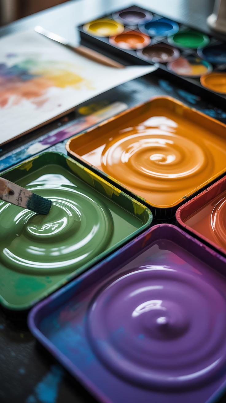
Practical Tips for Using the Colour Wheel
When you’re mixing your own paint colors, the colour wheel becomes a really handy tool—if you know how to use it right. The trick is to start with clean, primary colors and mix in small amounts. It’s tempting to throw everything in at once to get the shade you want, but that often leads to muddy or dull tones. Instead, add colors gradually and test as you go. For example, mixing blue and yellow gives green, but layering too many colors at once can quickly lose vibrancy.
Try to avoid mixing complementary colors directly if you want to keep brightness—these pairs, like red and green, often neutralize each other and turn grayish or brownish. If you want a muted tone, then yes, complementaries can help, but it’s a balance.
Choosing a palette is where the colour wheel really shines. Picking colors close together—analogous schemes like blue, blue-green, and green—creates harmony, which works well for calm or natural scenes. Complementary schemes (colors opposite on the wheel) bring contrast and energy; they’re useful if you want certain parts of your project to pop. Triadic schemes, where you use three colors evenly spaced around the wheel, can feel vibrant but balanced, though they do require careful handling to avoid clashing.
One way I find helpful is to pick a dominant color first, then choose supporting colors based on the wheel’s relationships. It keeps your palette coherent and easier to manage. Do you find you lean toward certain palettes more naturally? Let the wheel guide you, but don’t feel locked in—it’s just one way to think about your colors.
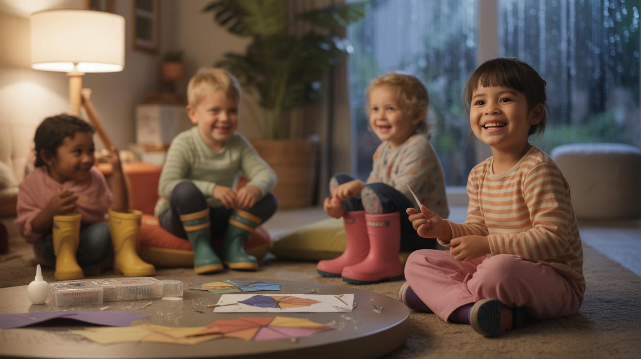
Experimenting and Developing Your Color Sense
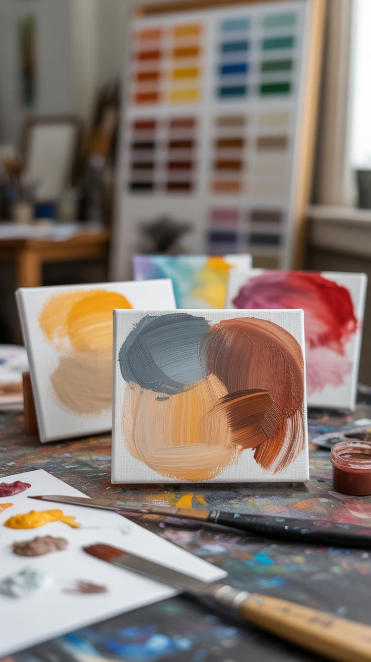
Developing a personal feel for color comes down to practice—lots of it. Reading about theory helps, but nothing replaces hands-on exploration. The colour wheel is a guide, not a rulebook, so try bending it to see what speaks to you. Simple exercises can open your eyes to color’s nuances.
Start by creating your own color charts. Mix primary colors in different ratios and note the shades you get. This reveals how subtle shifts change the mood entirely. Next, try mixing colors to match objects around you, like a leaf or a sunset. It’s a messy, sometimes frustrating process, but it tunes your eye.
Observation plays a huge role. Just look around—nature offers endless examples of unexpected harmonies and contrasts. Pay attention to shadows, light, and how colors change with the time of day or weather. This trains you to see beyond the obvious.
Don’t shy away from mistakes. If a mix looks wrong or a palette feels off, ask why. Those errors often uncover what you truly prefer. Sometimes, a “failed” experiment leads to a new color combo you’d never planned. So, embrace the missteps—they’re part of your unique learning curve and your journey toward mastering color.
Conclusions
The colour wheel is more than a circle of colors. It is a tool that shows you how colors relate and interact. Using what you’ve learned about primary, secondary, and tertiary colors, you can create balanced and appealing color combinations. This knowledge can improve your painting, crafting, and design work.
Try applying colour wheel theory in your next project. Experiment with complementary and analogous colors, and observe how they change the mood and look of your art. With practice, you will develop an instinct for color, making your DIY creations more vibrant and visually pleasing.