Introduction
Your business branding sets the stage for how your audience views your company and services. For event planners, choosing the right colors can make your brand stand out and connect emotionally with your clients. Business Branding Inspiration With Color Palettes For Event Planning is a key part of building a recognizable and appealing brand.
This article covers the importance of color in branding, practical color palette choices for event planning, and how you can use colors to create a strong, lasting impression. You will find examples, comparisons, and checklists to help you decide what works best for your business.
Business Branding Inspiration

Branding in event planning isn’t just about picking colors or designing a logo; it reflects who you are and what your business stands for. When people see your brand, they form quick impressions that shape whether they trust you. You might wonder how much those first few seconds matter — well, quite a lot. Your branding sets expectations before a client even touches base. Is your brand warm and inviting? Professional and sleek? Quirky and fun? These feelings come from your visual elements and the way you communicate.
Think about it: when you scroll through event planners’ profiles, some stand out, some blend in. Why? Because the standout ones use consistent logos, color schemes, and messaging that convey their unique style and values. That consistency builds a sense of reliability. Clients pick up on that — they want someone who’s clear about what they offer.
Key elements like logos, colors, and messaging don’t just decorate your materials; they are part of your identity. A logo acts as a symbol you’ll be remembered by. Colors evoke emotions, sometimes subtly influencing decisions. Messaging tells your story and defines your voice. All these parts work together to shape how your business feels, not just what it looks like.
How Colors Impact Brand Recognition
Colors play a huge role in how clients perceive your brand. It’s not just about what looks nice — color can trigger memories and emotions that stick with people long after they’ve seen your logo or website. For example, blue often makes people feel calm and trustworthy, while red can create excitement or urgency. These reactions happen unconsciously. When you choose colors thoughtfully, you set an emotional tone that can make your event planning business seem reliable, fun, elegant, or any other vibe you want.
Clients tend to remember colors more easily than names or slogans. If your brand’s palette is consistent, it helps embed your image in their minds. Imagine you attend an event that uses soft pastels versus one with bright primaries — the feelings will differ, and those differences affect how you remember and relate to the event. In a tricky way, colors help define your brand’s personality without you saying a word. But it’s not just about personal preference; color perceptions change across cultures and even age groups, so the context of your audience matters a lot.
Color Psychology And Its Effects

Color psychology studies how hues influence human behavior and emotions. It’s about understanding that colors aren’t random — they have meanings ingrained by biology and culture. For instance, green often represents growth and renewal, making it a great choice for outdoor or eco-friendly events. Yellow can uplift moods and bring warmth, but overusing it might cause anxiety.
In event planning, these subtle cues matter. Imagine decorating a corporate event in blue tones to inspire confidence and professionalism. Or using orange for a launch party to convey energy and creativity. Choosing the right color can amplify the atmosphere you want attendees to experience, sometimes even changing their mood before they notice anything else.
Examples Of Successful Color Uses
Look at brands like Tiffany & Co., which is instantly recognizable for its signature robin’s egg blue — it signals luxury and exclusivity, yet feels fresh and inviting. Similarly, event businesses that specialize in weddings often lean towards soft blush pinks or elegant golds to suggest romance and sophistication. These palettes work because they align closely with the emotions the brand wants to evoke.
You might also find event planners who use bold contrasts, like black and red, to energize corporate functions or galas. The contrast grabs attention and suggests seriousness mixed with excitement. Which makes you wonder — could sticking with muted colors for all events miss opportunities to engage different client emotions? It’s worth experimenting, even if the perfect palette feels elusive.
Choosing Your Brand Color Palette

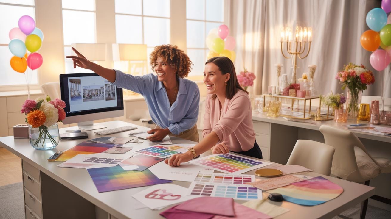
Picking your brand’s colors can feel like a big decision, possibly overwhelming, but it doesn’t have to be. First, think about the personality your brand wants to show. Is it serious or playful? Traditional or modern? Your color choice should echo these traits, but it’s rarely so simple—sometimes, colors you think suit your brand feel off once seen in use.
Understanding your target market matters too. Are your customers young and bold, or more conservative? You might want to test some colors with a sample audience before finalizing. It’s a bit like picking an outfit you’ll wear every day; comfort and fit count.
Here’s a quick checklist to guide you:
- Identify brand personality traits you want to highlight.
- Research your audience’s color preferences, considering cultural differences if relevant.
- Test your shortlisted colors in various settings—online, print, merchandise.
- Evaluate contrast to ensure readability and accessibility.
- Stay consistent with your brand voice in the feel your colors evoke.
Some common pitfalls? Avoid colors that clash badly making your brand hard to look at. Also, don’t pick a palette solely on personal taste—your brand isn’t just you. Poor contrast can kill usability, while colors that feel off-brand might confuse your audience about who you are.
So, take your time. Experiment. Be ready to reevaluate if something feels odd later on. Color choice is part science, part art, and a bit of intuition too.
Top Color Palettes For Event Planners

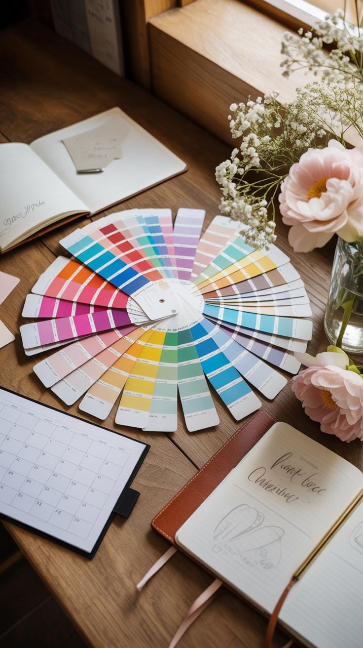
When you think about color palettes for event planning, certain combinations just come to mind as classics. But the choice really depends on the type of event — what message you want to send, the mood you aim to create. For example, there are palettes that scream sophistication, perfect for formal galas or black-tie weddings.
Elegant And Classic Palettes
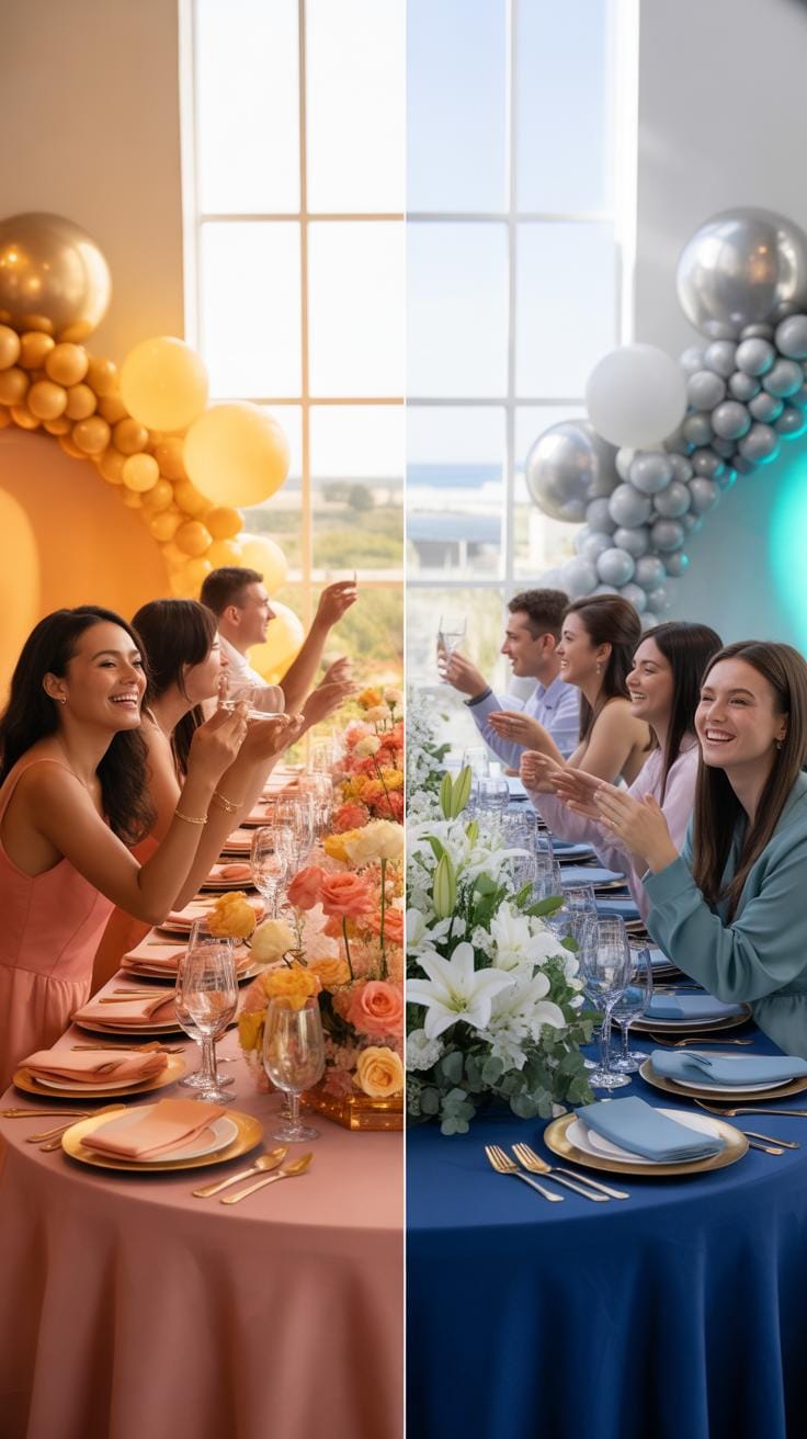
Imagine subtle shades like soft ivory, blush pink, and dusty blue. These colors tend to create a calm, refined atmosphere, great for weddings or corporate dinners where understatement is key. Another popular set includes deep navy, gold accents, and cream. This one feels timeless, a bit regal, often seen in upscale events. You might also find muted greens combined with warm taupe—there’s something quietly luxurious about that mix.
These palettes avoid loud color clashes. Instead, they rely on gentle contrasts and classic tones to pull the whole event together without overwhelming guests or detracting from the sophistication expected at formal occasions. It’s about a balanced look that doesn’t shout but makes an impression. What’s more, choosing such palettes allows for versatile decoration options, from linens to lighting.
Bright And Energetic Palettes
On the flip side, there’s a whole range of color combos that bring a joyful, lively vibe—think sunshine yellow paired with aqua or a punchy coral mixed with lime green. These sets are usually for events that want to feel fresh and upbeat: birthday parties, summer festivals, or casual corporate meetups where energy matters more than formality.

These palettes often use high contrast and unexpected pairings, appealing to younger crowds or brands that embrace playfulness and creativity. They can make an event feel less structured and more spontaneous. Bright palettes might not work as well in very formal settings, but they’re fantastic for engaging attendees and creating memorable experiences at more relaxed gatherings.
Choosing the right palette is more than picking pretty colors. It’s about capturing the spirit of the event. What kind of atmosphere do you want? Which colors tell your story best without saying a word? These palettes are tools to help you answer those questions visually.
Using Colors Consistently Across Materials Business Branding Inspiration
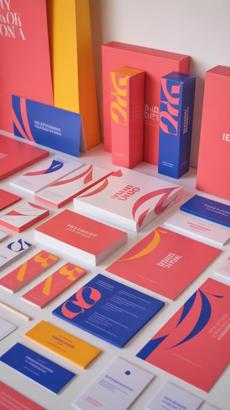
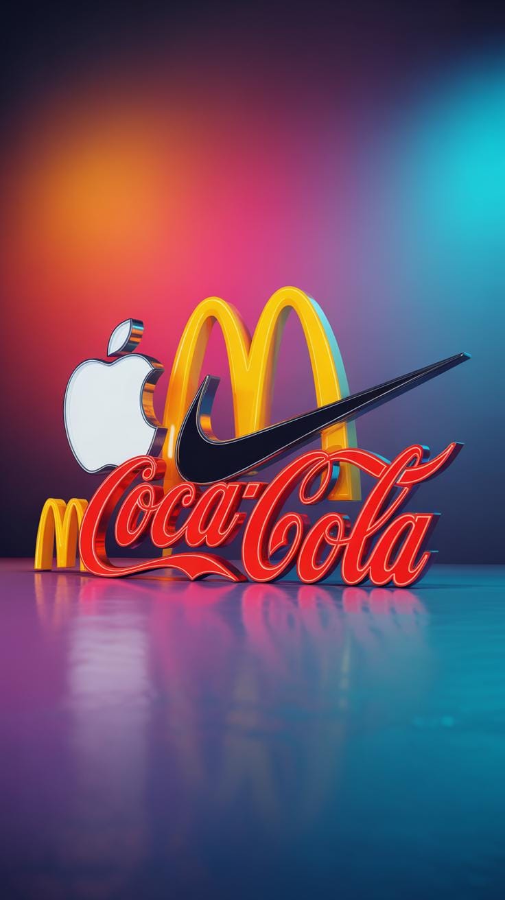
It might seem obvious, but using the same colors consistently in your business materials—logos, websites, flyers, even event decor—is more than just an aesthetic choice. It works on a deeper level, almost like a quiet reminder of who you are and what you represent. When people see the same shades over and over, their brains start connecting those colors with your brand. Over time, this builds familiarity and trust, whether they realize it or not.
Think about your favorite brands. Chances are, you recognize their colors immediately, before you even look at the name. That’s no accident. Consistency in color use means your audience picks you out from the crowd, creating a sense of reliability and professionalism. That said, aiming for perfect uniformity everywhere can feel a bit rigid sometimes. A little flexibility, like slight variations to fit different media, often works better.
Creating A Color Style Guide
Developing a simple color style guide can be surprisingly helpful for making this consistency manageable. You don’t need a complex manual; just outline your primary colors, secondary colors, and how they should be used. Include guidelines on color proportions, contrast ratios for accessibility, and perhaps notes on mood or emotion each color is meant to evoke. This acts as a reference for everyone involved in your branding and marketing, reducing guesswork.
When I first created a color guide for a small event planning startup, having these clear rules saved a lot of back-and-forth during the design phase. It doesn’t just protect your brand’s look; it also makes collaboration smoother. You might find that defining colors exactly can even inspire new creative directions—it’s encouraging to have defined boundaries to play within.
Examples Of Color Consistency Strengthening Brand Trust
Take a moment to look at companies that maintain their colors consistently across email campaigns, social media, and physical packets or brochures. The result is a seamless experience that feels trustworthy, aligned, and thoughtful. When you turn up at an event, their color choices even shape the atmosphere, tying everything back to their core identity. This kind of consistency is reassuring—it says, “We care about details.”
For example, a pastel-based brand using their soft pinks and blues across every touchpoint evokes a calming, approachable vibe. Or a bold use of black and gold screams premium and confident. Consistent colors can evoke emotions subconsciously, helping build a loyal audience. But, you might wonder, can sticking with the same colors every time become a bit dull? Possibly. That’s where thoughtful accents or seasonal tweaks come in, to keep things fresh without losing recognition.
How To Test Your Brand Colors

Testing your brand colors goes beyond just seeing them on a screen. You want to know how they perform in various conditions. One practical method is to print samples of your colors on different types of paper or fabrics. This can tell you a lot about how the colors might look in real-world applications. Also, try viewing your palette under different lighting conditions – natural light, fluorescent, and even candlelight if that fits your brand vibe. Colors can shift and surprise you, sometimes in ways you didn’t anticipate.
Feedback from clients is another crucial step, and I mean real feedback, not just a quick yes or no. You might send out small color samples or mockups and ask for their impressions. Sometimes clients notice things you overlooked, like a shade feeling too harsh or too dull for the mood you want. It’s a bit of trial and error, but it helps you get closer to something that resonates.
Feedback Techniques For Colors
Gathering feedback can be simple. You don’t need fancy tools; even a brief online survey asking specific questions about color feelings or associations can yield insightful responses. Peers in your industry can also provide perspective, especially if they compare your palette alongside competitors. Plus, letting people see colors in context—on event invitations, social media posts, or merchandise—allows more grounded opinions. Sometimes showing a color out of isolation helps clarify whether it’s working or not.
Viewing Colors On Multiple Devices
Don’t underestimate how different screens show colors. What looks perfect on your laptop might appear muted or overly bright on a phone or tablet. This inconsistency can also extend to printed materials, where inks and paper types influence hues. To check color accuracy, use color calibration tools if available, or at least view your designs on several devices and print tests. It’s tedious but pays off by avoiding unexpected surprises when your brand appears in different settings.
Case Study Comparing Brand Colors
Brand A Color Scheme And Impact
Brand A uses a palette dominated by soft blush pink and gold accents. The pink offers warmth and approachability, while the gold adds a touch of luxury and sophistication. These colors evoke feelings of romance and elegance, which fits well with wedding and upscale event planning. When I first saw their branding, it felt inviting but also exclusive—like stepping into a refined space where attention to detail matters. The blush pink, though gentle, isn’t overly sweet, giving it a mature vibe that suggests professionalism wrapped in creativity. It’s easy to imagine potential clients feeling comforted and excited by this palette, sensing both care and style.
Brand B Color Palette Differences
In contrast, Brand B opts for a bold combination of deep navy blue with vibrant orange highlights. The navy suggests trustworthiness and reliability—qualities you want when planning major events. Orange is an energetic, enthusiastic color, sparking creativity and a sense of excitement. The blend feels more dynamic and adventurous compared to Brand A’s restrained elegance. While Brand A might attract clients seeking classic sophistication, Brand B likely appeals to those looking for innovation and high-energy events. The vibe shifts from gentle assurance to confident boldness. It’s interesting how just swapping pastels for strong primaries alters the entire brand personality, shaping what clients might expect in service style and event atmosphere.
Steps To Launch Your Brand Colors

Setting new brand colors in motion isn’t just a splash of paint on your materials. It’s a process you want to pace carefully so nothing slips through without notice. Start with a checklist that helps you prioritize and time each step properly.
First, map out when your visual assets need the new colors. Logo revisions come top of the list because they’re everywhere—from business cards to digital headers. Then focus on updating your website; consider how color shifts impact user experience and brand perception online. Social media profiles should reflect the new look around the same time to keep your audience in sync.
Here’s a quick checklist:
- Revise logo files and brand guidelines.
- Refresh website elements: buttons, banners, backgrounds.
- Swap out colors in social media graphics and posts.
- Update printed materials like flyers, brochures, or signage.
- Adjust packaging if applicable.
- Inform your team about the changes—they’re brand ambassadors too.
Timing-wise, plan these changes in phases rather than a sudden switch. This helps you measure reactions and tweak as you go. I remember when a friend’s startup relaunched with fresh colors; they staggered updates over six weeks and noticed steady positive feedback instead of confusion.
Preparing Marketing Materials
The behind-the-scenes work on marketing materials can’t be rushed. Logos often need resizing or reformatting before you apply new colors—don’t underestimate the technical side. Websites might require both front-end tweaks and backend adjustments to ensure consistency, especially if you use templates that auto-generate components.
On social media, update profile pictures, cover photos, and highlight elements. But beyond visuals, think about your captions and how you talk about the brand. New colors can subtly shift tone and perceptions—have you considered updating your messaging to match? It might be a good time.
Announcing Your Brand Change
Revealing your new colors is more than a post or email blast. You want your audience to feel included, maybe even involved. What if you sneak peek your palette through stories or behind-the-scenes posts to spark curiosity? People tend to like being in the know, and it can soften the shock of change.
For more formal announcements, organize a small event or webinar explaining why you refreshed the brand colors. Share the story behind your choices. It can be as simple as a blog post or newsletter explaining the evolution and what it means for your business moving forward.
Above all, consistency matters. Ensure that when you talk about the change, your visuals and words reinforce each other. It’s tempting to rush this stage, but with careful communication, your new colors can strengthen your brand presence rather than confuse your audience.
Common Challenges With Color Branding

Color branding is tricky. You pick a palette that feels right, but soon realize some colors just don’t translate well across all media or audiences. It’s a common pitfall that trips up many businesses—colors look perfect on your screen but appear dull or muddy in print or online.
Another headache is accessibility. Not thinking about colorblindness can mean a big part of your audience misses key information or feels excluded. It’s a detail often overlooked in the rush to create bold visuals but turns out crucial for genuine connection.
You might also struggle to maintain the same hues consistently over time. As your brand grows or changes, color shades get altered unintentionally because of different printers, screens, or design tools. This inconsistency chips away at brand recognition.
So, what can you do? Here are some quick fixes:
- Test your chosen colors across various devices and print materials early on.
- Use online tools to simulate how your palette appears for people with color vision deficiencies.
- Create clear brand guidelines detailing exact color values (RGB, CMYK, Hex), and stick to them. No guessing.
None of these solve everything immediately but help paint a steadier picture over time.
Addressing Colorblind Accessibility
Choosing colors readable by those with color vision deficiencies isn’t just a nice-to-have. It’s a must. Roughly 1 in 12 men and 1 in 200 women worldwide experience some form of colorblindness. So, ignoring this means excluding a sizable audience, which feels counterproductive.
Here’s the deal: certain color combos like red and green are notoriously hard for colorblind individuals to distinguish. But don’t just avoid these blindly. Instead, focus on contrast, not just color. For example, pairing a desaturated dark shade with a lighter one can work wonders.
Another tip? Use texture or patterns alongside color to communicate key information. That way, even if someone can’t differentiate between hues, they still get the point.
Maintaining Brand Colors Over Time
Keeping your brand colors consistent is a challenge easier said than done. As teams grow, designers join and leave, or you switch suppliers, slight shifts in shade happen. You know, those subtle changes that you might barely notice but customers sure do.
One way to hold color stability is to have a single, centralized style guide. This document becomes your brand’s color bible. Share it widely and enforce it.
Also, consider using Pantone colors or other standardized color systems to minimize discrepancies across different mediums and manufacturers. That said, expecting perfect reproduction every single time isn’t realistic.
Over time, allow small, intentional tweaks if your brand identity evolves, but keep changes transparent and controlled. Too much variation can confuse your audience and weaken your impact.
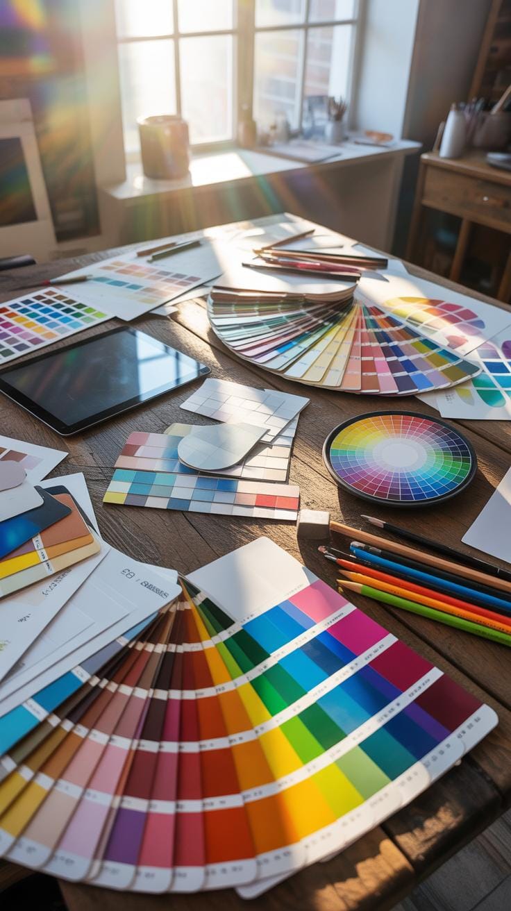
Resources For Choosing Brand Colors
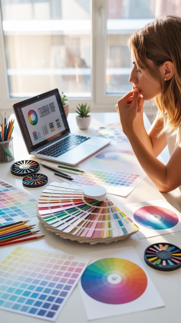
Picking the right colors for your brand isn’t always straightforward. Fortunately, there are tools designed to help you explore, test, and finalize a palette that fits your event planning business. Some are free, perfect when you’re starting out or testing ideas. Others come with a price but offer deeper customization, more advanced features, or easier collaboration.
Online Color Palette Generators
These tools create color schemes tailored to your preferences, with options to adjust shades, contrast, and harmonies. Popular choices include:
- Coolors – A simple but powerful generator that lets you lock colors and shuffle through palettes quickly.
- Canva Color Palette Generator – Useful if you already work in Canva, blending colors from an image or starting afresh.
- Adobe Color – Offers detailed color theory insights and lets you experiment with complementary or analogous colors.
- Paletton – Focuses on web-friendly schemes and lets you preview your combos in different layouts.
Most offer free access with optional premium upgrades for more capabilities. It’s worth trying a few to see which interface and output you find intuitive.
Professional Branding Services
At some point, you might feel overwhelmed trying to nail down your brand identity alone. This is when hiring a branding expert becomes tempting. Professionals take your business values, target audience, and market trends into account.
A branding specialist doesn’t just pick colors; they build a cohesive visual system—from logos and typography to marketing materials—that speaks consistently. They’ll also test your palette across media, ensuring your brand’s colors stay true whether on a website, print, or event signage.
It’s an investment, yes, but for growing businesses or those aiming to stand out in a crowded event planning scene, it often pays off by saving you time and avoiding costly branding missteps.
Conclusions
Color plays a crucial role in business branding, especially for event planners who need to create memorable experiences. The right color palette supports your brand voice and attracts your target clients. It helps separate you from competitors by providing a unique visual identity.
Focus on colors that fit your brand personality and test how they work in different event materials. Use the ideas and examples provided to build your brand with confidence. Thoughtful color choices will help your event planning business grow and connect better with clients.