Introduction
Eye catching wedding welcome signs play an important role in creating a warm and inviting atmosphere for your guests. These signs are not just practical tools for showing directions; they also set the tone for your special day. A well-designed welcome sign can greet guests with style and a personal touch, making them feel appreciated from the moment they arrive.
This article explores various aspects of wedding welcome signs, from choosing the right materials and designs to adding personal messages and creative elements. Whether you want something classic or modern, simple or elaborate, this guide will help you find ways to make your wedding entrance truly unforgettable.
Why Wedding Welcome Signs Matter
Creating First Impressions with Your Sign
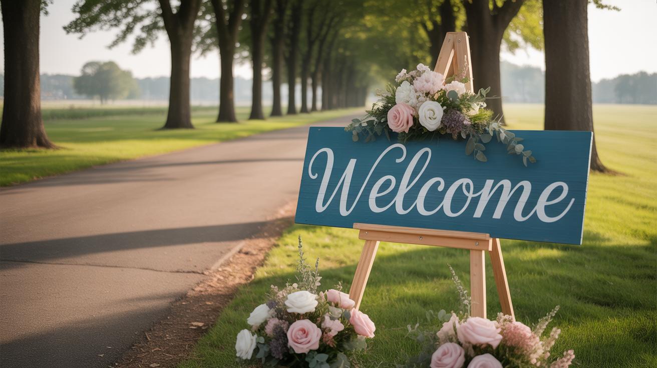
Your wedding welcome sign is often the very first thing guests see when they arrive. It sets a tone—whether casual, elegant, quirky, or traditional—that can influence how people feel right from the start. You might think it’s only a small detail, but I’ve noticed that even simple signs can spark excitement or calm nerves. When guests see a thoughtfully designed sign, it hints that the rest of the day will be just as considered. It’s like a preview, almost a little handshake, saying “We’re glad you’re here.” On the flip side, a sign that feels cluttered or out of place can confuse or unsettle guests, leaving a sense of disconnect before the celebration even kicks off.
Guiding Guests Smoothly to Your Venue
Wedding days often brim with activity—guests arriving, vendors setting up, people trying to find the right room or area. A clear welcome sign can redirect traffic flow in a way you might overlook while caught up in other plans. When signs guide guests smoothly, it helps avoid those awkward moments where people hesitate or ask repeatedly where to go. I think guests appreciate small things like this, especially when they’re juggling outfits, gifts, or trying to stay on schedule. Directional cues reduce stress not just for guests, but for you and your planners too. Sometimes, even a well-placed arrow can make a world of difference in preventing bottlenecks or confusion as everyone makes their way.
Choosing Materials for Your Wedding Welcome Sign
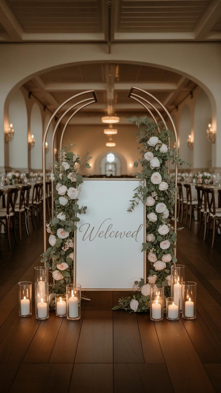
Picking the right material for your wedding welcome sign can feel a bit tricky. Each option has a different vibe and suited for particular wedding styles. You might have seen wood, chalkboard, acrylic, or metal signs—and they all bring something unique to the table.
Wood is an easy favorite if you’re aiming for something natural or rustic. It adds warmth and texture to outdoor weddings, making guests feel like they’ve stepped into a cozy setting. But wood can be heavy and sometimes tricky to transport or set up, especially if it’s large. And, depending on the finish, it might show wear—so you’ll want to plan for that.
Then there’s chalkboard, which works well for a more casual or vintage feel. It lets you personalize with handwritten fonts and doodles, which can feel very charming. On the downside, chalk can smudge, especially if it’s outdoors or there’s wind.
Acrylic is quite popular for sleek, modern designs. It looks polished and clear, perfect if you want a clean, contemporary look. It’s also lighter than wood and weather-resistant. Still, acrylic sometimes feels a little cold—if you want warmth, it might miss the mark. Plus, smudges and fingerprints show easily.
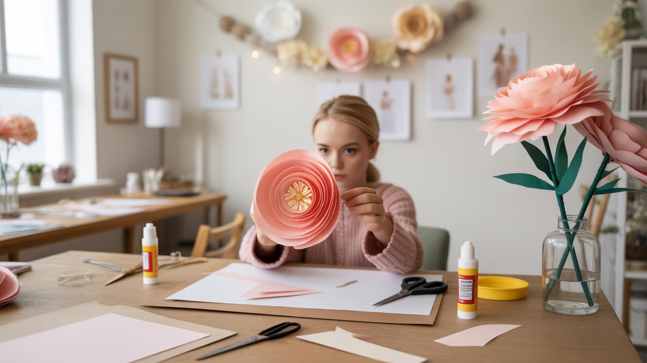
Metal signs catch the eye because of their durability and a bit of industrial chic. They’re sturdy and often waterproof. On the flip side, metal tends to be heavier, which might limit where you can place the sign or make handling tougher.
So, what’s your vibe? Rustic warmth with wood? Sleek modernity with acrylic? Practicality with metal? It’s worth thinking about these details as they affect not just look, but how easy the sign will be to display and maintain during your big day.
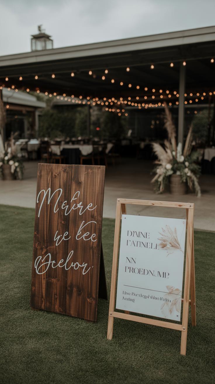
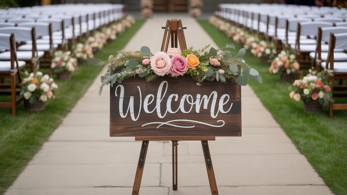
Rustic Wood for a Natural Look
Wood keeps popping up as a popular choice, especially for rustic, outdoor, or barn weddings. It creates a welcoming feel that’s hard to match. I remember a friend’s wedding where the natural wood sign blended beautifully with the greenery around it, making everything feel so down-to-earth.
Wood’s uneven textures and tones lend character that printed materials can’t replicate. You get this unique, handmade vibe, which can make guests feel like the event was thoughtfully curated.
But keep in mind, untreated wood might warp or fade if exposed to moisture for hours. So, you may want to seal or varnish the sign or place it somewhere sheltered. Still, the natural look wood pulls off rarely goes out of style, and it pairs well with floral garlands or simple greenery.
Modern Acrylic for a Sleek Finish
Acrylic signs are something else entirely. Their smooth, shiny surfaces give a modern and elegant finish. If your wedding has a minimal or contemporary theme, acrylic can really complement that sleek aesthetic.
One thing I noticed about acrylic is how versatile it is—you can cut it into any shape or use transparent or frosted finishes. It handles printed graphics sharply and is easy to clean, which helps keep the look crisp through the event.
That said, acrylic doesn’t offer the warmth you get with natural materials. If you want your decor to feel a bit more inviting, acrylic might feel a little sterile. Also, bright sunlight sometimes creates glare, which can make the text harder to read from certain angles.
Choosing your material means balancing style and practicality. Think about the vibe you want and the setting, and how the sign will hold up through the day. Sometimes, mixing materials in decor around the sign can help soften any harshness or add extra texture to your wedding entrance.
Designing Your Wedding Welcome Sign
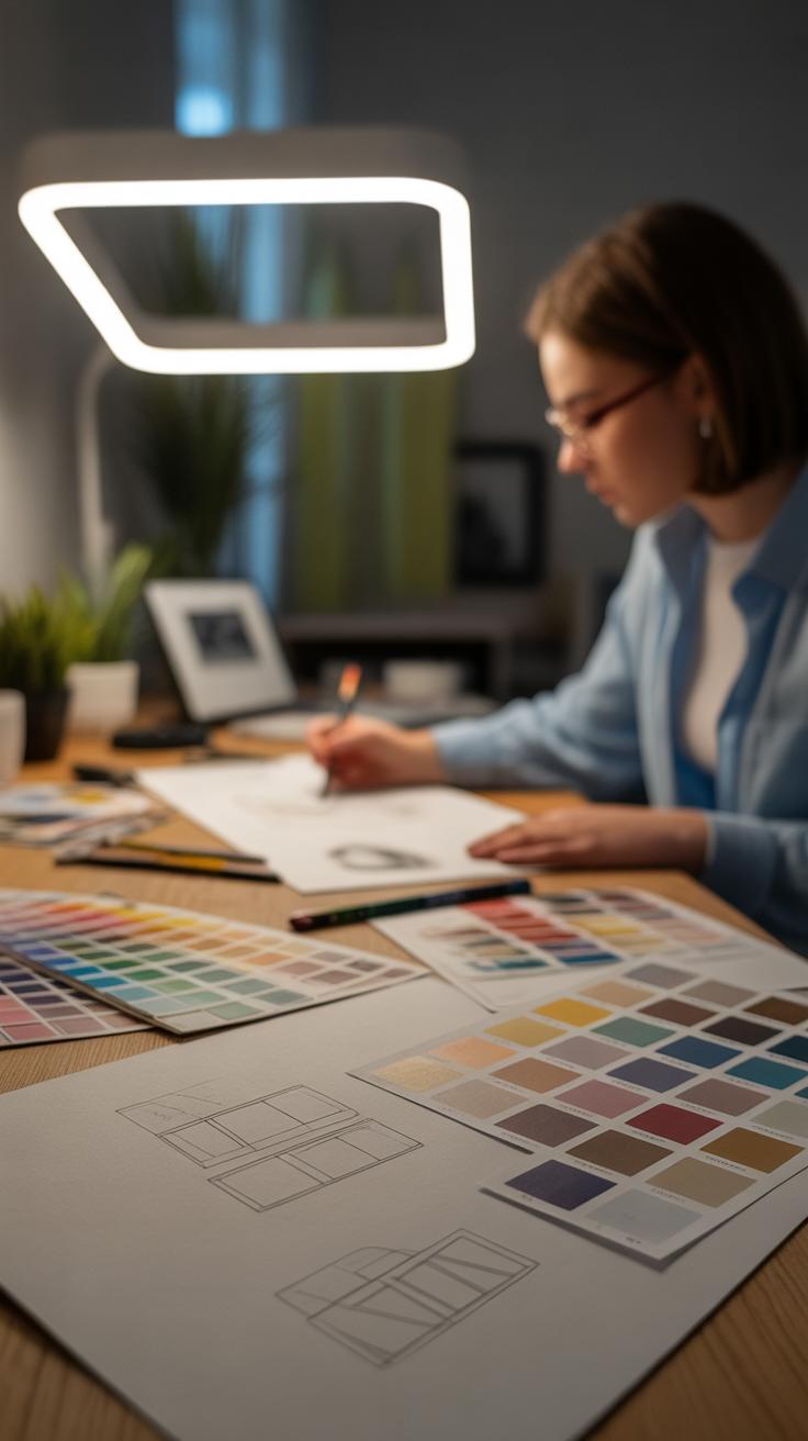
When designing your wedding welcome sign, the choices you make with fonts, colors, and graphics can really impact the overall feel. It’s not just about looking pretty—it’s about creating something that fits your theme and communicates clearly.
Choosing Fonts that Match Your Style
Fonts set the tone. Picking a font that’s easy to read but also matches your wedding style can be tricky. For example, a delicate script can feel romantic but might be hard to read from a distance. On the other hand, a bold sans serif might be super clear but could feel a bit too modern if your vibe is rustic. Sometimes, mixing two fonts can work well—perhaps a script for your names paired with a simple serif for directions or messages.
Think about how guests will see the sign: Are they walking quickly? Is it outdoors in bright sun? Legibility matters, but style counts too. It’s okay to test a few options before settling.
Color Coordination with Wedding Palette
Colors should play nicely with your wedding palette. Imagine a sign in bright reds at a soft blush-toned wedding—it might feel out of place. Matching your sign’s colors to the palette ties everything together, so guests get a sense of the style right from the entrance.
You don’t always need to match exactly though—sometimes using a complementary shade or a neutral tone helps balance the sign without overwhelming it. For instance, if your palette includes pastel blues, a charcoal gray font can look sharp and still fit in. Also, thinking about the background versus lettering colors is key. If you pick a dark background, lighter text is easier to read and vice versa.
Have you thought about how the colors will look in photos? Your welcome sign will likely feature in many pictures, so considering contrast and overall aesthetic there might be worth a little extra thought.
Personalizing Your Wedding Welcome Sign
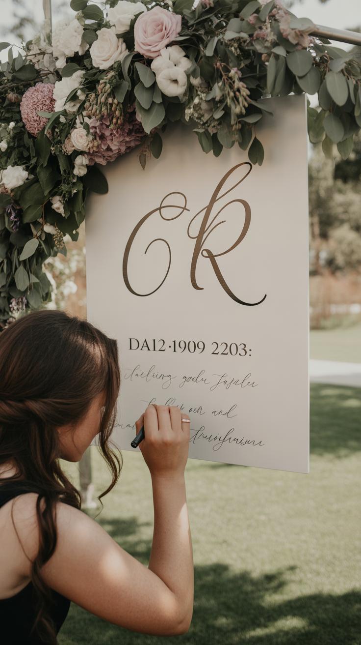
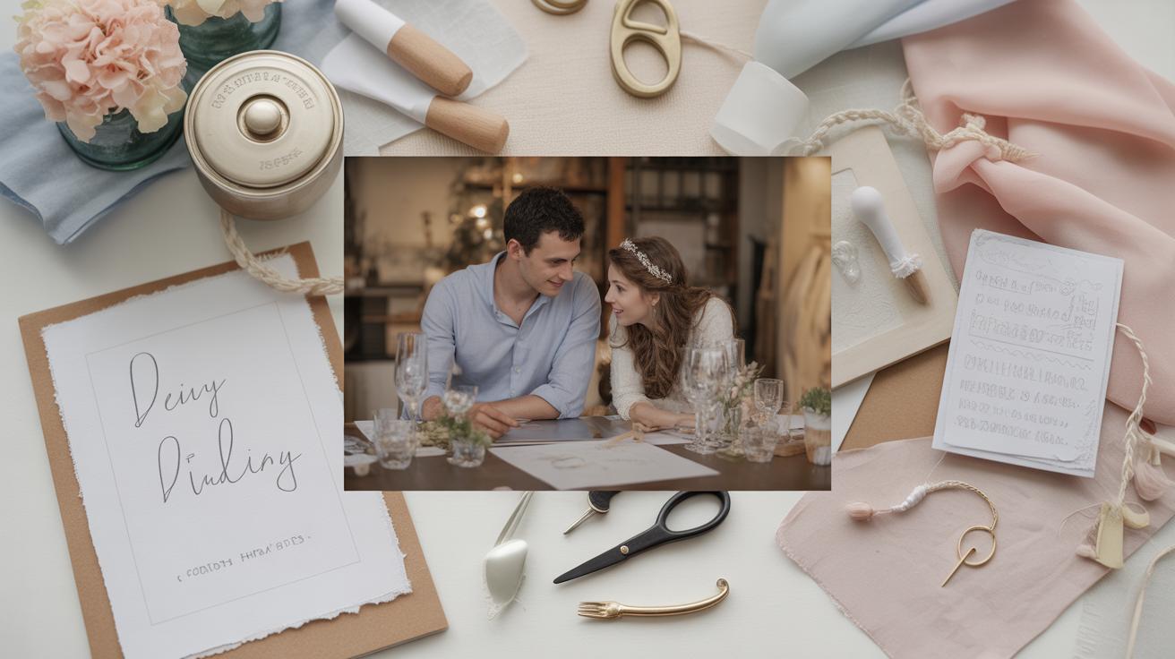
Adding a personal touch to your wedding welcome sign can make a big difference. It’s not just a piece of decor—it becomes a reflection of your story, something guests can connect with right from the start. One of the easiest ways to personalize your sign is by including your names and the wedding date. Seeing those details instantly sets the scene and gives the sign a special feel. It’s like saying, “This is our day”—and your guests pick up on that energy.
Beyond names and dates, you might want to add a quote or a message for your guests. Something simple that feels warm and sincere. For example:
- “Welcome to the beginning of forever.”
- “Love brought you here today.”
- “Thank you for celebrating with us.”
Choosing a quote can be a bit tricky. It should feel right, but not forced. Sometimes a favorite lyric or a line from a poem that means something to you both works really well. Other times, just a few heartfelt words saying “welcome” can set the tone perfectly. Don’t worry if it’s not profound—it’s enough that it feels genuine. What kind of message do you think would resonate with your guests? Your sign is your first ‘hello’—make it yours.
Creative Styles for Wedding Welcome Signs
When choosing a wedding welcome sign, the style can set the tone for the entire event. There are several creative directions to explore, each bringing its own vibe and personality.
Vintage designs often feature ornate frames, calligraphy fonts, or distressed wood backgrounds. These signs suit couples who appreciate something timeless, perhaps with some lace or antique decor nearby. They blend well with traditional venues—think historic mansions or grand ballrooms. You might notice how the details, like gold leaf accents or soft pastel colors, create an elegant yet inviting atmosphere. Sometimes, they feel a bit formal, but that’s part of their charm for classic weddings.
Minimalist signs are quite different. Their appeal lies in simplicity—clean lines, straightforward typography, and a lot of blank space. These work for couples who favor a modern look, avoiding excessive decoration and focusing instead on clarity and style. Often, a minimalist sign uses a monochrome palette, perhaps just black and white, or subtle neutrals. It’s interesting how such simplicity can still feel warm and welcoming. While minimalism might seem cold at first glance, a well-designed minimalist sign can actually feel very intentional and personal.
Other styles you might consider include floral or chalk art, each with its own flair, but nearby chapters will cover placement options. For now, think about what impression your sign will give. Do you want it to whisper elegance or shout clarity? Or maybe a bit of both? The choice is yours, and it’s okay if your style blends a little between categories.
Where to Place Your Wedding Welcome Sign

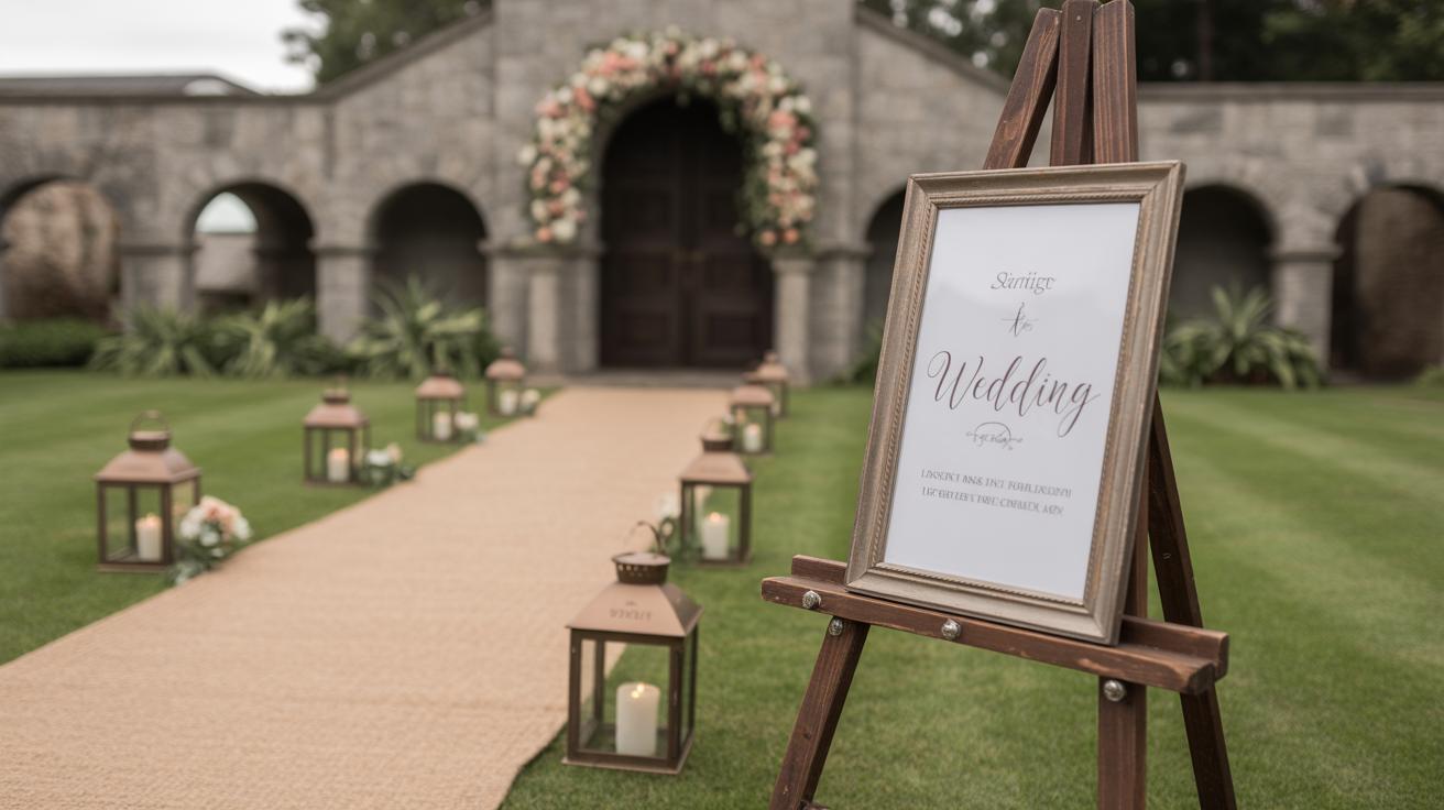
At the Venue Entrance
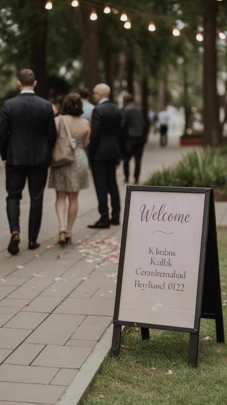
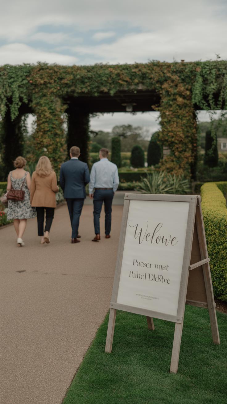
Placing your welcome sign right at the main entrance feels almost like the first “hello” to your guests. It sets the tone and gives people a clear sense of arrival. When guests pull up or walk in, having a sign there lets them know they’re in the right place—something that is surprisingly comforting, especially if others are nearby or there are multiple entrances.
Think about the usual flow of people entering a venue. If the sign is off to the side or tucked away, it might be missed altogether. Placing it front and center or somewhere highly noticeable makes it easier for everyone to pause and take in the message. Sometimes, couples forget that a well-placed sign reduces confusion and helps guests relax before the event even begins.
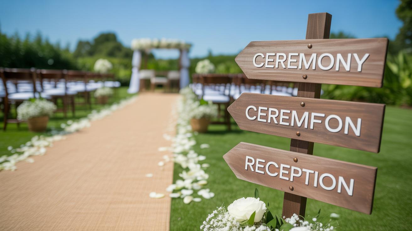
Along the Pathway or Parking Area
Signs don’t have to stop at the front door. A few smaller signs along the way—like on the pathway or in the parking lot—can do a lot to guide people while also building excitement. Maybe you have a long walk from where guests park to where the ceremony will be. Spotting a cute, comforting sign every so often can feel like little checkpoints, gently directing and reassuring them.
It doesn’t have to be elaborate, either. Simple arrows or reminders about where to go next can lessen that “Where am I supposed to be?” feeling. Sometimes, I’ve seen couples use these signs to share small bits of fun info or directions, which adds a personal touch without cluttering the main welcome spot. So, think about the entire guest journey—where might people hesitate? Those are your best spots for extra signage.
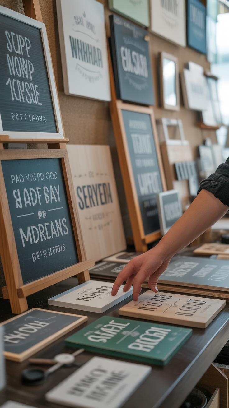
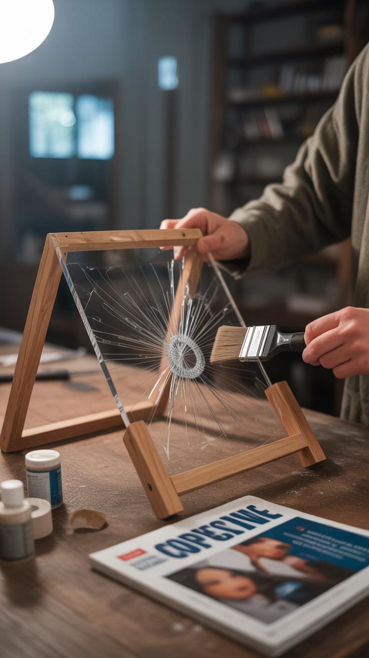
DIY vs Professional Wedding Welcome Signs
When you think about wedding welcome signs, one of the first decisions you’ll face is whether to make it yourself or hire a pro. Both paths have their own particular charm and challenges. You might save money with a DIY sign, but that doesn’t always mean it turns out exactly as you imagined. There’s just something about putting your own hands into crafting that can add a warm, personal vibe to the event. Maybe it’s a handwritten message or a quirky drawing only close friends will appreciate. That personal touch can make the sign feel like a true part of your story.
On the flip side, professional signs generally shine when it comes to look and durability. They tend to use higher quality materials that stand up well to weather and handling. The printwork is often sharper, the finishes cleaner—something that might be hard to match if you’re working with a glued-together board at home. Plus, custom options from professionals can offer unique designs that you might not have the skills or tools to replicate. Still, this usually comes with a bigger price tag, which can be a deciding factor.
With DIY, you’re trading cost-effectiveness and creativity for sometimes less polished results. Professionals deliver consistency and strength but may lack that handmade charm. Sometimes, the best choice depends on how you want your entrance to feel and how much time (and patience) you’re willing to invest.
Using Technology with Wedding Welcome Signs
Technology can add a surprising edge to your wedding welcome signs, giving guests more than just a pretty greeting. LED lights, for example, bring signs to life, especially if your celebration stretches into the evening. They don’t just make the sign visible—there’s a warm, inviting glow that draws people in. I’ve seen couples use soft fairy lights around wooden signs, and that small touch changes everything.
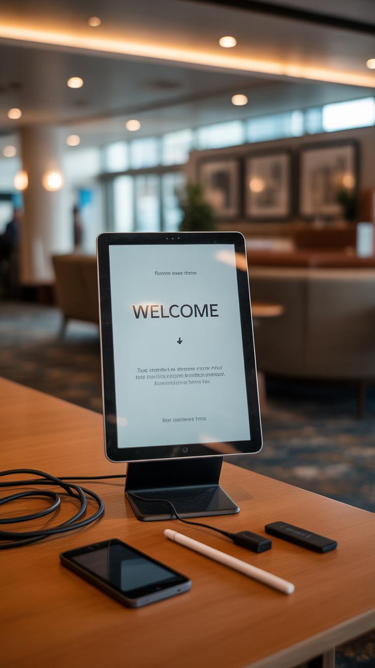
Digital signage might feel a bit formal for weddings, but it offers real convenience. Imagine a sleek digital screen displaying directions, schedules, or song requests. It’s flexible—you can update information right up to the last minute. If you want something simpler, QR codes printed on the welcome sign let guests scan and access details on their phones: menus, photos, or even a map of the venue. It combines tech with a personal touch without being overwhelming.
Here are some practical ways you can add tech:
- Use LED strips behind acrylic or wood signs for subtle illumination.
- Incorporate QR codes linking to your wedding website or event info.
- Set up a digital screen that rotates through greetings, timelines, or fun facts about the couple.
It’s easy to wonder if this might seem too modern or impersonal, but I think when done thoughtfully, it actually enhances the experience. Guests don’t get lost. They have everything they need at their fingertips. And the atmosphere benefits from that welcoming glow after dark, keeping the sign a focal point even when the sun sets.
Incorporating Wedding Welcome Signs into Overall Decor
When you’re setting up your wedding welcome signs, it’s tempting to treat them as just another decorative item. But they can actually feel much more connected to the rest of your décor if you pay some attention. Think about your floral arrangements and greenery—the kind that frame your ceremony or sit on tables. Matching what’s on your welcome sign with those natural elements can make the whole entrance feel intentional and pulled together. For instance, if your bouquets feature dusty roses and eucalyptus, having a few sprigs of the same greenery around the signage can create a nice, subtle continuity.
Color plays a key role, too. If you’ve chosen muted tones or a particular palette for your tables and linens, try to keep the colors on your welcome sign in the same family. It doesn’t mean everything has to be identical, but a sudden pop of neon might distract rather than welcome. Sometimes people get so caught up in making the signs stand out, they forget they should blend with the rest of the theme. Maybe a soft, handwritten font on natural wood would hold up better with rustic décor rather than something too bold or modern.
Consistency is about the little details as well: if your seating chart has gold foil accents, maybe your welcome sign could incorporate a subtle metallic element. Lighting, like fairy lights around the sign, should complement the overall mood—not overshadow it. Have you noticed how even slight mismatches can make a space feel disjointed? Try laying out your signage next to the other pieces ahead of time and ask yourself if it all feels like part of the same story.
Troubleshooting Common Issues with Wedding Welcome Signs
Protecting Signs from Weather
Outdoor wedding signs face the elements, and it’s easy to overlook how quickly sun, rain, or wind can ruin them. You might think a quick laminated finish is enough, but sometimes it isn’t. Vinyl or acrylic signs tend to hold up better than paper or wood, especially when coated with a waterproof sealant.
Consider using clear covers or temporary shelters—simple tarps or see-through boxes can keep a sign dry without hiding it. If wind is a concern, weigh down your sign’s base or secure it with stakes. I once saw a beautiful chalkboard welcome sign swept away because it had no stabilization. Not fun when guests arrive and it’s missing!
If you’re using wooden signs, try weather-resistant paint or oils designed to repel moisture. Treat anything organic before the big day to avoid warping or blistering. It’s a small extra effort but can save you from last-minute panic.
Ensuring Clear and Visible Messages
Many welcome signs struggle with legibility. You want everyone walking in to instantly understand the message, without walking up close squinting. Using large, simple fonts works better than intricate scripts that look great but blur from a distance.
Think carefully about color contrasts. Dark letters on a light background usually do the trick. Placing the sign in well-lit areas—natural sunlight or smart artificial lighting—helps too. I recall a wedding where a warmly lit lantern behind a translucent sign made the text pop just right at dusk.
Finally, keep messages brief. Long sentences can easily get lost in translation, especially if guests are coming from a noisy parking lot or bustling entrance. Ask yourself: can a passerby capture the gist in two seconds? If not, trim it down. A clear welcome, names of the couple, and the ceremony time often cover the essentials without overcrowding.
Conclusions
Wedding welcome signs offer a great opportunity to express your style and welcome your guests with warmth. By selecting materials and designs that match your wedding theme, you create harmony and enhance the overall experience. Personal touches, like your names or a special message, make the sign more meaningful and memorable.
As you plan your wedding, consider how your welcome sign can reflect your personality and greet guests in a unique way. With thought and creativity, your wedding welcome sign becomes a charming highlight that guests will remember long after the celebration ends.