Introduction
Wedding signage offers a unique way to guide, inform, and welcome guests while adding a personal touch to your special day. This article explores timeless styles for wedding signage that remain elegant and functional. Whether you want to direct guests or display heartfelt messages, the right signage creates lasting memories and enhances your wedding’s aesthetic.
We’ll cover classic designs, materials, and practical tips that you can apply to your wedding planning. By understanding these timeless styles, you can craft signage that fits seamlessly with your theme and leaves your guests impressed. Dive into the details to find inspiration and ideas for your perfect wedding signs.
Understanding the Role of Wedding Signage
Wedding signage might seem like just decorative pieces, but they play a much bigger role than many realize. At its core, wedding signage is any sign created for the wedding day to communicate with guests. It can be something simple, like a welcome sign, or more practical, like directions to the ceremony or reception area. Think about it—without clear signage, guests can feel lost, leading to awkward moments or delays.
Signage isn’t just about aesthetics. It shapes how smoothly the day unfolds. When guests know where to go and what to expect, they relax and enjoy. That ease makes the atmosphere more joyful and less stressful for everyone. I’ve witnessed weddings where the signs were overlooked, and guests wandered around wondering where they should be next. It wasn’t a disaster, but you could sense the tension creeping in.
Beyond logistics, signs can reflect the couple’s personality and style, providing little touches that make the experience memorable. It’s a balance of form and function—both matter. You might think signs are minor details, but they quietly hold the day together in subtle ways.
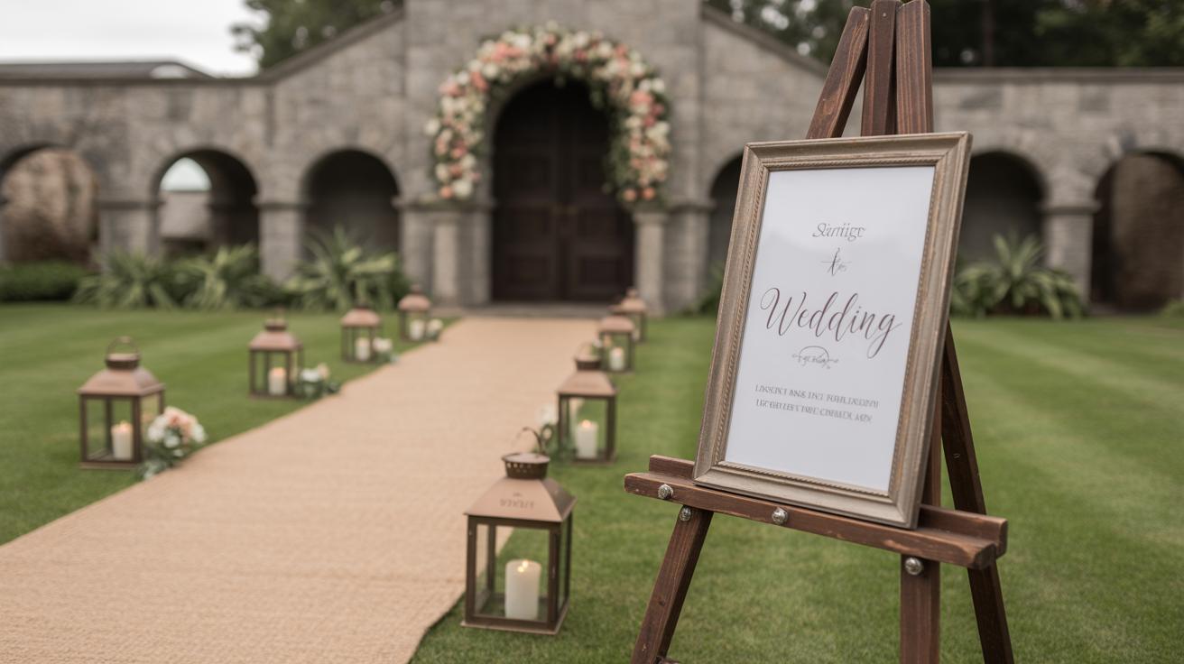
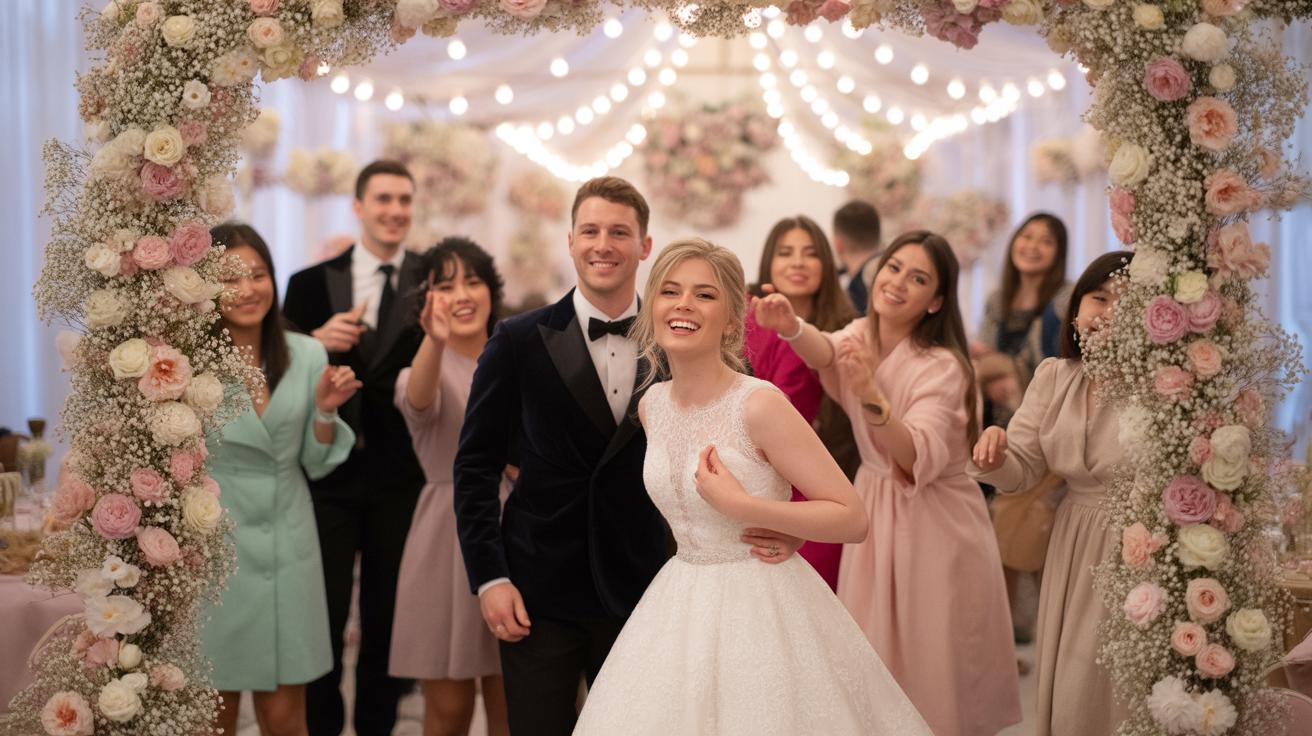
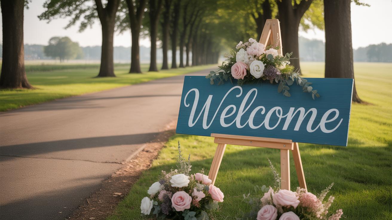
Welcoming Guests with Style
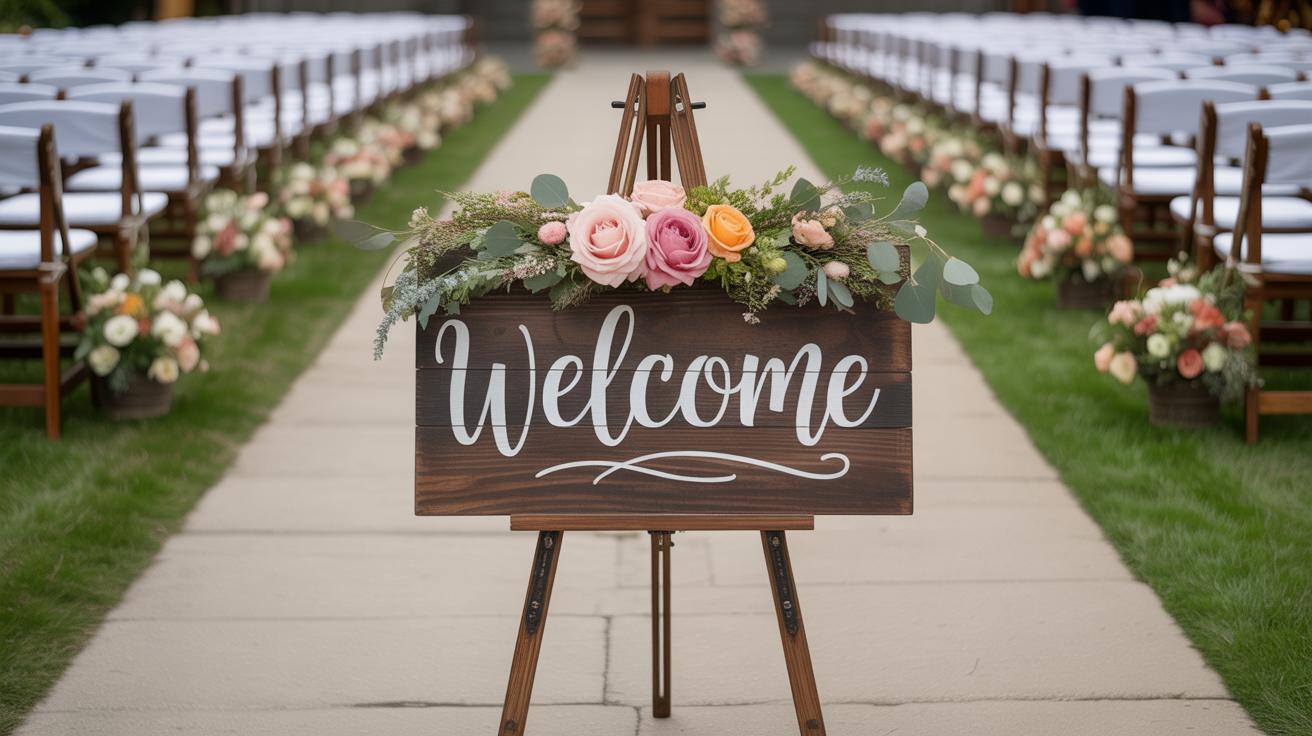
A well-designed welcome sign does more than point out the venue. It sets the tone before guests even enter the space. When people see a welcome sign that feels warm and thoughtful, they immediately feel invited. It says, “You belong here. We’re glad you came.”
Sometimes, a catchy phrase or the couple’s names with the wedding date can spark excitement. Other times, something simple—like elegant calligraphy on wood—feels just right. I remember one wedding where the welcome sign was hand-painted with soft colors and a personal greeting; guests commented later how it made the day feel more intimate from the start. So, it’s not just a marker, it’s a kind of handshake, a first impression that sticks.
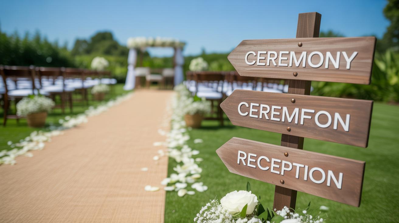
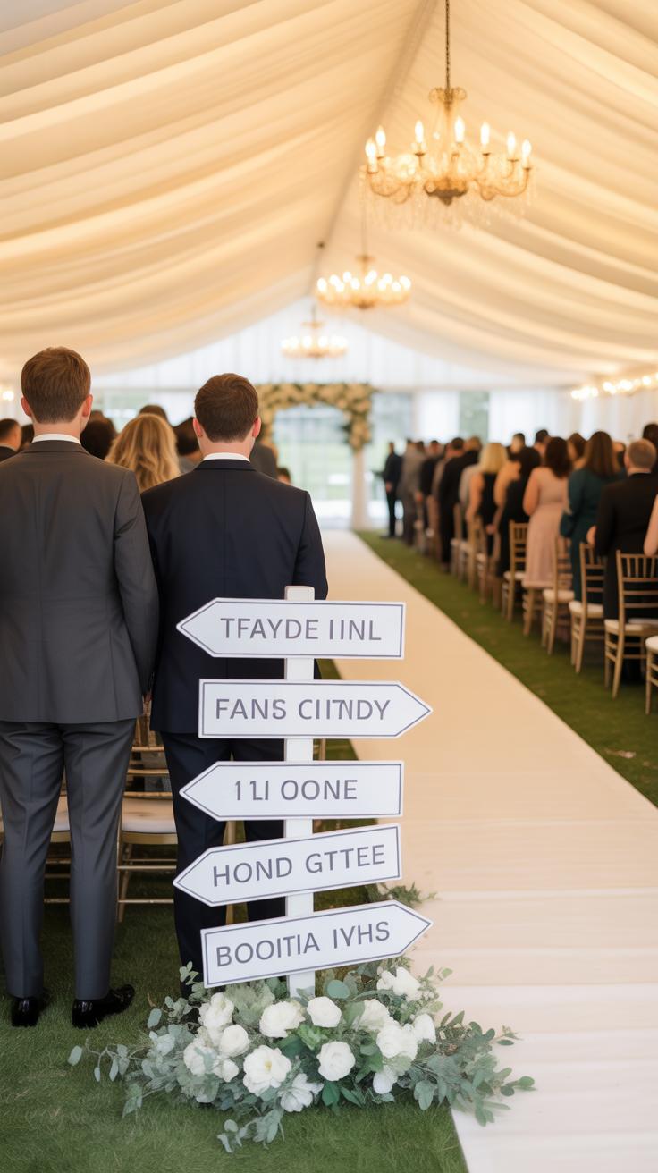
Guiding Guests Smoothly
Directional signs might not get applause, but they quietly prevent frustration. Imagine finding the restroom, the bar, or the dance floor when you’re new to a space. Without signs, people wander, ask strangers, or crowd corners trying to figure out where to go next.
Clear signs can avoid these small but annoying hiccups. That means guests aren’t distracted or tired from hunting around. Instead, they stay engaged with the celebration. You can think about this stage as one of the practical little anchors that keep the event’s momentum going.
When planning your wedding signage, try to see it from a guest’s perspective. What questions might they have? Where might confusion happen? Planning for those moments can save headaches down the line. Even subtle details, like consistent fonts and colors across signs, can help guests feel more oriented without thinking too hard about it.
Classic Signage Materials for Durability and Elegance
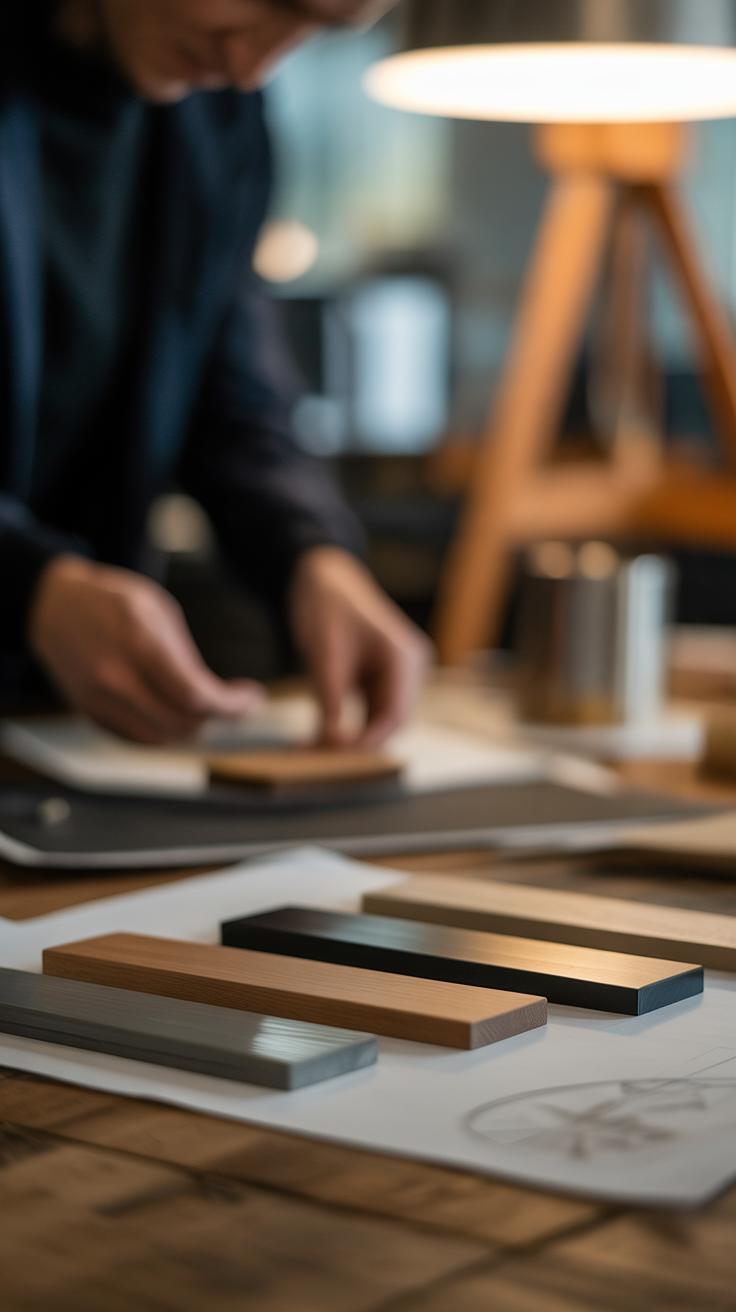
Wedding signs need to hold up throughout the day—and sometimes beyond. That’s why classic materials like wood, chalkboard, and acrylic remain popular choices. Each brings its own kind of lasting appeal, balancing durability with a look that can fit various wedding styles.
Wood is often chosen for its natural, warm vibe. It’s sturdy and can handle outdoor conditions better than some might expect. Plus, wood signs can be personalized—with painted lettering, engraved details, or even attached flowers. I’ve noticed couples lean toward wood when aiming for something rustic, informal, or earthy but still elegant. And because every piece of wood has a unique grain, no two signs look exactly the same.
Chalkboard feels flexible and approachable, especially for weddings where the plan might change or the message needs frequent updates. It invites a personal touch—your own handwriting or even creative doodles. While less weatherproof than wood, chalkboards have a casual charm that fits well in intimate or vintage-inspired settings. Just keep in mind that they’re more prone to smudges and might need a quick refresh if the day is long.
Acrylic offers a clean, modern aesthetic that’s easy to read and catches the light beautifully. It’s surprisingly durable and lightweight, which makes it practical, too. Many couples like acrylic for sleek, minimalist themes. The smooth surface allows sharp fonts and vivid colors that stand out. It’s less hands-on in customization compared to wood or chalkboard but shines when paired with vinyl lettering or laser printing.
So, which material fits you? Think about the style you’re aiming for and the conditions your signs will face. Wood brings nature and longevity. Chalkboard is casual and writable. Acrylic feels fresh and polished. Each has its own strengths, making them timeless choices for wedding signage.
Font Choices That Enhance Readability
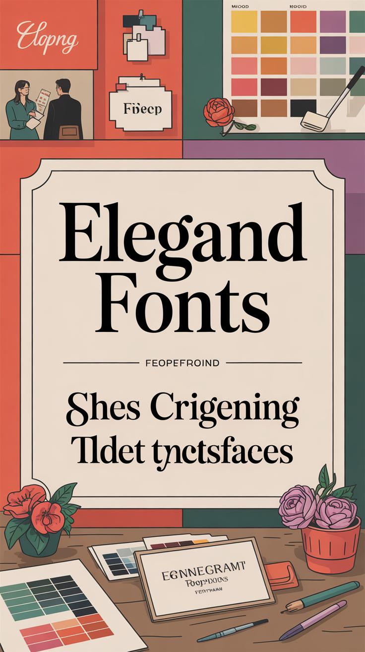
Choosing the right font for wedding signs is more than just picking something pretty. Fonts carry meaning, set tone, and most crucially, guide your guests smoothly through the information. If a sign is hard to read, it doesn’t matter how elegant it looks—people will struggle, get confused, or simply ignore it. Imagine guests squinting at a beautifully scripted font that blends into the background; you want your message to be grasped, not guessed.
Simple fonts often win this battle. Clean lines and clear letter shapes make a difference, especially when signs are viewed from a distance or in dim light. Fonts like serif or sans serif, without too many flourishes, work surprisingly well. I remember seeing a wedding where the signs used a delicate, hard-to-decipher script—it was charming but confusing. Many guests had to ask for directions, which defeated the purpose entirely.
That said, font choice doesn’t mean you must sacrifice style. Pairing fonts thoughtfully can add personality without compromising clarity.
Simple Fonts for Clear Messaging
Simple fonts matter because clarity matters. They help your message stand out and reduce the chance of misunderstandings. Here’s why they work best:
- They’re easier to read from a distance—meaning guests don’t have to stop and stare.
- Even in natural or uneven lighting, they hold up.
- Unfussy fonts tend to age well—they won’t feel outdated when you look back at photos years later.
If you want people to find the seating chart or ceremony time easily, you can’t rely on overly intricate fonts. It’s tempting to go for something eye-catching or trendy, but remember that wedding signage is functional—it has to communicate clearly first.
Complementary Fonts for Style
Mixing fonts can add flair and suit your wedding vibe, but it’s a balancing act. You might combine a bold serif font for headings with a neutral sans serif for details, which keeps things readable yet stylish. Or use a gentle script for names paired with a simpler font for dates and times.
The key is matching fonts so they don’t compete. Think about:
- The mood you want—a rustic wedding might lean on warm serif fonts, while a modern setting calls for clean, minimalist styles.
- Font sizes—ensure secondary fonts don’t shrink to the point of illegibility.
- Consistency—if you use two or three fonts, repeat them through all signage to maintain unity.
Font choice shouldn’t feel like an afterthought. Take time to test your options, print samples, and see how they look under lighting conditions expected at your venue. That little effort turns your wedding signs from “nice” to truly helpful and memorable.
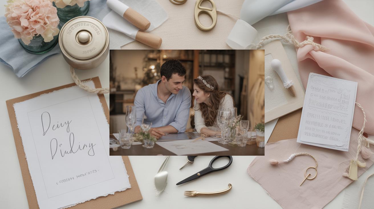
Incorporating Personal Touches into Signage
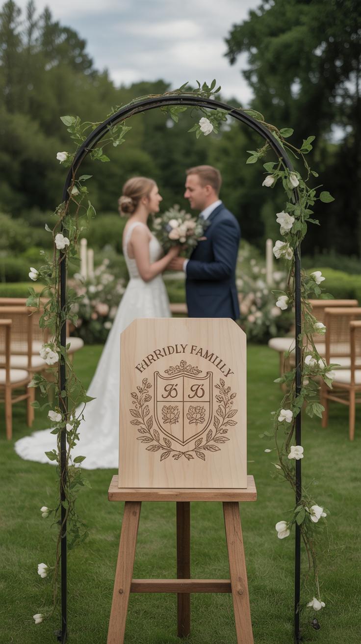
Wedding signage is more than just directions or information—it’s a chance to tell a story. When you include the couple’s names and wedding date on signs, it instantly makes them feel personal. It’s not just a generic “Welcome” sign anymore; it becomes something unique tied to a specific moment in time. Guests notice it, even if only subconsciously. There’s a warmth in seeing “Emma & Luke” alongside “June 5, 2024” that makes the setting feel intentional, curated.
You can go beyond just names and dates by adding custom messages or quotes that reflect the couple’s values or shared experiences. Sometimes a short phrase—like “Together is the best place to be” or “Love always wins”—adds a comforting vibe that resonates with everyone. I’ve seen signs quoting favorite song lyrics or inside jokes from the couple’s past, and those little details often spark smiles and conversations.
If you’re wondering what to choose, think about what sums up the couple’s story or your own sentiment towards love and commitment. It doesn’t have to be overly poetic. Even straightforward messages can feel meaningful when they come from the heart. So, when planning your signage, ask yourself: what words will make people pause and feel connected in that moment?
Effective Placement of Wedding Signs
Where you place your wedding signs can change how guests experience the day—sometimes more than the design itself. Let’s start at the very beginning: entrances and greeting areas. Putting a sign right at the entry helps set the tone, making people feel seen and welcomed. It’s often the first clue guests get about the day’s style and flow. Plus, a clear welcome sign can quietly ease any nervousness about not knowing where to go. I’ve seen a few weddings where guests looked lost without something upfront—something as simple as a “Welcome” or “This Way” sign makes a difference.
Beyond the entrance, think about the natural flow of your event. Bathrooms, reception spots, and areas that could confuse or congest people are perfect places for signs. Directional signs near these spaces save time and prevent awkward moments—as when a couple I know had no bathroom signs and people wandered for quite a while. Placing signs strategically keeps guests comfortable and the event moving. It’s worth considering which areas guests might circle back to or suddenly need, and then placing clear, friendly signs there.
So in short, think of signs as gentle guides—quiet helpers keeping things clear without shouting. Where could your guests use a little extra nudge? Spot those places, and place your signs there thoughtfully.
Timeless Color Palettes for Wedding Signage
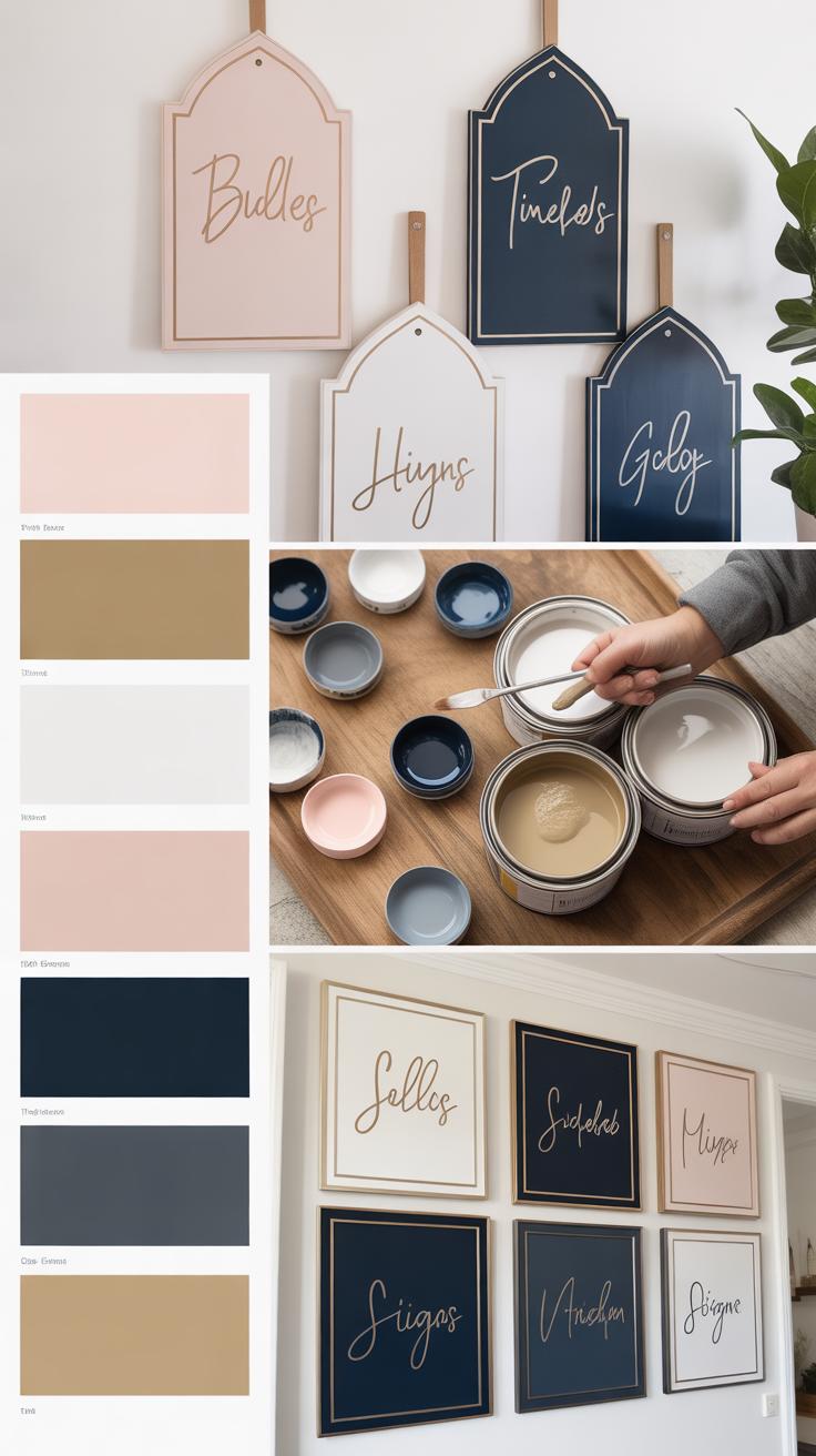

When choosing colors for wedding signage, some palettes stand the test of time better than others. Neutral and earth tones often top the list because they offer a quiet elegance that rarely clashes with anything else happening in your décor. Think soft beiges, gentle grays, creamy whites, and warm browns. These shades create a sophisticated backdrop that lets the lettering and message shine, without pulling attention away from flowers, table settings, or dresses.
What’s nice about neutrals is that they don’t fight for the spotlight. Your signs blend in naturally but remain readable. In practical terms, this means the overall look feels cohesive, not chaotic. It’s perhaps the safest choice for couples who prefer subtlety or want to keep their options open as themes evolve or details get added later.
Metallic accents, like gold, silver, or bronze, add a different kind of appeal. They can elevate a simple sign instantly with just a touch here and there—a border, a few letters, even a small emblem. These accents don’t have to be flashy or overwhelming. In fact, the best use of metallics is often restrained—to catch the light just enough to create interest while keeping the look refined.
One challenge with metallics is making sure they don’t read as dated or over the top. When done thoughtfully, though, they bring an understated luxury that works across styles—from rustic barn weddings to grand ballroom events. You might consider pairing them with earth tones too, which can soften what might otherwise feel cold or stark.
At the end of the day, the goal is to pick colors that feel lasting without being boring. Have you thought about how your signage colors will look in photos or under evening lighting? These small details can influence your choices quite a bit.
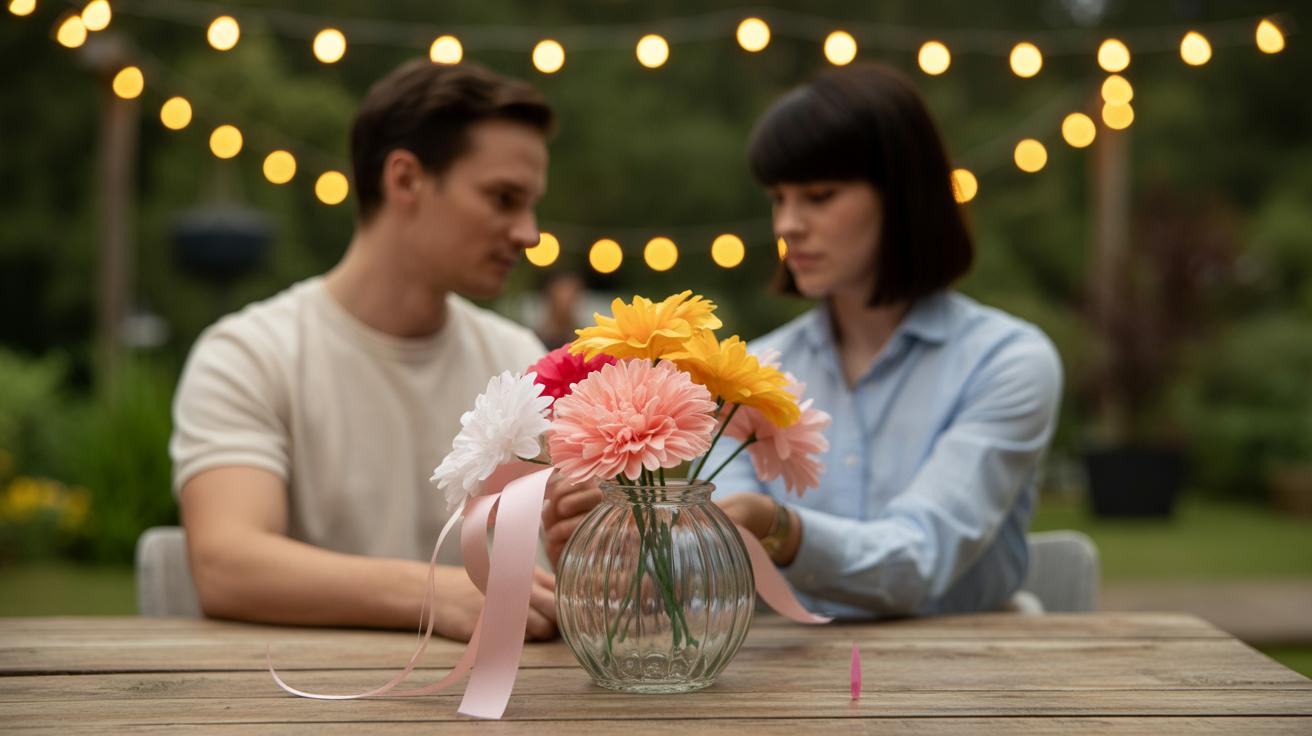
DIY Versus Professional Wedding Signage
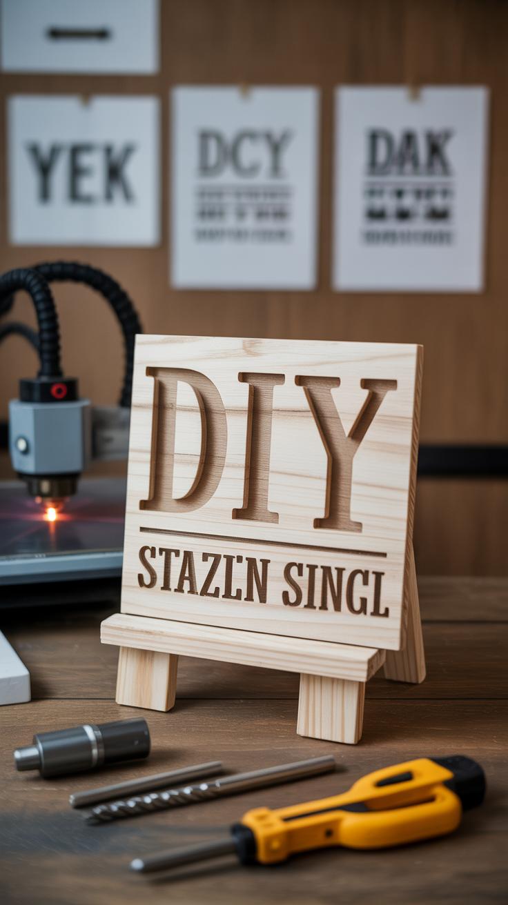
You might wonder whether making your own wedding signs is better than hiring a professional. Both paths come with clear upsides and some drawbacks that depend on your priorities and time.
Benefits of DIY Projects
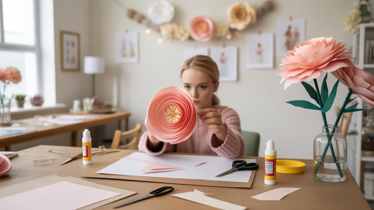
Doing it yourself can save quite a bit on the budget. Materials might be cheaper than ordering custom signs, and if you already own some supplies, even better. There’s something special about a sign you crafted with your own hands—it adds a personal touch that guests often notice. Maybe your handwriting or a little hand-painted detail will feel more genuine, more “you.”
On the other hand, DIY demands time—sometimes more than you expect. Mistakes happen, and not every project turns out as planned. But often, that’s part of the charm, right? You get to adjust as you go along.
In short, if you have some craft skills, time to spare, and want to make the signs truly personal, DIY might be the way to go.
Why Hire Professionals
Professional signage takes a different route. With pros, you’re paying for skill and experience that show in the final product. The signs tend to look polished and consistent, especially if you want something elegant or complex. This can matter a lot if you’re after a certain font, material finish, or if you want uniformity that’s hard to pull off yourself.
One huge draw is time saved. You won’t need to worry about materials, tools, or spending weekends crafting. Instead, you can focus on other wedding plans, which can make a big difference if your schedule feels tight.
Still, hiring professionals comes with a higher cost. Sometimes that’s worth it for peace of mind, but sometimes it feels a little… impersonal. If you crave that homemade feel, a professional sign might seem too polished or distant.
Choosing between DIY and professional comes down to what matters most to you: the personal challenge and charm versus a guaranteed, polished look without the hassle. There’s no one-size-fits-all answer, really.
Trends That Blend with Timeless Styles
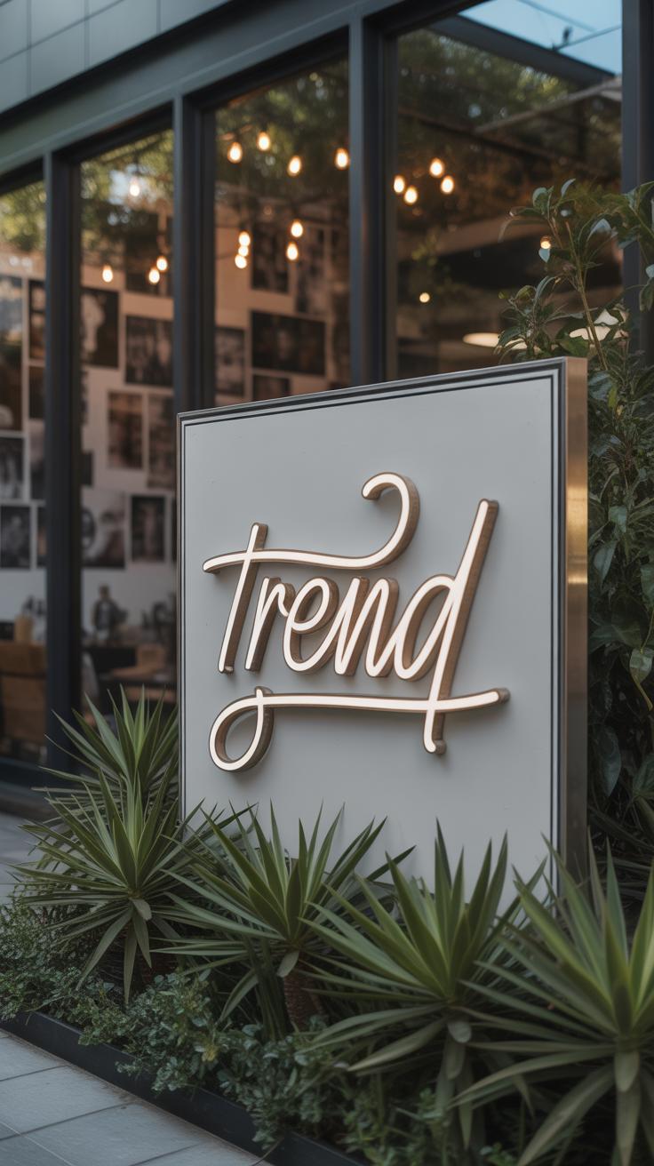
Wedding signage doesn’t have to chase every new trend to feel fresh and meaningful. Some trends actually fit right in with classic designs, enhancing rather than replacing them. Take hand lettering and calligraphy, for instance. There’s something undeniably personal about a perfectly imperfect handwritten sign. It adds a little human touch—like you can almost feel the person behind the pen. This charm fits naturally with traditional wedding aesthetics, where elegance meets warmth.
Hand lettering also allows for subtle quirks, small flourishes that make each sign unique. You might notice a slight wobble or unexpected loop that feels more genuine than a perfectly printed font. Maybe it’s the reason so many couples still opt for handwritten accents on their signs—because it tells a story, even if just a quiet one.
Then, there’s the draw of minimalist design. Stripping signs down to essentials, clean lines, and simple layouts isn’t about removing personality. Instead, it’s about clarity and focus. When you only highlight the necessary details, everything becomes easier to read—and easier to appreciate. Minimalism teams well with timeless styles by avoiding distractions that could date your signage quickly.
Some people might think minimalist signs feel too plain, but really, their strength is in their restraint. They rely on fine materials and thoughtful typography to carry the message. And honestly, in a wedding setting packed with so much decorative flair, a minimalist sign often provides a much-needed breath of calm.
So, when considering your own wedding signage, ask yourself: do you want something that stands apart or something that flows with tradition while feeling personal and clear? Between hand lettering and simple design, there’s a sweet spot where timeless meets today’s subtle trends.
Maintaining Signage for Reuse and Memories
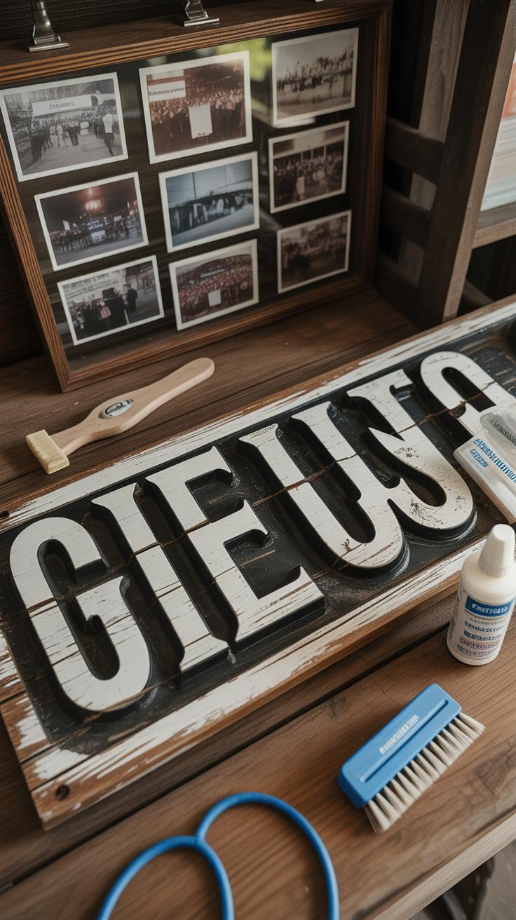
Storing Wooden and Chalkboard Signs
Wooden and chalkboard signs can be surprisingly delicate, even if they look sturdy. After the wedding, your signs need careful handling to avoid scratches, warping, or fading. For wooden signs, keep them in a dry, cool place where humidity won’t cause the wood to swell or crack. Wrapping them loosely in cloth or bubble wrap can offer some protection without trapping moisture.
Chalkboard signs demand different attention. You might want to fix the chalk art with a light spray of fixative or even a simple clear coat, depending on the finish. But remember, a fixative can change the matte look. Store these signs flat or upright against a solid surface to prevent bending.
During transport and storage, try to avoid stacking heavy objects on top. It’s tempting to cram everything into a box for convenience, but even slight pressure might chip the edges or smudge your carefully crafted design.
Displaying Signs After the Wedding
What to do with your signs after the big day? Many couples struggle with this. Some frame chalkboard signs to hang in hallways or kitchens—turning them into conversation starters or quirky art pieces.
Wooden signs can add warmth anywhere: a mantelpiece, an entryway, or even a garden nook. Some choose to repurpose their signs by repainting or adding personal touches over time, letting them evolve just like memories do.
You might wonder if preserving every sign is practical. Maybe not, but this encourages you to pick the ones that really resonate. A simple, heartfelt sign can become a keepsake, reminding you and your guests of that special occasion whenever it’s seen again.
Budgeting for Wedding Signage
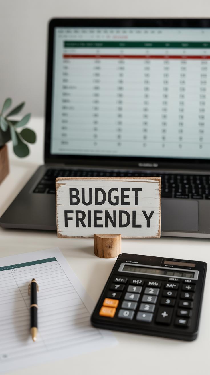
When planning your wedding signage budget, start by thinking about what really matters—materials, size, and the complexity of your designs all play big roles in cost. A larger wooden welcome sign will probably set you back more than a small paper printout. And if you want hand-painted details or intricate calligraphy, expect the price to rise. But you don’t have to break the bank to get something that looks great.
Try to break down your budget like this:
- Materials: Wood, metal, acrylic, or cardstock vary widely in price. For example, wood is often pricier but more durable.
- Size: Bigger signs use more materials and may require professional help to finish.
- Complexity: Simple printed text costs much less than custom artwork or lettering.
You might want to allocate about 5% of your total wedding budget just for signage. That sounds reasonable, though it depends on what other decor you’re prioritizing.
To save without giving up style, consider repurposing materials. Maybe you can reuse old frames or paint signs by hand. Printable templates offer a quick and cheap fix too—just print at home or a local shop and frame it yourself. I once found inexpensive chalkboard signs at a craft store and redid them with my own lettering; it felt personal and economical at the same time.
Ask yourself what statement your signs should make, and then figure out where splurging really counts. Would guests notice if a sign was smaller but still charming? Could you use fewer signs overall and make each one count more? These choices often help you find a balance between spending wisely and keeping your vision intact.
Conclusions
Timeless wedding signage combines beauty and purpose. By selecting classic styles and quality materials, your signs will look good and serve their function well. Remember that clear messages and thoughtful designs can improve your guests’ experience.
Consider your wedding theme and personal style when designing your signs. With careful planning and attention to detail, your wedding signage can become a cherished part of your celebration that you and your guests will appreciate for years to come.